- Published on
Beginners Guide: Build A Hoverable Neon Buttons With Tailwind CSS
- What is Tailwind CSS?
- The description of Hoverable Neon Buttons UI component
- Why use Tailwind CSS to create a Hoverable Neon Buttons UI component?
- The preview of Hoverable Neon Buttons UI component
- The source code of Hoverable Neon Buttons UI component
- How to create a Hoverable Neon Button with Tailwind CSS?
- Conclusion
As a beginner in FrontEnd development, it can be overwhelming to choose the right CSS framework to use for your projects. However, Tailwind CSS has gained popularity among developers due to its flexibility and ease of use. In this article, we will explore how to create a Hoverable Neon Buttons UI component with Tailwind CSS.
What is Tailwind CSS?
Tailwind CSS is a utility-first CSS framework that allows developers to quickly build custom user interfaces. It provides a set of pre-defined CSS classes that can be used to style HTML elements. With Tailwind CSS, you don't have to write custom CSS code for every element on your website. Instead, you can use pre-defined classes to style your components.
The description of Hoverable Neon Buttons UI component
A Hoverable Neon Button is a UI component that changes color when the user hovers over it. It is a popular design trend that is used in many modern websites. The button has a neon effect that makes it stand out from the rest of the page. The Hoverable Neon Button is a great way to draw attention to a call-to-action or to make a button more visually appealing.
Why use Tailwind CSS to create a Hoverable Neon Buttons UI component?
Tailwind CSS provides a set of pre-defined classes that can be used to style HTML elements. This makes it easy to create a Hoverable Neon Button without having to write custom CSS code. Tailwind CSS also allows you to customize the colors and styles of your components by modifying the configuration file. This makes it easy to create a unique design for your Hoverable Neon Button.
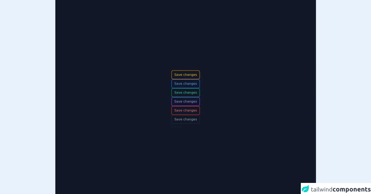
The preview of Hoverable Neon Buttons UI component
To create a Hoverable Neon Button with Tailwind CSS, we will use the following classes:
bg-black: sets the background color of the button to black.text-white: sets the text color of the button to white.hover:bg-red-500: changes the background color of the button to red when the user hovers over it.hover:text-white: changes the text color of the button to white when the user hovers over it.rounded-full: rounds the corners of the button.
Free download of the Hoverable Neon Buttons's source code
The source code of Hoverable Neon Buttons UI component
To create a Hoverable Neon Button with Tailwind CSS, you can use the following HTML code:
<button class="bg-black text-white hover:bg-red-500 hover:text-white rounded-full py-2 px-4">
  Click me
</button>
You can also use the following CSS code to create a Hoverable Neon Button:
.button {
  background-color: black;
  color: white;
  border-radius: 9999px;
  padding: 8px 16px;
  transition: background-color 0.2s ease-out, color 0.2s ease-out;
}

.button:hover {
  background-color: #ff3e00;
  color: white;
}
<div class="bg-gray-900">
  <div class="w-full h-screen">
    <div class="flex h-screen">
      <div class="m-auto flex flex-col gap-6">

        <!-- Orange Button -->
        <div class="border-2 border-yellow-600 rounded-lg px-3 py-2 text-yellow-400 cursor-pointer hover:bg-yellow-600 hover:text-yellow-200">
          Save changes
        </div>

        <!-- Orange Button -->
        <div class="border-2 border-blue-600 rounded-lg px-3 py-2 text-blue-400 cursor-pointer hover:bg-blue-600 hover:text-blue-200">
          Save changes
        </div>

        <!-- Green Button -->
        <div class="border-2 border-green-600 rounded-lg px-3 py-2 text-green-400 cursor-pointer hover:bg-green-600 hover:text-green-200">
          Save changes
        </div>

        <!-- Purple Button -->
        <div class="border-2 border-purple-600 rounded-lg px-3 py-2 text-purple-400 cursor-pointer hover:bg-purple-600 hover:text-purple-200">
          Save changes
        </div>

        <!-- Red Button -->
        <div class="border-2 border-red-600 rounded-lg px-3 py-2 text-red-400 cursor-pointer hover:bg-red-600 hover:text-red-200">
          Save changes
        </div>

        <!-- Dark Button -->
        <div class="border-2 border-gray-800 rounded-lg px-3 py-2 text-gray-400 cursor-pointer hover:bg-gray-800 hover:text-gray-200">
          Save changes
        </div>

      </div>
    </div>
  </div>
</div>
How to create a Hoverable Neon Button with Tailwind CSS?
- Start by creating a new HTML file and adding a button element to it.
<button class="bg-black text-white hover:bg-red-500 hover:text-white rounded-full py-2 px-4">
  Click me
</button>
- Add the Tailwind CSS CDN link to your HTML file.
<head>
  <link
    href="https://cdn.jsdelivr.net/npm/tailwindcss@latest/dist/tailwind.min.css"
    rel="stylesheet"
  />
</head>
Save the HTML file and open it in your browser. You should see a black button with white text.
Add the
hover:bg-red-500andhover:text-whiteclasses to the button element to change the background color and text color of the button when the user hovers over it.
<button class="bg-black text-white hover:bg-red-500 hover:text-white rounded-full py-2 px-4">
  Click me
</button>
Save the HTML file and refresh your browser. You should now see a Hoverable Neon Button that changes color when the user hovers over it.
You can also customize the colors and styles of your Hoverable Neon Button by modifying the Tailwind CSS configuration file. To do this, create a new file named
tailwind.config.jsin your project directory and add the following code:
module.exports = {
  theme: {
    extend: {
      colors: {
        neon: {
          DEFAULT: "#ff3e00",
        },
      },
    },
  },
  variants: {},
  plugins: [],
};
- Save the
tailwind.config.jsfile and add thebg-neonclass to your button element.
<button class="bg-black text-white hover:bg-neon hover:text-white rounded-full py-2 px-4">
  Click me
</button>
- Save the HTML file and refresh your browser. You should now see a Hoverable Neon Button with a custom color.
Conclusion
In this article, we have explored how to create a Hoverable Neon Button UI component with Tailwind CSS. We have seen how Tailwind CSS provides a set of pre-defined classes that can be used to style HTML elements and how it can be used to create a unique design for your components. With Tailwind CSS, you can easily create a Hoverable Neon Button without having to write custom CSS code.