- Published on
How To Create A Horizontal Scroll Card Components With Tailwind CSS From Scratch
- What is Tailwind CSS?
- The description of Horizontal scroll card components ui component
- Why use Tailwind CSS to create a Horizontal scroll card components ui component?
- The preview of Horizontal scroll card components ui component
- The source code of Horizontal scroll card components ui component
- How to create a Horizontal scroll card components with Tailwind CSS?
- Conclusion
What is Tailwind CSS?
Tailwind CSS is a utility-first CSS framework that provides a set of pre-defined classes to create responsive and customizable user interfaces. It allows developers to create complex layouts and designs without writing custom CSS code. Tailwind CSS is gaining popularity among developers due to its simplicity and flexibility.
The description of Horizontal scroll card components ui component
Horizontal scroll card components are a popular UI component used in web applications to display a set of items in a horizontal scrollable container. Each item is represented by a card that contains a title, image, and description. Users can scroll horizontally to view all the items.
Why use Tailwind CSS to create a Horizontal scroll card components ui component?
Tailwind CSS provides a set of pre-defined classes that can be used to create the layout and styles of the horizontal scroll card components. Using Tailwind CSS, developers can create a responsive and customizable UI component quickly and easily. Additionally, Tailwind CSS provides a consistent and maintainable codebase that can be easily extended and modified.
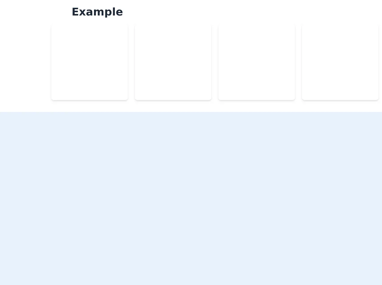
The preview of Horizontal scroll card components ui component
To create a horizontal scroll card component, we will use Tailwind CSS classes to style the layout and content of each card. The result will be a responsive and visually appealing UI component that can be easily integrated into any web application.
Free download of the Horizontal scroll card components's source code
The source code of Horizontal scroll card components ui component
The source code for the horizontal scroll card component can be found below.
<div class="flex flex-col bg-white m-auto p-auto">
<h1
        class="flex py-5 lg:px-20 md:px-10 px-5 lg:mx-40 md:mx-20 mx-5 font-bold text-4xl text-gray-800"
      >
        Example
      </h1>
      <div
        class="flex overflow-x-scroll pb-10 hide-scroll-bar"
      >
        <div
          class="flex flex-nowrap lg:ml-40 md:ml-20 ml-10 "
        >
          <div class="inline-block px-3">
            <div
              class="w-64 h-64 max-w-xs overflow-hidden rounded-lg shadow-md bg-white hover:shadow-xl transition-shadow duration-300 ease-in-out"
            ></div>
          </div>
          <div class="inline-block px-3">
            <div
              class="w-64 h-64 max-w-xs overflow-hidden rounded-lg shadow-md bg-white hover:shadow-xl transition-shadow duration-300 ease-in-out"
            ></div>
          </div>
          <div class="inline-block px-3">
            <div
              class="w-64 h-64 max-w-xs overflow-hidden rounded-lg shadow-md bg-white hover:shadow-xl transition-shadow duration-300 ease-in-out"
            ></div>
          </div>
          <div class="inline-block px-3">
            <div
              class="w-64 h-64 max-w-xs overflow-hidden rounded-lg shadow-md bg-white hover:shadow-xl transition-shadow duration-300 ease-in-out"
            ></div>
          </div>
          <div class="inline-block px-3">
            <div
              class="w-64 h-64 max-w-xs overflow-hidden rounded-lg shadow-md bg-white hover:shadow-xl transition-shadow duration-300 ease-in-out"
            ></div>
          </div>
          <div class="inline-block px-3">
            <div
              class="w-64 h-64 max-w-xs overflow-hidden rounded-lg shadow-md bg-white hover:shadow-xl transition-shadow duration-300 ease-in-out"
            ></div>
          </div>
          <div class="inline-block px-3">
            <div
              class="w-64 h-64 max-w-xs overflow-hidden rounded-lg shadow-md bg-white hover:shadow-xl transition-shadow duration-300 ease-in-out"
            ></div>
          </div>
          <div class="inline-block px-3">
            <div
              class="w-64 h-64 max-w-xs overflow-hidden rounded-lg shadow-md bg-white hover:shadow-xl transition-shadow duration-300 ease-in-out"
            ></div>
          </div>
        </div>
      </div>
</div>
<style>
.hide-scroll-bar {
  -ms-overflow-style: none;
  scrollbar-width: none;
}
.hide-scroll-bar::-webkit-scrollbar {
  display: none;
}
</style>
How to create a Horizontal scroll card components with Tailwind CSS?
Let's start by creating the HTML structure for the horizontal scroll container and the cards. We will use the flex and overflow-x-auto classes to create a horizontal scrollable container.
<div class="flex overflow-x-auto">
  <div class="flex-shrink-0 w-64 bg-white shadow-lg rounded-lg overflow-hidden">
    <img src="https://via.placeholder.com/64x64" alt="Placeholder" class="w-full h-32 object-cover">
    <div class="p-4">
      <h2 class="text-lg font-bold text-gray-800">Card Title</h2>
      <p class="mt-2 text-gray-600">Card Description</p>
    </div>
  </div>
  <!-- Add more cards here -->
</div>
Next, we will add the Tailwind CSS classes to style the layout and content of each card. We will use the flex-shrink-0, w-64, bg-white, shadow-lg, and rounded-lg classes to style the card container. We will use the object-cover class to ensure that the image inside the card is fully visible. We will use the p-4 class to add padding to the card content. We will use the text-lg, font-bold, text-gray-800, mt-2, and text-gray-600 classes to style the title and description of the card.
<div class="flex overflow-x-auto">
  <div class="flex-shrink-0 w-64 bg-white shadow-lg rounded-lg overflow-hidden">
    <img src="https://via.placeholder.com/64x64" alt="Placeholder" class="w-full h-32 object-cover">
    <div class="p-4">
      <h2 class="text-lg font-bold text-gray-800">Card Title</h2>
      <p class="mt-2 text-gray-600">Card Description</p>
    </div>
  </div>
  <div class="flex-shrink-0 w-64 bg-white shadow-lg rounded-lg overflow-hidden ml-4">
    <img src="https://via.placeholder.com/64x64" alt="Placeholder" class="w-full h-32 object-cover">
    <div class="p-4">
      <h2 class="text-lg font-bold text-gray-800">Card Title</h2>
      <p class="mt-2 text-gray-600">Card Description</p>
    </div>
  </div>
  <!-- Add more cards here -->
</div>
Finally, we will add more cards to the horizontal scroll container by duplicating the card container and adding the ml-4 class to create a margin between each card.
Conclusion
In this article, we learned how to create a horizontal scroll card component using Tailwind CSS. We saw how Tailwind CSS provides a set of pre-defined classes that can be used to create responsive and customizable UI components quickly and easily. We also saw how the horizontal scroll card component can be easily integrated into any web application. With Tailwind CSS, developers can create complex layouts and designs without writing custom CSS code, making it a valuable tool for front-end development.