- Published on
What You Need To Make A Hero With Image With Tailwind CSS
- What is Tailwind CSS?
- The description of Hero With Image UI component
- Why use Tailwind CSS to create a Hero With Image UI component?
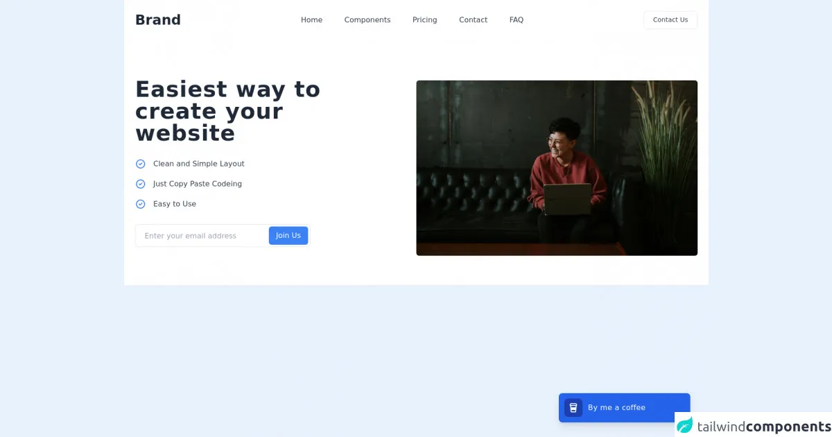
- The preview of Hero With Image UI component
- The source code of Hero With Image UI component
- How to create a Hero With Image with Tailwind CSS?
- Conclusion
What is Tailwind CSS?
Tailwind CSS is a utility-first CSS framework that provides a set of pre-defined classes to help developers quickly build custom user interfaces. It allows you to create complex layouts and designs without writing any custom CSS. Tailwind CSS is highly customizable and can be used with any front-end framework or library.
The description of Hero With Image UI component
The Hero With Image UI component is a common design pattern used in web development. It typically consists of a large background image or video, a title, and a call-to-action button. The Hero With Image UI component is often used on landing pages or homepages to grab the user's attention and encourage them to take action.
Why use Tailwind CSS to create a Hero With Image UI component?
Tailwind CSS provides a set of pre-defined classes that make it easy to create a Hero With Image UI component. With Tailwind CSS, you can quickly style the background image, title, and call-to-action button without writing any custom CSS. This saves time and makes the development process more efficient.
The preview of Hero With Image UI component
To create a Hero With Image UI component with Tailwind CSS, you can use the following code:
<div class="bg-cover bg-center h-screen flex items-center">
  <div class="container mx-auto px-6 text-center">
    <h1 class="text-5xl font-bold mb-2 text-white">Welcome to my website</h1>
    <p class="text-xl mb-8 text-white">
      Lorem ipsum dolor sit amet, consectetur adipiscing elit. Sed do eiusmod tempor incididunt ut labore et dolore magna aliqua.
    </p>
    <a href="#" class="bg-white font-bold rounded-full py-4 px-8 shadow-lg uppercase tracking-wider">Get started</a>
  </div>
</div>
{{__placeholder1__}}
This code creates a Hero With Image UI component with a full-screen background image, a title, and a call-to-action button. The bg-cover and bg-center classes are used to style the background image, while the text-5xl, font-bold, mb-2, and text-white classes are used to style the title. The text-xl, mb-8, and text-white classes are used to style the paragraph, and the bg-white, font-bold, rounded-full, py-4, px-8, shadow-lg, uppercase, and tracking-wider classes are used to style the call-to-action button.
Free download of the Hero With Image's source code
The source code of Hero With Image UI component
To create the Hero With Image UI component, you can use the following code:
<div class="bg-cover bg-center h-screen flex items-center">
  <div class="container mx-auto px-6 text-center">
    <h1 class="text-5xl font-bold mb-2 text-white">Welcome to my website</h1>
    <p class="text-xl mb-8 text-white">
      Lorem ipsum dolor sit amet, consectetur adipiscing elit. Sed do eiusmod tempor incididunt ut labore et dolore magna aliqua.
    </p>
    <a href="#" class="bg-white font-bold rounded-full py-4 px-8 shadow-lg uppercase tracking-wider">Get started</a>
  </div>
</div>
{{__placeholder2__}}
This code creates the same Hero With Image UI component as the previous code. It uses the same Tailwind CSS classes to style the background image, title, and call-to-action button.
<section class="bg-white dark:bg-gray-800">
        <nav class="container p-6 mx-auto lg:flex lg:justify-between lg:items-center">
            <div class="flex items-center justify-between">
                <div>
                    <a class="text-2xl font-bold text-gray-800 dark:text-white lg:text-3xl hover:text-gray-700 dark:hover:text-gray-300" href="#">Brand</a>
                </div>

                <!-- Mobile menu button -->
                <div class="flex lg:hidden">
                    <button type="button"
                        class="text-gray-500 hover:text-gray-600 focus:outline-none focus:text-gray-600"
                        aria-label="toggle menu">
                        <svg viewBox="0 0 24 24" class="w-6 h-6 fill-current">
                            <path fill-rule="evenodd"
                                d="M4 5h16a1 1 0 0 1 0 2H4a1 1 0 1 1 0-2zm0 6h16a1 1 0 0 1 0 2H4a1 1 0 0 1 0-2zm0 6h16a1 1 0 0 1 0 2H4a1 1 0 0 1 0-2z">
                            </path>
                        </svg>
                    </button>
                </div>
            </div>

            <!-- Mobile Menu open: "block", Menu closed: "hidden" -->
            <div class="flex flex-col mt-4 space-y-2 lg:-mx-6 lg:mt-0 lg:flex-row lg:space-y-0">
                <a class="text-gray-700 dark:text-gray-200 lg:px-6 dark:hover:text-blue-400 hover:text-blue-500"
                    href="#">Home</a>
                <a class="text-gray-700 dark:text-gray-200 lg:px-6 dark:hover:text-blue-400 hover:text-blue-500"
                    href="#">Components</a>
                <a class="text-gray-700 dark:text-gray-200 lg:px-6 dark:hover:text-blue-400 hover:text-blue-500"
                    href="#">Pricing</a>
                <a class="text-gray-700 dark:text-gray-200 lg:px-6 dark:hover:text-blue-400 hover:text-blue-500"
                    href="#">Contact</a>
                <a class="text-gray-700 dark:text-gray-200 lg:px-6 dark:hover:text-blue-400 hover:text-blue-500"
                href="#">FAQ</a>
            </div>

            <a class="block h-10 px-5 py-2 mt-4 text-sm text-center text-gray-700 capitalize transition-colors duration-200 transform border rounded-md dark:hover:bg-gray-700 dark:text-white lg:mt-0 hover:bg-gray-100 lg:w-auto"
                href="#">
                Contact Us
            </a>
        </nav>

        <div class="container flex flex-col px-6 py-10 mx-auto space-y-6 lg:h-[32rem] lg:py-16 lg:flex-row lg:items-center">
            <div class="w-full lg:w-1/2">
                <div class="lg:max-w-lg">
                    <h1 class="text-3xl font-bold tracking-wide text-gray-800 dark:text-white lg:text-5xl">
                        Easiest way to create your website
                    </h1>

                    <div class="mt-8 space-y-5">
                        <p class="flex items-center -mx-2 text-gray-700 dark:text-gray-200">
                            <svg xmlns="http://www.w3.org/2000/svg" class="w-6 h-6 mx-2 text-blue-500" fill="none" viewBox="0 0 24 24" stroke="currentColor">
                                <path stroke-linecap="round" stroke-linejoin="round" stroke-width="2" d="M9 12l2 2 4-4m6 2a9 9 0 11-18 0 9 9 0 0118 0z" />
                            </svg>

                            <span class="mx-2">Clean and Simple Layout</span>
                        </p>

                        <p class="flex items-center -mx-2 text-gray-700 dark:text-gray-200">
                            <svg xmlns="http://www.w3.org/2000/svg" class="w-6 h-6 mx-2 text-blue-500" fill="none" viewBox="0 0 24 24" stroke="currentColor">
                                <path stroke-linecap="round" stroke-linejoin="round" stroke-width="2" d="M9 12l2 2 4-4m6 2a9 9 0 11-18 0 9 9 0 0118 0z" />
                            </svg>

                            <span class="mx-2">Just Copy Paste Codeing</span>
                        </p>

                        <p class="flex items-center -mx-2 text-gray-700 dark:text-gray-200">
                            <svg xmlns="http://www.w3.org/2000/svg" class="w-6 h-6 mx-2 text-blue-500" fill="none" viewBox="0 0 24 24" stroke="currentColor">
                                <path stroke-linecap="round" stroke-linejoin="round" stroke-width="2" d="M9 12l2 2 4-4m6 2a9 9 0 11-18 0 9 9 0 0118 0z" />
                            </svg>

                            <span class="mx-2">Easy to Use</span>
                        </p>
                    </div>
                </div>

                <div class="w-full mt-8 bg-transparent border rounded-md lg:max-w-sm dark:border-gray-700 focus-within:border-blue-400 focus-within:ring focus-within:ring-blue-300 dark:focus-within:border-blue-400 focus-within:ring-opacity-40">
                    <form class="flex flex-col lg:flex-row">
                        <input type="email" placeholder="Enter your email address" class="flex-1 h-10 px-4 py-2 m-1 text-gray-700 placeholder-gray-400 bg-transparent border-none appearance-none dark:text-gray-200 focus:outline-none focus:placeholder-transparent focus:ring-0" />

                        <button type="button" class="h-10 px-4 py-2 m-1 text-white transition-colors duration-200 transform bg-blue-500 rounded-md hover:bg-blue-400 focus:outline-none focus:bg-blue-400">
                            Join Us
                        </button>
                    </form>
                </div>
            </div>

            <div class="flex items-center justify-center w-full h-96 lg:w-1/2">
                <img class="object-cover w-full h-full mx-auto rounded-md lg:max-w-2xl" src="https://images.unsplash.com/photo-1543269664-7eef42226a21?ixlib=rb-1.2.1&ixid=MnwxMjA3fDB8MHxwaG90by1wYWdlfHx8fGVufDB8fHx8&auto=format&fit=crop&w=1470&q=80" alt="glasses photo">
            </div>
        </div>
    </section>

    <div class="fixed inset-x-0 lg:inset-x-auto bottom-6 lg:right-8 xl:right-10 xl:bottom-8">
        <div class="lg:w-72 px-6 lg:px-0">
            <div class="p-2 bg-blue-600 rounded-lg shadow-lg sm:p-3">
                <div class="flex flex-wrap items-center justify-between">
                    <a target="_blank" href="https://www.buymeacoffee.com/khatabwedaa" class="flex items-center flex-1 w-0">
                        <span class="flex p-2 bg-blue-800 rounded-lg">
                            <svg class="h-6 w-6 text-white" viewBox="0 0 24 24" fill="none" xmlns="http://www.w3.org/2000/svg">
                                <path d="M5.12954 3.00772C5.48563 2.38457 6.14831 2 6.86603 2H17.134C17.8517 2 18.5144 2.38457 18.8704 3.00772L20.0133 5.00772C20.6612 6.14163 20.0618 7.51107 18.9235 7.89532C18.9276 7.97661 18.9269 8.0591 18.9209 8.14249L18.0638 20.1425C17.989 21.1891 17.1181 22 16.0689 22H7.9311C6.88182 22 6.01094 21.1891 5.93618 20.1425L5.07904 8.14249C5.07308 8.0591 5.07231 7.97661 5.07645 7.89531C3.93813 7.51105 3.33874 6.14162 3.98668 5.00772L5.12954 3.00772ZM7.07396 8L7.28824 11H16.7117L16.926 8H7.07396ZM7.71681 17L7.9311 20H16.0689L16.2831 17H7.71681ZM18.2768 6L17.134 4L6.86603 4L5.72317 6H18.2768Z" fill="currentColor"></path>
                            </svg>

                        </span>

                        <p class="ml-3 font-medium tracking-wide text-white truncate">
                            By me a coffee
                        </p>
                    </a>
                </div>
            </div>
        </div>
    </div>
How to create a Hero With Image with Tailwind CSS?
To create a Hero With Image with Tailwind CSS, you can follow these steps:
- Create a new HTML file and add the following code:
<!DOCTYPE html>
<html>
<head>
  <title>Hero With Image</title>
  <link rel="stylesheet" href="https://cdn.jsdelivr.net/npm/[email protected]/dist/tailwind.min.css">
</head>
<body>
  <div class="bg-cover bg-center h-screen flex items-center">
    <div class="container mx-auto px-6 text-center">
      <h1 class="text-5xl font-bold mb-2 text-white">Welcome to my website</h1>
      <p class="text-xl mb-8 text-white">
        Lorem ipsum dolor sit amet, consectetur adipiscing elit. Sed do eiusmod tempor incididunt ut labore et dolore magna aliqua.
      </p>
      <a href="#" class="bg-white font-bold rounded-full py-4 px-8 shadow-lg uppercase tracking-wider">Get started</a>
    </div>
  </div>
</body>
</html>
Save the file and open it in a web browser. You should see the Hero With Image UI component.
To customize the component, you can modify the Tailwind CSS classes used in the HTML code. For example, you can change the background image by modifying the
bg-coverandbg-centerclasses.You can also add additional elements to the component, such as a logo or a navigation menu.
Conclusion
Tailwind CSS is a powerful CSS framework that makes it easy to create custom user interfaces. With Tailwind CSS, you can quickly create a Hero With Image UI component that grabs the user's attention and encourages them to take action. By using pre-defined classes, you can save time and make the development process more efficient.