- Published on
How To Make A Hero Section With Tailwind CSS In 5 Easy Steps
- What is Tailwind CSS?
- The description of Hero Section ui component
- Why use Tailwind CSS to create a Hero Section ui component?
- The preview of Hero Section ui component
- The source code of Hero Section ui component
- How to create a Hero Section with Tailwind CSS?
- Step 1: Create a new HTML file
- Step 2: Add Tailwind CSS to the project
- Step 3: Create the Hero Section container
- Step 4: Add the Hero Section content
- Step 5: Preview and test the Hero Section
- Conclusion
What is Tailwind CSS?
Tailwind CSS is a utility-first CSS framework that provides a set of pre-defined CSS classes to quickly build custom user interfaces. It allows developers to create responsive and modern web designs without having to write custom CSS.
The description of Hero Section ui component
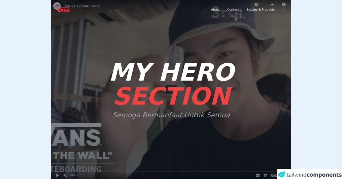
A Hero Section is a large and prominent section at the top of a webpage that typically includes a call-to-action (CTA) button, a headline, and an image or video background. It is used to grab the user's attention and convey the main message of the website.
Why use Tailwind CSS to create a Hero Section ui component?
Tailwind CSS provides a wide range of pre-defined CSS classes that can be used to create a Hero Section quickly and easily. It also provides responsive design classes that allow the Hero Section to adapt to different screen sizes.
The preview of Hero Section ui component
To create a Hero Section with Tailwind CSS, we will be using the following classes:
bg-cover: Sets the background image to cover the entire container.bg-gradient-to-r: Sets a gradient background that fades from left to right.text-5xl: Sets the font size to 5xl (extra large).text-white: Sets the text color to white.py-32: Adds padding to the top and bottom of the container.flex: Sets the display property to flex.items-center: Centers the child elements vertically.justify-center: Centers the child elements horizontally.h-screen: Sets the height of the container to the height of the screen.
Free download of the Hero Section's source code
The source code of Hero Section ui component
To create a Hero Section with Tailwind CSS, we will be using the following HTML markup:
<div class="bg-cover bg-gradient-to-r from-purple-500 to-pink-500 text-white py-32 flex items-center justify-center h-screen">
  <div class="text-center">
    <h1 class="text-5xl font-bold mb-4">Welcome to My Website</h1>
    <p class="text-xl">Lorem ipsum dolor sit amet, consectetur adipiscing elit.</p>
    <button class="bg-white text-purple-500 font-bold py-2 px-4 rounded-full mt-8 hover:bg-purple-500 hover:text-white transition duration-300 ease-in-out">Get Started</button>
  </div>
</div>
<!DOCTYPE html>
<html lang="en">
<head>
    <meta charset="UTF-8">
    <meta name="viewport" content="width=device-width, initial-scale=1.0">
    <title>CSC</title>
    <link href="https://unpkg.com/tailwindcss@^2/dist/tailwind.min.css" rel="stylesheet">
    <script src="https://cdn.jsdelivr.net/gh/alpinejs/[email protected]/dist/alpine.min.js" defer></script>
    <link rel="stylesheet" href="https://unpkg.com/aos@next/dist/aos.css" />
</head>
<style>
    #nav-mobile-btn.close span:first-child{
        transform: rotate(45deg);
        top: 4px;
        position: relative;
        background:#a0aec0;
    }
    #nav-mobile-btn.close span:nth-child(2){
        transform: rotate(-45deg);
        margin-top: 0px;
        background:#a0aec0;
    }
    html {
            scroll-behavior: smooth;
            background: #ffffff !important;
        }
</style>
<body class="overflow-x-hidden antialiased w-full">

    <!-- HERO SECTION -->
    <div>
        <div class="z-30 relative items-center justify-center w-full w-screen h-screen">
            <div>
                <div class="inset-0  h-screen">
                    <!-- <video
                        src="https://youtu.be/OhyQRljsp2w"
                        autoplay
                        muted
                        loop
                        class="object-cover w-full h-full"
                    >
                    </video>      -->
                    <iframe class="object-cover w-full h-full" src="https://www.youtube.com/embed/OhyQRljsp2w?autoplay=1" title="YouTube video player" frameborder="0" allow="accelerometer; autoplay; clipboard-write; encrypted-media; gyroscope; picture-in-picture" allowfullscreen></iframe>
                </div>

                <div class="absolute inset-0 z-40  flex justify-between h-full px-8 " >
                    <div class="relative z-20 w-full h-24  pt-2 ">
                        <div class="flex items-center justify-between h-full w-full">
                            <img src="https://external-content.duckduckgo.com/iu/?u=http%3A%2F%2F4.bp.blogspot.com%2F-Vwuv72HQYhs%2FVW6yjk1BqEI%2FAAAAAAAAC5Y%2FuDFxGmthr9A%2Fs1600%2FVans-vector-logo.png&f=1&nofb=1" class="w-auto h-12"/>

                            <div id="nav" class=" text-white absolute top-0 left-0 hidden block w-full mt-20 border-b border-gray-200 sm:border-none sm:px-5 sm:block sm:relative sm:mt-0 sm:px-0 sm:w-auto">
                                <nav class="flex flex-col items-center py-3  bg-red-500 sm:flex-row sm:bg-transparent sm:border-none sm:py-0">
                                    <a href="#" class="px-1 mb-1 mb-5 mr-0 text-base sm:mb-0 sm:mr-4 lg:mr-8">About</a>
                                    <a href="#_" class="px-1 mb-1 mb-5 mr-0 text-base sm:mb-0 sm:mr-4 lg:mr-8">Contact</a>
                                    <a href="#" class="px-1 mb-1 mb-5 mr-0 text-base sm:mb-0 sm:mr-4 lg:mr-8">Servies & Products</a>
                                </nav>
                            </div>

                            <div id="nav-mobile-btn" class="absolute top-0 right-0 z-50 block w-6 mt-8 mr-10 cursor-pointer select-none sm:hidden sm:mt-10">
                                <span class="block w-full h-1 mt-2 duration-200 transform bg-white rounded-full sm:mt-1"></span>
                                <span class="block w-full h-1 mt-1 duration-200 transform bg-white rounded-full"></span>
                            </div>
                        </div>
                    </div>
                </div>

                <div class="absolute inset-0 z-20 flex items-center justify-center h-screen w-full bg-gray-900 bg-opacity-50"></div>
                <div data-aos="flip-down" class="absolute inset-0  z-30 container flex flex-col items-center justify-center h-full max-w-6xl pl-0 mx-auto  sm:pl-8 xl:pl-0 md:flex-row md:justify-between">
                    <div class="flex flex-col items-center justify-center mx-auto">
                        <div class="relative text-center ">
                            <h1 class="text-white relative mb-4 text-6xl font-bold font-sans italic leading-none text-center lg:text-9xl xl:text-9xl"> MY HERO<br><span class="text-red-500">SECTION</span></h1>
                            <p class="text-gray-400 text-sm lg:text-4xl lg:text-center font-sans italic">Semoga Bermanfaat Untuk Semua
                            </p>

                        </div>
                    </div>
                </div>
            </div>
        </div>
    </div>
    <!-- HERO SECTION END -->


<script src="https://unpkg.com/aos@next/dist/aos.js"></script>
    <script>
        AOS.init({
            offset:100,
            duration :1000
        });
    </script>
    <script>
        if( document.getElementById('nav-mobile-btn') ){
            document.getElementById('nav-mobile-btn').addEventListener('click', function(){
                if( this.classList.contains('close') ){
                    document.getElementById('nav').classList.add('hidden');
                    this.classList.remove('close');
                } else {
                    document.getElementById('nav').classList.remove('hidden');
                    this.classList.add('close');
                }
            });
        }
    </script>
</body>
</html>
How to create a Hero Section with Tailwind CSS?
Now that we have a basic understanding of Tailwind CSS and the Hero Section component, let's dive into the steps to create a Hero Section with Tailwind CSS.
Step 1: Create a new HTML file
Create a new HTML file and add the basic HTML structure.
<!DOCTYPE html>
<html>
  <head>
    <title>My Website</title>
  </head>
  <body>
  </body>
</html>
Step 2: Add Tailwind CSS to the project
Add Tailwind CSS to the project by including the CDN link in the head section of the HTML file.
<!DOCTYPE html>
<html>
  <head>
    <title>My Website</title>
    <link rel="stylesheet" href="https://cdn.jsdelivr.net/npm/[email protected]/dist/tailwind.min.css">
  </head>
  <body>
  </body>
</html>
Step 3: Create the Hero Section container
Create a container for the Hero Section and add the necessary Tailwind CSS classes to style it.
<!DOCTYPE html>
<html>
  <head>
    <title>My Website</title>
    <link rel="stylesheet" href="https://cdn.jsdelivr.net/npm/[email protected]/dist/tailwind.min.css">
  </head>
  <body>
    <div class="bg-cover bg-gradient-to-r from-purple-500 to-pink-500 text-white py-32 flex items-center justify-center h-screen">
    </div>
  </body>
</html>
Step 4: Add the Hero Section content
Add the content for the Hero Section, including the headline, subheading, and CTA button.
<!DOCTYPE html>
<html>
  <head>
    <title>My Website</title>
    <link rel="stylesheet" href="https://cdn.jsdelivr.net/npm/[email protected]/dist/tailwind.min.css">
  </head>
  <body>
    <div class="bg-cover bg-gradient-to-r from-purple-500 to-pink-500 text-white py-32 flex items-center justify-center h-screen">
      <div class="text-center">
        <h1 class="text-5xl font-bold mb-4">Welcome to My Website</h1>
        <p class="text-xl">Lorem ipsum dolor sit amet, consectetur adipiscing elit.</p>
        <button class="bg-white text-purple-500 font-bold py-2 px-4 rounded-full mt-8 hover:bg-purple-500 hover:text-white transition duration-300 ease-in-out">Get Started</button>
      </div>
    </div>
  </body>
</html>
Step 5: Preview and test the Hero Section
Save the HTML file and open it in a web browser to preview and test the Hero Section.
Conclusion
In this article, we learned how to create a Hero Section with Tailwind CSS in 5 easy steps. Tailwind CSS provides a wide range of pre-defined CSS classes that can be used to create custom user interfaces quickly and easily. With Tailwind CSS, developers can create responsive and modern web designs without having to write custom CSS.