- Published on
Surprisingly Effective Ways To Build A Hero-component With Tailwind CSS
- What is Tailwind CSS?
- The description of hero-component ui component
- Why use Tailwind CSS to create a hero-component ui component?
- The preview of hero-component ui component
- The source code of hero-component ui component
- How to create a hero-component with Tailwind CSS?
- Conclusion
What is Tailwind CSS?
Tailwind CSS is a utility-first CSS framework that provides a set of pre-defined CSS classes to style HTML elements. It allows developers to quickly prototype and build user interfaces without having to write custom CSS. Tailwind CSS is highly customizable, making it a popular choice for front-end developers.
The description of hero-component ui component
A hero-component is a UI component that is commonly used on the homepage of a website. It typically consists of a large image or video background, a headline, and a call-to-action button. A hero-component is designed to grab the user's attention and encourage them to take action.
Why use Tailwind CSS to create a hero-component ui component?
Tailwind CSS provides a set of pre-defined classes that can be used to quickly style a hero-component. This saves developers time and effort, as they don't have to write custom CSS for every element in the component. Additionally, Tailwind CSS is highly customizable, so developers can easily modify the styles to fit their design needs.
The preview of hero-component ui component
To create a hero-component with Tailwind CSS, we can use the following classes:
bg-cover- sets the background image to cover the entire containerbg-center- centers the background image horizontally and verticallytext-white- sets the text color to whitetext-4xl- sets the font size to 4xl (equivalent to 2rem)font-bold- sets the font weight to boldpy-10- adds padding to the top and bottom of the containerpx-4- adds padding to the left and right of the containermax-w-screen-xl- sets the maximum width of the container to XL screen size
Free download of the hero-component's source code
The source code of hero-component ui component
To create a hero-component with Tailwind CSS, we can use the following HTML code:
<div class="bg-cover bg-center text-white py-10 px-4 max-w-screen-xl">
  <h1 class="text-4xl font-bold">Welcome to my website</h1>
  <p class="mt-4">Lorem ipsum dolor sit amet, consectetur adipiscing elit. Sed euismod, urna eu aliquam tincidunt, massa urna interdum sapien, ac dapibus lorem massa eu nisi.</p>
  <button class="mt-4 bg-white text-black px-4 py-2 rounded-full">Learn More</button>
</div>
<div class="flex flex-wrap md items-center h-screen">
<div class="bg-white w-full md:w-1/2 h-screen">
<div class="mx-32">
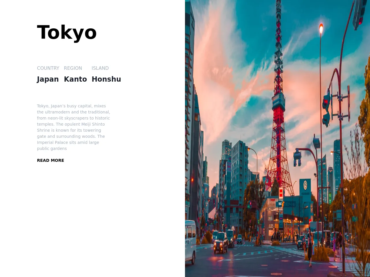
<h1 class="text-6xl font-bold mt-16">Tokyo</h1>
<!-- country region island -->
<div class="flex mt-16 font-light text-gray-500">
<div class="pr-4">
<span class="uppercase">Country</span>
<p class="text-2xl text-gray-900 font-semibold pt-2">Japan</p>
</div>
<div class="pr-4">
<span class="uppercase">Region</span>
<p class="text-2xl text-gray-900 font-semibold pt-2">Kanto</p>
</div>
<div class="pr-4">
<span class="uppercase">island</span>
<p class="text-2xl text-gray-900 font-semibold pt-2">Honshu</p>
</div>
</div>
<!-- description -->
<div
class="description w-full sm: md:w-2/3 mt-16 text-gray-500 text-sm"
>
Tokyo, Japan’s busy capital, mixes the ultramodern and the
traditional, from neon-lit skyscrapers to historic temples. The
opulent Meiji Shinto Shrine is known for its towering gate and
surrounding woods. The Imperial Palace sits amid large public
gardens
</div>
<button class="uppercase mt-5 text-sm font-semibold hover:underline">
read more
</button>
</div>
</div>
<div class="bg-red-600 w-full md:w-1/2 h-screen">
<img
src="https://source.unsplash.com/7H77FWkK_x4/1600x900"
class="h-screen w-full"
alt=""
/>
</div>
</div>
How to create a hero-component with Tailwind CSS?
- Start by creating a container element for the hero-component. This can be a
divor any other HTML element.
<div class="hero-component"></div>
- Add a background image to the container using the
bg-coverandbg-centerclasses.
<div class="hero-component bg-cover bg-center"></div>
- Add content to the hero-component using HTML elements such as
h1,p, andbutton.
<div class="hero-component bg-cover bg-center">
  <h1>Welcome to my website</h1>
  <p>Lorem ipsum dolor sit amet, consectetur adipiscing elit. Sed euismod, urna eu aliquam tincidunt, massa urna interdum sapien, ac dapibus lorem massa eu nisi.</p>
  <button>Learn More</button>
</div>
- Style the content using Tailwind CSS classes. For example, to set the text color to white, use the
text-whiteclass.
<div class="hero-component bg-cover bg-center text-white">
  <h1>Welcome to my website</h1>
  <p>Lorem ipsum dolor sit amet, consectetur adipiscing elit. Sed euismod, urna eu aliquam tincidunt, massa urna interdum sapien, ac dapibus lorem massa eu nisi.</p>
  <button>Learn More</button>
</div>
- Add padding to the top and bottom of the container using the
py-10class.
<div class="hero-component bg-cover bg-center text-white py-10">
  <h1>Welcome to my website</h1>
  <p>Lorem ipsum dolor sit amet, consectetur adipiscing elit. Sed euismod, urna eu aliquam tincidunt, massa urna interdum sapien, ac dapibus lorem massa eu nisi.</p>
  <button>Learn More</button>
</div>
- Add padding to the left and right of the container using the
px-4class.
<div class="hero-component bg-cover bg-center text-white py-10 px-4">
  <h1>Welcome to my website</h1>
  <p>Lorem ipsum dolor sit amet, consectetur adipiscing elit. Sed euismod, urna eu aliquam tincidunt, massa urna interdum sapien, ac dapibus lorem massa eu nisi.</p>
  <button>Learn More</button>
</div>
- Set the maximum width of the container using the
max-w-screen-xlclass.
<div class="hero-component bg-cover bg-center text-white py-10 px-4 max-w-screen-xl">
  <h1>Welcome to my website</h1>
  <p>Lorem ipsum dolor sit amet, consectetur adipiscing elit. Sed euismod, urna eu aliquam tincidunt, massa urna interdum sapien, ac dapibus lorem massa eu nisi.</p>
  <button>Learn More</button>
</div>
Conclusion
In conclusion, Tailwind CSS provides a quick and easy way to create a hero-component UI component. By using pre-defined CSS classes, developers can save time and effort when styling their components. Additionally, Tailwind CSS is highly customizable, allowing developers to modify the styles to fit their design needs. With these tips and tricks, you can create stunning hero-components with ease using Tailwind CSS.