- Published on
How to Build A Hero Big Grid With Tailwind CSS?
- What is Tailwind CSS?
- The description of Hero Big Grid UI component
- Why use Tailwind CSS to create a Hero Big Grid UI component?
- The preview of Hero Big Grid UI component
- The source code of Hero Big Grid UI component
- How to create a Hero Big Grid with Tailwind CSS?
- Step 1: Set up your HTML
- Step 2: Add Tailwind CSS
- Step 3: Style the Hero Big Grid
- Conclusion
As a FrontEnd technology blogger, I am always excited to share my knowledge with fellow developers. In this article, we will explore how to build a Hero Big Grid with Tailwind CSS.
What is Tailwind CSS?
Tailwind CSS is a utility-first CSS framework that allows developers to quickly build custom designs without writing any CSS. It has a comprehensive set of pre-defined classes that can be used to style HTML elements. Tailwind CSS is designed to be highly customizable and can be used with any JavaScript framework or library.
The description of Hero Big Grid UI component
A Hero Big Grid is a UI component that is commonly used on landing pages. It is a large section that typically includes a hero image or video, a headline, and a call-to-action button. The Hero Big Grid is an effective way to showcase a product or service and encourage users to take action.
Why use Tailwind CSS to create a Hero Big Grid UI component?
Tailwind CSS is an excellent choice for creating a Hero Big Grid UI component because it provides a wide range of utility classes that can be used to quickly style the component. Additionally, Tailwind CSS is highly customizable, which means that you can easily modify the styles to match your brand or design requirements.
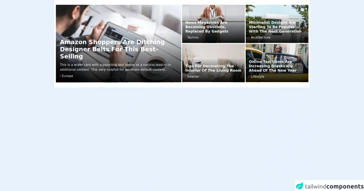
The preview of Hero Big Grid UI component
To give you an idea of what the Hero Big Grid UI component looks like, here is a preview:
Free download of the Hero Big Grid's source code
The source code of Hero Big Grid UI component
Here is the source code for the Hero Big Grid UI component:
<style>
.bg-gradient-cover {
	background-color: transparent;
    background-image: linear-gradient(transparent,rgba(0,0,0,0.92));
    background-position-y: -1px;
}
.max-h-98 {
    max-height: 24.3rem;
}
.box-one > article:nth-child(1) {
	padding-top: 0;
	padding-bottom: 0.125rem;
	padding-right: 0.125rem;
}
.box-one > article:nth-child(2) {
	padding-top: 0;
	padding-bottom: 0.125rem;
	padding-left: 0.125rem;
}
.box-one > article:nth-child(3) {
	padding-top: 0.125rem;
	padding-bottom: 0.125rem;
	padding-right: 0.125rem;
}
.box-one > article:nth-child(4) {
	padding-top: 0.125rem;
	padding-bottom: 0.125rem;
	padding-left: 0.125rem;
}
</style>
<div class="bg-white py-6">
    <div class="xl:container mx-auto px-3 sm:px-4 xl:px-2">
        <!-- big grid 1 -->
        <div class="flex flex-row flex-wrap">
            <!--Start left cover-->
            <div class="flex-shrink max-w-full w-full lg:w-1/2 pb-1 lg:pb-0 lg:pr-1">
                <div class="relative hover-img max-h-98 overflow-hidden">
                    <a href="#">
                        <img class="max-w-full w-full mx-auto h-auto" src="https://tailnews.tailwindtemplate.net/src/img/dummy/img1.jpg" alt="Image description">
                    </a>
                    <div class="absolute px-5 pt-8 pb-5 bottom-0 w-full bg-gradient-cover">
                        <a href="#">
                            <h2 class="text-3xl font-bold capitalize text-white mb-3">Amazon Shoppers Are Ditching Designer Belts for This Best-Selling</h2>
                        </a>
                        <p class="text-gray-100 hidden sm:inline-block">This is a wider card with supporting text below as a natural lead-in to additional content. This very helpfull for generate default content..</p>
                        <div class="pt-2">
                            <div class="text-gray-100">
                                <div class="inline-block h-3 border-l-2 border-red-600 mr-2"></div>Europe
                            </div>
                        </div>
                    </div>
                </div>
            </div>
            <!--Start box news-->
            <div class="flex-shrink max-w-full w-full lg:w-1/2">
                <div class="box-one flex flex-row flex-wrap">
                    <article class="flex-shrink max-w-full w-full sm:w-1/2">
                        <div class="relative hover-img max-h-48 overflow-hidden">
                            <a href="#">
                                <img class="max-w-full w-full mx-auto h-auto" src="https://tailnews.tailwindtemplate.net/src/img/dummy/img2.jpg" alt="Image description">
                            </a>
                            <div class="absolute px-4 pt-7 pb-4 bottom-0 w-full bg-gradient-cover">
                                <a href="#">
                                    <h2 class="text-lg font-bold capitalize leading-tight text-white mb-1">News magazines are becoming obsolete, replaced by gadgets</h2>
                                </a>
                                <div class="pt-1">
                                    <div class="text-gray-100">
                                        <div class="inline-block h-3 border-l-2 border-red-600 mr-2"></div>Techno
                                    </div>
                                </div>
                            </div>
                        </div>
                    </article>
                    <article class="flex-shrink max-w-full w-full sm:w-1/2">
                        <div class="relative hover-img max-h-48 overflow-hidden">
                            <a href="#">
                                <img class="max-w-full w-full mx-auto h-auto" src="https://tailnews.tailwindtemplate.net/src/img/dummy/img3.jpg" alt="Image description">
                            </a>
                            <div class="absolute px-4 pt-7 pb-4 bottom-0 w-full bg-gradient-cover">
                                <a href="#">
                                    <h2 class="text-lg font-bold capitalize leading-tight text-white mb-1">Minimalist designs are starting to be popular with the next generation</h2>
                                </a>
                                <div class="pt-1">
                                    <div class="text-gray-100">
                                        <div class="inline-block h-3 border-l-2 border-red-600 mr-2"></div>Architecture
                                    </div>
                                </div>
                            </div>
                        </div>
                    </article>
                    <article class="flex-shrink max-w-full w-full sm:w-1/2">
                        <div class="relative hover-img max-h-48 overflow-hidden">
                            <a href="#">
                                <img class="max-w-full w-full mx-auto h-auto" src="https://tailnews.tailwindtemplate.net/src/img/dummy/img4.jpg" alt="Image description">
                            </a>
                            <div class="absolute px-4 pt-7 pb-4 bottom-0 w-full bg-gradient-cover">
                                <a href="#">
                                    <h2 class="text-lg font-bold capitalize leading-tight text-white mb-1">Tips for decorating the interior of the living room</h2>
                                </a>
                                <div class="pt-1">
                                    <div class="text-gray-100">
                                        <div class="inline-block h-3 border-l-2 border-red-600 mr-2"></div>Interior
                                    </div>
                                </div>
                            </div>
                        </div>
                    </article>
                    <article class="flex-shrink max-w-full w-full sm:w-1/2">
                        <div class="relative hover-img max-h-48 overflow-hidden">
                            <a href="#">
                                <img class="max-w-full w-full mx-auto h-auto" src="https://tailnews.tailwindtemplate.net/src/img/dummy/img5.jpg" alt="Image description">
                            </a>
                            <div class="absolute px-4 pt-7 pb-4 bottom-0 w-full bg-gradient-cover">
                                <a href="#">
                                    <h2 class="text-lg font-bold capitalize leading-tight text-white mb-1">Online taxi users are increasing drastically ahead of the new year</h2>
                                </a>
                                <div class="pt-1">
                                    <div class="text-gray-100">
                                        <div class="inline-block h-3 border-l-2 border-red-600 mr-2"></div>Lifestyle
                                    </div>
                                </div>
                            </div>
                        </div>
                    </article>
                </div>
            </div>
        </div>
    </div>
</div>
How to create a Hero Big Grid with Tailwind CSS?
Now that we have a basic understanding of what a Hero Big Grid is and why Tailwind CSS is a good choice for building it, let's dive into the steps required to create it.
Step 1: Set up your HTML
The first step is to set up your HTML. Here is an example of what your HTML might look like:
<div class="bg-gray-800">
  <div class="container mx-auto px-4 py-32">
    <div class="grid grid-cols-1 md:grid-cols-2 lg:grid-cols-3 gap-8">
      <div class="bg-white rounded-lg shadow-lg overflow-hidden">
        <img class="w-full h-64 object-cover" src="https://via.placeholder.com/640x360" alt="Placeholder">
        <div class="p-4">
          <h2 class="text-gray-800 font-bold text-xl mb-2">Product 1</h2>
          <p class="text-gray-700 text-base">Lorem ipsum dolor sit amet, consectetur adipiscing elit. Sed euismod, diam eget efficitur lacinia, enim mi iaculis urna, id convallis eros velit vel ipsum.</p>
          <a href="#" class="mt-4 bg-gray-800 text-white font-bold py-2 px-4 rounded">Buy Now</a>
        </div>
      </div>
      <!-- Repeat this block for each product -->
    </div>
  </div>
</div>
In this example, we have a container with a gray background that contains a grid of products. Each product is contained within a white box with a shadow and rounded corners. The product box contains an image, a title, a description, and a call-to-action button.
Step 2: Add Tailwind CSS
The next step is to add Tailwind CSS to your project. You can do this by including the Tailwind CSS stylesheet in your HTML file:
<link href="https://cdn.jsdelivr.net/npm/[email protected]/dist/tailwind.min.css" rel="stylesheet">
Step 3: Style the Hero Big Grid
Now that we have our HTML and Tailwind CSS set up, we can start styling our Hero Big Grid. Here is an example of some of the classes that we can use to style the component:
bg-gray-800: Sets the background color of the container to gray.container: Centers the content within the container and sets the maximum width.mx-auto: Centers the container horizontally.px-4: Adds padding to the left and right of the container.py-32: Adds padding to the top and bottom of the container.grid: Sets the display property to grid.grid-cols-1: Sets the number of columns to 1 on small screens.md:grid-cols-2: Sets the number of columns to 2 on medium screens and up.lg:grid-cols-3: Sets the number of columns to 3 on large screens and up.gap-8: Adds a gap of 8 pixels between each grid item.bg-white: Sets the background color of the product box to white.rounded-lg: Adds rounded corners to the product box.shadow-lg: Adds a shadow to the product box.overflow-hidden: Hides any content that overflows the product box.w-full: Sets the width of the image to 100%.h-64: Sets the height of the image to 64 pixels.object-cover: Sets the image to cover the entire container.text-gray-800: Sets the color of the title to gray.font-bold: Makes the title bold.text-xl: Sets the font size of the title to extra large.mb-2: Adds margin to the bottom of the title.text-gray-700: Sets the color of the description to gray.text-base: Sets the font size of the description to base.mt-4: Adds margin to the top of the call-to-action button.bg-gray-800: Sets the background color of the call-to-action button to gray.text-white: Sets the color of the call-to-action button to white.py-2: Adds padding to the top and bottom of the call-to-action button.px-4: Adds padding to the left and right of the call-to-action button.rounded: Adds rounded corners to the call-to-action button.
By combining these classes, we can create a beautiful and functional Hero Big Grid that is fully responsive and customizable.
Conclusion
In this article, we explored how to build a Hero Big Grid with Tailwind CSS. We learned what a Hero Big Grid is, why Tailwind CSS is a good choice for building it, and how to create it using HTML and Tailwind CSS. By following these steps, you can create a Hero Big Grid that is both beautiful and functional. Happy coding!