- Published on
A Complete Guide To Make A Heading With Tailwind CSS

- What is Tailwind CSS?
- The description of Heading UI component
- Why use Tailwind CSS to create a Heading UI component?
- The preview of Heading UI component
- The source code of Heading UI component
- How to create a Heading with Tailwind CSS?
- Conclusion
As a FrontEnd technology blogger, I am always looking for ways to improve my UI design skills. One of the best tools I have found for this purpose is Tailwind CSS. In this article, I will guide you through the process of creating a Heading UI component with Tailwind CSS.
What is Tailwind CSS?
Tailwind CSS is a utility-first CSS framework that provides a set of pre-defined classes to help you build custom UI components quickly and easily. It is designed to be highly customizable and flexible, allowing you to create unique designs without writing any custom CSS.
The description of Heading UI component
A Heading UI component is a common element in most web pages. It is used to display the title or heading of a section or page. The Heading UI component can be styled in many different ways, including font size, color, alignment, and weight.
Why use Tailwind CSS to create a Heading UI component?
Tailwind CSS provides a set of pre-defined classes that can be used to style the Heading UI component quickly and easily. This saves time and effort, as you do not have to write custom CSS for each Heading UI component. Additionally, Tailwind CSS is highly customizable, allowing you to create unique designs that match your brand or website.
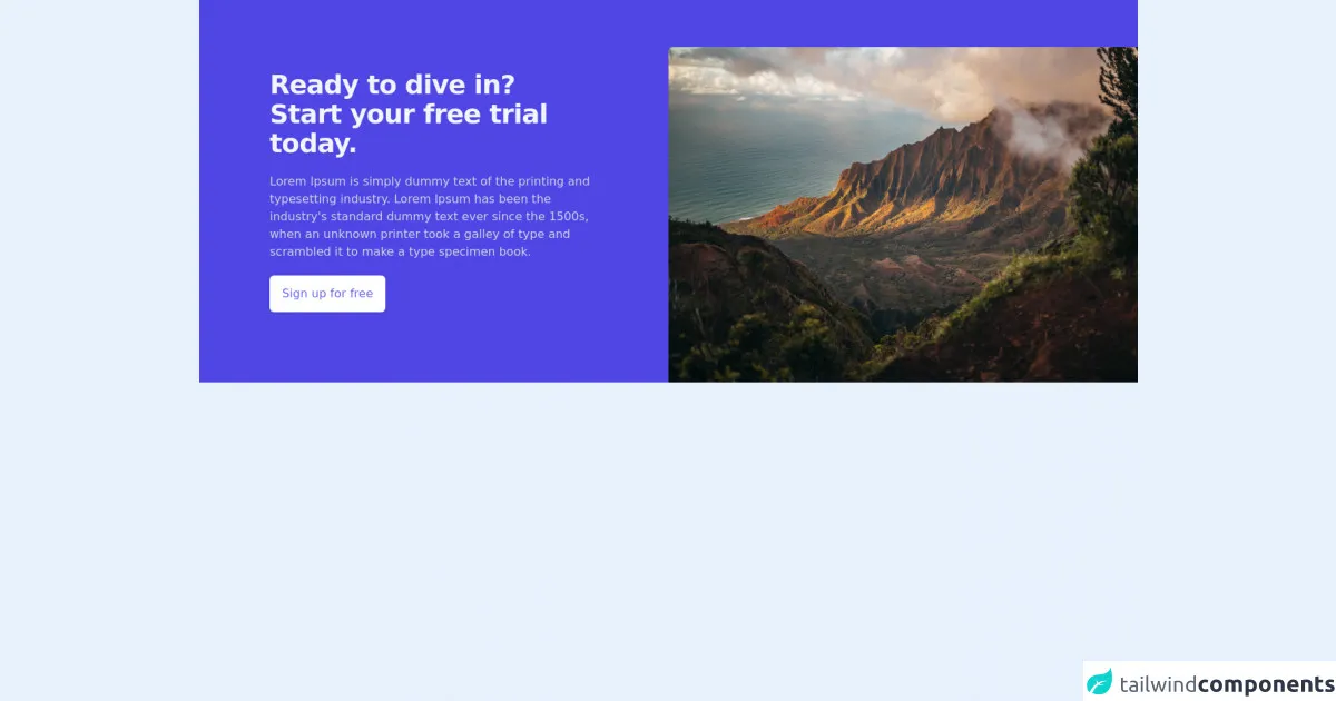
The preview of Heading UI component
To create a Heading UI component with Tailwind CSS, we will use the text- and font- classes to style the text. We will also use the mb- class to add margin to the bottom of the Heading UI component.
Free download of the Heading's source code
The source code of Heading UI component
To create a Heading UI component with Tailwind CSS, we can use the following code:
<div class="bg-indigo-600">
        <div class="lg:grid lg:grid-cols-2">
            <div class="py-24 px-10 lg:px-0 max-w-3xl lg:max-w-md mx-auto">
                <h2 class="text-4xl tracking-tight font-extrabold text-gray-100">
                    <span class="block">Ready to dive in?</span>
                    <span class="block">Start your free trial today.</span>
                </h2>
                <p class="text-gray-300 mt-5">
                    Lorem Ipsum is simply dummy text of the printing and typesetting industry. Lorem Ipsum has been the industry's standard dummy text ever since the 1500s, when an unknown printer took a galley of type and scrambled it to make a type specimen book.
                </p>
                <div class="inline-block shadow mt-5">
                    <a href="#" class="inline-block py-3 px-4 bg-white hover:bg-indigo-100 text-indigo-500 font-medium border border-transparent rounded-md">Sign up for free</a>
                </div>
            </div>
            <div class="lg:relative lg:mt-16">
                <img class="lg:absolute lg:inset-0 h-60 w-full lg:h-full object-cover object-center lg:rounded-tl-md" src="https://images.pexels.com/photos/2559941/pexels-photo-2559941.jpeg?auto=compress&cs=tinysrgb&dpr=3&h=750&w=1260" alt="Woman workcation on the beach">
            </div>
        </div>
    </div>
How to create a Heading with Tailwind CSS?
To create a Heading UI component with Tailwind CSS, follow these steps:
Add the
text-andfont-classes to style the text. For example, to set the font size to4xland the font weight tobold, use the following classes:text-4xl font-bold.Add the
mb-class to add margin to the bottom of the Heading UI component. For example, to add a margin of4to the bottom of the Heading UI component, use the following class:mb-4.Combine the classes to create the Heading UI component. For example, to create a Heading UI component with a font size of
4xl, font weight ofbold, and a margin of4at the bottom, use the following code:
<h1 class="text-4xl font-bold mb-4">Heading</h1>
- Customize the Heading UI component as needed. For example, you can change the font size, font weight, color, alignment, and margin to match your design.
Conclusion
In conclusion, creating a Heading UI component with Tailwind CSS is easy and straightforward. By using pre-defined classes, you can style the Heading UI component quickly and easily, without writing any custom CSS. Additionally, Tailwind CSS is highly customizable, allowing you to create unique designs that match your brand or website. With this guide, you should be able to create a Heading UI component that looks great and fits your design needs.