- Published on
How To Build A Header With Sign In Form With Tailwind CSS From Scratch

- What is Tailwind CSS?
- The description of Header with Sign in form ui component
- Why use Tailwind CSS to create a Header with Sign in form ui component?
- The preview of Header with Sign in form ui component
- The source code of Header with Sign in form ui component
- How to create a Header with Sign in form with Tailwind CSS?
- Step 1: Create a new HTML file
- Step 2: Add Tailwind CSS classes
- Step 3: Customize the design
- Conclusion
What is Tailwind CSS?
Tailwind CSS is a utility-first CSS framework that provides a set of pre-defined classes to create custom designs. It allows developers to rapidly build user interfaces without writing any CSS code. Tailwind CSS is highly customizable and provides a wide range of features to create responsive and accessible designs.
The description of Header with Sign in form ui component
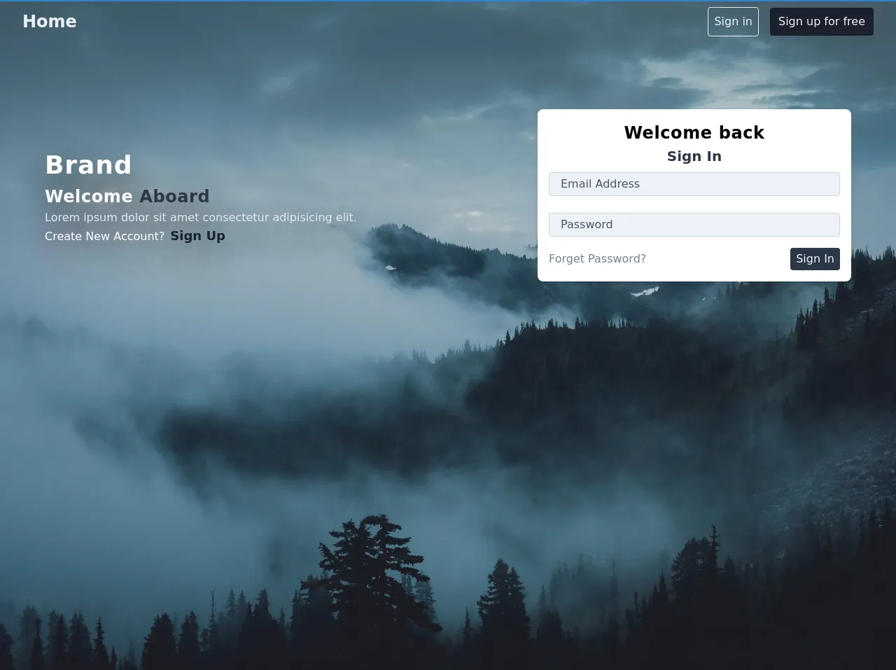
A header with sign in form is a common UI component used in many web applications. It allows users to sign in to the application and access their account. The header typically contains a logo, navigation links, and a sign-in form. The sign-in form usually includes an email input field, a password input field, and a submit button.
Why use Tailwind CSS to create a Header with Sign in form ui component?
Tailwind CSS provides a set of pre-defined classes that can be used to create a header with sign-in form UI component quickly. It also provides a responsive design system that allows developers to create a responsive design without writing any custom CSS code. Tailwind CSS is highly customizable and provides a wide range of features to create a modern and accessible design.
The preview of Header with Sign in form ui component
To create a header with sign-in form UI component, we will use Tailwind CSS. The header will contain a logo, navigation links, and a sign-in form. The sign-in form will include an email input field, a password input field, and a submit button.
Free download of the Header with Sign in form's source code
The source code of Header with Sign in form ui component
To create a header with sign-in form UI component, we will use HTML and Tailwind CSS. The HTML code will contain a header element, a logo, navigation links, and a sign-in form. The sign-in form will include an email input field, a password input field, and a submit button.
<header class=" bg-cover border-t-2 border-blue-600 h-full" style="background-image: url('https://ik.imagekit.io/q5edmtudmz/peter-lloyd-680526-unsplash_TYZn4kayG.jpg');">
        <div class="content px-8 py-2">
            <nav class="flex items-center justify-between">
                <h2 class="text-gray-200 font-bold text-2xl ">Home</h2>
                <div class="auth flex items-center">
                    <button class="bg-transparent text-gray-200  p-2 rounded border border-gray-300 mr-4 hover:bg-gray-100 hover:text-gray-700">Sign in</button>
                    <button class="bg-gray-900 text-gray-200  py-2 px-3 rounded  hover:bg-gray-800 hover:text-gray-100">Sign up for free</button>
                </div>
            </nav>
            <div class="body mt-20 mx-8">
                <div class="md:flex items-center justify-between">
                    <div class="w-full md:w-1/2 mr-auto" style="text-shadow: 0 20px 50px hsla(0,0%,0%,8);">
                        <h1 class="text-4xl font-bold text-white tracking-wide">Brand</h1>
                        <h2 class=" text-2xl font-bold text-white tracking-wide">Welcome <span class="text-gray-800"> Aboard</span></h2>
                        <p class="text-gray-300">
                            Lorem ipsum dolor sit amet consectetur adipisicing elit.
                        </p>
                        <span class="text-white">Create New Account?<a href="#" class="text-gray-900 text-lg ml-2 font-bold">Sign Up</a></span>
                    </div>
                    <div class="w-full md:max-w-md mt-6">
                        <div class="card bg-white shadow-md rounded-lg px-4 py-4 mb-6 ">
                            <form action="#">
                                <div class="flex items-center justify-center">
                                    <h2 class="text-2xl font-bold tracking-wide">
                                        Welcome back
                                    </h2>
                                </div>
                                <h2 class="text-xl text-center font-semibold text-gray-800 mb-2">
                                    Sign In
                                </h2>
                                <input type="text" class="rounded px-4 w-full py-1 bg-gray-200  border border-gray-400 mb-6 text-gray-700 placeholder-gray-700 focus:bg-white focus:outline-none" placeholder="Email Address">
                                <input type="password" class="rounded px-4 w-full py-1 bg-gray-200  border border-gray-400 mb-4 text-gray-700 placeholder-gray-700 focus:bg-white focus:outline-none" placeholder="Password">
                                <div class="flex items-center justify-between">
                                    <a href="#" class="text-gray-600">Forget Password?</a>
                                    <button class="bg-gray-800 text-gray-200  px-2 py-1 rounded">Sign In</button>
                                </div>
                            </form>
                        </div>

                    </div>
                </div>
            </div>
        </div>
    </header>
How to create a Header with Sign in form with Tailwind CSS?
To create a header with sign-in form UI component, follow the steps below:
Step 1: Create a new HTML file
Create a new HTML file and add the following code:
<!DOCTYPE html>
<html lang="en">
<head>
    <meta charset="UTF-8">
    <meta name="viewport" content="width=device-width, initial-scale=1.0">
    <title>Header with Sign in form</title>
    <link rel="stylesheet" href="https://unpkg.com/tailwindcss@latest/dist/tailwind.min.css">
</head>
<body>
    <header class="bg-gray-800 py-4">
        <div class="container mx-auto flex justify-between items-center px-4">
            <div class="flex items-center">
                <img src="logo.svg" alt="Logo" class="h-8">
                <h1 class="text-white ml-2 font-bold text-lg">My App</h1>
            </div>
            <nav class="hidden md:block">
                <a href="#" class="text-gray-400 hover:text-white ml-4">Home</a>
                <a href="#" class="text-gray-400 hover:text-white ml-4">About</a>
                <a href="#" class="text-gray-400 hover:text-white ml-4">Contact</a>
            </nav>
            <div class="md:flex items-center">
                <form action="#" method="POST">
                    <div class="md:flex items-center">
                        <label for="email" class="sr-only">Email</label>
                        <input type="email" id="email" name="email" placeholder="Email" class="bg-gray-700 text-white rounded-lg py-2 px-4 focus:outline-none focus:ring-2 focus:ring-blue-500 focus:border-transparent">
                        <label for="password" class="sr-only">Password</label>
                        <input type="password" id="password" name="password" placeholder="Password" class="bg-gray-700 text-white rounded-lg py-2 px-4 focus:outline-none focus:ring-2 focus:ring-blue-500 focus:border-transparent ml-2">
                        <button type="submit" class="bg-blue-500 text-white rounded-lg py-2 px-4 ml-2 hover:bg-blue-600 focus:outline-none focus:ring-2 focus:ring-blue-500 focus:border-transparent">Sign In</button>
                    </div>
                </form>
            </div>
        </div>
    </header>
</body>
</html>
Step 2: Add Tailwind CSS classes
Add Tailwind CSS classes to the HTML elements to create the header with sign-in form UI component.
Step 3: Customize the design
Customize the design of the header with sign-in form UI component by modifying the Tailwind CSS classes.
Conclusion
In this article, we have learned how to create a header with sign-in form UI component using Tailwind CSS. Tailwind CSS provides a set of pre-defined classes that can be used to create custom designs quickly. It also provides a responsive design system that allows developers to create a responsive design without writing any custom CSS code. By following the steps outlined in this article, you can create a modern and accessible header with sign-in form UI component for your web application.