- Published on
6 Easy Ways To Make A Header For Blog With Tailwind CSS
- What is Tailwind CSS?
- The description of header for blog ui component
- Why use Tailwind CSS to create a header for blog ui component?
- The preview of header for blog ui component.
- The source code of header for blog ui component.
- How to create a header for blog with Tailwind CSS?
- Step 1: Set up the HTML
- Step 2: Style the header with Tailwind CSS
- Step 3: Add responsive design with Tailwind CSS
- Conclusion
What is Tailwind CSS?
Tailwind CSS is a utility-first CSS framework that allows developers to quickly and easily create custom designs without writing any CSS code. It provides a set of pre-defined classes that can be used to style HTML elements, making it easy to create responsive and modern user interfaces.
The description of header for blog ui component
A header for a blog is an important UI component that provides users with easy access to the main sections of the website, such as the blog posts, categories, and search bar. It also often includes the website logo and navigation menu.
Why use Tailwind CSS to create a header for blog ui component?
Tailwind CSS is a great choice for creating a header for a blog because it provides a wide range of pre-defined classes that can be used to style the different elements of the header. This makes it easy to create a custom design that looks great and is responsive on all devices.
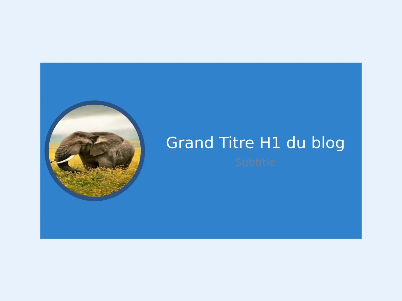
The preview of header for blog ui component.
To create a header for a blog with Tailwind CSS, we can use a combination of flexbox and grid layout to create a responsive and modern design. Here is a preview of what the header will look like:
Free download of the header for blog's source code
The source code of header for blog ui component.
To create the header for a blog with Tailwind CSS, we can use the following HTML and CSS code:
<header class=" xl:bg-blue-500 lg:bg-red-700 md:bg-orange-400 sm:bg-green-600">
    <div class=" md:flex justify-center py-16 ">
        <div class=" p-2 my-auto">
            <img class="  rounded-full h-48 w-48 mx-auto border-8 border-blue-800 "
                src="https://encrypted-tbn0.gstatic.com/images?q=tbn%3AANd9GcRDnpoy3P0jzpsWtm4omh6teFU4M1q1Z4RDDBvRseZacenKIHh6">
        </div>
        <div class="p-8  my-auto ">
            <h1 class="text-orange-100 text-3xl text-center"> Grand Titre H1 du blog </h1>
            <p class=" text-gray-600 text-xl text-center"> Subtitle </p>
        </div>

    </div>
</header>
How to create a header for blog with Tailwind CSS?
Now that we have an idea of what the header will look like and the code we’ll be using, let’s dive into the steps to create a header for a blog with Tailwind CSS.
Step 1: Set up the HTML
The first step is to set up the HTML structure for the header. We’ll use a combination of flexbox and grid layout to create a responsive and modern design. Here’s the HTML code:
<header class="flex justify-between items-center py-4 px-6 bg-white shadow-md">
  <div class="flex items-center">
    <img class="h-8 w-auto" src="logo.png" alt="Logo">
    <h1 class="ml-2 text-gray-800 font-bold">My Blog</h1>
  </div>
  <div class="hidden md:block">
    <nav>
      <ul class="flex items-center">
        <li><a class="px-4 hover:text-gray-800" href="#">Home</a></li>
        <li><a class="px-4 hover:text-gray-800" href="#">Blog</a></li>
        <li><a class="px-4 hover:text-gray-800" href="#">About</a></li>
        <li><a class="px-4 hover:text-gray-800" href="#">Contact</a></li>
      </ul>
    </nav>
  </div>
  <div class="md:hidden">
    <button class="mobile-menu-button">
      <svg class="w-6 h-6" viewBox="0 0 24 24">
        <path fill="currentColor" d="M4 6h16v2H4zm0 5h16v2H4zm0 5h16v2H4z"/>
      </svg>
    </button>
  </div>
</header>
In this code, we’ve created a header element with a class of flex justify-between items-center py-4 px-6 bg-white shadow-md. This sets up the basic layout and styling for the header.
Inside the header, we’ve added two div elements. The first div contains the logo and website name, while the second div contains the navigation menu.
We’ve also added a third div element with a class of md:hidden. This will be used to display a mobile menu button when the screen size is small.
Step 2: Style the header with Tailwind CSS
Now that we have the HTML structure in place, we can use Tailwind CSS to style the header. Here’s the CSS code:
/* Set the font family and size for the website name */
h1 {
  font-family: 'Open Sans', sans-serif;
  font-size: 1.5rem;
}

/* Style the navigation menu links */
nav ul li a {
  font-family: 'Open Sans', sans-serif;
  font-size: 1rem;
  text-decoration: none;
  color: #333;
}

nav ul li a:hover {
  color: #666;
}

/* Style the mobile menu button */
.mobile-menu-button {
  background-color: transparent;
  border: none;
  cursor: pointer;
  outline: none;
}

.mobile-menu-button svg {
  fill: #333;
}
In this code, we’ve set the font family and size for the website name and navigation menu links. We’ve also added some basic styling for the mobile menu button.
Step 3: Add responsive design with Tailwind CSS
Finally, we’ll add some responsive design to the header using Tailwind CSS. Here’s the CSS code:
/* Set the font family and size for the website name */
h1 {
  font-family: 'Open Sans', sans-serif;
  font-size: 1.5rem;
}

/* Style the navigation menu links */
nav ul li a {
  font-family: 'Open Sans', sans-serif;
  font-size: 1rem;
  text-decoration: none;
  color: #333;
}

nav ul li a:hover {
  color: #666;
}

/* Style the mobile menu button */
.mobile-menu-button {
  background-color: transparent;
  border: none;
  cursor: pointer;
  outline: none;
}

.mobile-menu-button svg {
  fill: #333;
}

/* Set up responsive design for the header */
@media (max-width: 768px) {
  header {
    flex-direction: column;
    align-items: center;
  }

  .mobile-menu-button {
    display: block;
  }

  nav {
    display: none;
  }

  nav.active {
    display: block;
  }

  nav.active ul {
    flex-direction: column;
    align-items: center;
  }

  nav.active ul li {
    margin: 0.5rem 0;
  }
}
In this code, we’ve added some media queries to make the header responsive. When the screen size is less than or equal to 768px, the header will switch to a vertical layout and the navigation menu will be hidden. The mobile menu button will be displayed instead.
When the mobile menu button is clicked, the active class will be added to the navigation menu, which will be displayed as a vertical list.
Conclusion
In this article, we’ve gone over the steps to create a header for a blog with Tailwind CSS. We’ve used a combination of flexbox and grid layout to create a responsive and modern design, and added some basic styling and responsive design with Tailwind CSS.
By using Tailwind CSS, we can quickly and easily create custom designs without writing any CSS code. This makes it a great choice for creating headers and other UI components for blogs and websites.