- Published on
Ways To Build A Header Farmat Full With Tailwind CSS In 60 Minutes
- What is Tailwind CSS?
- The description of Header Format full UI component
- Why use Tailwind CSS to create a Header Format full UI component?
- The preview of Header Format full UI component
- The source code of Header Format full UI component
- How to create a Header Format full with Tailwind CSS?
- Conclusion
What is Tailwind CSS?
Tailwind CSS is a utility-first CSS framework that allows developers to build custom designs quickly. It provides a set of pre-defined classes that can be used to style HTML elements. Tailwind CSS is highly customizable and can be used with any JavaScript framework or library.
The description of Header Format full UI component
A header is an essential part of any website, and it is the first thing that visitors see when they land on a webpage. A header typically includes a logo, navigation menu, and other important information about the website. The Header Format full UI component is a complete header design that includes all the necessary elements of a header.
Why use Tailwind CSS to create a Header Format full UI component?
Tailwind CSS provides a set of pre-defined classes that can be used to style HTML elements. This makes it easy to create complex designs quickly. With Tailwind CSS, you can customize every aspect of your design, including colors, typography, and layout. Additionally, Tailwind CSS is highly responsive, which means that your design will look great on any device.
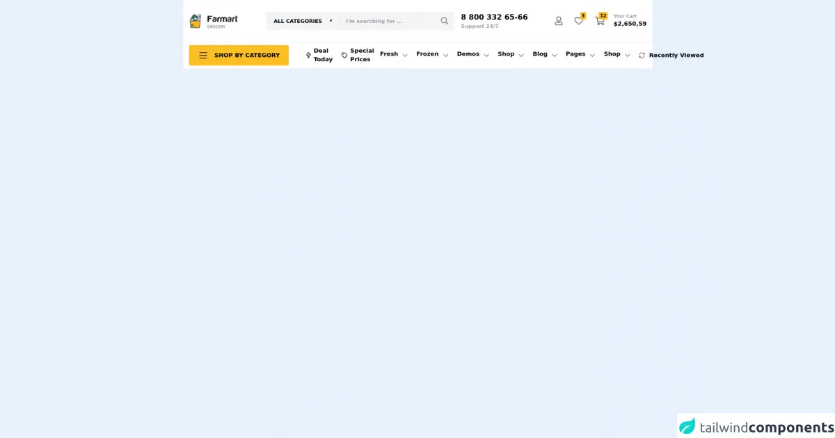
The preview of Header Format full UI component
To create a Header Format full UI component, we will be using Tailwind CSS. The Header Format full UI component includes a logo, navigation menu, search bar, and social media icons.
Free download of the Header Farmat full's source code
The source code of Header Format full UI component
To create the Header Format full UI component, we will be using HTML and Tailwind CSS. The HTML code includes a header element with a logo, navigation menu, search bar, and social media icons. The Tailwind CSS code is used to style the HTML elements.
<header class="bg-white">
  <div class="container mx-auto px-4 py-8 flex items-center">

    <!-- logo -->
    <div class="mr-auto md:w-48 flex-shrink-0">
      <img class="h-8 md:h-10" src="https://i.ibb.co/98pHdFq/2021-10-27-15h51-15.png" alt="">
    </div>

    <!-- search -->
    <div class="w-full max-w-xs xl:max-w-lg 2xl:max-w-2xl bg-gray-100 rounded-md hidden lg:flex items-center">
      <select class="bg-transparent uppercase font-bold text-sm p-4 mr-4" name="" id="">
        <option>all categories</option>
      </select>
      <input class="border-l border-gray-300 bg-transparent font-semibold text-sm pl-4" type="text" placeholder="I'm searching for ...">
      <svg class="ml-auto h-5 px-4 text-gray-500" aria-hidden="true" focusable="false" data-prefix="far" data-icon="search" role="img" xmlns="http://www.w3.org/2000/svg" viewBox="0 0 512 512" class="svg-inline--fa fa-search fa-w-16 fa-9x"><path fill="currentColor" d="M508.5 468.9L387.1 347.5c-2.3-2.3-5.3-3.5-8.5-3.5h-13.2c31.5-36.5 50.6-84 50.6-136C416 93.1 322.9 0 208 0S0 93.1 0 208s93.1 208 208 208c52 0 99.5-19.1 136-50.6v13.2c0 3.2 1.3 6.2 3.5 8.5l121.4 121.4c4.7 4.7 12.3 4.7 17 0l22.6-22.6c4.7-4.7 4.7-12.3 0-17zM208 368c-88.4 0-160-71.6-160-160S119.6 48 208 48s160 71.6 160 160-71.6 160-160 160z"></path></svg>
    </div>

    <!-- phone number -->
    <div class="ml-auto md:w-48 hidden sm:flex flex-col place-items-end">
      <span class="font-bold md:text-xl">8 800 332 65-66</span>
      <span class="font-semibold text-sm text-gray-400">Support 24/7</span>
    </div>

    <!-- buttons -->
    <nav class="contents">
      <ul class="ml-4 xl:w-48 flex items-center justify-end">
        <li class="ml-2 lg:ml-4 relative inline-block">
          <a class="" href="">
            <svg class="h-9 lg:h-10 p-2 text-gray-500" aria-hidden="true" focusable="false" data-prefix="far" data-icon="user" role="img" xmlns="http://www.w3.org/2000/svg" viewBox="0 0 448 512" class="svg-inline--fa fa-user fa-w-14 fa-9x"><path fill="currentColor" d="M313.6 304c-28.7 0-42.5 16-89.6 16-47.1 0-60.8-16-89.6-16C60.2 304 0 364.2 0 438.4V464c0 26.5 21.5 48 48 48h352c26.5 0 48-21.5 48-48v-25.6c0-74.2-60.2-134.4-134.4-134.4zM400 464H48v-25.6c0-47.6 38.8-86.4 86.4-86.4 14.6 0 38.3 16 89.6 16 51.7 0 74.9-16 89.6-16 47.6 0 86.4 38.8 86.4 86.4V464zM224 288c79.5 0 144-64.5 144-144S303.5 0 224 0 80 64.5 80 144s64.5 144 144 144zm0-240c52.9 0 96 43.1 96 96s-43.1 96-96 96-96-43.1-96-96 43.1-96 96-96z"></path></svg>
          </a>
        </li>
        <li class="ml-2 lg:ml-4 relative inline-block">
          <a class="" href="">
            <div class="absolute -top-1 right-0 z-10 bg-yellow-400 text-xs font-bold px-1 py-0.5 rounded-sm">3</div>
            <svg class="h-9 lg:h-10 p-2 text-gray-500" aria-hidden="true" focusable="false" data-prefix="far" data-icon="heart" role="img" xmlns="http://www.w3.org/2000/svg" viewBox="0 0 512 512" class="svg-inline--fa fa-heart fa-w-16 fa-9x"><path fill="currentColor" d="M458.4 64.3C400.6 15.7 311.3 23 256 79.3 200.7 23 111.4 15.6 53.6 64.3-21.6 127.6-10.6 230.8 43 285.5l175.4 178.7c10 10.2 23.4 15.9 37.6 15.9 14.3 0 27.6-5.6 37.6-15.8L469 285.6c53.5-54.7 64.7-157.9-10.6-221.3zm-23.6 187.5L259.4 430.5c-2.4 2.4-4.4 2.4-6.8 0L77.2 251.8c-36.5-37.2-43.9-107.6 7.3-150.7 38.9-32.7 98.9-27.8 136.5 10.5l35 35.7 35-35.7c37.8-38.5 97.8-43.2 136.5-10.6 51.1 43.1 43.5 113.9 7.3 150.8z"></path></svg>
          </a>
        </li>
        <li class="ml-2 lg:ml-4 relative inline-block">
          <a class="" href="">
            <div class="absolute -top-1 right-0 z-10 bg-yellow-400 text-xs font-bold px-1 py-0.5 rounded-sm">12</div>
            <svg class="h-9 lg:h-10 p-2 text-gray-500" aria-hidden="true" focusable="false" data-prefix="far" data-icon="shopping-cart" role="img" xmlns="http://www.w3.org/2000/svg" viewBox="0 0 576 512" class="svg-inline--fa fa-shopping-cart fa-w-18 fa-9x"><path fill="currentColor" d="M551.991 64H144.28l-8.726-44.608C133.35 8.128 123.478 0 112 0H12C5.373 0 0 5.373 0 12v24c0 6.627 5.373 12 12 12h80.24l69.594 355.701C150.796 415.201 144 430.802 144 448c0 35.346 28.654 64 64 64s64-28.654 64-64a63.681 63.681 0 0 0-8.583-32h145.167a63.681 63.681 0 0 0-8.583 32c0 35.346 28.654 64 64 64 35.346 0 64-28.654 64-64 0-18.136-7.556-34.496-19.676-46.142l1.035-4.757c3.254-14.96-8.142-29.101-23.452-29.101H203.76l-9.39-48h312.405c11.29 0 21.054-7.869 23.452-18.902l45.216-208C578.695 78.139 567.299 64 551.991 64zM208 472c-13.234 0-24-10.766-24-24s10.766-24 24-24 24 10.766 24 24-10.766 24-24 24zm256 0c-13.234 0-24-10.766-24-24s10.766-24 24-24 24 10.766 24 24-10.766 24-24 24zm23.438-200H184.98l-31.31-160h368.548l-34.78 160z"></path></svg>
          </a>
        </li>
      </ul>
    </nav>

    <!-- cart count -->
    <div class="ml-4 hidden sm:flex flex-col font-bold">
      <span class="text-xs text-gray-400">Your Cart</span>
      <span>$2,650,59</span>
    </div>
  </div>

  <hr>

  <div class="container mx-auto px-4 py-2 flex items-center">
    <button class="bg-yellow-400 hover:bg-gray-700 font-bold uppercase px-4 xl:px-6 py-2 xl:py-3 rounded flex-shrink-0 flex items-center">
      <svg class="h-8 p-1" aria-hidden="true" focusable="false" data-prefix="fal" data-icon="bars" role="img" xmlns="http://www.w3.org/2000/svg" viewBox="0 0 448 512" class="svg-inline--fa fa-bars fa-w-14 fa-9x"><path fill="currentColor" d="M442 114H6a6 6 0 0 1-6-6V84a6 6 0 0 1 6-6h436a6 6 0 0 1 6 6v24a6 6 0 0 1-6 6zm0 160H6a6 6 0 0 1-6-6v-24a6 6 0 0 1 6-6h436a6 6 0 0 1 6 6v24a6 6 0 0 1-6 6zm0 160H6a6 6 0 0 1-6-6v-24a6 6 0 0 1 6-6h436a6 6 0 0 1 6 6v24a6 6 0 0 1-6 6z" class=""></path></svg>
      <span class="ml-4">shop by category</span>
    </button>

    <nav class="ml-8">
      <ul class="flex items-center font-bold">
        <li class="px-2 flex items-center">
          <svg class="h-7 lg:h-8 p-2 flex-shrink-0" aria-hidden="true" focusable="false" data-prefix="far" data-icon="bolt" role="img" xmlns="http://www.w3.org/2000/svg" viewBox="0 0 384 512" class="svg-inline--fa fa-bolt fa-w-12 fa-9x"><path fill="currentColor" d="M377.8 167.9c-8.2-14.3-23.1-22.9-39.6-22.9h-94.4l28.7-87.5c3.7-13.8.8-28.3-7.9-39.7C255.8 6.5 242.5 0 228.2 0H97.7C74.9 0 55.4 17.1 52.9 37.1L.5 249.3c-1.9 13.8 2.2 27.7 11.3 38.2C20.9 298 34.1 304 48 304h98.1l-34.9 151.7c-3.2 13.7-.1 27.9 8.6 38.9 8.7 11.1 21.8 17.4 35.9 17.4 16.3 0 31.5-8.8 38.8-21.6l183.2-276.7c8.4-14.3 8.4-31.5.1-45.8zM160.1 457.4L206.4 256H47.5L97.7 48l127.6-.9L177.5 193H334L160.1 457.4z"></path></svg>
          <span>Deal Today</span>
        </li>
        <li class="px-2 flex items-center">
          <svg class="h-7 lg:h-8 p-2 flex-shrink-0" aria-hidden="true" focusable="false" data-prefix="far" data-icon="tag" role="img" xmlns="http://www.w3.org/2000/svg" viewBox="0 0 512 512" class="svg-inline--fa fa-tag fa-w-16 fa-9x"><path fill="currentColor" d="M497.941 225.941L286.059 14.059A48 48 0 0 0 252.118 0H48C21.49 0 0 21.49 0 48v204.118a47.998 47.998 0 0 0 14.059 33.941l211.882 211.882c18.745 18.745 49.137 18.746 67.882 0l204.118-204.118c18.745-18.745 18.745-49.137 0-67.882zM259.886 463.996L48 252.118V48h204.118L464 259.882 259.886 463.996zM192 144c0 26.51-21.49 48-48 48s-48-21.49-48-48 21.49-48 48-48 48 21.49 48 48z"></path></svg>
          <span>Special Prices</span>
        </li>
        <li class="px-2 flex">
          <span>Fresh</span>
          <svg class="ml-1 h-7 lg:h-8 p-2 text-gray-500" aria-hidden="true" focusable="false" data-prefix="far" data-icon="chevron-down" role="img" xmlns="http://www.w3.org/2000/svg" viewBox="0 0 448 512" class="svg-inline--fa fa-chevron-down fa-w-14 fa-9x"><path fill="currentColor" d="M441.9 167.3l-19.8-19.8c-4.7-4.7-12.3-4.7-17 0L224 328.2 42.9 147.5c-4.7-4.7-12.3-4.7-17 0L6.1 167.3c-4.7 4.7-4.7 12.3 0 17l209.4 209.4c4.7 4.7 12.3 4.7 17 0l209.4-209.4c4.7-4.7 4.7-12.3 0-17z"></path></svg>
        </li>
        <li class="px-2 flex">
          <span>Frozen</span>
          <svg class="ml-1 h-7 lg:h-8 p-2 text-gray-500" aria-hidden="true" focusable="false" data-prefix="far" data-icon="chevron-down" role="img" xmlns="http://www.w3.org/2000/svg" viewBox="0 0 448 512" class="svg-inline--fa fa-chevron-down fa-w-14 fa-9x"><path fill="currentColor" d="M441.9 167.3l-19.8-19.8c-4.7-4.7-12.3-4.7-17 0L224 328.2 42.9 147.5c-4.7-4.7-12.3-4.7-17 0L6.1 167.3c-4.7 4.7-4.7 12.3 0 17l209.4 209.4c4.7 4.7 12.3 4.7 17 0l209.4-209.4c4.7-4.7 4.7-12.3 0-17z"></path></svg>
        </li>
        <li class="px-2 flex">
          <span>Demos</span>
          <svg class="ml-1 h-7 lg:h-8 p-2 text-gray-500" aria-hidden="true" focusable="false" data-prefix="far" data-icon="chevron-down" role="img" xmlns="http://www.w3.org/2000/svg" viewBox="0 0 448 512" class="svg-inline--fa fa-chevron-down fa-w-14 fa-9x"><path fill="currentColor" d="M441.9 167.3l-19.8-19.8c-4.7-4.7-12.3-4.7-17 0L224 328.2 42.9 147.5c-4.7-4.7-12.3-4.7-17 0L6.1 167.3c-4.7 4.7-4.7 12.3 0 17l209.4 209.4c4.7 4.7 12.3 4.7 17 0l209.4-209.4c4.7-4.7 4.7-12.3 0-17z"></path></svg>
        </li>
        <li class="px-2 flex">
          <span>Shop</span>
          <svg class="ml-1 h-7 lg:h-8 p-2 text-gray-500" aria-hidden="true" focusable="false" data-prefix="far" data-icon="chevron-down" role="img" xmlns="http://www.w3.org/2000/svg" viewBox="0 0 448 512" class="svg-inline--fa fa-chevron-down fa-w-14 fa-9x"><path fill="currentColor" d="M441.9 167.3l-19.8-19.8c-4.7-4.7-12.3-4.7-17 0L224 328.2 42.9 147.5c-4.7-4.7-12.3-4.7-17 0L6.1 167.3c-4.7 4.7-4.7 12.3 0 17l209.4 209.4c4.7 4.7 12.3 4.7 17 0l209.4-209.4c4.7-4.7 4.7-12.3 0-17z"></path></svg>
        </li>
        <li class="px-2 flex">
          <span>Blog</span>
          <svg class="ml-1 h-7 lg:h-8 p-2 text-gray-500" aria-hidden="true" focusable="false" data-prefix="far" data-icon="chevron-down" role="img" xmlns="http://www.w3.org/2000/svg" viewBox="0 0 448 512" class="svg-inline--fa fa-chevron-down fa-w-14 fa-9x"><path fill="currentColor" d="M441.9 167.3l-19.8-19.8c-4.7-4.7-12.3-4.7-17 0L224 328.2 42.9 147.5c-4.7-4.7-12.3-4.7-17 0L6.1 167.3c-4.7 4.7-4.7 12.3 0 17l209.4 209.4c4.7 4.7 12.3 4.7 17 0l209.4-209.4c4.7-4.7 4.7-12.3 0-17z"></path></svg>
        </li>
        <li class="px-2 flex">
          <span>Pages</span>
          <svg class="ml-1 h-7 lg:h-8 p-2 text-gray-500" aria-hidden="true" focusable="false" data-prefix="far" data-icon="chevron-down" role="img" xmlns="http://www.w3.org/2000/svg" viewBox="0 0 448 512" class="svg-inline--fa fa-chevron-down fa-w-14 fa-9x"><path fill="currentColor" d="M441.9 167.3l-19.8-19.8c-4.7-4.7-12.3-4.7-17 0L224 328.2 42.9 147.5c-4.7-4.7-12.3-4.7-17 0L6.1 167.3c-4.7 4.7-4.7 12.3 0 17l209.4 209.4c4.7 4.7 12.3 4.7 17 0l209.4-209.4c4.7-4.7 4.7-12.3 0-17z"></path></svg>
        </li>
        <li class="px-2 flex">
          <span>Shop</span>
          <svg class="ml-1 h-7 lg:h-8 p-2 text-gray-500" aria-hidden="true" focusable="false" data-prefix="far" data-icon="chevron-down" role="img" xmlns="http://www.w3.org/2000/svg" viewBox="0 0 448 512" class="svg-inline--fa fa-chevron-down fa-w-14 fa-9x"><path fill="currentColor" d="M441.9 167.3l-19.8-19.8c-4.7-4.7-12.3-4.7-17 0L224 328.2 42.9 147.5c-4.7-4.7-12.3-4.7-17 0L6.1 167.3c-4.7 4.7-4.7 12.3 0 17l209.4 209.4c4.7 4.7 12.3 4.7 17 0l209.4-209.4c4.7-4.7 4.7-12.3 0-17z"></path></svg>
        </li>
      </ul>
    </nav>

    <a href="" class="ml-auto flex-shrink-0 flex items-center">
      <svg class="h-7 lg:h-8 p-2 text-gray-500" aria-hidden="true" focusable="false" data-prefix="far" data-icon="sync-alt" role="img" xmlns="http://www.w3.org/2000/svg" viewBox="0 0 512 512" class="svg-inline--fa fa-sync-alt fa-w-16 fa-9x"><path fill="currentColor" d="M483.515 28.485L431.35 80.65C386.475 35.767 324.485 8 256 8 123.228 8 14.824 112.338 8.31 243.493 7.971 250.311 13.475 256 20.301 256h28.045c6.353 0 11.613-4.952 11.973-11.294C66.161 141.649 151.453 60 256 60c54.163 0 103.157 21.923 138.614 57.386l-54.128 54.129c-7.56 7.56-2.206 20.485 8.485 20.485H492c6.627 0 12-5.373 12-12V36.971c0-10.691-12.926-16.045-20.485-8.486zM491.699 256h-28.045c-6.353 0-11.613 4.952-11.973 11.294C445.839 370.351 360.547 452 256 452c-54.163 0-103.157-21.923-138.614-57.386l54.128-54.129c7.56-7.56 2.206-20.485-8.485-20.485H20c-6.627 0-12 5.373-12 12v143.029c0 10.691 12.926 16.045 20.485 8.485L80.65 431.35C125.525 476.233 187.516 504 256 504c132.773 0 241.176-104.338 247.69-235.493.339-6.818-5.165-12.507-11.991-12.507z"></path></svg>
      <span class="ml-1 font-bold">Recently Viewed</span>
    </a>
  </div>

  <hr>
</header>
How to create a Header Format full with Tailwind CSS?
To create a Header Format full with Tailwind CSS, follow these steps:
Create a new HTML file and add the necessary HTML elements for the header, including a logo, navigation menu, search bar, and social media icons.
Add the necessary Tailwind CSS classes to style the HTML elements. You can use the pre-defined classes provided by Tailwind CSS or create your own custom classes.
Customize the design by changing the colors, typography, and layout using Tailwind CSS.
Test the design on different devices to ensure that it is responsive.
Conclusion
In conclusion, Tailwind CSS is an excellent framework for building custom designs quickly. The Header Format full UI component is an essential part of any website, and with Tailwind CSS, you can create a complete header design in just 60 minutes. By following the steps outlined in this article, you can create a Header Format full UI component that is both functional and visually appealing.