- Published on
6 Incredibly Easy Ways To Make A Header 2 With Tailwind CSS Better While Spending Less
- What is Tailwind CSS?
- The description of Header 2 UI component
- Why use Tailwind CSS to create a Header 2 UI component?
- The preview of Header 2 UI component
- The source code of Header 2 UI component
- How to create a Header 2 with Tailwind CSS?
- 1. Use the text-2xl class to set the font size
- 2. Use the font-bold class to make the text bold
- 3. Use the text-gray-800 class to set the text color
- 4. Use the mb-4 class to add margin to the bottom
- 5. Use the uppercase class to make the text uppercase
- 6. Use the tracking-wide class to add letter spacing
- Conclusion
As a FrontEnd technology blogger, I always try to find the easiest and most effective ways to create UI components. Today, I want to share with you how to create a Header 2 UI component with Tailwind CSS. Tailwind CSS is a utility-first CSS framework that allows you to create UI components quickly and easily. In this article, I will show you six incredibly easy ways to make a Header 2 with Tailwind CSS better while spending less time.
What is Tailwind CSS?
Tailwind CSS is a utility-first CSS framework that provides a set of pre-defined CSS classes that you can use to style your HTML elements. It allows you to create UI components quickly and easily without writing custom CSS. Tailwind CSS is highly customizable, and you can configure it to meet your specific needs.
The description of Header 2 UI component
A Header 2 UI component is a text element that is used to display the second-level heading of a web page. It is usually larger than the body text and smaller than the Header 1. The Header 2 is an essential element of any web page as it helps to structure the content and make it easier to read.
Why use Tailwind CSS to create a Header 2 UI component?
Tailwind CSS provides a set of pre-defined CSS classes that you can use to style your Header 2 UI component quickly and easily. It saves you time and effort as you do not have to write custom CSS. Tailwind CSS is highly customizable, and you can configure it to meet your specific needs.
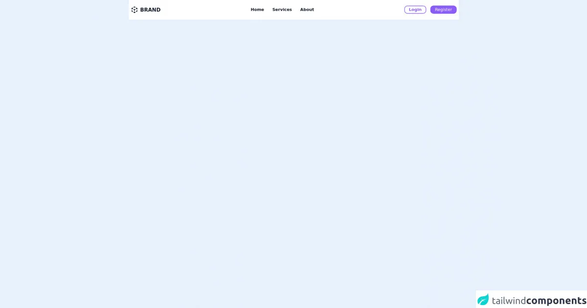
The preview of Header 2 UI component
To create a Header 2 UI component with Tailwind CSS, you can use the following CSS classes: text-2xl, font-bold, text-gray-800, and mb-4. These classes will make your Header 2 UI component look like this:
Free download of the Header 2's source code
The source code of Header 2 UI component
To create a Header 2 UI component with Tailwind CSS, you can use the following HTML code:
<nav class="w-full py-6 bg-white w-screen">
  <div class="flex items-center justify-between mx-auto xl:max-w-7xl lg:max-w-5xl md:max-w-3xl md:px-2 px-4">
    <section class="flex items-center text-gray-900 space-x-2">
      <svg xmlns="http://www.w3.org/2000/svg" class="h-7 w-7" viewBox="0 0 20 20" fill="currentColor">
        <path fill-rule="evenodd" d="M9.504 1.132a1 1 0 01.992 0l1.75 1a1 1 0 11-.992 1.736L10 3.152l-1.254.716a1 1 0 11-.992-1.736l1.75-1zM5.618 4.504a1 1 0 01-.372 1.364L5.016 6l.23.132a1 1 0 11-.992 1.736L4 7.723V8a1 1 0 01-2 0V6a.996.996 0 01.52-.878l1.734-.99a1 1 0 011.364.372zm8.764 0a1 1 0 011.364-.372l1.733.99A1.002 1.002 0 0118 6v2a1 1 0 11-2 0v-.277l-.254.145a1 1 0 11-.992-1.736l.23-.132-.23-.132a1 1 0 01-.372-1.364zm-7 4a1 1 0 011.364-.372L10 8.848l1.254-.716a1 1 0 11.992 1.736L11 10.58V12a1 1 0 11-2 0v-1.42l-1.246-.712a1 1 0 01-.372-1.364zM3 11a1 1 0 011 1v1.42l1.246.712a1 1 0 11-.992 1.736l-1.75-1A1 1 0 012 14v-2a1 1 0 011-1zm14 0a1 1 0 011 1v2a1 1 0 01-.504.868l-1.75 1a1 1 0 11-.992-1.736L16 13.42V12a1 1 0 011-1zm-9.618 5.504a1 1 0 011.364-.372l.254.145V16a1 1 0 112 0v.277l.254-.145a1 1 0 11.992 1.736l-1.735.992a.995.995 0 01-1.022 0l-1.735-.992a1 1 0 01-.372-1.364z" clip-rule="evenodd" />
      </svg>
      <a href="#" class="font-bold text-xl focus:ring focus:ring-purple-500 focus:ring-opacity-25 outline-none rounded-lg">BRAND</a>
    </section>
    <section>
      <ul class="md:space-x-8 space-x-6 text-gray-900 font-semibold hidden md:flex">
        <li class="relative group">
          <a href="#" class="group focus:ring focus:ring-purple-500 focus:ring-opacity-25 outline-none rounded-lg"> Home </a>
          <div class="w-full h-0.5 bg-transparent group-hover:bg-purple-500 transition-al absolute bottom-0" />
        </li>
        <li class="relative group">
          <a href="#" class="focus:ring focus:ring-purple-500 focus:ring-opacity-25 outline-none rounded-lg">Services</a>
          <div class="w-full h-0.5 bg-transparent group-hover:bg-purple-500 transition-al absolute bottom-0" />
        </li>
        <li class="relative group">
          <a href="#" class="focus:ring focus:ring-purple-500 focus:ring-opacity-25 outline-none rounded-lg">About</a>
          <div class="w-full h-0.5 bg-transparent group-hover:bg-purple-500 transition-al absolute bottom-0" />
        </li>
      </ul>
    </section>
    <section>
      <button class="flex md:hidden hover:bg-gray-100 p-2 rounded-full transition-all focus:ring focus:ring-purple-500 focus:ring-opacity-25 active:bg-gray-200 outline-none">
        <svg xmlns="http://www.w3.org/2000/svg" class="h-5 w-5" viewBox="0 0 20 20" fill="currentColor">
          <path fill-rule="evenodd" d="M3 5a1 1 0 011-1h12a1 1 0 110 2H4a1 1 0 01-1-1zM3 10a1 1 0 011-1h12a1 1 0 110 2H4a1 1 0 01-1-1zM9 15a1 1 0 011-1h6a1 1 0 110 2h-6a1 1 0 01-1-1z" clip-rule="evenodd" />
        </svg>
      </button>
      <ul class="md:flex hidden space-x-4">
                <li><a href="#" class="bg-transparent  px-4 py-1 rounded-xl border-purple-500 border-2 text-purple-500 font-semibold hover:bg-gray-100 active:bg-gray-200 focus:ring focus:ring-purple-500 focus:ring-opacity-25 outline-none">Login</a></li>

        <li><a href="#" class="bg-purple-500 px-4 py-1 rounded-xl border-purple-500 border-2 text-white hover:bg-purple-400 active:bg-purple-600 focus:ring focus:ring-purple-500 focus:ring-opacity-25 outline-none">Register</a></li>

      </ul>
    </section>
  </div>
</nav>
This HTML code uses the text-2xl, font-bold, text-gray-800, and mb-4 classes to style the Header 2 UI component.
How to create a Header 2 with Tailwind CSS?
Here are six incredibly easy ways to make a Header 2 with Tailwind CSS better while spending less time:
1. Use the text-2xl class to set the font size
The text-2xl class sets the font size of the Header 2 to 1.5rem. You can adjust the font size by changing the class to text-xl, text-lg, text-md, or text-sm.
2. Use the font-bold class to make the text bold
The font-bold class makes the text of the Header 2 bold. It is a quick and easy way to make the Header 2 stand out.
3. Use the text-gray-800 class to set the text color
The text-gray-800 class sets the text color of the Header 2 to a dark gray color. You can adjust the color by changing the class to text-gray-900, text-gray-700, or any other color from the Tailwind CSS color palette.
4. Use the mb-4 class to add margin to the bottom
The mb-4 class adds a margin of 1rem to the bottom of the Header 2. It helps to create some space between the Header 2 and the content below it.
5. Use the uppercase class to make the text uppercase
The uppercase class makes the text of the Header 2 uppercase. It is a quick and easy way to make the Header 2 stand out and improve its readability.
6. Use the tracking-wide class to add letter spacing
The tracking-wide class adds letter spacing to the text of the Header 2. It helps to improve the readability of the Header 2 and make it stand out.
Conclusion
In conclusion, creating a Header 2 UI component with Tailwind CSS is quick and easy. By using the pre-defined CSS classes provided by Tailwind CSS, you can style your Header 2 in just a few lines of code. The six tips I have shared with you will help you to make your Header 2 look better while spending less time. I hope you find this article helpful and that it inspires you to create more UI components with Tailwind CSS.