- Published on
6 Ideas To Help You Make A Verification Code Screen With Tailwind CSS Like A Pro
- What is Tailwind CSS?
- The description of Verification Code Screen ui component
- Why use Tailwind CSS to create a Verification Code Screen ui component?
- The preview of Verification Code Screen ui component
- The source code of Verification Code Screen ui component
- How to create a Verification Code Screen with Tailwind CSS?
- 1. Use Flexbox to Align Elements
- 2. Use Grid to Create a Responsive Layout
- 3. Use Tailwind CSS Forms Plugin
- 4. Use Tailwind CSS Typography Plugin
- 5. Use Tailwind CSS Transition Plugin
- 6. Use Tailwind CSS Animation Plugin
- Conclusion
In today's world, where security is of utmost importance, verification code screens have become a common feature in many applications. A verification code screen is a user interface component that allows users to enter a code sent to them via email or SMS to verify their identity. In this article, we will explore how to create a verification code screen with Tailwind CSS.
What is Tailwind CSS?
Tailwind CSS is a utility-first CSS framework that provides a set of pre-defined classes that can be used to style HTML elements. It allows developers to create custom designs quickly and efficiently without writing any CSS code. Tailwind CSS is highly customizable and can be used with any JavaScript framework.
The description of Verification Code Screen ui component
A verification code screen is a user interface component that allows users to enter a code sent to them via email or SMS to verify their identity. It typically consists of a form with an input field for the code and a button to submit the code. The screen may also include a timer to indicate how much time the user has left to enter the code.
Why use Tailwind CSS to create a Verification Code Screen ui component?
Tailwind CSS provides a set of pre-defined classes that can be used to style HTML elements. This makes it easy to create a verification code screen without writing any CSS code. Tailwind CSS is also highly customizable, allowing developers to create custom designs quickly and efficiently.
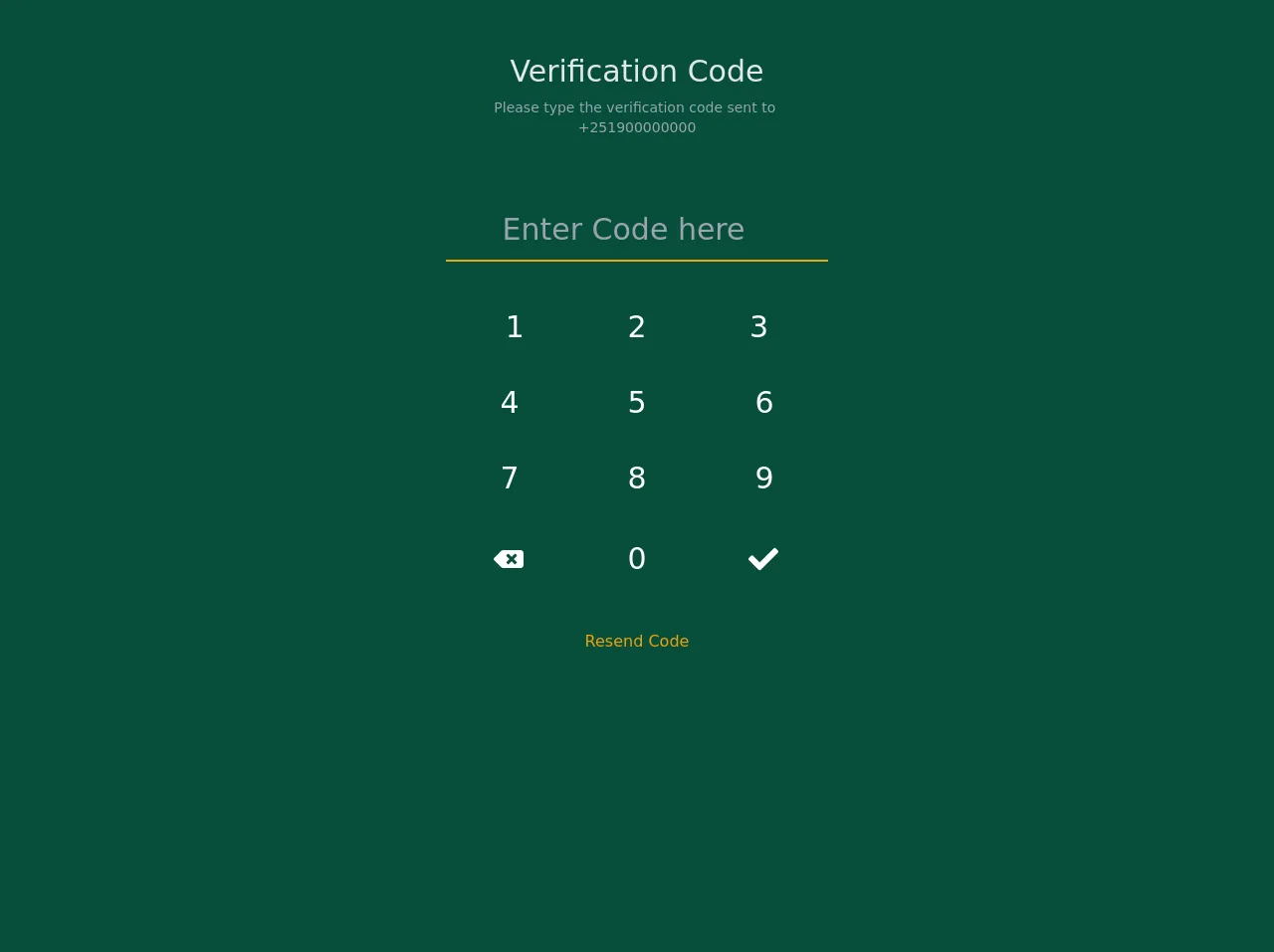
The preview of Verification Code Screen ui component
To create a verification code screen with Tailwind CSS, we will use a form with an input field for the code and a button to submit the code. The screen may also include a timer to indicate how much time the user has left to enter the code.
Free download of the Verification Code Screen's source code
The source code of Verification Code Screen ui component
To create a verification code screen with Tailwind CSS, we will use a form with an input field for the code and a button to submit the code. The screen may also include a timer to indicate how much time the user has left to enter the code.
<div class="w-screen h-screen flex justify-center items-center bg-green-900">
      <div class="container h-screen  max-w-full overflow-hidden shadow-lg">
        <div class="flex flex-col">
          <div
            class="flex flex-col w-full  h-48 justify-center">
            <div class="text-3xl block w-full text-gray-200 text-center"> Verification Code</div>
            <div class="text-sm block w-full text-gray-400 font-base text-center pt-2">
              Please type the verification code sent to
              <br />
              +251900000000
            </div>
          </div>
          <div class="flex w-full flex-1  h-screen flex justify-center items-center text-white">
            <div class="h-full py-1 px-8 text-center">
              <div class="w-full max-w-sm">
                <div class="flex items-center border-b-2 border-yellow-500 py-2 mt-1">
                  <input
                    class="text-center appearance-none bg-transparent border-none w-full text-white text-3xl mr-3 py-1 px-2 leading-tight focus:outline-none"
                    type="number"
                    placeholder="Enter Code here"
                  />

                </div>
                <div class="text-center text-xs font-base my-10">
                  <div class="px-2">
                    <div class="flex  text-3xl">
                       <div class="w-1/3 px-2 hover:bg-green-800 rounded cursor-pointer my-auto py-2">
                        1
                      </div>
                       <div class="w-1/3 px-2 hover:bg-green-800 rounded cursor-pointer my-auto py-2">
                        2
                      </div>
                      <div class="w-1/3 px-2 hover:bg-green-800 rounded cursor-pointer my-auto py-2">
                        3
                      </div>
                    </div>
                  </div>
                  <div class="px-2 pt-6">
                    <div class="flex -mx-2  text-3xl">
                      <div class="w-1/3 px-2 hover:bg-green-800 rounded cursor-pointer my-auto py-2">
                        4
                      </div>
                      <div class="w-1/3 px-2 hover:bg-green-800 rounded cursor-pointer my-auto py-2">
                        5
                      </div>
                      <div class="w-1/3 px-2 hover:bg-green-800 rounded cursor-pointer my-auto py-2">
                        6
                      </div>
                    </div>
                  </div>
                  <div class="px-2 pt-6">
                    <div class="flex -mx-2  text-3xl">
                      <div class="w-1/3 px-2 hover:bg-green-800 rounded cursor-pointer my-auto py-2">
                        7
                      </div>
                      <div class="w-1/3 px-2 hover:bg-green-800 rounded cursor-pointer my-auto py-2">
                        8
                      </div>
                      <div class="w-1/3 px-2 hover:bg-green-800 rounded cursor-pointer my-auto py-2">
                        9
                      </div>
                    </div>
                  </div>
                  <div class="px-2 pt-6">
                    <div class="flex -mx-2  text-3xl">
                       <div class="w-1/3 px-2 hover:bg-green-800 rounded cursor-pointer my-auto py-2">
                        <div class=" px-10 py-2">
                        <svg stroke="currentColor" fill="currentColor" stroke-width="0" viewBox="0 0 640 512" height="1em" width="1em" xmlns="http://www.w3.org/2000/svg"><path d="M576 64H205.26A63.97 63.97 0 0 0 160 82.75L9.37 233.37c-12.5 12.5-12.5 32.76 0 45.25L160 429.25c12 12 28.28 18.75 45.25 18.75H576c35.35 0 64-28.65 64-64V128c0-35.35-28.65-64-64-64zm-84.69 254.06c6.25 6.25 6.25 16.38 0 22.63l-22.62 22.62c-6.25 6.25-16.38 6.25-22.63 0L384 301.25l-62.06 62.06c-6.25 6.25-16.38 6.25-22.63 0l-22.62-22.62c-6.25-6.25-6.25-16.38 0-22.63L338.75 256l-62.06-62.06c-6.25-6.25-6.25-16.38 0-22.63l22.62-22.62c6.25-6.25 16.38-6.25 22.63 0L384 210.75l62.06-62.06c6.25-6.25 16.38-6.25 22.63 0l22.62 22.62c6.25 6.25 6.25 16.38 0 22.63L429.25 256l62.06 62.06z"></path></svg>
                        </div>
                      </div>
                      <div class="w-1/3 px-2 hover:bg-green-800 rounded cursor-pointer my-auto py-2">
                        0
                      </div>
                     <div class="w-1/3 px-2 hover:bg-green-800 rounded cursor-pointer my-auto py-2">
                        <div class=" px-10 py-2">
                        <svg stroke="currentColor" fill="currentColor" stroke-width="0" viewBox="0 0 512 512" height="1em" width="1em" xmlns="http://www.w3.org/2000/svg"><path d="M173.898 439.404l-166.4-166.4c-9.997-9.997-9.997-26.206 0-36.204l36.203-36.204c9.997-9.998 26.207-9.998 36.204 0L192 312.69 432.095 72.596c9.997-9.997 26.207-9.997 36.204 0l36.203 36.204c9.997 9.997 9.997 26.206 0 36.204l-294.4 294.401c-9.998 9.997-26.207 9.997-36.204-.001z"></path></svg>
                        </div>
                      </div>
                    </div>
                  </div>
                </div>
                <a class="text-center pt-8 text-yellow-500 cursor-pointer">
                  Resend Code
                </a>
              </div>
            </div>
          </div>
        </div>
      </div>
    </div>
How to create a Verification Code Screen with Tailwind CSS?
Here are six ideas to help you create a verification code screen with Tailwind CSS like a pro:
1. Use Flexbox to Align Elements
Flexbox is a powerful layout tool that allows developers to create flexible and responsive layouts. To align the elements of the verification code screen, we can use the Flexbox utility classes provided by Tailwind CSS.
<div class="flex flex-col items-center justify-center h-screen">
  <form class="w-full max-w-sm">
    <!-- form elements -->
  </form>
</div>
In the above code, we have used the flex class to create a flex container and the flex-col class to stack the child elements vertically. We have also used the items-center and justify-center classes to center the child elements horizontally and vertically.
2. Use Grid to Create a Responsive Layout
Grid is another powerful layout tool that allows developers to create complex and responsive layouts. To create a responsive layout for the verification code screen, we can use the Grid utility classes provided by Tailwind CSS.
<div class="grid grid-cols-1 md:grid-cols-2 gap-4">
  <div class="col-span-1">
    <!-- form elements -->
  </div>
  <div class="col-span-1">
    <!-- timer element -->
  </div>
</div>
In the above code, we have used the grid class to create a grid container with one column on small screens and two columns on medium screens and above. We have also used the gap-4 class to add some space between the columns. We have used the col-span-1 class to specify the width of the columns.
3. Use Tailwind CSS Forms Plugin
Tailwind CSS Forms plugin provides a set of pre-defined classes that can be used to style form elements. To style the form elements of the verification code screen, we can use the Forms plugin provided by Tailwind CSS.
<input type="text" class="form-input w-full text-center text-5xl font-bold" />
In the above code, we have used the form-input class to style the input field of the form. We have also used the w-full class to make the input field full width. We have used the text-center class to center the text horizontally and the text-5xl and font-bold classes to style the text.
4. Use Tailwind CSS Typography Plugin
Tailwind CSS Typography plugin provides a set of pre-defined classes that can be used to style text. To style the text of the verification code screen, we can use the Typography plugin provided by Tailwind CSS.
<p class="text-center text-lg font-medium text-gray-600">Enter the verification code sent to your email or phone number</p>
In the above code, we have used the text-center class to center the text horizontally. We have also used the text-lg class to specify the font size, the font-medium class to specify the font weight, and the text-gray-600 class to specify the text color.
5. Use Tailwind CSS Transition Plugin
Tailwind CSS Transition plugin provides a set of pre-defined classes that can be used to add transitions to elements. To add a transition to the timer element of the verification code screen, we can use the Transition plugin provided by Tailwind CSS.
<div class="bg-gray-200 rounded-full overflow-hidden">
  <div class="bg-blue-500 h-2 transition-all duration-300" style="width: 50%;"></div>
</div>
In the above code, we have used the bg-gray-200 class to specify the background color of the timer element. We have also used the rounded-full class to make the element round and the overflow-hidden class to hide the overflow. We have used the bg-blue-500 class to specify the color of the progress bar and the h-2 class to specify the height of the progress bar. We have also used the transition-all and duration-300 classes to add a transition to the progress bar.
6. Use Tailwind CSS Animation Plugin
Tailwind CSS Animation plugin provides a set of pre-defined classes that can be used to add animations to elements. To add an animation to the button element of the verification code screen, we can use the Animation plugin provided by Tailwind CSS.
<button class="bg-blue-500 hover:bg-blue-700 text-white font-bold py-2 px-4 rounded-full animate-pulse">Submit</button>
In the above code, we have used the bg-blue-500 class to specify the background color of the button. We have also used the hover:bg-blue-700 class to change the background color of the button on hover. We have used the text-white class to specify the text color, the font-bold class to specify the font weight, and the py-2 and px-4 classes to specify the padding of the button. We have used the rounded-full class to make the button round. We have also used the animate-pulse class to add a pulse animation to the button.
Conclusion
In this article, we have explored how to create a verification code screen with Tailwind CSS. We have discussed why Tailwind CSS is a great choice for creating user interface components and provided six ideas to help you create a verification code screen with Tailwind CSS like a pro. With Tailwind CSS, creating custom designs quickly and efficiently has never been easier.