- Published on
Advanced Guide: Create A Grid Responsive Tailwind CSS With Tailwind CSS
- What is Tailwind CSS?
- The description of Grid Responsive Tailwind CSS UI component
- Why use Tailwind CSS to create a Grid Responsive Tailwind CSS UI component?
- The preview of Grid Responsive Tailwind CSS UI component.
- The source code of Grid Responsive Tailwind CSS UI component.
- How to create a Grid Responsive Tailwind CSS with Tailwind CSS?
- Step 1: Install Tailwind CSS
- Step 2: Create a configuration file
- Step 3: Configure Tailwind CSS
- Step 4: Create a HTML file
- Step 5: Create a CSS file
- Conclusion
In the world of FrontEnd development, CSS frameworks have become an essential tool for creating beautiful and responsive user interfaces. One of the most popular CSS frameworks is Tailwind CSS. Tailwind CSS is a utility-first CSS framework that provides a set of pre-defined classes to help you build your UI components quickly and efficiently. In this article, we will explore how to create a Grid Responsive Tailwind CSS UI component using Tailwind CSS.
What is Tailwind CSS?
Tailwind CSS is a utility-first CSS framework that provides a set of pre-defined classes to help you build your UI components quickly and efficiently. It is designed to be highly customizable and easy to use. Tailwind CSS is built using PostCSS, which means that you can use it with any modern build tool, including webpack, Rollup, and Gulp.
The description of Grid Responsive Tailwind CSS UI component
A Grid Responsive Tailwind CSS UI component is a UI component that uses a grid system to layout its content. The grid system allows you to create a responsive layout that adapts to different screen sizes. This means that your UI component will look great on desktops, tablets, and mobile devices.
Why use Tailwind CSS to create a Grid Responsive Tailwind CSS UI component?
Tailwind CSS provides a set of pre-defined classes that allow you to create a responsive grid system quickly and efficiently. This means that you don't need to spend time writing custom CSS code to create a grid system. Tailwind CSS also provides a set of utilities that allow you to customize the grid system to suit your needs.
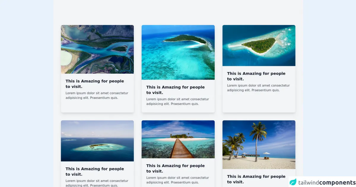
The preview of Grid Responsive Tailwind CSS UI component.
Free download of the Grid Responsive Tailwind CSS's source code
The source code of Grid Responsive Tailwind CSS UI component.
<div class="bg-gray-100 min-h-screen py-32 px-10 ">
  <div class="grid grid-cols-1 md:grid-cols-2 lg:grid-cols-3 md:gap-x-10 xl-grid-cols-4 gap-y-10 gap-x-6 ">

  <div class="container mx-auto shadow-lg rounded-lg max-w-md hover:shadow-2xl transition duration-300">
    <img src="https://images.unsplash.com/photo-1627751476653-e954179b174a" alt="" class="rounded-t-lg w-full">
  <div class="p-6">
    <h1 class="md:text-1xl text-xl hover:text-indigo-600 transition duration-200  font-bold text-gray-900 ">This is Amazing for people to visit.</h1>
  <p class="text-gray-700 my-2 hover-text-900 ">Lorem ipsum dolor sit amet consectetur adipisicing elit. Praesentium quis.</p>
  </div>
    </div>
  <div class="container mx-auto shadow-lg rounded-lg max-w-md hover:shadow-2xl transition duration-300">
    <img src="https://images.unsplash.com/photo-1572431447238-425af66a273b" alt="" class="rounded-t-lg w-full">
  <div class="p-6">
    <h1 class="md:text-1xl text-xl hover:text-indigo-600 transition duration-200  font-bold text-gray-900 ">This is Amazing for people to visit.</h1>
  <p class="text-gray-700 my-2 hover-text-900 ">Lorem ipsum dolor sit amet consectetur adipisicing elit. Praesentium quis.</p>
  </div>
    </div>
  <div class="container mx-auto shadow-lg rounded-lg max-w-md hover:shadow-2xl transition duration-300">
    <img src="https://images.unsplash.com/photo-1540202404-1b927e27fa8b" alt="" class="rounded-t-lg w-full">
  <div class="p-6">
    <h1 class="md:text-1xl text-xl hover:text-indigo-600 transition duration-200  font-bold text-gray-900 ">This is Amazing for people to visit.</h1>
  <p class="text-gray-700 my-2 hover-text-900 ">Lorem ipsum dolor sit amet consectetur adipisicing elit. Praesentium quis.</p>
  </div>
    </div>
  <div class="container mx-auto shadow-lg rounded-lg max-w-md hover:shadow-2xl transition duration-300">
    <img src="https://images.unsplash.com/photo-1506790409786-287062b21cfe" alt="" class="rounded-t-lg w-full">
  <div class="p-6">
    <h1 class="md:text-1xl text-xl hover:text-indigo-600 transition duration-200  font-bold text-gray-900 ">This is Amazing for people to visit.</h1>
  <p class="text-gray-700 my-2 hover-text-900 ">Lorem ipsum dolor sit amet consectetur adipisicing elit. Praesentium quis.</p>
  </div>
    </div>
  <div class="container mx-auto shadow-lg rounded-lg max-w-md hover:shadow-2xl transition duration-300">
    <img src="https://images.unsplash.com/photo-1505881502353-a1986add3762" alt="" class="rounded-t-lg w-full">
  <div class="p-6">
    <h1 class="md:text-1xl text-xl hover:text-indigo-600 transition duration-200  font-bold text-gray-900 ">This is Amazing for people to visit.</h1>
  <p class="text-gray-700 my-2 hover-text-900 ">Lorem ipsum dolor sit amet consectetur adipisicing elit. Praesentium quis.</p>
  </div>
    </div>
  <div class="container mx-auto shadow-lg rounded-lg max-w-md hover:shadow-2xl transition duration-300">
    <img src="https://images.unsplash.com/photo-1544473244-f6895e69ad8b" alt="" class="rounded-t-lg w-full">
  <div class="p-6">
    <h1 class="md:text-1xl text-xl hover:text-indigo-600 transition duration-200  font-bold text-gray-900 ">This is Amazing for people to visit.</h1>
  <p class="text-gray-700 my-2 hover-text-900 ">Lorem ipsum dolor sit amet consectetur adipisicing elit. Praesentium quis.</p>
  </div>
    </div>

    </div>
</div>
How to create a Grid Responsive Tailwind CSS with Tailwind CSS?
To create a Grid Responsive Tailwind CSS UI component, you need to follow these steps:
Step 1: Install Tailwind CSS
The first step is to install Tailwind CSS. You can install Tailwind CSS using npm or yarn.
npm install tailwindcss
Step 2: Create a configuration file
The next step is to create a configuration file for Tailwind CSS. You can create a configuration file using the following command:
npx tailwindcss init
This command will create a tailwind.config.js file in your project directory.
Step 3: Configure Tailwind CSS
The next step is to configure Tailwind CSS. You can configure Tailwind CSS by editing the tailwind.config.js file. In this file, you can customize the colors, fonts, spacing, and other properties of Tailwind CSS.
Step 4: Create a HTML file
The next step is to create a HTML file for your UI component. In this file, you can use the pre-defined classes provided by Tailwind CSS to create your UI component.
Step 5: Create a CSS file
The final step is to create a CSS file for your UI component. In this file, you can customize the pre-defined classes provided by Tailwind CSS to suit your needs.
Conclusion
In this article, we have explored how to create a Grid Responsive Tailwind CSS UI component using Tailwind CSS. Tailwind CSS provides a set of pre-defined classes that allow you to create a responsive grid system quickly and efficiently. This means that you don't need to spend time writing custom CSS code to create a grid system. Tailwind CSS also provides a set of utilities that allow you to customize the grid system to suit your needs.