- Published on
How To Create A Grid Post Layout With Tailwind CSS In 6 Easy Steps?
- What is Tailwind CSS?
- The description of Grid Post Layout ui component
- Why use Tailwind CSS to create a Grid Post Layout ui component?
- The preview of Grid Post Layout ui component
- The source code of Grid Post Layout ui component
- How to create a Grid Post Layout with Tailwind CSS?
- Step 1: Set up the HTML structure
- Step 2: Add the Post Items
- Step 3: Add Tailwind CSS classes
- Step 4: Add Hover Effect
- Step 5: Add Responsive Design
- Step 6: Add Margin and Padding
- Conclusion
In today's world, web development has become a crucial aspect of our daily lives. With the increasing demand for web applications, developers are always looking for ways to create user-friendly and responsive interfaces. One such way is by using Tailwind CSS, a utility-first CSS framework that allows developers to create complex layouts with ease. In this article, we will discuss how to create a Grid Post Layout with Tailwind CSS in 6 easy steps.
What is Tailwind CSS?
Tailwind CSS is a utility-first CSS framework that provides a set of pre-defined classes to style HTML elements. It allows developers to create complex layouts quickly and efficiently. Tailwind CSS is highly customizable and can be integrated with other CSS frameworks like Bootstrap or Foundation.
The description of Grid Post Layout ui component
A Grid Post Layout is a common UI component used in blog websites. It displays a set of posts in a grid layout, with each post having a thumbnail image, title, author, and date. The Grid Post Layout is responsive and adjusts its layout based on the screen size.
Why use Tailwind CSS to create a Grid Post Layout ui component?
Tailwind CSS provides a set of pre-defined classes that can be used to create complex layouts quickly and efficiently. It eliminates the need for writing custom CSS, which can be time-consuming and error-prone. Tailwind CSS also provides responsive design utilities, making it easy to create responsive layouts that adjust based on the screen size.
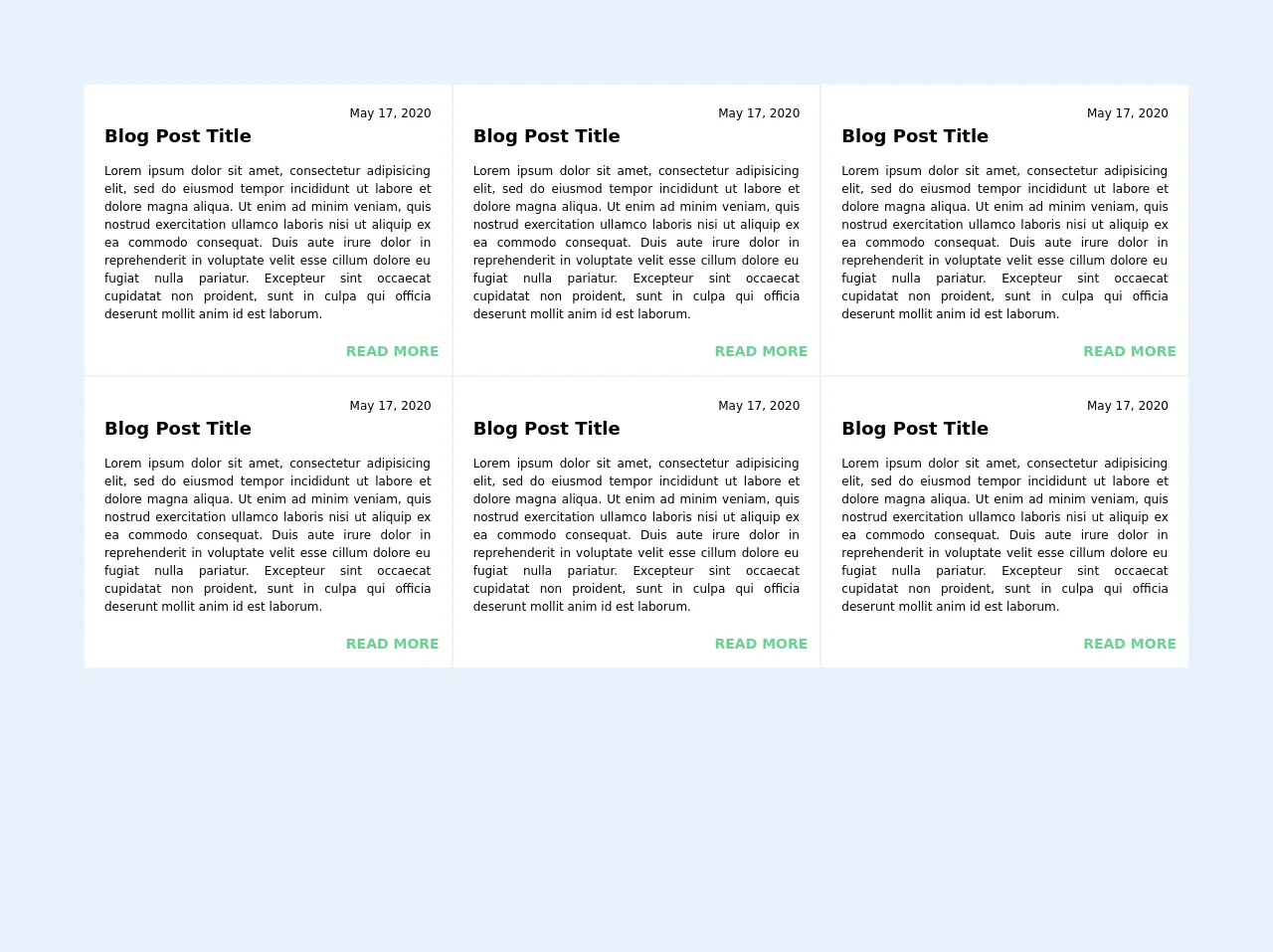
The preview of Grid Post Layout ui component
To create a Grid Post Layout with Tailwind CSS, we will use a sample set of posts. The Grid Post Layout will have a responsive design and adjust its layout based on the screen size.
Free download of the Grid Post Layout's source code
The source code of Grid Post Layout ui component
The source code for the Grid Post Layout is straightforward and easy to understand. We will use HTML and Tailwind CSS classes to create the layout.
<body class="bg-gray-100 text-gray-700  font-sans quicksand">

  <div class="p-16">
    <div class="grid md:grid-cols-2 sm:grid-cols-1 lg:grid-cols-3 m-5 mb-10">


            <div class="bg-white overflow-hidden hover:bg-green-100 border border-gray-200 p-3">
        <div class="m-2 text-justify text-sm">
            <p class="text-right text-xs">May 17, 2020</p>
            <h2 class="font-bold text-lg h-2 mb-8">Blog Post Title </h2>
            <p class="text-xs">
              Lorem ipsum dolor sit amet, consectetur adipisicing elit, sed do eiusmod tempor incididunt ut labore et dolore magna aliqua. Ut enim ad minim veniam, quis nostrud exercitation ullamco laboris nisi ut aliquip ex ea commodo consequat. Duis aute irure dolor in reprehenderit in voluptate velit esse cillum dolore eu fugiat nulla pariatur. Excepteur sint occaecat cupidatat non proident, sunt in culpa qui officia deserunt mollit anim id est laborum.
            </p>

        </div>
        <div class="w-full text-right mt-4">
          <a class="text-green-400 uppercase font-bold text-sm" href="#">Read More</a>
        </div>
    </div>
          <div class="bg-white overflow-hidden hover:bg-green-100 border border-gray-200 p-3">
        <div class="m-2 text-justify text-sm">
            <p class="text-right text-xs">May 17, 2020</p>
            <h2 class="font-bold text-lg h-2 mb-8">Blog Post Title </h2>
            <p class="text-xs">
              Lorem ipsum dolor sit amet, consectetur adipisicing elit, sed do eiusmod tempor incididunt ut labore et dolore magna aliqua. Ut enim ad minim veniam, quis nostrud exercitation ullamco laboris nisi ut aliquip ex ea commodo consequat. Duis aute irure dolor in reprehenderit in voluptate velit esse cillum dolore eu fugiat nulla pariatur. Excepteur sint occaecat cupidatat non proident, sunt in culpa qui officia deserunt mollit anim id est laborum.
            </p>

        </div>
        <div class="w-full text-right mt-4">
          <a class="text-green-400 uppercase font-bold text-sm" href="#">Read More</a>
        </div>
    </div>

    </div>
  </div>

</body>
How to create a Grid Post Layout with Tailwind CSS?
Let's dive into the steps to create a Grid Post Layout with Tailwind CSS.
Step 1: Set up the HTML structure
The first step is to set up the HTML structure for the Grid Post Layout. We will create a container div with a class of "grid grid-cols-1 sm:grid-cols-2 md:grid-cols-3 lg:grid-cols-4 gap-4". This will create a grid layout with 1 column on small screens, 2 columns on medium screens, and 4 columns on large screens.
<div class="grid grid-cols-1 sm:grid-cols-2 md:grid-cols-3 lg:grid-cols-4 gap-4">
  <!-- Post Items will be added here -->
</div>
Step 2: Add the Post Items
Next, we will add the Post Items to the Grid Post Layout. We will create a div with a class of "bg-white shadow-md rounded-md overflow-hidden" for each post item. Inside the div, we will add the thumbnail image, title, author, and date.
<div class="bg-white shadow-md rounded-md overflow-hidden">
  <img src="https://via.placeholder.com/150" alt="Post Thumbnail" class="w-full h-48 object-cover">
  <div class="p-4">
    <h2 class="text-lg font-medium text-gray-800">Post Title</h2>
    <p class="text-sm font-medium text-gray-500">Author Name</p>
    <p class="text-sm font-medium text-gray-500">Date</p>
  </div>
</div>
Step 3: Add Tailwind CSS classes
Next, we will add Tailwind CSS classes to style the Post Items. We will use the "w-full" and "h-48" classes to set the width and height of the thumbnail image. We will also use the "object-cover" class to ensure that the image covers the entire container.
<img src="https://via.placeholder.com/150" alt="Post Thumbnail" class="w-full h-48 object-cover">
We will use the "text-lg" and "font-medium" classes to style the Post Title. We will use the "text-gray-800" class to set the text color to gray.
<h2 class="text-lg font-medium text-gray-800">Post Title</h2>
We will use the "text-sm" and "font-medium" classes to style the Author Name and Date. We will use the "text-gray-500" class to set the text color to gray.
<p class="text-sm font-medium text-gray-500">Author Name</p>
<p class="text-sm font-medium text-gray-500">Date</p>
Step 4: Add Hover Effect
Next, we will add a hover effect to the Post Items. We will use the "hover:bg-gray-100" class to set the background color of the Post Item to gray when the user hovers over it.
<div class="bg-white shadow-md rounded-md overflow-hidden hover:bg-gray-100">
  <!-- Post Item Content -->
</div>
Step 5: Add Responsive Design
Next, we will add responsive design to the Grid Post Layout. We will use the "sm:", "md:", and "lg:" prefixes to specify the number of columns for different screen sizes.
<div class="grid grid-cols-1 sm:grid-cols-2 md:grid-cols-3 lg:grid-cols-4 gap-4">
  <!-- Post Items will be added here -->
</div>
Step 6: Add Margin and Padding
Finally, we will add margin and padding to the Grid Post Layout. We will use the "p-4" class to add padding to the Post Items. We will use the "m-4" class to add margin to the Grid Post Layout.
<div class="grid grid-cols-1 sm:grid-cols-2 md:grid-cols-3 lg:grid-cols-4 gap-4 m-4">
  <div class="bg-white shadow-md rounded-md overflow-hidden p-4 hover:bg-gray-100">
    <!-- Post Item Content -->
  </div>
</div>
Conclusion
In this article, we discussed how to create a Grid Post Layout with Tailwind CSS in 6 easy steps. We learned about Tailwind CSS, the Grid Post Layout UI component, and why we should use Tailwind CSS to create the Grid Post Layout. We also provided a preview of the Grid Post Layout and the source code for the layout. With Tailwind CSS, creating complex layouts like the Grid Post Layout has never been easier.