- Published on
Most Effective Ways To Create A Gradient Card With Tailwind CSS
- What is Tailwind CSS?
- The description of Gradient card ui component
- Why use Tailwind CSS to create a Gradient card ui component?
- The preview of Gradient card ui component
- The source code of Gradient card ui component
- How to create a Gradient card with Tailwind CSS?
- Conclusion
What is Tailwind CSS?
Tailwind CSS is a utility-first CSS framework that helps you create custom designs quickly and efficiently. It provides a set of pre-defined CSS classes that you can use to style your HTML elements without writing any CSS code. Tailwind CSS is highly customizable and can be configured to match your project's design requirements.
The description of Gradient card ui component
A gradient card is a UI component that combines a background gradient and a card layout to create a visually appealing design. Gradient cards are commonly used in web and mobile applications to display information or images in a structured and organized way. The gradient effect adds depth and dimension to the card, making it stand out from other elements on the page.
Why use Tailwind CSS to create a Gradient card ui component?
Tailwind CSS provides a set of pre-defined gradient classes that you can use to create a gradient card quickly and easily. These classes allow you to define the gradient colors, direction, and opacity, without having to write any CSS code. Additionally, Tailwind CSS provides a responsive design system that allows you to create gradient cards that look great on all screen sizes.
The preview of Gradient card ui component
To create a gradient card with Tailwind CSS, you can use the following classes:
<div class="bg-gradient-to-r from-purple-400 via-pink-500 to-red-500 rounded-lg p-6">
  <!-- Content goes here -->
</div>
Free download of the Gradient card's source code
The source code of Gradient card ui component
To create a gradient card with Tailwind CSS, you can use the following HTML and CSS code:
<div class="gradient-card">
  <div class="gradient-card__content">
    <!-- Content goes here -->
  </div>
</div>
.gradient-card {
  background: linear-gradient(to right, #8A2387, #E94057, #F27121);
  border-radius: 0.5rem;
  padding: 2rem;
}

.gradient-card__content {
  /* Additional styling for the content */
}
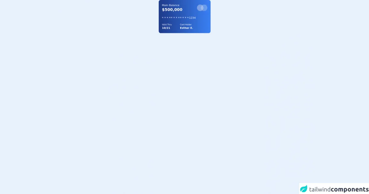
<div class=''>
    <div class='text-white max-w-xs my-auto mx-auto bg-gradient-to-r from-blue-900 to-blue-500 p-4 py-5 px-5 rounded-xl'>
        <div class="flex justify-between">
            <div>
                <h2> Main Balance </h2>
                <p class='text-2xl font-bold'> $500,000 </p>
            </div>
            <div class="flex items-center ">
                <div class='p-5 bg-gray-200 bg-opacity-40 rounded-full'></div>
                <div class='p-5 bg-gray-200 bg-opacity-30 rounded-full -ml-4'></div>
            </div>
        </div>
        <div class='mt-5 flex justify-between items-center w-52'>
            <span class='text-lg'> * * * * </span>
            <span class='text-lg'> * * * * </span>
            <span class='text-lg'> * * * * </span>
            <span> 1234 </span>
        </div>
        <div class='flex justify-between mt-5 w-48 '>
            <div>
                <h3 class="text-xs"> Valid Thru </h3>
                <p class="font-bold"> 10/21 </p>
            </div>
            <div>
                <h3 class="text-xs"> Card Holder </h3>
                <p class="font-bold"> Esther E. </p>
            </div>
        </div>
    </div>
</div>
How to create a Gradient card with Tailwind CSS?
To create a gradient card with Tailwind CSS, follow these steps:
- Create a new HTML file and add a
divelement with thebg-gradient-to-rclass. This class defines a right-to-left gradient direction.
<div class="bg-gradient-to-r"></div>
- Add the
from-andto-classes to define the gradient colors. You can also use thevia-class to add an additional color to the gradient.
<div class="bg-gradient-to-r from-purple-400 via-pink-500 to-red-500"></div>
- Add the
rounded-lgclass to round the corners of the card.
<div class="bg-gradient-to-r from-purple-400 via-pink-500 to-red-500 rounded-lg"></div>
- Add the
p-6class to add padding to the card content.
<div class="bg-gradient-to-r from-purple-400 via-pink-500 to-red-500 rounded-lg p-6">
  <!-- Content goes here -->
</div>
- Customize the gradient card by adding additional CSS classes or modifying the existing ones.
<div class="bg-gradient-to-r from-purple-400 via-pink-500 to-red-500 rounded-lg p-6 gradient-card">
  <div class="gradient-card__content">
    <!-- Content goes here -->
  </div>
</div>
.gradient-card {
  /* Additional styling for the gradient card */
}

.gradient-card__content {
  /* Additional styling for the content */
}
Conclusion
Creating a gradient card with Tailwind CSS is a simple and effective way to add visual interest to your web or mobile application. With the pre-defined gradient classes and responsive design system, you can create gradient cards that look great on all screen sizes. Use the tips and techniques outlined in this article to create your own gradient cards with Tailwind CSS.