- Published on
Ultimate Guide: Make A Gradient Buttons With Tailwind CSS
- What is Tailwind CSS?
- The description of Gradient buttons ui component
- Why use Tailwind CSS to create a Gradient buttons ui component?
- The preview of Gradient buttons ui component
- The source code of Gradient buttons ui component
- How to create a Gradient buttons with Tailwind CSS?
- Conclusion
What is Tailwind CSS?
Tailwind CSS is a utility-first CSS framework that provides a set of pre-defined CSS classes to style HTML elements. It allows developers to quickly build responsive and customizable user interfaces without writing any CSS code from scratch.
The description of Gradient buttons ui component
Gradient buttons are a popular UI component used in web applications. They provide a modern and sleek look to the user interface. Gradient buttons are typically used for call-to-action buttons, sign-up buttons, and other important actions that require user attention.
Why use Tailwind CSS to create a Gradient buttons ui component?
Tailwind CSS provides a set of pre-defined utility classes that can be used to create gradient buttons quickly and easily. This saves time and effort for developers who want to create a modern and responsive user interface.
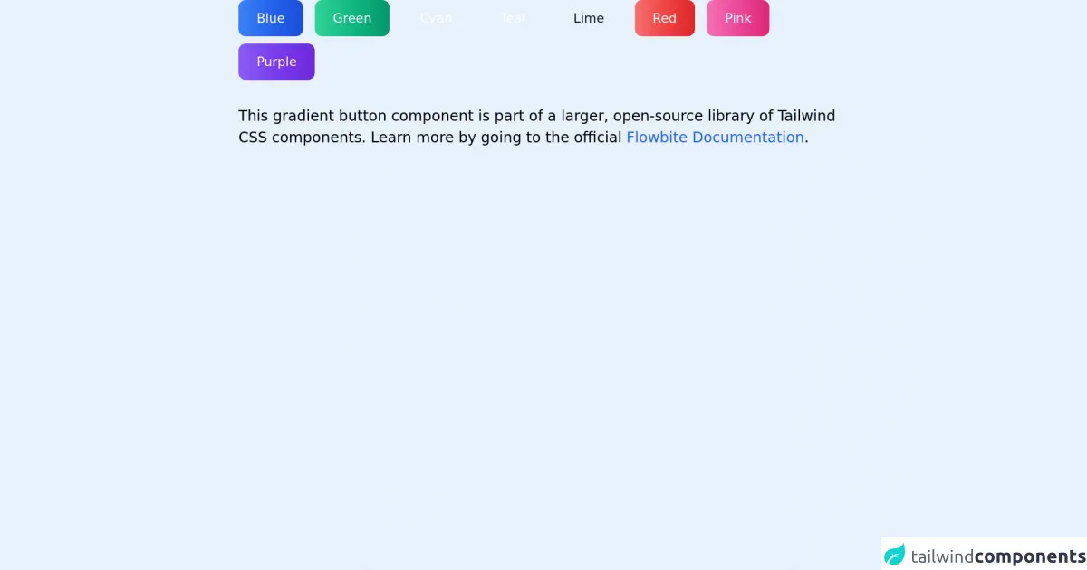
The preview of Gradient buttons ui component
To create gradient buttons with Tailwind CSS, we can use the bg-gradient-to-r class to define the gradient direction and colors. We can also use the hover and focus classes to add hover and focus effects to the buttons.
Free download of the Gradient buttons's source code
The source code of Gradient buttons ui component
To create gradient buttons with Tailwind CSS, we can use the following HTML and CSS code:
<!-- This is an example component -->
<div class="max-w-2xl mx-auto">

	<button type="button" class="text-white bg-gradient-to-r from-blue-500 via-blue-600 to-blue-700 hover:bg-gradient-to-br focus:ring-4 focus:ring-blue-300 dark:focus:ring-blue-800 font-medium rounded-lg text-sm px-5 py-2.5 text-center mr-2 mb-2">Blue</button>
	<button type="button" class="text-white bg-gradient-to-r from-green-400 via-green-500 to-green-600 hover:bg-gradient-to-br focus:ring-4 focus:ring-green-300 dark:focus:ring-green-800 font-medium rounded-lg text-sm px-5 py-2.5 text-center mr-2 mb-2">Green</button>
	<button type="button" class="text-white bg-gradient-to-r from-cyan-400 via-cyan-500 to-cyan-600 hover:bg-gradient-to-br focus:ring-4 focus:ring-cyan-300 dark:focus:ring-cyan-800 font-medium rounded-lg text-sm px-5 py-2.5 text-center mr-2 mb-2">Cyan</button>
	<button type="button" class="text-white bg-gradient-to-r from-teal-400 via-teal-500 to-teal-600 hover:bg-gradient-to-br focus:ring-4 focus:ring-teal-300 dark:focus:ring-teal-800 font-medium rounded-lg text-sm px-5 py-2.5 text-center mr-2 mb-2">Teal</button>
	<button type="button" class="text-gray-900 bg-gradient-to-r from-lime-200 via-lime-400 to-lime-500 hover:bg-gradient-to-br focus:ring-4 focus:ring-lime-300 dark:focus:ring-lime-800 font-medium rounded-lg text-sm px-5 py-2.5 text-center mr-2 mb-2">Lime</button>
	<button type="button" class="text-white bg-gradient-to-r from-red-400 via-red-500 to-red-600 hover:bg-gradient-to-br focus:ring-4 focus:ring-red-300 dark:focus:ring-red-800 font-medium rounded-lg text-sm px-5 py-2.5 text-center mr-2 mb-2">Red</button>
	<button type="button" class="text-white bg-gradient-to-r from-pink-400 via-pink-500 to-pink-600 hover:bg-gradient-to-br focus:ring-4 focus:ring-pink-300 dark:focus:ring-pink-800 font-medium rounded-lg text-sm px-5 py-2.5 text-center mr-2 mb-2">Pink</button>
	<button type="button" class="text-white bg-gradient-to-r from-purple-500 via-purple-600 to-purple-700 hover:bg-gradient-to-br focus:ring-4 focus:ring-purple-300 dark:focus:ring-purple-800 font-medium rounded-lg text-sm px-5 py-2.5 text-center mr-2 mb-2">Purple</button>

	<p class="mt-5">This gradient button component is part of a larger, open-source library of Tailwind CSS components. Learn more by going to the official <a class="text-blue-600 hover:underline" href="https://flowbite.com/docs/getting-started/introduction/" target="_blank">Flowbite Documentation</a>.
	</p>
</div>
How to create a Gradient buttons with Tailwind CSS?
To create gradient buttons with Tailwind CSS, follow these steps:
- Create a new HTML file and add a button element.
<button class="bg-gradient-to-r from-purple-400 to-pink-500 hover:from-pink-500 hover:to-purple-400 focus:outline-none focus:ring-2 focus:ring-purple-600 focus:ring-opacity-50 text-white font-bold py-2 px-4 rounded">
  Gradient Button
</button>
Add the
bg-gradient-to-rclass to the button element to define the gradient direction and colors. In this example, we use thefrom-purple-400class to set the starting color to purple and theto-pink-500class to set the ending color to pink.Add the
hoverandfocusclasses to add hover and focus effects to the button. In this example, we use thehover:from-pink-500class to change the starting color to pink on hover and thehover:to-purple-400class to change the ending color to purple on hover. We also use thefocus:outline-noneclass to remove the default focus outline, thefocus:ring-2class to add a focus ring with a width of 2 pixels, thefocus:ring-purple-600class to set the focus ring color to purple, and thefocus:ring-opacity-50class to set the focus ring opacity to 50%.Add the
text-whiteclass to set the text color to white, thefont-boldclass to set the font weight to bold, thepy-2class to set the vertical padding to 0.5rem, thepx-4class to set the horizontal padding to 1rem, and theroundedclass to add rounded corners to the button.
Conclusion
In this article, we have learned how to create gradient buttons with Tailwind CSS. We have seen how Tailwind CSS provides a set of pre-defined utility classes that can be used to create modern and responsive user interfaces quickly and easily. By using the bg-gradient-to-r class and the hover and focus classes, we can create gradient buttons that provide a sleek and modern look to our web applications.