- Published on
How to Create A Glassmorphism With Tailwind CSS?
- What is Tailwind CSS?
- The description of Glassmorphism ui component
- Why use Tailwind CSS to create a Glassmorphism ui component?
- The preview of Glassmorphism ui component
- The source code of Glassmorphism ui component
- How to create a Glassmorphism with Tailwind CSS?
- Step 1: Create a container
- Step 2: Add content
- Step 3: Customize the design
- Conclusion
In recent years, Glassmorphism has become a popular trend in UI design. It is a design style that uses transparent and blurred objects to create a glass-like effect. In this article, we will explore how to create a Glassmorphism UI component with Tailwind CSS.
What is Tailwind CSS?
Tailwind CSS is a utility-first CSS framework that provides a set of pre-defined classes to help you quickly build custom user interfaces. It allows you to create complex layouts and designs without writing any custom CSS. Tailwind CSS is a popular choice among developers due to its flexibility and ease of use.
The description of Glassmorphism ui component
Glassmorphism is a UI design trend that uses transparent and blurred objects to create a glass-like effect. It is a modern and sleek design style that has become increasingly popular in recent years. Glassmorphism can be used to create a variety of UI components, such as buttons, cards, and modals.
Why use Tailwind CSS to create a Glassmorphism ui component?
Tailwind CSS provides a set of pre-defined classes that can be used to create a Glassmorphism UI component quickly. It allows you to create complex designs without writing any custom CSS. Tailwind CSS also provides a range of utilities for working with colors, gradients, and shadows, which are essential for creating a Glassmorphism effect.
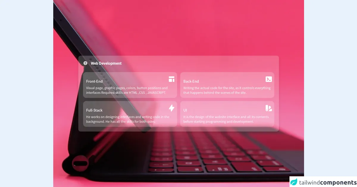
The preview of Glassmorphism ui component
To create a Glassmorphism UI component, we will use Tailwind CSS to create a transparent and blurred background. We will also add a border and a box-shadow to create a glass-like effect. Here is a preview of what our Glassmorphism UI component will look like:
Free download of the Glassmorphism's source code
The source code of Glassmorphism ui component
To create a Glassmorphism UI component, we will use HTML and Tailwind CSS. Here is the source code for our Glassmorphism UI component:
<style>
	@import url('https://fonts.googleapis.com/css2?family=Noto+Sans+JP:wght@300;400;500&display=swap');

	* {
		font-family: 'Noto Sans JP', sans-serif;
	}

	.bg-app {
		background-image: url('https://images.unsplash.com/photo-1589070127509-ea788341cc5b?ixlib=rb-1.2.1&ixid=MnwxMjA3fDB8MHxwaG90by1wYWdlfHx8fGVufDB8fHx8&auto=format&fit=crop&w=889&q=80');
	}
</style>
<div class="flex flex-row justify-center items-center min-h-screen bg-app bg-center bg-no-repeat bg-cover">
	<main
		class="flex flex-col lg:flex-row bg-white backdrop-filter backdrop-blur-lg bg-opacity-20 rounded-xl overflow-hidden w-full max-w-5xl shadow-lg m-4 lg:m-6">
		<div class="flex-1 p-4 lg:p-6">
			<div class="text-lg text-white mb-8 flex items-center">
				<svg class="w-6 h-6" fill="currentColor" viewBox="0 0 20 20" xmlns="http://www.w3.org/2000/svg">
					<path fill-rule="evenodd"
						d="M4.083 9h1.946c.089-1.546.383-2.97.837-4.118A6.004 6.004 0 004.083 9zM10 2a8 8 0 100 16 8 8 0 000-16zm0 2c-.076 0-.232.032-.465.262-.238.234-.497.623-.737 1.182-.389.907-.673 2.142-.766 3.556h3.936c-.093-1.414-.377-2.649-.766-3.556-.24-.56-.5-.948-.737-1.182C10.232 4.032 10.076 4 10 4zm3.971 5c-.089-1.546-.383-2.97-.837-4.118A6.004 6.004 0 0115.917 9h-1.946zm-2.003 2H8.032c.093 1.414.377 2.649.766 3.556.24.56.5.948.737 1.182.233.23.389.262.465.262.076 0 .232-.032.465-.262.238-.234.498-.623.737-1.182.389-.907.673-2.142.766-3.556zm1.166 4.118c.454-1.147.748-2.572.837-4.118h1.946a6.004 6.004 0 01-2.783 4.118zm-6.268 0C6.412 13.97 6.118 12.546 6.03 11H4.083a6.004 6.004 0 002.783 4.118z"
						clip-rule="evenodd"></path>
				</svg>
				<div class="ml-4 font-bold">Web Development</div>
			</div>
			<div class="grid grid-rows-4 grid-cols-1 gap-4 md:grid-rows-2 md:grid-cols-2">
				<div
					class="rounded-2xl bg-white backdrop-filter backdrop-blur-lg bg-opacity-20 p-4 flex flex-col relative undefined">
					<div class="text-white absolute right-2">
						<svg class="w-10 h-10" fill="currentColor" viewBox="0 0 20 20"
							xmlns="http://www.w3.org/2000/svg">
							<path
								d="M3 4a1 1 0 011-1h12a1 1 0 011 1v2a1 1 0 01-1 1H4a1 1 0 01-1-1V4zM3 10a1 1 0 011-1h6a1 1 0 011 1v6a1 1 0 01-1 1H4a1 1 0 01-1-1v-6zM14 9a1 1 0 00-1 1v6a1 1 0 001 1h2a1 1 0 001-1v-6a1 1 0 00-1-1h-2z">
							</path>
						</svg>
					</div>
					<div class="text-white text-lg font-medium mb-2 mt-4">Front-End</div>
					<div class="text-white font-normal">Visual page, graphic pages, colors, button positions and
						interfaces Required skills are HTML ,CSS , JAVASCRIPT.</div>
				</div>
				<div
					class="rounded-2xl bg-white backdrop-filter backdrop-blur-lg bg-opacity-20 p-4 flex flex-col relative undefined">
					<div class="text-white absolute right-2">
						<svg class="w-10 h-10" fill="currentColor" viewBox="0 0 20 20"
							xmlns="http://www.w3.org/2000/svg">
							<path fill-rule="evenodd"
								d="M2 5a2 2 0 012-2h12a2 2 0 012 2v10a2 2 0 01-2 2H4a2 2 0 01-2-2V5zm3.293 1.293a1 1 0 011.414 0l3 3a1 1 0 010 1.414l-3 3a1 1 0 01-1.414-1.414L7.586 10 5.293 7.707a1 1 0 010-1.414zM11 12a1 1 0 100 2h3a1 1 0 100-2h-3z"
								clip-rule="evenodd"></path>
						</svg>
					</div>
					<div class="text-white text-lg font-medium mb-2 mt-4">Back-End</div>
					<div class="text-white font-normal">Writing the actual code for the site, as it controls everything
						that happens behind the scenes of the site.</div>
				</div>
				<div
					class="rounded-2xl bg-white backdrop-filter backdrop-blur-lg bg-opacity-20 p-4 flex flex-col relative undefined">
					<div class="text-white absolute right-2">
						<svg class="w-10 h-10" fill="currentColor" viewBox="0 0 20 20"
							xmlns="http://www.w3.org/2000/svg">
							<path fill-rule="evenodd"
								d="M11.3 1.046A1 1 0 0112 2v5h4a1 1 0 01.82 1.573l-7 10A1 1 0 018 18v-5H4a1 1 0 01-.82-1.573l7-10a1 1 0 011.12-.38z"
								clip-rule="evenodd"></path>
						</svg> </div>
					<div class="text-white text-lg font-medium mb-2 mt-4">Full-Stack</div>
					<div class="text-white font-normal">He works on designing interfaces and writing code in the
						background. He has all the skills for both sides.</div>
				</div>
				<div
					class="rounded-2xl bg-white backdrop-filter backdrop-blur-lg bg-opacity-20 p-4 flex flex-col relative undefined">
					<div class="text-white absolute right-2">
						<svg class="w-10 h-10" fill="currentColor" viewBox="0 0 20 20"
							xmlns="http://www.w3.org/2000/svg">
							<path fill-rule="evenodd"
								d="M4 2a2 2 0 00-2 2v11a3 3 0 106 0V4a2 2 0 00-2-2H4zm1 14a1 1 0 100-2 1 1 0 000 2zm5-1.757l4.9-4.9a2 2 0 000-2.828L13.485 5.1a2 2 0 00-2.828 0L10 5.757v8.486zM16 18H9.071l6-6H16a2 2 0 012 2v2a2 2 0 01-2 2z"
								clip-rule="evenodd"></path>
						</svg>
					</div>
					<div class="text-white text-lg font-medium mb-2 mt-4">UI</div>
					<div class="text-white font-normal">It is the design of the website interface and all its contents
						before starting programming and development.</div>
				</div>
			</div>
		</div>
	</main>
</div>
How to create a Glassmorphism with Tailwind CSS?
To create a Glassmorphism UI component with Tailwind CSS, follow these steps:
Step 1: Create a container
The first step is to create a container for our Glassmorphism UI component. We will use the div element and give it a class of bg-white bg-opacity-25 backdrop-filter backdrop-blur-md border border-gray-300 rounded-lg p-6.
<div class="bg-white bg-opacity-25 backdrop-filter backdrop-blur-md border border-gray-300 rounded-lg p-6">
  <!-- Content goes here -->
</div>
Step 2: Add content
Next, we will add content to our Glassmorphism UI component. This can be any HTML content, such as text, images, or other UI components.
<div class="bg-white bg-opacity-25 backdrop-filter backdrop-blur-md border border-gray-300 rounded-lg p-6">
  <h2 class="text-2xl font-bold mb-4">Glassmorphism UI Component</h2>
  <p class="text-gray-500">This is a Glassmorphism UI component created with Tailwind CSS.</p>
  <button class="bg-blue-500 hover:bg-blue-600 text-white font-bold py-2 px-4 rounded mt-4">Click me</button>
</div>
Step 3: Customize the design
Finally, we can customize the design of our Glassmorphism UI component by adjusting the Tailwind CSS classes. We can change the background color, border color, and box-shadow to create different variations of the Glassmorphism effect.
<div class="bg-gray-100 bg-opacity-25 backdrop-filter backdrop-blur-md border border-gray-400 rounded-lg p-6 shadow-lg">
  <h2 class="text-2xl font-bold mb-4">Glassmorphism UI Component</h2>
  <p class="text-gray-500">This is a Glassmorphism UI component created with Tailwind CSS.</p>
  <button class="bg-blue-500 hover:bg-blue-600 text-white font-bold py-2 px-4 rounded mt-4">Click me</button>
</div>
Conclusion
In this article, we have explored how to create a Glassmorphism UI component with Tailwind CSS. We have learned that Tailwind CSS provides a set of pre-defined classes that can be used to create complex designs quickly. We have also seen how to customize the design of our Glassmorphism UI component by adjusting the Tailwind CSS classes. With these skills, you can create stunning UI designs that are both modern and sleek.