- Published on
Learn How To Make A Github - Testimony Card With Tailwind CSS Like an Expert
- What is Tailwind CSS?
- The description of Github - Testimony Card ui component
- Why use Tailwind CSS to create a Github - Testimony Card ui component?
- The preview of Github - Testimony Card ui component.
- The source code of Github - Testimony Card ui component.
- How to create a Github - Testimony Card with Tailwind CSS?
- Step 1: Set up the HTML structure
- Step 2: Style the HTML elements with Tailwind CSS
- Step 3: Add the user's data dynamically
- Conclusion
If you are a web developer or designer, you must have heard of Tailwind CSS. It is a utility-first CSS framework that helps you quickly build custom designs without writing any CSS. In this article, we will learn how to create a Github - Testimony Card with Tailwind CSS.
What is Tailwind CSS?
Tailwind CSS is a utility-first CSS framework that provides you with pre-defined classes to style your HTML elements. It is different from other CSS frameworks like Bootstrap or Foundation, which provide you with pre-built components. With Tailwind CSS, you can create custom designs without writing any CSS. You can use its pre-defined classes to style your HTML elements.
The description of Github - Testimony Card ui component
Github - Testimony Card is a UI component that is used to display testimonials or feedback from users. It is a card-like structure that contains the user's name, image, and feedback. It is a simple yet effective way to showcase your user's feedback.
Why use Tailwind CSS to create a Github - Testimony Card ui component?
Tailwind CSS provides you with pre-defined classes that you can use to style your HTML elements. It is a utility-first CSS framework that helps you quickly build custom designs without writing any CSS. With Tailwind CSS, you can create a Github - Testimony Card UI component in a few minutes.
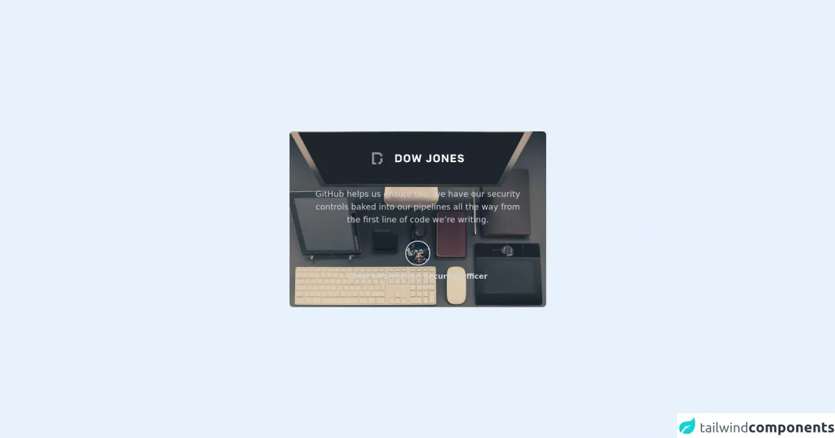
The preview of Github - Testimony Card ui component.
To create a Github - Testimony Card UI component, we will use Tailwind CSS. The final output will look like this:
Free download of the Github - Testimony Card's source code
The source code of Github - Testimony Card ui component.
To create a Github - Testimony Card UI component, we will use HTML and Tailwind CSS. Here is the source code:
<div class="h-screen flex items-center justify-center">

  <card class="relative h-[30rem] sm:h-96 w-[35rem] rounded-lg">

    <!-- Background Image -->
    <img src="https://picsum.photos/seed/1840/1000/600" class="object-cover w-full h-full rounded-lg" />

    <!-- Content -->
    <div class="absolute w-full h-full bottom-0 bg-gradient-to-r from-fuchsia-700/30 to-violet-700 rounded-lg flex flex-col items-center justify-center text-center">

        <!-- Company Logo -->
        <img src="https://github.githubassets.com/images/modules/site/enterprise/launchpad/logos/logo-dowjones.svg" />

        <!-- Quotes -->
        <p class="text-lg px-14 text-gray-300 mt-10">
          GitHub helps us ensure that we have our security controls baked into our pipelines all the way from the first line of code we’re writing.
        </p>

        <!-- Photo -->
        <img src="https://picsum.photos/50/50" class="rounded-full border-2 mt-8" />

        <!-- Title -->
        <p class="text-base font-bold px-14 text-gray-300 mt-3">
          Chief Information Security Officer
        </p>

        <p class="text-sm font-light px-14 text-gray-300 ">
          Dow Jones
        </p>

    </div>

  </card>

</div>
How to create a Github - Testimony Card with Tailwind CSS?
To create a Github - Testimony Card UI component with Tailwind CSS, follow these steps:
Step 1: Set up the HTML structure
First, we need to set up the HTML structure for the Github - Testimony Card. We will use the following HTML structure:
<div class="max-w-sm rounded overflow-hidden shadow-lg">
  <img class="w-full" src="https://via.placeholder.com/150" alt="user image">
  <div class="px-6 py-4">
    <div class="font-bold text-xl mb-2">John Doe</div>
    <p class="text-gray-700 text-base">
      Lorem ipsum dolor sit amet, consectetur adipiscing elit. Sed do eiusmod tempor incididunt ut labore et dolore magna aliqua.
    </p>
  </div>
</div>
In this HTML structure, we have used the max-w-sm class to set the maximum width of the card to sm (small) size. We have also used the rounded class to round the corners of the card. The overflow-hidden class is used to hide the overflow content of the card. The shadow-lg class is used to add a shadow effect to the card.
Inside the card, we have used an img tag to display the user's image. We have used the w-full class to set the width of the image to full. We have also used the px-6 and py-4 classes to add padding to the card's content.
Step 2: Style the HTML elements with Tailwind CSS
Now, we will use Tailwind CSS classes to style our HTML elements. We will use the following classes to style our HTML elements:
/* Style the card */
.max-w-sm {
  width: 20rem;
}

/* Style the user's image */
img {
  height: 10rem;
  object-fit: cover;
}

/* Style the card's content */
.py-4 {
  padding-top: 1.5rem;
  padding-bottom: 1.5rem;
}

/* Style the user's name */
.font-bold {
  font-weight: 700;
}

/* Style the user's feedback */
.text-gray-700 {
  color: #4a5568;
}
In this CSS code, we have used the max-w-sm class to set the width of the card to 20rem. We have also used the img tag to set the height of the user's image to 10rem and used the object-fit: cover property to fit the image inside the card.
We have used the py-4 class to add padding to the card's content. We have also used the font-bold class to make the user's name bold and used the text-gray-700 class to set the color of the user's feedback to #4a5568.
Step 3: Add the user's data dynamically
Finally, we need to add the user's data dynamically to the Github - Testimony Card. We can do this by using JavaScript or a templating engine like Handlebars or Mustache.
Here is an example of how to add the user's data dynamically using JavaScript:
<div class="max-w-sm rounded overflow-hidden shadow-lg">
  <img class="w-full" src="https://via.placeholder.com/150" alt="user image">
  <div class="px-6 py-4">
    <div class="font-bold text-xl mb-2" id="user-name"></div>
    <p class="text-gray-700 text-base" id="user-feedback"></p>
  </div>
</div>

<script>
  const user = {
    name: 'John Doe',
    image: 'https://via.placeholder.com/150',
    feedback: 'Lorem ipsum dolor sit amet, consectetur adipiscing elit. Sed do eiusmod tempor incididunt ut labore et dolore magna aliqua.'
  }

  document.getElementById('user-name').textContent = user.name
  document.getElementById('user-feedback').textContent = user.feedback
  document.querySelector('img').setAttribute('src', user.image)
</script>
In this example, we have created a user object that contains the user's name, image, and feedback. We have used JavaScript to add the user's data dynamically to the Github - Testimony Card. We have used the textContent property to set the user's name and feedback. We have also used the setAttribute method to set the user's image.
Conclusion
In this article, we have learned how to create a Github - Testimony Card with Tailwind CSS. We have used HTML and Tailwind CSS to create the card and added the user's data dynamically using JavaScript. Tailwind CSS provides you with pre-defined classes that you can use to style your HTML elements. It is a utility-first CSS framework that helps you quickly build custom designs without writing any CSS.