- Published on
Advanced Guide: Create A Labeled Tag With Tailwind CSS
- What is Tailwind CSS?
- The description of labeled tag ui component
- Why use Tailwind CSS to create a labeled tag ui component?
- The preview of labeled tag ui component
- The source code of labeled tag ui component
- How to create a labeled tag with Tailwind CSS?
- Conclusion
As a FrontEnd technology blogger, it is important to keep up with the latest trends and tools in the industry. Tailwind CSS is one of the most popular CSS frameworks that has gained a lot of attention in recent years. In this article, we will explore how to create a labeled tag ui component using Tailwind CSS.
What is Tailwind CSS?
Tailwind CSS is a utility-first CSS framework that provides pre-defined classes to style your HTML elements. It allows you to build custom designs without writing any CSS code. With Tailwind CSS, you can easily create responsive designs, customize colors, and typography.
The description of labeled tag ui component
A labeled tag is a UI component that displays a label or a tag with a background color. It is commonly used to categorize or label items. The labeled tag UI component consists of a label and a background color.
Why use Tailwind CSS to create a labeled tag ui component?
Tailwind CSS provides pre-defined classes that make it easy to create a labeled tag UI component. It also allows you to customize the colors, typography, and other properties of the labeled tag UI component. With Tailwind CSS, you can create a labeled tag UI component that is responsive and accessible.
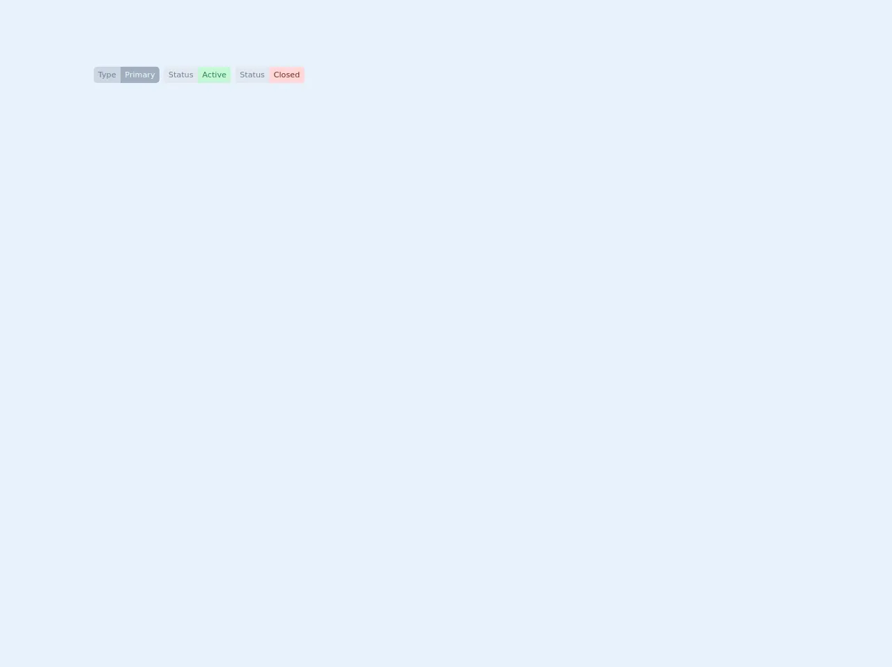
The preview of labeled tag ui component
To create a labeled tag UI component, we will use Tailwind CSS classes. The labeled tag UI component consists of a label and a background color. Here is a preview of what the labeled tag UI component will look like:
Free download of the labeled tag's source code
The source code of labeled tag ui component
To create a labeled tag UI component, we will use the following Tailwind CSS classes:
bg-blue-500: This class sets the background color of the labeled tag to blue.text-white: This class sets the text color of the labeled tag to white.rounded-full: This class sets the border radius of the labeled tag to a full circle.px-3: This class sets the horizontal padding of the labeled tag to 3.py-1: This class sets the vertical padding of the labeled tag to 1.text-sm: This class sets the font size of the labeled tag to small.font-semibold: This class sets the font weight of the labeled tag to semi-bold.
Here is the source code for the labeled tag UI component:
<div class="flex flex-shrink-0">
  <div class="flex flex-shrink-0 text-sm items-center px-2">
    <div class="bg-gray-400 text-gray-600 px-2 py-1 rounded-l-md">Type</div>
    <div class="bg-gray-500 text-green-100 px-2 py-1 rounded-r-md">Primary</div>
  </div>

  <div class="flex flex-shrink-0 text-sm items-center pr-2">
    <div class="bg-gray-300 text-gray-600 px-2 py-1 rounded-l">Status</div>
    <div class="bg-green-200 text-green-700 px-2 py-1 rounded-r">Active</div>
  </div>

  <div class="flex flex-shrink-0 text-sm items-center pr-2">
    <div class="bg-gray-300 text-gray-600 px-2 py-1 rounded-l">Status</div>
    <div class="bg-red-200 text-red-900 px-2 py-1 rounded-r">Closed</div>
  </div>
</div>
How to create a labeled tag with Tailwind CSS?
To create a labeled tag UI component with Tailwind CSS, follow these steps:
- Create a new HTML file and add the following code:
<!DOCTYPE html>
<html lang="en">
<head>
  <meta charset="UTF-8">
  <title>Labeled Tag UI Component</title>
  <link rel="stylesheet" href="https://cdn.jsdelivr.net/npm/[email protected]/dist/tailwind.min.css">
</head>
<body>
  <div class="bg-blue-500 text-white rounded-full px-3 py-1 text-sm font-semibold">Label</div>
</body>
</html>
Save the file and open it in your web browser. You should see a labeled tag UI component with the label "Label" and a blue background color.
To customize the labeled tag UI component, you can modify the Tailwind CSS classes. For example, to change the background color to red, you can replace
bg-blue-500withbg-red-500.
<div class="bg-red-500 text-white rounded-full px-3 py-1 text-sm font-semibold">Label</div>
- Save the file and refresh your web browser. You should see a labeled tag UI component with the label "Label" and a red background color.
Conclusion
In this article, we have learned how to create a labeled tag UI component using Tailwind CSS. Tailwind CSS provides pre-defined classes that make it easy to create a labeled tag UI component that is responsive and accessible. With Tailwind CSS, you can customize the colors, typography, and other properties of the labeled tag UI component to match your design requirements.