- Published on
Surprisingly Effective Ways To Make A Github Profile Card With Tailwind CSS
- What is Tailwind CSS?
- The description of Github profile card UI component
- Why use Tailwind CSS to create a Github profile card UI component?
- The preview of Github profile card UI component
- The source code of Github profile card UI component
- How to create a Github profile card with Tailwind CSS?
- Step 1: Set up your HTML structure
- Step 2: Style the card using Tailwind CSS
- Step 3: Customize the card
- Conclusion
As a FrontEnd technology blogger, it's important to stay up-to-date with the latest tools and techniques. One such tool that has gained a lot of popularity in recent years is Tailwind CSS. Tailwind CSS is a utility-first CSS framework that allows you to quickly build custom designs without writing any CSS.
In this article, we will explore how to use Tailwind CSS to create a Github profile card UI component. We will cover the benefits of using Tailwind CSS, the preview and source code of the Github profile card, and a step-by-step guide on how to create it.
What is Tailwind CSS?
Tailwind CSS is a utility-first CSS framework that provides a set of pre-defined classes that you can use to style your HTML elements. It is designed to be highly customizable and allows you to create custom designs without writing any CSS.
Tailwind CSS provides a large number of utility classes that cover everything from typography to layout. You can use these classes to quickly style your HTML elements and create custom designs.
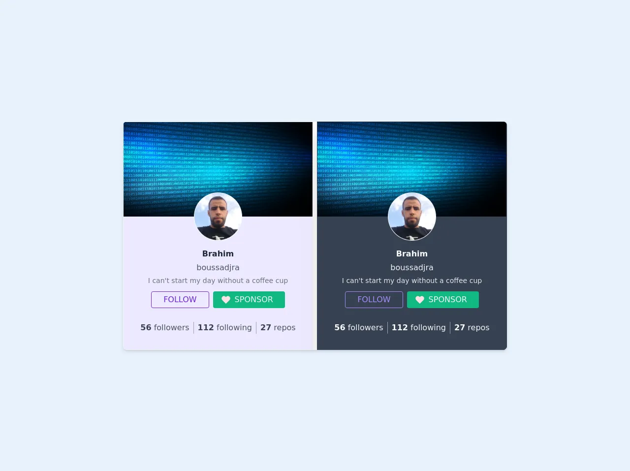
The description of Github profile card UI component
A Github profile card UI component is a card that displays a user's Github profile information. It typically includes the user's profile picture, name, bio, and social media links.
The Github profile card UI component is a common UI element that is used on many websites and applications. It provides a quick and easy way for users to view a user's Github profile information without having to navigate to the Github website.
Why use Tailwind CSS to create a Github profile card UI component?
Tailwind CSS provides a number of benefits when it comes to creating a Github profile card UI component. Here are a few reasons why you should consider using Tailwind CSS:
- Speed: Tailwind CSS allows you to quickly create custom designs without writing any CSS. This can save you a lot of time and effort when it comes to building your Github profile card UI component.
- Flexibility: Tailwind CSS provides a large number of utility classes that cover everything from typography to layout. This allows you to create custom designs that are highly flexible and can be easily modified.
- Consistency: Tailwind CSS provides a consistent set of utility classes that can be used throughout your project. This helps to ensure that your Github profile card UI component is consistent with the rest of your project.
The preview of Github profile card UI component
Free download of the github profile card's source code
The source code of Github profile card UI component
<!-- This is an example component -->
<div>
	<div class='flex space-x-2 w-full bg-white shadow-md rounded-lg overflow-hidden mx-auto'>
		<div
			class="card  min-w-sm border border-gray-100 bg-purple-100   transition-shadow shadow-xl hover:shadow-xl min-w-max">
			<!---->
			<div class="w-full card__media"><img src="https://image.freepik.com/free-vector/abstract-binary-code-techno-background_1048-12836.jpg" class="h-48 w-96"></div>
				<div class="  card__media--aside "></div>
				<div class="flex items-center p-4">
					<div class="relative flex flex-col items-center w-full">
						<div
							class="h-24 w-24 md rounded-full relative avatar flex items-end justify-end text-purple-600 min-w-max absolute -top-16 flex bg-purple-200 text-purple-100 row-start-1 row-end-3 text-purple-650 ring-1 ring-white">
							<img class="h-24 w-24 md rounded-full relative" src="https://avatars3.githubusercontent.com/u/11801238?v=4" alt="">
							<div class="absolute"></div>
						</div>
						<div class="flex flex-col space-y-1 justify-center items-center -mt-12 w-full">
							<span class="text-md whitespace-nowrap text-gray-800 font-semibold">Brahim</span><span class="text-md whitespace-nowrap text-gray-600">boussadjra</span>
							<p class="text-sm text-gray-500">
								I can't start my day without a coffee cup
							</p>
							<div class="py-2 flex space-x-2">
								<button class="flex justify-center  max-h-max whitespace-nowrap focus:outline-none  focus:ring  focus:border-blue-300 rounded max-w-max border bg-transparent border-purple-700 text-purple-700 hover:border-purple-800 hover:border-purple-800 px-4 py-1 flex items-center hover:shadow-lg"><span class="mr-2"></span>FOLLOW<span class="ml-2"></span></button><button class="flex justify-center  max-h-max whitespace-nowrap focus:outline-none  focus:ring  focus:border-blue-300 rounded max-w-max text-gray-100 bg-green-500 hover:bg-green-600 px-4 py-1 flex items-center hover:shadow-lg"><span class="mr-2"><svg height="20" width="20" viewBox="0 0 32 32" class="fill-current text-red-100"><path d="M22.5,4c-2,0-3.9,0.8-5.3,2.2L16,7.4l-1.1-1.1C12,3.3,7.2,3.3,4.3,6.2c0,0-0.1,0.1-0.1,0.1c-3,3-3,7.8,0,10.8L16,29	l11.8-11.9c3-3,3-7.8,0-10.8C26.4,4.8,24.5,4,22.5,4z"></path></svg></span>SPONSOR <span class="ml-2"></span></button>
							</div>
							<div
								class="py-4 flex justify-center items-center w-full divide-x divide-gray-400 divide-solid">
								<span class="text-center px-2"><span class="font-bold text-gray-700">56</span><span class="text-gray-600"> followers</span></span><span class="text-center px-2"><span class="font-bold text-gray-700">112</span><span class="text-gray-600"> following</span></span><span class="text-center px-2"><span class="font-bold text-gray-700">27</span><span class="text-gray-600"> repos</span></span>
							</div>
						</div>
					</div>
				</div>
				<!---->
			</div>
			<!---->
			<!---->
			<!---->
				<div
			class="card  min-w-sm border border-gray-700 bg-gray-700 text-gray-50   transition-shadow shadow-xl hover:shadow-xl min-w-max">
			<!---->
			<div class="w-full card__media"><img src="https://image.freepik.com/free-vector/abstract-binary-code-techno-background_1048-12836.jpg" class="h-48 w-96"></div>

				<div class="flex items-center p-4">
					<div class="relative flex flex-col items-center w-full">
						<div
							class="h-24 w-24 md rounded-full relative avatar flex items-end justify-end text-purple-400 min-w-max absolute -top-16 flex bg-purple-200 text-purple-100 row-start-1 row-end-3 text-purple-650 ring-1 ring-white">
							<img class="h-24 w-24 md rounded-full relative" src="https://avatars3.githubusercontent.com/u/11801238?v=4" alt="">
							<div class="absolute"></div>
						</div>
						<div class="flex flex-col space-y-1 justify-center items-center -mt-12 w-full">
							<span class="text-md whitespace-nowrap text-gray-50 font-semibold">Brahim</span><span class="text-md whitespace-nowrap text-gray-100">boussadjra</span>
							<p class="text-sm text-gray-200">
								I can't start my day without a coffee cup
							</p>
							<div class="py-2 flex space-x-2">
								<button class="flex justify-center  max-h-max whitespace-nowrap focus:outline-none  focus:ring  focus:border-blue-300 rounded max-w-max border bg-transparent border-purple-400 text-purple-400 hover:border-purple-800 hover:border-purple-500 px-4 py-1 flex items-center hover:shadow-lg"><span class="mr-2"></span>FOLLOW<span class="ml-2"></span></button><button class="flex justify-center  max-h-max whitespace-nowrap focus:outline-none  focus:ring  focus:border-blue-300 rounded max-w-max text-gray-100 bg-green-500 hover:bg-green-600 px-4 py-1 flex items-center hover:shadow-lg"><span class="mr-2"><svg height="20" width="20" viewBox="0 0 32 32" class="fill-current text-red-100"><path d="M22.5,4c-2,0-3.9,0.8-5.3,2.2L16,7.4l-1.1-1.1C12,3.3,7.2,3.3,4.3,6.2c0,0-0.1,0.1-0.1,0.1c-3,3-3,7.8,0,10.8L16,29	l11.8-11.9c3-3,3-7.8,0-10.8C26.4,4.8,24.5,4,22.5,4z"></path></svg></span>SPONSOR <span class="ml-2"></span></button>
							</div>
							<div
								class="py-4 flex justify-center items-center w-full divide-x divide-gray-400 divide-solid">
								<span class="text-center px-2"><span class="font-bold text-gray-50">56</span><span class="text-gray-100"> followers</span></span><span class="text-center px-2"><span class="font-bold text-gray-50">112</span><span class="text-gray-100"> following</span></span><span class="text-center px-2"><span class="font-bold text-gray-50">27</span><span class="text-gray-100"> repos</span></span>
							</div>
						</div>
					</div>
				</div>
				<!---->
			</div>
		</div>
	</div>
How to create a Github profile card with Tailwind CSS?
Now that we've covered the benefits of using Tailwind CSS and the preview and source code of the Github profile card UI component, let's dive into how to create it.
Step 1: Set up your HTML structure
The first step is to set up the HTML structure for your Github profile card. Here's an example:
<div class="card">
  <img class="card-img" src="https://avatars.githubusercontent.com/u/12345678?v=4" alt="Profile picture">
  <div class="card-body">
    <h2 class="card-title">John Doe</h2>
    <p class="card-text">FrontEnd Developer</p>
    <a href="#" class="card-link">Github</a>
    <a href="#" class="card-link">Twitter</a>
  </div>
</div>
Step 2: Style the card using Tailwind CSS
Next, we'll use Tailwind CSS to style the card. Here's an example:
.card {
  max-width: 400px;
  background-color: #fff;
  border: 1px solid #e5e7eb;
  border-radius: 0.5rem;
  overflow: hidden;
}

.card-img {
  width: 100%;
  height: 200px;
  object-fit: cover;
}

.card-body {
  padding: 1rem;
}

.card-title {
  font-size: 1.5rem;
  font-weight: bold;
  margin-bottom: 0.5rem;
}

.card-text {
  font-size: 1.25rem;
  margin-bottom: 1rem;
}

.card-link {
  display: inline-block;
  margin-right: 1rem;
  color: #4b5563;
  text-decoration: none;
}

.card-link:hover {
  text-decoration: underline;
}
Step 3: Customize the card
Finally, you can customize the card to match your own design preferences. Here are a few examples:
.card {
  max-width: 500px;
  background-color: #f3f4f6;
  border: none;
  border-radius: 1rem;
  overflow: hidden;
}

.card-img {
  width: 100%;
  height: 300px;
  object-fit: cover;
}

.card-body {
  padding: 2rem;
}

.card-title {
  font-size: 2rem;
  font-weight: bold;
  margin-bottom: 1rem;
}

.card-text {
  font-size: 1.5rem;
  margin-bottom: 2rem;
}

.card-link {
  display: inline-block;
  margin-right: 2rem;
  color: #6b7280;
  text-decoration: none;
}

.card-link:hover {
  text-decoration: underline;
}
Conclusion
In conclusion, Tailwind CSS is a powerful tool that can help you quickly create custom designs without writing any CSS. By using Tailwind CSS to create a Github profile card UI component, you can save time and effort while still creating a highly customizable and flexible design.
We hope this article has been helpful in showing you how to create a Github profile card UI component with Tailwind CSS. If you have any questions or comments, please feel free to leave them below.