- Published on
6 Easy Ways To Make A Github Navbar Searchbox With Tailwind CSS
- What is Tailwind CSS?
- The description of Github navbar searchbox ui component
- Why use Tailwind CSS to create a Github navbar searchbox ui component?
- The preview of Github navbar searchbox ui component.
- The source code of Github navbar searchbox ui component.
- How to create a Github navbar searchbox with Tailwind CSS?
- Conclusion
What is Tailwind CSS?
Tailwind CSS is a utility-first CSS framework that helps you to create responsive and customizable user interfaces quickly. It provides a set of pre-defined classes that you can use to style your HTML elements without writing any CSS code. Tailwind CSS is easy to learn and use, and it is compatible with all modern web browsers.
The description of Github navbar searchbox ui component
Github navbar searchbox is a UI component that allows users to search for repositories, issues, pull requests, and other content on Github. It is located at the top of the Github website, and it is one of the most frequently used features of Github.
Why use Tailwind CSS to create a Github navbar searchbox ui component?
Tailwind CSS is an excellent choice for creating Github navbar searchbox UI components because it provides a set of pre-defined classes that you can use to style your HTML elements quickly. You don't need to write any CSS code, which saves you a lot of time and effort. Tailwind CSS is also responsive, which means that your UI components will look great on all devices.
The preview of Github navbar searchbox ui component.
To create a Github navbar searchbox UI component with Tailwind CSS, you can use the following HTML code:
<div class="flex items-center justify-center">
  <div class="relative w-full max-w-xs">
    <div class="absolute inset-y-0 left-0 flex items-center pl-3">
      <svg class="w-4 h-4 fill-current text-gray-500" viewBox="0 0 16 16">
        <path
          d="M11.707,10.293c-0.391,0.391-1.023,0.391-1.414,0l-2.965-2.965C7.574,7.574,7.5,7.438,7.5,7.293V6.5c0-1.93-1.57-3.5-3.5-3.5S0.5,4.57,0.5,6.5S2.07,10,4,10c0.145,0,0.281-0.074,0.357-0.197l0.793,0.793C5.512,10.918,5.756,11,6,11s0.488-0.082,0.707-0.293l2.965,2.965C9.488,13.902,9.744,14,10,14s0.512-0.098,0.707-0.293C11.098,13.316,11.098,10.902,11.707,10.293z M4,8c-1.378,0-2.5-1.122-2.5-2.5S2.622,3,4,3s2.5,1.122,2.5,2.5S5.378,8,4,8z"
        />
      </svg>
    </div>
    <input
      class="block w-full pl-9 pr-4 py-2 rounded-md leading-5 bg-gray-100 text-gray-900 placeholder-gray-500 focus:outline-none focus:bg-white focus:placeholder-gray-400 focus:text-gray-900 sm:text-sm transition duration-150 ease-in-out"
      placeholder="Search Github"
    />
  </div>
</div>
Free download of the Github navbar searchbox's source code
The source code of Github navbar searchbox ui component.
To create a Github navbar searchbox UI component with Tailwind CSS, you can use the following HTML and Tailwind CSS code:
<div class="flex items-center justify-center">
  <div class="relative w-full max-w-xs">
    <div class="absolute inset-y-0 left-0 flex items-center pl-3">
      <svg class="w-4 h-4 fill-current text-gray-500" viewBox="0 0 16 16">
        <path
          d="M11.707,10.293c-0.391,0.391-1.023,0.391-1.414,0l-2.965-2.965C7.574,7.574,7.5,7.438,7.5,7.293V6.5c0-1.93-1.57-3.5-3.5-3.5S0.5,4.57,0.5,6.5S2.07,10,4,10c0.145,0,0.281-0.074,0.357-0.197l0.793,0.793C5.512,10.918,5.756,11,6,11s0.488-0.082,0.707-0.293l2.965,2.965C9.488,13.902,9.744,14,10,14s0.512-0.098,0.707-0.293C11.098,13.316,11.098,10.902,11.707,10.293z M4,8c-1.378,0-2.5-1.122-2.5-2.5S2.622,3,4,3s2.5,1.122,2.5,2.5S5.378,8,4,8z"
        />
      </svg>
    </div>
    <input
      class="block w-full pl-9 pr-4 py-2 rounded-md leading-5 bg-gray-100 text-gray-900 placeholder-gray-500 focus:outline-none focus:bg-white focus:placeholder-gray-400 focus:text-gray-900 sm:text-sm transition duration-150 ease-in-out"
      placeholder="Search Github"
    />
  </div>
</div>

```css
/* Tailwind CSS */
@tailwind base;
@tailwind components;
@tailwind utilities;
<style>
[x-cloak]{
display: none;
}
</style>
<div class="min-h-screen">
<nav class="py-1 text-white bg-gray-900 md:py-2 md:flex md:items-center" x-data="navbar()" x-init="init($el)">
<div class="flex items-center justify-between p-2">
<!-- Menu button -->
<button @click="toggleNavbar" class="p-1 text-gray-300 rounded-md md:hidden focus:outline-none focus:ring">
<svg class="w-8 h-8" xmlns="http://www.w3.org/2000/svg" fill="none" viewBox="0 0 24 24" stroke="currentColor">
<path stroke-linecap="round" stroke-linejoin="round" stroke-width="2" d="M4 6h16M4 12h16M4 18h16" />
</svg>
</button>
<!-- Logo -->
<a
href="https://github.com/Kamona-WD"
target="_blank"
class="inline-block text-2xl font-semibold tracking-wider text-gray-200 uppercase md:ml-3"
>
K-WD
</a>
<!-- Notification button -->
<a href="#" class="p-1 text-gray-300 rounded-md md:hidden focus:outline-none focus:ring">
<svg class="w-5 h-5" xmlns="http://www.w3.org/2000/svg" fill="none" viewBox="0 0 24 24" stroke="currentColor">
<path
stroke-linecap="round"
stroke-linejoin="round"
stroke-width="2"
d="M15 17h5l-1.405-1.405A2.032 2.032 0 0118 14.158V11a6.002 6.002 0 00-4-5.659V5a2 2 0 10-4 0v.341C7.67 6.165 6 8.388 6 11v3.159c0 .538-.214 1.055-.595 1.436L4 17h5m6 0v1a3 3 0 11-6 0v-1m6 0H9"
/>
</svg>
</a>
</div>
<div
:class="{'overflow-hidden max-h-0': !isOpen}"
class="md:max-h-full md:flex md:items-center md:overflow-visible md:flex-1"
>
<!-- Search -->
<div class="relative w-full md:max-w-max">
<form action="#" class="px-3 md:px-0">
<label class="relative">
<input
id="searchInput"
type="text"
placeholder="Search or jump to..."
x-model="searchQuery"
@focus="openSearchBox"
@blur="closeSearchBox"
autocomplete="off"
@keydown="startSearching"
class="w-full px-2 py-1 text-gray-700 transition-all bg-gray-900 border border-gray-600 rounded-md focus:outline-none focus:bg-gray-200"
:class="{'md:w-60 lg:w-96': isSearchBoxOpen, 'md:w-60':!isSearchBoxOpen}"
/>
<span
x-show="!isSearchBoxOpen"
class="absolute inset-y-0 flex items-center justify-center px-2 py-1 text-xs text-gray-500 border border-gray-500 rounded-md right-2"
>/</span
>
</label>
</form>
<div x-show="isSearchBoxOpen" class="absolute inset-x-0 px-3 -mt-1 md:px-0" x-cloak>
<div class="mx-px bg-white shadow-md rounded-b-md">
<div x-show="loading" class="flex items-center justify-center">
<h1 class="text-gray-600">Loading...</h1>
</div>
<div x-show="!loading" class="bg-white">
<ul>
<li x-show="searchQuery.length">
<a
href="#"
id="ss"
class="flex items-center p-2"
:class="{'text-white bg-blue-700': isTyping, 'text-gray-600': !isTyping}"
@mouseleave="isTyping=false"
@mouseenter="isTyping=true"
>
<!-- Search icon -->
<span>
<svg
class="w-4 h-4"
xmlns="http://www.w3.org/2000/svg"
fill="none"
viewBox="0 0 24 24"
stroke="currentColor"
>
<path
stroke-linecap="round"
stroke-linejoin="round"
stroke-width="2"
d="M21 21l-6-6m2-5a7 7 0 11-14 0 7 7 0 0114 0z"
/>
</svg>
</span>
<span class="ml-2 text-sm truncate" x-text="searchQuery"></span>
<span
class="inline-block px-2 py-1 ml-auto text-xs bg-white rounded-md"
:class="{'text-gray-600': isTyping, 'text-white': !isTyping}"
>All Github</span
>
</a>
</li>
<li>
<a href="#" class="flex items-center p-2 text-gray-600 group hover:bg-blue-700 hover:text-white">
<span>
<svg
class="w-4 h-4"
xmlns="http://www.w3.org/2000/svg"
fill="none"
viewBox="0 0 24 24"
stroke="currentColor"
>
<path
stroke-linecap="round"
stroke-linejoin="round"
stroke-width="2"
d="M3 7v10a2 2 0 002 2h14a2 2 0 002-2V9a2 2 0 00-2-2h-6l-2-2H5a2 2 0 00-2 2z"
/>
</svg>
</span>
<span class="ml-2 text-sm truncate">Kamona-WD/starter-dashboard-layout</span>
<span
class="inline-block px-2 py-1 ml-auto text-xs text-white bg-white rounded-md whitespace-nowrap group-hover:text-gray-600"
>Jumb to</span
>
</a>
</li>
<li>
<a href="#" class="flex items-center p-2 text-gray-600 group hover:text-white hover:bg-blue-700">
<span>
<svg
class="w-4 h-4"
xmlns="http://www.w3.org/2000/svg"
fill="none"
viewBox="0 0 24 24"
stroke="currentColor"
>
<path
stroke-linecap="round"
stroke-linejoin="round"
stroke-width="2"
d="M3 7v10a2 2 0 002 2h14a2 2 0 002-2V9a2 2 0 00-2-2h-6l-2-2H5a2 2 0 00-2 2z"
/>
</svg>
</span>
<span class="ml-2 text-sm truncate">Kamona-WD/fortify-bootstrap</span>
<span
class="inline-block px-2 py-1 ml-auto text-xs text-white bg-white rounded-md whitespace-nowrap group-hover:text-gray-600"
>Jumb to</span
>
</a>
</li>
<li>
<a href="#" class="flex items-center p-2 text-gray-600 group hover:text-white hover:bg-blue-700">
<span>
<svg
class="w-4 h-4"
xmlns="http://www.w3.org/2000/svg"
fill="none"
viewBox="0 0 24 24"
stroke="currentColor"
>
<path
stroke-linecap="round"
stroke-linejoin="round"
stroke-width="2"
d="M3 7v10a2 2 0 002 2h14a2 2 0 002-2V9a2 2 0 00-2-2h-6l-2-2H5a2 2 0 00-2 2z"
/>
</svg>
</span>
<span class="ml-2 text-sm truncate">Kamona-WD/fortify-windmill</span>
<span
class="inline-block px-2 py-1 ml-auto text-xs text-white bg-white rounded-md whitespace-nowrap group-hover:text-gray-600"
>Jumb to</span
>
</a>
</li>
<li>
<a href="#" class="flex items-center p-2 text-gray-600 group hover:text-white hover:bg-blue-700">
<span>
<svg
class="w-4 h-4"
xmlns="http://www.w3.org/2000/svg"
fill="none"
viewBox="0 0 24 24"
stroke="currentColor"
>
<path
stroke-linecap="round"
stroke-linejoin="round"
stroke-width="2"
d="M3 7v10a2 2 0 002 2h14a2 2 0 002-2V9a2 2 0 00-2-2h-6l-2-2H5a2 2 0 00-2 2z"
/>
</svg>
</span>
<span class="ml-2 text-sm truncate">Kamona-WD/tailwindcss-directions</span>
<span
class="inline-block px-2 py-1 ml-auto text-xs text-white bg-white rounded-md whitespace-nowrap group-hover:text-gray-600"
>Jumb to</span
>
</a>
</li>
</ul>
</div>
</div>
</div>
</div>
<!-- Links -->
<ul
class="mx-3 mt-4 border-t border-gray-700 divide-y divide-gray-700 md:mx-1 md:flex md:items-center md:space-x-1 md:border-none md:divide-y-0 md:mt-0"
>
<li class="md:hidden">
<a
href="#"
class="inline-flex py-2 font-medium transition-colors md:p-2 md:rounded-md hover:text-gray-400 focus:text-gray-400 focus:outline-none md:focus:ring"
>Dashboard</a
>
</li>
<li class="">
<a
href="#"
class="inline-flex py-2 font-medium transition-colors md:text-sm whitespace-nowrap md:p-1 md:rounded-md hover:text-gray-400 focus:text-gray-400 focus:outline-none md:focus:ring"
>Pull requests</a
>
</li>
<li class="">
<a
href="#"
class="inline-flex py-2 font-medium transition-colors md:text-sm whitespace-nowrap md:p-1 md:rounded-md hover:text-gray-400 focus:text-gray-400 focus:outline-none md:focus:ring"
>Issues</a
>
</li>
<li class="">
<a
href="#"
class="inline-flex py-2 font-medium transition-colors md:text-sm whitespace-nowrap md:p-1 md:rounded-md hover:text-gray-400 focus:text-gray-400 focus:outline-none md:focus:ring"
>Marketplace</a
>
</li>
<li class="">
<a
href="#"
class="inline-flex py-2 font-medium transition-colors md:text-sm whitespace-nowrap md:p-1 md:rounded-md hover:text-gray-400 focus:text-gray-400 focus:outline-none md:focus:ring"
>Explore</a
>
</li>
<li class="md:hidden">
<a
href="#"
class="inline-flex py-2 font-medium transition-colors md:p-1 md:rounded-md hover:text-gray-400 focus:text-gray-400 focus:outline-none md:focus:ring"
>Settings</a
>
</li>
</ul>
<ul class="flex-shrink-0 mx-3 md:ml-auto md:px-3 md:flex md:items-center md:space-x-2">
<li class="hidden md:block">
<a href="#" class="text-gray-300 rounded-md focus:outline-none focus:ring">
<svg
class="w-5 h-5"
xmlns="http://www.w3.org/2000/svg"
fill="none"
viewBox="0 0 24 24"
stroke="currentColor"
>
<path
stroke-linecap="round"
stroke-linejoin="round"
stroke-width="2"
d="M15 17h5l-1.405-1.405A2.032 2.032 0 0118 14.158V11a6.002 6.002 0 00-4-5.659V5a2 2 0 10-4 0v.341C7.67 6.165 6 8.388 6 11v3.159c0 .538-.214 1.055-.595 1.436L4 17h5m6 0v1a3 3 0 11-6 0v-1m6 0H9"
/>
</svg>
</a>
</li>
<li class="hidden md:block">
<a href="#" class="flex items-center rounded-md focus:outline-none focus:ring">
<span class="">
<!-- plus icon -->
<svg
class="w-6 h-6 text-gray-300"
xmlns="http://www.w3.org/2000/svg"
fill="none"
viewBox="0 0 24 24"
stroke="currentColor"
>
<path
stroke-linecap="round"
stroke-linejoin="round"
stroke-width="2"
d="M12 6v6m0 0v6m0-6h6m-6 0H6"
/>
</svg>
</span>
<span
class="inline-block w-0 h-0"
style="
vertical-align: middle;
content: '';
border-top-style: solid;
border-top-width: 4px;
border-right: 4px solid transparent;
border-bottom: 0 solid transparent;
border-left: 4px solid transparent;
"
></span>
</a>
</li>
<li>
<a
href="#"
class="flex items-center md:rounded-md hover:text-gray-400 focus:text-gray-400 focus:outline-none md:focus:ring"
>
<img
class="w-5 h-5 rounded-full"
src="https://avatars0.githubusercontent.com/u/57622665?s=400&u=8f581f4c4acd4c18c33a87b3e6476112325e8b38&v=4"
alt="Kamona-WD"
/>
<span class="ml-2 md:hidden">Kamona-WD</span>
<span
class="hidden w-0 h-0 md:inline-block md:ml-1"
style="
vertical-align: middle;
content: '';
border-top-style: solid;
border-top-width: 4px;
border-right: 4px solid transparent;
border-bottom: 0 solid transparent;
border-left: 4px solid transparent;
"
></span>
</a>
</li>
<li class="py-2 md:hidden">
<a href="#" class="flex items-center space-x-2">
<svg
class="w-5 h-5"
xmlns="http://www.w3.org/2000/svg"
fill="none"
viewBox="0 0 24 24"
stroke="currentColor"
>
<path
stroke-linecap="round"
stroke-linejoin="round"
stroke-width="2"
d="M17 16l4-4m0 0l-4-4m4 4H7m6 4v1a3 3 0 01-3 3H6a3 3 0 01-3-3V7a3 3 0 013-3h4a3 3 0 013 3v1"
/>
</svg>
<span>Logout</span>
</a>
</li>
</ul>
</div>
</nav>
<main class="m-12">
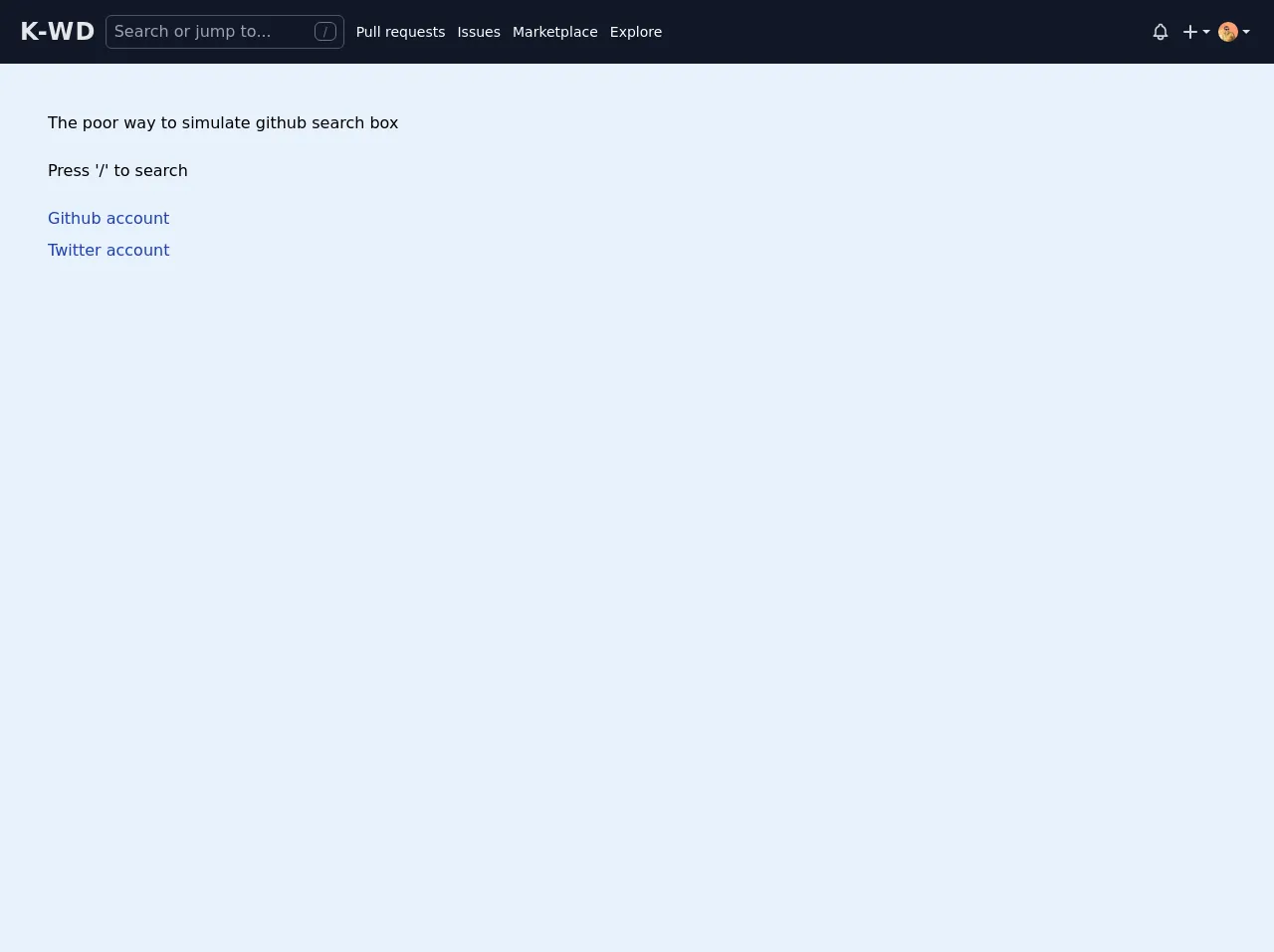
<p>The poor way to simulate github search box</p>
<p class="mt-6">Press '/' to search</p>
<div class="inline-flex flex-col mt-6 space-y-2">
<a href="https://github.com/Kamona-WD" target="_blank" class="text-blue-800 hover:underline"
>Github account</a
>
<a href="https://twitter.com/ak_kamona" target="_blank" class="text-blue-800 hover:underline"
>Twitter account</a
>
</div>
</main>
</div>
<script src="https://cdn.jsdelivr.net/gh/alpinejs/[email protected]/dist/alpine.min.js"></script>
<script>
function handleKeydown(el, event) {
if (event.keyCode == 191) {
event.preventDefault()
el.querySelector('#searchInput').focus()
}
if (event.keyCode == 27) {
el.querySelector('#searchInput').blur()
}
}
function init(el) {
document.addEventListener('keydown', handleKeydown.bind(null, el), false)
}
function navbar() {
return {
isOpen: false,
toggleNavbar() {
this.isOpen = !this.isOpen
},
isSearchBoxOpen: false,
isSearching: false,
loading: false,
isTyping: false,
searchQuery: '',
openSearchBox() {
this.isSearchBoxOpen = true
this.loading = true
setTimeout(() => {
this.loading = false
}, 500)
},
closeSearchBox() {
this.isSearchBoxOpen = false
},
startSearching() {
this.isTyping = true
},
}
}
</script>
How to create a Github navbar searchbox with Tailwind CSS?
To create a Github navbar searchbox with Tailwind CSS, you can follow these six easy steps:
- Create a new HTML file and add the following code:
<!DOCTYPE html>
<html lang="en">
  <head>
    <meta charset="UTF-8" />
    <meta name="viewport" content="width=device-width, initial-scale=1.0" />
    <meta http-equiv="X-UA-Compatible" content="ie=edge" />
    <title>Github Navbar Searchbox with Tailwind CSS</title>
    <link rel="stylesheet" href="https://cdn.jsdelivr.net/npm/[email protected]/dist/tailwind.min.css" />
  </head>
  <body>
    <div class="flex items-center justify-center">
      <div class="relative w-full max-w-xs">
        <div class="absolute inset-y-0 left-0 flex items-center pl-3">
          <svg class="w-4 h-4 fill-current text-gray-500" viewBox="0 0 16 16">
            <path
              d="M11.707,10.293c-0.391,0.391-1.023,0.391-1.414,0l-2.965-2.965C7.574,7.574,7.5,7.438,7.5,7.293V6.5c0-1.93-1.57-3.5-3.5-3.5S0.5,4.57,0.5,6.5S2.07,10,4,10c0.145,0,0.281-0.074,0.357-0.197l0.793,0.793C5.512,10.918,5.756,11,6,11s0.488-0.082,0.707-0.293l2.965,2.965C9.488,13.902,9.744,14,10,14s0.512-0.098,0.707-0.293C11.098,13.316,11.098,10.902,11.707,10.293z M4,8c-1.378,0-2.5-1.122-2.5-2.5S2.622,3,4,3s2.5,1.122,2.5,2.5S5.378,8,4,8z"
            />
          </svg>
        </div>
        <input
          class="block w-full pl-9 pr-4 py-2 rounded-md leading-5 bg-gray-100 text-gray-900 placeholder-gray-500 focus:outline-none focus:bg-white focus:placeholder-gray-400 focus:text-gray-900 sm:text-sm transition duration-150 ease-in-out"
          placeholder="Search Github"
        />
      </div>
    </div>
  </body>
</html>
Add the Tailwind CSS CDN link to the head section of your HTML file.
Wrap the searchbox HTML code inside a container div with the
flex,items-center, andjustify-centerclasses.Add the
relative,w-full, andmax-w-xsclasses to the searchbox container div.Add the
absolute,inset-y-0,left-0,flex, anditems-centerclasses to the search icon container div.Add the
block,w-full,pl-9,pr-4,py-2,rounded-md,leading-5,bg-gray-100,text-gray-900,placeholder-gray-500,focus:outline-none,focus:bg-white,focus:placeholder-gray-400,focus:text-gray-900,sm:text-sm,transition,duration-150, andease-in-outclasses to the search input element.
Conclusion
In this article, we have learned how to create a Github navbar searchbox UI component with Tailwind CSS. Tailwind CSS provides a set of pre-defined classes that you can use to style your HTML elements quickly and easily. By following the six easy steps outlined in this article, you can create a beautiful and responsive Github navbar searchbox UI component in no time.