- Published on
6 Steps To Create A Game Lobby With Tailwind CSS Like A Pro In Under An Hour
- What is Tailwind CSS?
- The description of Game Lobby ui component
- Why use Tailwind CSS to create a Game Lobby ui component?
- The preview of Game Lobby ui component
- The source code of Game Lobby ui component
- How to create a Game Lobby with Tailwind CSS?
- Step 1: Set up your development environment
- Step 2: Create a new HTML file
- Step 3: Add the necessary HTML elements
- Step 4: Add Tailwind CSS to your project
- Step 5: Style your HTML elements with Tailwind CSS
- Step 6: Preview your game lobby UI component
- Conclusion
If you're a game developer, you know the importance of creating a visually appealing game lobby. A game lobby is the first thing that players see when they enter your game, and it sets the tone for the entire gaming experience. In this article, we'll show you how to create a game lobby with Tailwind CSS like a pro in under an hour.
What is Tailwind CSS?
Tailwind CSS is a utility-first CSS framework that allows you to quickly and easily create custom designs. With Tailwind CSS, you can create complex layouts and designs without having to write custom CSS. It provides a set of pre-defined classes that you can use to style your HTML elements.
The description of Game Lobby ui component
A game lobby is a user interface component that allows players to join a game, create a new game, or customize their game settings. It typically includes a list of available games, a chat window, and options for creating a new game or joining an existing game.
Why use Tailwind CSS to create a Game Lobby ui component?
Tailwind CSS is an excellent choice for creating a game lobby UI component because it allows you to quickly and easily create custom designs. With Tailwind CSS, you can create complex layouts and designs without having to write custom CSS. It provides a set of pre-defined classes that you can use to style your HTML elements. This saves you time and allows you to focus on creating a great gaming experience for your players.
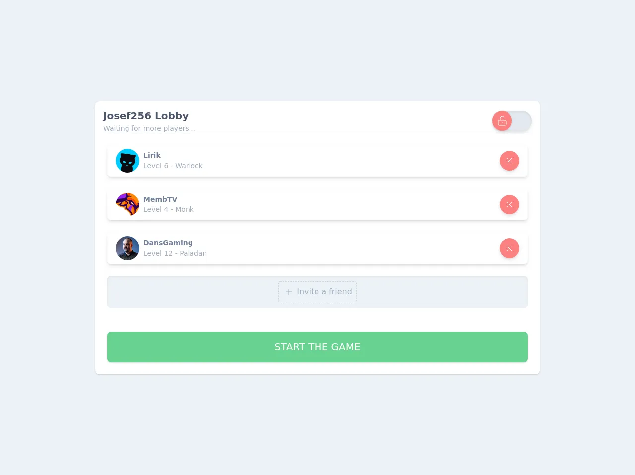
The preview of Game Lobby ui component
To give you an idea of what the game lobby UI component will look like, here's a preview:
Free download of the Game Lobby's source code
The source code of Game Lobby ui component
Here's the source code for the game lobby UI component:
<div class="min-h-screen flex-1 bg-gray-200 p-4 flex justify-center items-center">
<div class="bg-white w-full md:max-w-4xl rounded-lg shadow">
<div class="h-12 flex justify-between items-center border-b border-gray-200 m-4">
  <div >
   <div class="text-xl font-bold text-gray-700">Josef256 Lobby</div>
   <div class="text-sm font-base text-gray-500">Waiting for more players...</div>
  </div>
  <div>
    <div class="flex items-center justify-center w-full  shadow-md rounded-full">
      <label
          htmlFor="toogleA"
          class="flex items-center cursor-pointer"
      >
        <div class="flex items-center">
          <input id="toogleA" type="checkbox" class="hidden"/>
          <div
              class="toggle__line w-20 h-10 bg-gray-300 rounded-full shadow-inner"
          >
          </div>
          <div
              class="toggle__dot bg-red-400 absolute w-10 h-10 bg-white rounded-full shadow flex items-center justify-center"
          >
            <svg class="text-white w-6 h-6 " xmlns="http://www.w3.org/2000/svg" fill="none" viewBox="0 0 24 24" stroke="currentColor">
              <path strokeLinecap="round" strokeLinejoin="round" strokeWidth={2} d="M8 11V7a4 4 0 118 0m-4 8v2m-6 4h12a2 2 0 002-2v-6a2 2 0 00-2-2H6a2 2 0 00-2 2v6a2 2 0 002 2z" />
            </svg>
          </div>
        </div>
      </label>
    </div>
  </div>
</div>
<div class="px-6">
  <div class="flex justify-between items-center h-16 p-4 my-6  rounded-lg border border-gray-100 shadow-md">
    <div class="flex items-center">
      <img class="rounded-full h-12 w-12" src="https://static-cdn.jtvnw.net/jtv_user_pictures/27fdad08-a2c2-4e0b-8983-448c39519643-profile_image-70x70.png" alt="Logo" />
    <div class="ml-2">
      <div class="text-sm font-semibold text-gray-600">Lirik</div>
      <div class="text-sm font-light text-gray-500">Level 6 - Warlock</div>
    </div>
    </div>
    <div>
      <button class="bg-red-400 hover:bg-red-500 p-2 rounded-full shadow-md flex justify-center items-center">
        <svg class="text-white toggle__lock w-6 h-6" xmlns="http://www.w3.org/2000/svg" fill="none" viewBox="0 0 24 24" stroke="currentColor">
          <path strokeLinecap="round" strokeLinejoin="round" strokeWidth={2} d="M6 18L18 6M6 6l12 12" />
        </svg>
      </button>
    </div>
  </div>
  <div class="flex justify-between items-center h-16 p-4 my-6  rounded-lg border border-gray-100 shadow-md">
    <div class="flex items-center">
      <img class="rounded-full h-12 w-12" src="https://static-cdn.jtvnw.net/jtv_user_pictures/cb661e9a-68e5-4e37-89ce-231960ff7f8e-profile_image-70x70.png" alt="Logo" />
      <div class="ml-2">
        <div class="text-sm font-semibold text-gray-600">MembTV</div>
        <div class="text-sm font-light text-gray-500">Level 4 - Monk</div>
      </div>
    </div>
    <div>
      <button class="bg-red-400 hover:bg-red-500  p-2 rounded-full shadow-md flex justify-center items-center">
        <svg class="text-white toggle__lock w-6 h-6" xmlns="http://www.w3.org/2000/svg" fill="none" viewBox="0 0 24 24" stroke="currentColor">
          <path strokeLinecap="round" strokeLinejoin="round" strokeWidth={2} d="M6 18L18 6M6 6l12 12" />
        </svg>
      </button>
    </div>
  </div>
  <div class="flex justify-between items-center h-16 p-4 my-6  rounded-lg border border-gray-100 shadow-md">
    <div class="flex items-center">
      <img class="rounded-full h-12 w-12" src="https://static-cdn.jtvnw.net/jtv_user_pictures/e82b2c90-efe6-41c7-bd50-7caba86fd3b5-profile_image-70x70.png" alt="Logo" />
      <div class="ml-2">
        <div class="text-sm font-semibold text-gray-600">DansGaming</div>
        <div class="text-sm font-light text-gray-500">Level 12 - Paladan</div>
      </div>
    </div>
    <div>
      <button class="bg-red-400 hover:bg-red-500  p-2 rounded-full shadow-md flex justify-center items-center">
        <svg class="text-white toggle__lock w-6 h-6" xmlns="http://www.w3.org/2000/svg" fill="none" viewBox="0 0 24 24" stroke="currentColor">
          <path strokeLinecap="round" strokeLinejoin="round" strokeWidth={2} d="M6 18L18 6M6 6l12 12" />
        </svg>
      </button>
    </div>
  </div>
  <div class="flex bg-gray-200 justify-center items-center h-16 p-4 my-6  rounded-lg  shadow-inner">
    <div class="flex items-center border border-gray-400 p-2 border-dashed rounded cursor-pointer">
    <div>
      <svg class="text-gray-500 w-6 h-6" xmlns="http://www.w3.org/2000/svg" fill="none" viewBox="0 0 24 24" stroke="currentColor">
      <path strokeLinecap="round" strokeLinejoin="round" strokeWidth={2} d="M12 6v6m0 0v6m0-6h6m-6 0H6" />
    </svg>
    </div>
      <div class="ml-1 text-gray-500 font-medium"> Invite a friend</div>
    </div>
  </div>
</div>
  <div class="p-6 ">
    <button class="p-4 bg-green-400 hover:bg-green-500 w-full rounded-lg shadow text-xl font-medium uppercase text-white">Start the game</button>
  </div>
</div>
    </div>

<style>
  .toggle__dot {
    transition: all 0.3s ease-in-out;
}

input:checked ~ .toggle__dot {
    transform: translateX(100%);
    background-color:#68D391
}
</style>
How to create a Game Lobby with Tailwind CSS?
Now that you know why Tailwind CSS is an excellent choice for creating a game lobby UI component, let's dive into the steps to create one.
Step 1: Set up your development environment
Before you can start creating your game lobby UI component with Tailwind CSS, you need to set up your development environment. You'll need a text editor, a web browser, and a local server. You can use any text editor you like, but we recommend Visual Studio Code. For the local server, you can use XAMPP or MAMP.
Step 2: Create a new HTML file
Next, create a new HTML file and save it in your development environment. You can name the file whatever you like, but we recommend naming it "index.html."
Step 3: Add the necessary HTML elements
In your HTML file, add the necessary HTML elements for the game lobby UI component. This includes a list of available games, a chat window, and options for creating a new game or joining an existing game.
Step 4: Add Tailwind CSS to your project
To use Tailwind CSS in your project, you need to add it to your project. You can do this by downloading the Tailwind CSS files and adding them to your project, or you can use a package manager like npm to install Tailwind CSS.
Step 5: Style your HTML elements with Tailwind CSS
Once you've added Tailwind CSS to your project, you can start styling your HTML elements with Tailwind CSS classes. Tailwind CSS provides a set of pre-defined classes that you can use to style your HTML elements. For example, you can use the "bg-blue-500" class to set the background color of an element to blue.
Step 6: Preview your game lobby UI component
Finally, preview your game lobby UI component in your web browser. If everything looks good, you're ready to integrate your game lobby UI component into your game.
Conclusion
Creating a game lobby UI component with Tailwind CSS is a great way to quickly and easily create a visually appealing game lobby. With Tailwind CSS, you can create complex layouts and designs without having to write custom CSS. We hope this article has been helpful in showing you how to create a game lobby UI component with Tailwind CSS like a pro in under an hour.