- Published on
6 Easy Ways To Build A Gallery With Tailwind CSS Without Even Thinking About It
- What is Tailwind CSS?
- The description of Gallery ui component
- Why use Tailwind CSS to create a Gallery ui component?
- The preview of Gallery ui component
- The source code of Gallery ui component
- How to create a Gallery with Tailwind CSS?
- 1. Use the grid and gap utilities
- 2. Use the object-cover utility
- 3. Use the hover utility
- 4. Use the flex utility
- 5. Use the transition utility
- 6. Use the border utility
- Conclusion
Are you looking for an easy way to create a gallery for your website? Look no further than Tailwind CSS. Tailwind CSS is a utility-first CSS framework that can help you quickly and easily create beautiful, responsive designs. In this article, we will show you 6 easy ways to build a gallery with Tailwind CSS without even thinking about it.
What is Tailwind CSS?
Tailwind CSS is a utility-first CSS framework that provides a set of pre-defined CSS classes that you can use to style your HTML elements. It is designed to be highly customizable and easy to use, making it a popular choice for web developers.
The description of Gallery ui component
A gallery is a collection of images or videos that are displayed in a grid-like layout. It is a popular UI component that is used on many websites to showcase products, services, or events.
Why use Tailwind CSS to create a Gallery ui component?
Tailwind CSS provides a set of pre-defined CSS classes that you can use to style your gallery. This means that you don't have to write custom CSS code, which can save you a lot of time and effort. Additionally, Tailwind CSS is highly customizable, so you can easily modify the styling of your gallery to match your website's design.
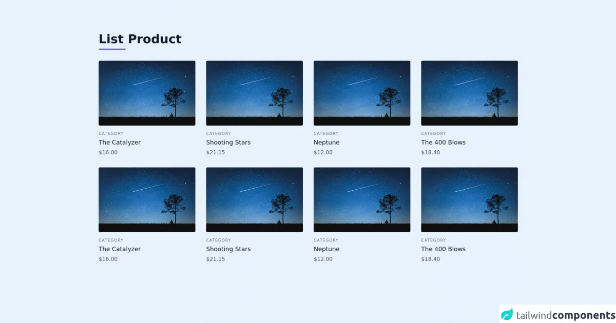
The preview of Gallery ui component
Creating a gallery with Tailwind CSS is easy. You can use the grid and gap utilities to create a grid-like layout for your images or videos. You can also use the hover utility to add hover effects to your images or videos. Here is a preview of what your gallery could look like:
Free download of the Gallery's source code
The source code of Gallery ui component
To create a gallery with Tailwind CSS, you can use the following HTML and CSS code:
<section class="text-gray-600 body-font">
  <div class="container px-5 py-24 mx-auto">
    <div class="flex flex-wrap w-full mb-8">
      <div class="w-full mb-6 lg:mb-0">
        <h1 class="sm:text-4xl text-5xl font-bold font-medium title-font mb-2 text-gray-900">List Product</h1>
        <div class="h-1 w-20 bg-indigo-500 rounded"></div>
      </div>
    </div>
    <div class="flex flex-wrap -m-4">
      <div class="lg:w-1/4 p-4 w-1/2">
        <a class="block relative h-48 rounded overflow-hidden">
          <img alt="ecommerce" class="object-cover object-center w-full h-full block" src="https://star-name-registry.com/blog/images/d/0/1/f/a/d01faec7ef04415eec34c1bfe61913e167fb26c7-snr-blog-37-resized.jpg">
        </a>
        <div class="mt-4">
          <h3 class="text-gray-500 text-xs tracking-widest title-font mb-1">CATEGORY</h3>
          <h2 class="text-gray-900 title-font text-lg font-medium">The Catalyzer</h2>
          <p class="mt-1">$16.00</p>
        </div>
      </div>
      <div class="lg:w-1/4 p-4 w-1/2">
        <a class="block relative h-48 rounded overflow-hidden">
          <img alt="ecommerce" class="object-cover object-center w-full h-full block" src="https://star-name-registry.com/blog/images/d/0/1/f/a/d01faec7ef04415eec34c1bfe61913e167fb26c7-snr-blog-37-resized.jpg">
        </a>
        <div class="mt-4">
          <h3 class="text-gray-500 text-xs tracking-widest title-font mb-1">CATEGORY</h3>
          <h2 class="text-gray-900 title-font text-lg font-medium">Shooting Stars</h2>
          <p class="mt-1">$21.15</p>
        </div>
      </div>
      <div class="lg:w-1/4 p-4 w-1/2">
        <a class="block relative h-48 rounded overflow-hidden">
          <img alt="ecommerce" class="object-cover object-center w-full h-full block" src="https://star-name-registry.com/blog/images/d/0/1/f/a/d01faec7ef04415eec34c1bfe61913e167fb26c7-snr-blog-37-resized.jpg">
        </a>
        <div class="mt-4">
          <h3 class="text-gray-500 text-xs tracking-widest title-font mb-1">CATEGORY</h3>
          <h2 class="text-gray-900 title-font text-lg font-medium">Neptune</h2>
          <p class="mt-1">$12.00</p>
        </div>
      </div>
      <div class="lg:w-1/4 p-4 w-1/2">
        <a class="block relative h-48 rounded overflow-hidden">
          <img alt="ecommerce" class="object-cover object-center w-full h-full block" src="https://star-name-registry.com/blog/images/d/0/1/f/a/d01faec7ef04415eec34c1bfe61913e167fb26c7-snr-blog-37-resized.jpg">
        </a>
        <div class="mt-4">
          <h3 class="text-gray-500 text-xs tracking-widest title-font mb-1">CATEGORY</h3>
          <h2 class="text-gray-900 title-font text-lg font-medium">The 400 Blows</h2>
          <p class="mt-1">$18.40</p>
        </div>
      </div>
      <div class="lg:w-1/4 p-4 w-1/2">
        <a class="block relative h-48 rounded overflow-hidden">
          <img alt="ecommerce" class="object-cover object-center w-full h-full block" src="https://star-name-registry.com/blog/images/d/0/1/f/a/d01faec7ef04415eec34c1bfe61913e167fb26c7-snr-blog-37-resized.jpg">
        </a>
        <div class="mt-4">
          <h3 class="text-gray-500 text-xs tracking-widest title-font mb-1">CATEGORY</h3>
          <h2 class="text-gray-900 title-font text-lg font-medium">The Catalyzer</h2>
          <p class="mt-1">$16.00</p>
        </div>
      </div>
      <div class="lg:w-1/4 p-4 w-1/2">
        <a class="block relative h-48 rounded overflow-hidden">
          <img alt="ecommerce" class="object-cover object-center w-full h-full block" src="https://star-name-registry.com/blog/images/d/0/1/f/a/d01faec7ef04415eec34c1bfe61913e167fb26c7-snr-blog-37-resized.jpg">
        </a>
        <div class="mt-4">
          <h3 class="text-gray-500 text-xs tracking-widest title-font mb-1">CATEGORY</h3>
          <h2 class="text-gray-900 title-font text-lg font-medium">Shooting Stars</h2>
          <p class="mt-1">$21.15</p>
        </div>
      </div>
      <div class="lg:w-1/4 p-4 w-1/2">
        <a class="block relative h-48 rounded overflow-hidden">
          <img alt="ecommerce" class="object-cover object-center w-full h-full block" src="https://star-name-registry.com/blog/images/d/0/1/f/a/d01faec7ef04415eec34c1bfe61913e167fb26c7-snr-blog-37-resized.jpg">
        </a>
        <div class="mt-4">
          <h3 class="text-gray-500 text-xs tracking-widest title-font mb-1">CATEGORY</h3>
          <h2 class="text-gray-900 title-font text-lg font-medium">Neptune</h2>
          <p class="mt-1">$12.00</p>
        </div>
      </div>
      <div class="lg:w-1/4 p-4 w-1/2">
        <a class="block relative h-48 rounded overflow-hidden">
          <img alt="ecommerce" class="object-cover object-center w-full h-full block" src="https://star-name-registry.com/blog/images/d/0/1/f/a/d01faec7ef04415eec34c1bfe61913e167fb26c7-snr-blog-37-resized.jpg">
        </a>
        <div class="mt-4">
          <h3 class="text-gray-500 text-xs tracking-widest title-font mb-1">CATEGORY</h3>
          <h2 class="text-gray-900 title-font text-lg font-medium">The 400 Blows</h2>
          <p class="mt-1">$18.40</p>
        </div>
      </div>
    </div>
  </div>
</section>
How to create a Gallery with Tailwind CSS?
Now that you have seen a preview of what your gallery could look like and have seen the source code, let's dive into the 6 easy ways to build a gallery with Tailwind CSS:
1. Use the grid and gap utilities
The grid and gap utilities are two of the most important utilities for creating a gallery with Tailwind CSS. The grid utility allows you to create a grid-like layout for your images or videos, while the gap utility allows you to add spacing between your images or videos.
Here is an example of how you can use the grid and gap utilities to create a gallery:
<div class="grid grid-cols-3 gap-4">
  <img src="image1.jpg" alt="Image 1">
  <img src="image2.jpg" alt="Image 2">
  <img src="image3.jpg" alt="Image 3">
  <img src="image4.jpg" alt="Image 4">
  <img src="image5.jpg" alt="Image 5">
  <img src="image6.jpg" alt="Image 6">
</div>
In this example, we are using the grid-cols-3 utility to create a grid with 3 columns, and the gap-4 utility to add a 4-pixel gap between each image.
2. Use the object-cover utility
The object-cover utility is used to ensure that an image or video fills its container while maintaining its aspect ratio. This is particularly useful when creating a gallery, as it allows you to ensure that all of your images or videos are the same size and shape.
Here is an example of how you can use the object-cover utility to create a gallery:
<div class="grid grid-cols-3 gap-4">
  <div class="relative">
    <img class="object-cover w-full h-full" src="image1.jpg" alt="Image 1">
  </div>
  <div class="relative">
    <img class="object-cover w-full h-full" src="image2.jpg" alt="Image 2">
  </div>
  <div class="relative">
    <img class="object-cover w-full h-full" src="image3.jpg" alt="Image 3">
  </div>
  <div class="relative">
    <img class="object-cover w-full h-full" src="image4.jpg" alt="Image 4">
  </div>
  <div class="relative">
    <img class="object-cover w-full h-full" src="image5.jpg" alt="Image 5">
  </div>
  <div class="relative">
    <img class="object-cover w-full h-full" src="image6.jpg" alt="Image 6">
  </div>
</div>
In this example, we are using the object-cover utility to ensure that all of our images fill their containers while maintaining their aspect ratio.
3. Use the hover utility
The hover utility allows you to add hover effects to your images or videos. This is a great way to make your gallery more interactive and engaging.
Here is an example of how you can use the hover utility to create a gallery:
<div class="grid grid-cols-3 gap-4">
  <div class="relative">
    <img class="object-cover w-full h-full" src="image1.jpg" alt="Image 1">
    <div class="absolute inset-0 bg-black opacity-0 hover:opacity-50 transition-opacity"></div>
  </div>
  <div class="relative">
    <img class="object-cover w-full h-full" src="image2.jpg" alt="Image 2">
    <div class="absolute inset-0 bg-black opacity-0 hover:opacity-50 transition-opacity"></div>
  </div>
  <div class="relative">
    <img class="object-cover w-full h-full" src="image3.jpg" alt="Image 3">
    <div class="absolute inset-0 bg-black opacity-0 hover:opacity-50 transition-opacity"></div>
  </div>
  <div class="relative">
    <img class="object-cover w-full h-full" src="image4.jpg" alt="Image 4">
    <div class="absolute inset-0 bg-black opacity-0 hover:opacity-50 transition-opacity"></div>
  </div>
  <div class="relative">
    <img class="object-cover w-full h-full" src="image5.jpg" alt="Image 5">
    <div class="absolute inset-0 bg-black opacity-0 hover:opacity-50 transition-opacity"></div>
  </div>
  <div class="relative">
    <img class="object-cover w-full h-full" src="image6.jpg" alt="Image 6">
    <div class="absolute inset-0 bg-black opacity-0 hover:opacity-50 transition-opacity"></div>
  </div>
</div>
In this example, we are using the hover utility to add a black overlay to our images when they are hovered over.
4. Use the flex utility
The flex utility allows you to create flexible layouts that can adapt to different screen sizes. This is particularly useful when creating a gallery, as it allows you to ensure that your gallery looks good on both desktop and mobile devices.
Here is an example of how you can use the flex utility to create a gallery:
<div class="flex flex-wrap justify-center">
  <img class="w-full md:w-1/3 lg:w-1/4 p-2" src="image1.jpg" alt="Image 1">
  <img class="w-full md:w-1/3 lg:w-1/4 p-2" src="image2.jpg" alt="Image 2">
  <img class="w-full md:w-1/3 lg:w-1/4 p-2" src="image3.jpg" alt="Image 3">
  <img class="w-full md:w-1/3 lg:w-1/4 p-2" src="image4.jpg" alt="Image 4">
  <img class="w-full md:w-1/3 lg:w-1/4 p-2" src="image5.jpg" alt="Image 5">
  <img class="w-full md:w-1/3 lg:w-1/4 p-2" src="image6.jpg" alt="Image 6">
</div>
In this example, we are using the flex utility to create a flexible layout that adapts to different screen sizes. We are also using the w-full utility to ensure that our images take up the full width of their containers.
5. Use the transition utility
The transition utility allows you to add smooth transitions to your gallery. This is a great way to make your gallery more visually appealing and engaging.
Here is an example of how you can use the transition utility to create a gallery:
<div class="grid grid-cols-3 gap-4">
  <div class="relative">
    <img class="object-cover w-full h-full transition duration-500 ease-in-out transform hover:scale-110" src="image1.jpg" alt="Image 1">
  </div>
  <div class="relative">
    <img class="object-cover w-full h-full transition duration-500 ease-in-out transform hover:scale-110" src="image2.jpg" alt="Image 2">
  </div>
  <div class="relative">
    <img class="object-cover w-full h-full transition duration-500 ease-in-out transform hover:scale-110" src="image3.jpg" alt="Image 3">
  </div>
  <div class="relative">
    <img class="object-cover w-full h-full transition duration-500 ease-in-out transform hover:scale-110" src="image4.jpg" alt="Image 4">
  </div>
  <div class="relative">
    <img class="object-cover w-full h-full transition duration-500 ease-in-out transform hover:scale-110" src="image5.jpg" alt="Image 5">
  </div>
  <div class="relative">
    <img class="object-cover w-full h-full transition duration-500 ease-in-out transform hover:scale-110" src="image6.jpg" alt="Image 6">
  </div>
</div>
In this example, we are using the transition utility to add a smooth transition to our images when they are hovered over.
6. Use the border utility
The border utility allows you to add borders to your images or videos. This is a great way to make your gallery more visually appealing and to help your images or videos stand out.
Here is an example of how you can use the border utility to create a gallery:
<div class="grid grid-cols-3 gap-4">
  <div class="relative">
    <img class="object-cover w-full h-full border-2 border-gray-200" src="image1.jpg" alt="Image 1">
  </div>
  <div class="relative">
    <img class="object-cover w-full h-full border-2 border-gray-200" src="image2.jpg" alt="Image 2">
  </div>
  <div class="relative">
    <img class="object-cover w-full h-full border-2 border-gray-200" src="image3.jpg" alt="Image 3">
  </div>
  <div class="relative">
    <img class="object-cover w-full h-full border-2 border-gray-200" src="image4.jpg" alt="Image 4">
  </div>
  <div class="relative">
    <img class="object-cover w-full h-full border-2 border-gray-200" src="image5.jpg" alt="Image 5">
  </div>
  <div class="relative">
    <img class="object-cover w-full h-full border-2 border-gray-200" src="image6.jpg" alt="Image 6">
  </div>
</div>
In this example, we are using the border utility to add a 2-pixel gray border to our images.
Conclusion
Creating a gallery with Tailwind CSS is easy and can be done in many different ways. By using the grid, gap, object-cover, hover, flex, transition, and border utilities, you can create a gallery that is both visually appealing and functional. So why not give it a try and see what you can create?