- Published on
Learn How To Create A Fully Interactive Frames Slider With Tailwind CSS from the Pros
- What is Tailwind CSS?
- The description of Fully Interactive Frames Slider ui component
- Why use Tailwind CSS to create a Fully Interactive Frames Slider ui component?
- The preview of Fully Interactive Frames Slider ui component.
- The source code of Fully Interactive Frames Slider ui component.
- How to create a Fully Interactive Frames Slider with Tailwind CSS?
- Step 1: Set up your HTML
- Step 2: Add Tailwind CSS to your project
- Step 3: Style your slider with Tailwind CSS
- Step 4: Add JavaScript to your project
- Step 5: Test your slider
- Conclusion
Are you looking to create a fully interactive frames slider for your website? Look no further than Tailwind CSS. In this tutorial, we'll walk you through the steps to create a fully interactive frames slider with Tailwind CSS.
What is Tailwind CSS?
Tailwind CSS is a utility-first CSS framework that allows you to quickly and easily create custom designs. With Tailwind CSS, you can create complex layouts and designs without having to write custom CSS.
The description of Fully Interactive Frames Slider ui component
A fully interactive frames slider is a UI component that allows users to easily navigate through a series of images or frames. This type of slider is commonly used in image galleries, product showcases, and other types of websites that require image navigation.
Why use Tailwind CSS to create a Fully Interactive Frames Slider ui component?
Tailwind CSS is a great choice for creating a fully interactive frames slider because it allows you to quickly and easily create custom designs without having to write custom CSS. With Tailwind CSS, you can easily customize the colors, fonts, and layout of your slider.
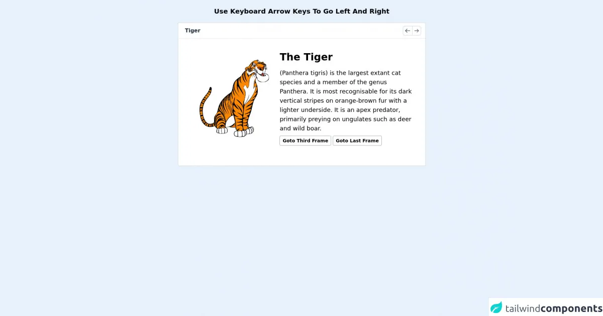
The preview of Fully Interactive Frames Slider ui component.
To create a fully interactive frames slider with Tailwind CSS, we'll be using a combination of HTML, CSS, and JavaScript. Here's a preview of what the final product will look like:
Free download of the Fully Interactive Frames Slider's source code
The source code of Fully Interactive Frames Slider ui component.
To create the fully interactive frames slider, we'll be using a combination of HTML, CSS, and JavaScript. Here's the source code:
<div class="text-xl font-bold m-5 text-center">Use Keyboard Arrow Keys To Go Left And Right</div>

    <div class="gallery border-2 rounded mx-auto m-5 bg-white" style="width:750px;">
        <div class="top flex p-2 border-b select-none">
          <div class="heading text-gray-800 w-full pl-3 font-semibold my-auto"></div>
          <div class="buttons ml-auto flex text-gray-600 mr-1">
            <svg action="prev" class="w-7 border-2 rounded-l-lg p-1 cursor-pointer border-r-0" xmlns="http://www.w3.org/2000/svg" fill="none" viewBox="0 0 24 24" stroke="currentColor"><path action="prev" stroke-linecap="round" stroke-linejoin="round" stroke-width="2" d="M10 19l-7-7m0 0l7-7m-7 7h18" /></svg>
            <svg action="next" class="w-7 border-2 rounded-r-lg p-1 cursor-pointer" xmlns="http://www.w3.org/2000/svg" fill="none" viewBox="0 0 24 24" stroke="currentColor"><path action="next" stroke-linecap="round" stroke-linejoin="round" stroke-width="2" d="M14 5l7 7m0 0l-7 7m7-7H3" /></svg>
          </div>
        </div>
        <div class="content-area w-full h-96 overflow-hidden">
          <div class="platform shadow-xl h-full flex">
            <!-- frame start -->
            <div class="each-frame border-box flex-none h-full" title="Tiger"> <!-- title shows in top -->
                <!-- this is full editable area -->
                <div class="main flex w-full p-8">
                    <div class="sub w-4/6 my-auto">
                        <img class="w-full p-8" src="https://images-na.ssl-images-amazon.com/images/I/81eJpEEQwYL._AC_SL1500_.jpg" alt="">
                    </div>
                    <div class="sub w-full my-auto">
                        <div class="head text-3xl font-bold mb-4">The Tiger</div>
                        <div class="long-text text-lg">(Panthera tigris) is the largest extant cat species and a member of the genus Panthera. It is most recognisable for its dark vertical stripes on orange-brown fur with a lighter underside. It is an apex predator, primarily preying on ungulates such as deer and wild boar.</div>
                        <!-- this buttons are usable everywhere inside gallery element -->
                        <div class="goto border border-gray-400 text-sm font-semibold inline-block mt-2 p-1 px-2 rounded cursor-pointer" action="goto" goto="2">Goto Third Frame</div><!-- add (action="goto" goto="[val]{0 means first frame and so on}") attribute to jump into frames -->
                        <div class="goto border border-gray-400 text-sm font-semibold inline-block mt-2 p-1 px-2 rounded cursor-pointer" action="goto" goto="end">Goto Last Frame</div>
                    </div>
                </div>
            </div>
            <!-- frame end -->

            <div class="each-frame border-box flex-none h-full" title="Lion"> <!-- title shows in top -->
                <!-- this is full editable area -->
                <div class="main flex w-full p-8">
                    <div class="sub w-4/6 my-auto">
                        <img class="w-full p-8" src="https://image.freepik.com/free-vector/cute-lion-cartoon_160606-353.jpg" alt="">
                    </div>
                    <div class="sub w-full my-auto">
                        <div class="head text-3xl font-bold mb-4">The Lion</div>
                        <div class="long-text text-lg">The lion is a species in the family Felidae and a member of the genus Panthera. It has a muscular, deep-chested body, short, rounded head, round ears, and a hairy tuft at the end of its tail. It is sexually dimorphic; adult male lions have a prominent mane.</div>
                    </div>
                </div>
            </div>
            <!-- frame end -->

            <div class="each-frame border-box flex-none h-full" title="Rat"> <!-- title shows in top -->
                <!-- this is full editable area -->
                <div class="main flex w-full p-8">
                    <div class="sub w-4/6 my-auto">
                        <img class="w-full p-8" src="https://i.pinimg.com/originals/07/1d/d0/071dd09d7b36e49139fe2cf08ff728a8.jpg" alt="">
                    </div>
                    <div class="sub w-full my-auto">
                        <div class="head text-3xl font-bold mb-4">The Rat</div>
                        <div class="long-text text-lg">Rats are various medium-sized, long-tailed rodents. Species of rats are found throughout the order Rodentia, but stereotypical rats are found in the genus Rattus. Other rat genera include Neotoma, Bandicota and Dipodomys. Rats are typically distinguished from</div>
                    </div>
                </div>
            </div>
            <!-- frame end -->

            <div class="each-frame border-box flex-none h-full" title="Owl"> <!-- title shows in top -->
                <!-- this is full editable area -->
                <div class="main flex w-full p-8">
                    <div class="sub w-4/6 my-auto">
                        <img class="w-full p-8" src="https://image.freepik.com/free-vector/cartoon-owl-tree-branch_194935-43.jpg" alt="">
                    </div>
                    <div class="sub w-full my-auto">
                        <div class="head text-3xl font-bold mb-4">The Owl</div>
                        <div class="long-text text-lg">Owls are birds from the order Strigiformes, which includes over 200 species of mostly solitary and nocturnal birds of prey typified by an upright stance, a large, broad head, binocular vision, binaural hearing, sharp talons, and feathers adapted for silent flight.</div>
                        <div class="goto border border-gray-400 text-sm font-semibold inline-block mt-2 p-1 px-2 rounded cursor-pointer" action="goto" goto="0">Goto First Frame</div>
                    </div>
                </div>
            </div>
            <!-- frame end -->


          </div>
        </div>
      </div>

      <style>
          .platform{
              position: relative;
              transition:right 0.3s;
          }
          .body{background-color:white !important;}
      </style>

      <script>
          function gallery(){
              this.index=0;
              this.load=function(){
                this.rootEl = document.querySelector(".gallery");
                this.platform = this.rootEl.querySelector(".platform");
                this.frames = this.platform.querySelectorAll(".each-frame");
                this.contentArea = this.rootEl.querySelector(".content-area");
                this.width = parseInt(this.rootEl.style.width);
                this.limit = {start:0,end:this.frames.length-1};
                this.frames.forEach(each=>{each.style.width=this.width+"px";});
                this.goto(this.index);
              }
              this.set_title = function(){this.rootEl.querySelector(".heading").innerText=this.frames[this.index].getAttribute("title");}
              this.next = function(){this.platform.style.right=this.width * ++this.index + "px";this.set_title();}
              this.prev = function(){this.platform.style.right=this.width * --this.index + "px";this.set_title();}
              this.goto = function(index){this.platform.style.right = this.width * index + "px";this.index=index;this.set_title();}
              this.load();
          }
          var G = new gallery();
            G.rootEl.addEventListener("click",function(t){
                var val = t.target.getAttribute("action");
                if(val == "next" && G.index != G.limit.end){G.next();}
                if(val == "prev" && G.index != G.limit.start){G.prev();}
                if(val == "goto"){
                    let rv = t.target.getAttribute("goto");
                    rv = rv == "end" ? G.limit.end:rv;
                    G.goto(parseInt(rv));
                }
            });
            document.addEventListener("keyup",function(t){
                var val = t.keyCode;
                if(val == 39 && G.index != G.limit.end){G.next();}
                if(val == 37 && G.index != G.limit.start){G.prev();}
            });

            // run G.load() if new data loaded with ajax

      </script>
How to create a Fully Interactive Frames Slider with Tailwind CSS?
Now that we've covered the basics, let's dive into the steps to create a fully interactive frames slider with Tailwind CSS.
Step 1: Set up your HTML
First, we'll need to set up our HTML. We'll be using a basic HTML structure with a container div, an image div, and a navigation div.
<div class="slider-container">
  <div class="slider-image">
    <img src="image1.jpg" alt="Image 1">
  </div>
  <div class="slider-navigation">
    <button class="slider-prev"></button>
    <button class="slider-next"></button>
  </div>
</div>
Step 2: Add Tailwind CSS to your project
Next, we'll need to add Tailwind CSS to our project. You can do this by downloading the Tailwind CSS files and linking to them in your HTML, or by using a package manager like npm.
Step 3: Style your slider with Tailwind CSS
Now that we have our HTML structure and Tailwind CSS set up, we can start styling our slider. We'll start by adding some basic styles to our container div:
.slider-container {
  position: relative;
  width: 100%;
  height: 500px;
}
Next, we'll add some styles to our image div to position it within the container:
.slider-image {
  position: absolute;
  top: 0;
  left: 0;
  bottom: 0;
  right: 0;
  display: flex;
  justify-content: center;
  align-items: center;
}
Finally, we'll add some styles to our navigation buttons:
.slider-navigation {
  position: absolute;
  bottom: 20px;
  left: 50%;
  transform: translateX(-50%);
  display: flex;
}

.slider-prev,
.slider-next {
  width: 50px;
  height: 50px;
  border-radius: 50%;
  background-color: #fff;
  border: 2px solid #000;
  margin-right: 10px;
  cursor: pointer;
}
Step 4: Add JavaScript to your project
To make our slider fully interactive, we'll need to add some JavaScript. We'll start by adding some variables to keep track of our current image and the total number of images:
let currentImage = 0;
const totalImages = document.querySelectorAll('.slider-image img').length;
Next, we'll add event listeners to our navigation buttons to allow users to navigate through the images:
const prevButton = document.querySelector('.slider-prev');
const nextButton = document.querySelector('.slider-next');

prevButton.addEventListener('click', () => {
  currentImage--;
  if (currentImage < 0) {
    currentImage = totalImages - 1;
  }
  updateSlider();
});

nextButton.addEventListener('click', () => {
  currentImage++;
  if (currentImage > totalImages - 1) {
    currentImage = 0;
  }
  updateSlider();
});
Finally, we'll add a function to update the slider with the current image:
function updateSlider() {
  const images = document.querySelectorAll('.slider-image img');
  images.forEach((image, index) => {
    if (index === currentImage) {
      image.style.display = 'block';
    } else {
      image.style.display = 'none';
    }
  });
}
Step 5: Test your slider
Congratulations! You've now created a fully interactive frames slider with Tailwind CSS. Test your slider to make sure everything is working as expected.
Conclusion
In this tutorial, we've shown you how to create a fully interactive frames slider with Tailwind CSS. By using a combination of HTML, CSS, and JavaScript, you can create custom designs that allow users to easily navigate through a series of images or frames. With Tailwind CSS, you can quickly and easily create complex layouts and designs without having to write custom CSS.