- Published on
6 Easy Ways To Build A Free Tailwind CSS Product Details Component With Tailwind CSS
- What is Tailwind CSS?
- The description of Free Tailwind CSS Product Details Component ui component
- Why use Tailwind CSS to create a Free Tailwind CSS Product Details Component ui component?
- The preview of Free Tailwind CSS Product Details Component ui component.
- The source code of Free Tailwind CSS Product Details Component ui component.
- How to create a Free Tailwind CSS Product Details Component with Tailwind CSS?
- Step 1: Set up the HTML structure
- Step 2: Add Tailwind CSS classes
- Step 3: Customize the UI component
- Conclusion
What is Tailwind CSS?
Tailwind CSS is a utility-first CSS framework that allows developers to quickly build custom user interfaces. It provides a set of pre-defined CSS classes that can be used to style HTML elements. With Tailwind CSS, developers can easily create responsive, mobile-first designs without having to write custom CSS.
The description of Free Tailwind CSS Product Details Component ui component
The Free Tailwind CSS Product Details Component is a UI component that can be used to display product details on an e-commerce website. It is built using Tailwind CSS and includes a product image, product name, product description, and price.
Why use Tailwind CSS to create a Free Tailwind CSS Product Details Component ui component?
Tailwind CSS provides a set of pre-defined CSS classes that can be used to style HTML elements. This makes it easy to create custom user interfaces without having to write custom CSS. Additionally, Tailwind CSS is mobile-first and responsive, which means that the UI component will look great on all devices.
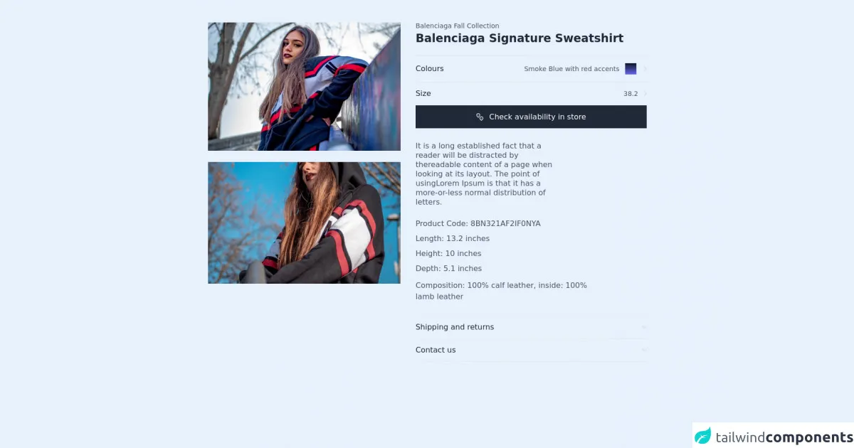
The preview of Free Tailwind CSS Product Details Component ui component.
Free download of the Free Tailwind CSS Product Details Component's source code
The source code of Free Tailwind CSS Product Details Component ui component.
<div class="md:flex items-start justify-center py-12 2xl:px-20 md:px-6 px-4">
  <!--- more free and premium Tailwind CSS components at https://tailwinduikit.com/ --->

  <div class="xl:w-2/6 lg:w-2/5 w-80 md:block hidden">
    <img class="w-full" alt="image of a girl posing" src="https://i.ibb.co/QMdWfzX/component-image-one.png" />
    <img class="mt-6 w-full" alt="image of a girl posing" src="https://i.ibb.co/qxkRXSq/component-image-two.png" />
  </div>
  <div class="md:hidden">
    <img class="w-full" alt="image of a girl posing" src="https://i.ibb.co/QMdWfzX/component-image-one.png" />
    <div class="flex items-center justify-between mt-3 space-x-4 md:space-x-0">
      <img alt="image-tag-one" class="md:w-48 md:h-48 w-full" src="https://i.ibb.co/cYDrVGh/Rectangle-245.png" />
      <img alt="image-tag-one" class="md:w-48 md:h-48 w-full" src="https://i.ibb.co/f17NXrW/Rectangle-244.png" />
      <img alt="image-tag-one" class="md:w-48 md:h-48 w-full" src="https://i.ibb.co/cYDrVGh/Rectangle-245.png" />
      <img alt="image-tag-one" class="md:w-48 md:h-48 w-full" src="https://i.ibb.co/f17NXrW/Rectangle-244.png" />
    </div>
  </div>
  <div class="xl:w-2/5 md:w-1/2 lg:ml-8 md:ml-6 md:mt-0 mt-6">
    <div class="border-b border-gray-200 pb-6">
      <p class="text-sm leading-none text-gray-600 dark:text-gray-300 ">Balenciaga Fall Collection</p>
      <h1 class="lg:text-2xl text-xl font-semibold lg:leading-6 leading-7 text-gray-800 dark:text-white mt-2">Balenciaga Signature Sweatshirt</h1>
    </div>
    <div class="py-4 border-b border-gray-200 flex items-center justify-between">
      <p class="text-base leading-4 text-gray-800 dark:text-gray-300">Colours</p>
      <div class="flex items-center justify-center">
        <p class="text-sm leading-none text-gray-600 dark:text-gray-300">Smoke Blue with red accents</p>
        <div class="w-6 h-6 bg-gradient-to-b from-gray-900 to-indigo-500 ml-3 mr-4 cursor-pointer"></div>
        <svg class="cursor-pointer text-gray-300 dark:text-white" width="6" height="10" viewBox="0 0 6 10" fill="none" xmlns="http://www.w3.org/2000/svg">
          <path d="M1 1L5 5L1 9" stroke="currentColor" stroke-width="1.25" stroke-linecap="round" stroke-linejoin="round" />
        </svg>
      </div>
    </div>
    <div class="py-4 border-b border-gray-200 flex items-center justify-between">
      <p class="text-base leading-4 text-gray-800 dark:text-gray-300">Size</p>
      <div class="flex items-center justify-center">
        <p class="text-sm leading-none text-gray-600 dark:text-gray-300 mr-3">38.2</p>
        <svg class="text-gray-300 dark:text-white cursor-pointer" width="6" height="10" viewBox="0 0 6 10" fill="none" xmlns="http://www.w3.org/2000/svg">
          <path d="M1 1L5 5L1 9" stroke="currentColor" stroke-width="1.25" stroke-linecap="round" stroke-linejoin="round" />
        </svg>
      </div>
    </div>
    <button class="dark:bg-white dark:text-gray-900 dark:hover:bg-gray-100 focus:outline-none focus:ring-2 focus:ring-offset-2 focus:ring-gray-800 text-base flex items-center justify-center leading-none text-white bg-gray-800 w-full py-4 hover:bg-gray-700 focus:outline-none">
      <svg class="mr-3 text-white dark:text-gray-900" width="16" height="17" viewBox="0 0 16 17" fill="none" xmlns="http://www.w3.org/2000/svg">
        <path d="M7.02301 7.18999C7.48929 6.72386 7.80685 6.12992 7.93555 5.48329C8.06425 4.83666 7.9983 4.16638 7.74604 3.55724C7.49377 2.94809 7.06653 2.42744 6.51835 2.06112C5.97016 1.6948 5.32566 1.49928 4.66634 1.49928C4.00703 1.49928 3.36252 1.6948 2.81434 2.06112C2.26615 2.42744 1.83891 2.94809 1.58665 3.55724C1.33439 4.16638 1.26843 4.83666 1.39713 5.48329C1.52583 6.12992 1.8434 6.72386 2.30968 7.18999L4.66634 9.54749L7.02301 7.18999Z" stroke="currentColor" stroke-width="1.25" stroke-linecap="round" stroke-linejoin="round" />
        <path d="M4.66699 4.83333V4.84166" stroke="currentColor" stroke-width="1.25" stroke-linecap="round" stroke-linejoin="round" />
        <path d="M13.69 13.8567C14.1563 13.3905 14.4738 12.7966 14.6025 12.15C14.7312 11.5033 14.6653 10.8331 14.413 10.2239C14.1608 9.61476 13.7335 9.09411 13.1853 8.72779C12.6372 8.36148 11.9926 8.16595 11.3333 8.16595C10.674 8.16595 10.0295 8.36148 9.48133 8.72779C8.93314 9.09411 8.5059 9.61476 8.25364 10.2239C8.00138 10.8331 7.93543 11.5033 8.06412 12.15C8.19282 12.7966 8.51039 13.3905 8.97667 13.8567L11.3333 16.2142L13.69 13.8567Z" stroke="currentColor" stroke-width="1.25" stroke-linecap="round" stroke-linejoin="round" />
        <path d="M11.333 11.5V11.5083" stroke="currentColor" stroke-width="1.25" stroke-linecap="round" stroke-linejoin="round" />
      </svg>
      Check availability in store
    </button>
    <div>
      <p class="xl:pr-48 text-base lg:leading-tight leading-normal text-gray-600 dark:text-gray-300 mt-7">It is a long established fact that a reader will be distracted by thereadable content of a page when looking at its layout. The point of usingLorem Ipsum is that it has a more-or-less normal distribution of letters.</p>
      <p class="text-base leading-4 mt-7 text-gray-600 dark:text-gray-300">Product Code: 8BN321AF2IF0NYA</p>
      <p class="text-base leading-4 mt-4 text-gray-600 dark:text-gray-300">Length: 13.2 inches</p>
      <p class="text-base leading-4 mt-4 text-gray-600 dark:text-gray-300">Height: 10 inches</p>
      <p class="text-base leading-4 mt-4 text-gray-600 dark:text-gray-300">Depth: 5.1 inches</p>
      <p class="md:w-96 text-base leading-normal text-gray-600 dark:text-gray-300 mt-4">Composition: 100% calf leather, inside: 100% lamb leather</p>
    </div>
    <div>
      <div class="border-t border-b py-4 mt-7 border-gray-200">
        <div data-menu class="flex justify-between items-center cursor-pointer">
          <p class="text-base leading-4 text-gray-800 dark:text-gray-300">Shipping and returns</p>
          <button class="cursor-pointer focus:outline-none focus:ring-2 focus:ring-offset-2 focus:ring-gray-400 rounded" role="button" aria-label="show or hide">
            <svg class="transform text-gray-300 dark:text-white" width="10" height="6" viewBox="0 0 10 6" fill="none" xmlns="http://www.w3.org/2000/svg">
              <path d="M9 1L5 5L1 1" stroke="currentColor" stroke-width="1.25" stroke-linecap="round" stroke-linejoin="round" />
            </svg>
          </button>
        </div>
        <div class="hidden pt-4 text-base leading-normal pr-12 mt-4 text-gray-600 dark:text-gray-300" id="sect">You will be responsible for paying for your own shipping costs for returning your item. Shipping costs are nonrefundable</div>
      </div>
    </div>
    <div>
      <div class="border-b py-4 border-gray-200">
        <div data-menu class="flex justify-between items-center cursor-pointer">
          <p class="text-base leading-4 text-gray-800 dark:text-gray-300">Contact us</p>
          <button class="cursor-pointer focus:outline-none focus:ring-2 focus:ring-offset-2 focus:ring-gray-400 rounded" role="button" aria-label="show or hide">
            <svg class="transform text-gray-300 dark:text-white" width="10" height="6" viewBox="0 0 10 6" fill="none" xmlns="http://www.w3.org/2000/svg">
              <path d="M9 1L5 5L1 1" stroke="currentColor" stroke-width="1.25" stroke-linecap="round" stroke-linejoin="round" />
            </svg>
          </button>
        </div>
        <div class="hidden pt-4 text-base leading-normal pr-12 mt-4 text-gray-600 dark:text-gray-300" id="sect">If you have any questions on how to return your item to us, contact us.</div>
      </div>
    </div>
  </div>
</div>
<script>
    let elements = document.querySelectorAll("[data-menu]");
for (let i = 0; i < elements.length; i++) {
  let main = elements[i];
  main.addEventListener("click", function () {
    let element = main.parentElement.parentElement;
    let andicators = main.querySelectorAll("svg");
    let child = element.querySelector("#sect");
    child.classList.toggle("hidden");
    andicators[0].classList.toggle("rotate-180");
  });
}
</script>
How to create a Free Tailwind CSS Product Details Component with Tailwind CSS?
Step 1: Set up the HTML structure
The first step is to set up the HTML structure for the Free Tailwind CSS Product Details Component. This can be done using standard HTML tags and classes provided by Tailwind CSS.
<div class="bg-white rounded-lg overflow-hidden shadow-lg">
  <img class="w-full" src="product-image.jpg" alt="Product Image">
  <div class="p-4">
    <h2 class="text-gray-900 font-bold text-xl mb-2">Product Name</h2>
    <p class="text-gray-700 text-base">Product Description</p>
    <p class="text-gray-700 font-bold text-xl mt-2">$99.99</p>
  </div>
</div>
Step 2: Add Tailwind CSS classes
Next, we need to add Tailwind CSS classes to the HTML tags to style the UI component. We can use classes like bg-white, rounded-lg, overflow-hidden, shadow-lg, w-full, text-gray-900, font-bold, text-xl, mb-2, text-gray-700, text-base, font-bold, and mt-2.
<div class="bg-white rounded-lg overflow-hidden shadow-lg">
  <img class="w-full" src="product-image.jpg" alt="Product Image">
  <div class="p-4">
    <h2 class="text-gray-900 font-bold text-xl mb-2">Product Name</h2>
    <p class="text-gray-700 text-base">Product Description</p>
    <p class="text-gray-700 font-bold text-xl mt-2">$99.99</p>
  </div>
</div>
Step 3: Customize the UI component
Finally, we can customize the UI component by changing the values of the Tailwind CSS classes. For example, we can change the background color by using the bg-blue-500 class instead of bg-white. We can also change the font size by using the text-lg class instead of text-xl.
<div class="bg-blue-500 rounded-lg overflow-hidden shadow-lg">
  <img class="w-full" src="product-image.jpg" alt="Product Image">
  <div class="p-4">
    <h2 class="text-gray-100 font-bold text-lg mb-2">Product Name</h2>
    <p class="text-gray-200 text-base">Product Description</p>
    <p class="text-gray-200 font-bold text-lg mt-2">$99.99</p>
  </div>
</div>
Conclusion
In conclusion, the Free Tailwind CSS Product Details Component is a great UI component that can be used to display product details on an e-commerce website. It is built using Tailwind CSS, which makes it easy to customize and responsive. By following the steps outlined in this article, developers can easily create their own Free Tailwind CSS Product Details Component.