- Published on
The Ultimate Guide To Help You Make A Free Tailwind CSS Pricing Component With Tailwind CSS
- What is Tailwind CSS?
- The description of Free Tailwind CSS Pricing Component ui component
- Why use Tailwind CSS to create a Free Tailwind CSS Pricing Component ui component?
- The preview of Free Tailwind CSS Pricing Component ui component.
- The source code of Free Tailwind CSS Pricing Component ui component.
- How to create a Free Tailwind CSS Pricing Component with Tailwind CSS?
- Step 1: Set up the HTML structure
- Step 2: Style the pricing component
- Step 3: Add responsive design
- Conclusion
In the world of web development, CSS frameworks have become an essential tool for creating beautiful and responsive websites quickly. One such framework that has gained immense popularity in recent years is Tailwind CSS. Tailwind CSS is a utility-first CSS framework that allows developers to create responsive and customizable user interfaces with ease.
In this article, we will be discussing how to create a free Tailwind CSS pricing component. We will cover what Tailwind CSS is, the description of the pricing component, why you should use Tailwind CSS to create it, a preview of the component, the source code, and a step-by-step guide on how to create it.
What is Tailwind CSS?
Tailwind CSS is a utility-first CSS framework that provides a set of pre-defined CSS classes that can be used to create responsive and customizable user interfaces. It is designed to be highly customizable and flexible, allowing developers to create unique designs quickly.
Tailwind CSS provides a wide range of pre-defined classes for common CSS properties such as margin, padding, font-size, and color. These classes can be combined to create complex layouts and designs without the need for custom CSS.
The description of Free Tailwind CSS Pricing Component ui component
The free Tailwind CSS pricing component is a user interface element that displays pricing information for a product or service. It typically includes information such as the price, features, and benefits of each pricing plan.
The pricing component is an essential element for any website that sells products or services. It helps users understand the different pricing options available and choose the one that best fits their needs.
Why use Tailwind CSS to create a Free Tailwind CSS Pricing Component ui component?
Tailwind CSS is an excellent choice for creating the pricing component because it provides a wide range of pre-defined classes that can be used to create complex layouts and designs quickly. It also allows for easy customization, making it easy to create a unique design that fits your brand.
Tailwind CSS also provides excellent support for responsive design, making it easy to create a pricing component that looks great on all devices.
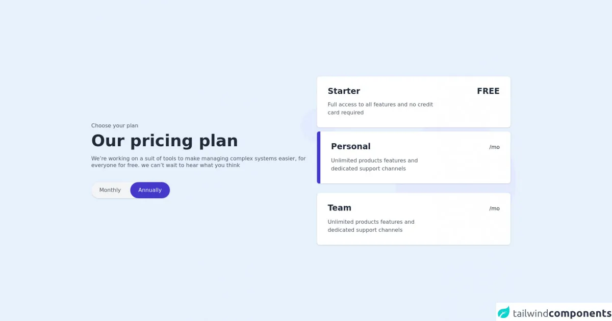
The preview of Free Tailwind CSS Pricing Component ui component.
The free Tailwind CSS pricing component is a visually appealing and responsive element that is easy to use and customize. It includes information such as the price, features, and benefits of each pricing plan, making it easy for users to choose the plan that best fits their needs.
Free download of the Free Tailwind CSS Pricing Component's source code
The source code of Free Tailwind CSS Pricing Component ui component.
The source code for the free Tailwind CSS pricing component is straightforward and easy to understand. It uses a combination of pre-defined Tailwind CSS classes and custom CSS to create a visually appealing and responsive design.
<div class="lg:flex items-center justify-between">
            <div class="lg:w-1/2 w-full">
                <p class="text-base leading-4 text-gray-600">Choose your plan</p>
                <h1 role="heading" class="md:text-5xl text-3xl font-bold leading-10 mt-3 text-gray-800">Our pricing plan</h1>
                <p role="contentinfo" class="text-base leading-5 mt-5 text-gray-600">We’re working on a suit of tools to make managing complex systems easier, for everyone for free. we can’t wait to hear what you think</p>
                <div class="w-56">
                    <button onclick="toggleIt()" class="bg-gray-100 shadow rounded-full flex items-center mt-10 rounded-full">
                        <div class="bg-gray-100 focus:ring-2 focus:ring-offset-2 focus:ring-indigo-700 focus:outline-none text-base leading-none text-gray-600 rounded-full py-4 px-6 mr-1" id="monthly">Monthly</div>
                        <div class="bg-indigo-700 focus:ring-2 focus:ring-offset-2 focus:ring-indigo-700 focus:outline-none text-base leading-none text-white rounded-full py-4 px-6" id="annually">Annually</div>
                    </button>
                </div>
            </div>
            <div class="xl:w-1/2 lg:w-7/12 relative w-full lg:mt-0 mt-12 md:px-8" role="list">
                <img src="https://i.ibb.co/0n6DSS3/bgimg.png" class="absolute w-full -ml-12 mt-24" alt="background circle images" />
                <div role="listitem" class="bg-white cursor-pointer shadow rounded-lg p-8 relative z-30">
                    <div class="md:flex items-center justify-between">
                        <h2 class="text-2xl font-semibold leading-6 text-gray-800">Starter</h2>
                        <p class="text-2xl font-semibold md:mt-0 mt-4 leading-6 text-gray-800">FREE</p>
                    </div>
                    <p class="md:w-80 text-base leading-6 mt-4 text-gray-600">Full access to all features and no credit card required</p>
                </div>
                <div role="listitem" class="bg-white cursor-pointer shadow rounded-lg mt-3 flex relative z-30">
                    <div class="w-2.5 h-auto bg-indigo-700 rounded-tl-md rounded-bl-md"></div>
                    <div class="w-full p-8">
                        <div class="md:flex items-center justify-between">
                            <h2 class="text-2xl font-semibold leading-6 text-gray-800">Personal</h2>
                            <p class="text-2xl md:mt-0 mt-4 font-semibold leading-6 text-gray-800"><span class="font-normal text-base">/mo</span></p>
                        </div>
                        <p class="md:w-80 text-base leading-6 mt-4 text-gray-600">Unlimited products features and dedicated support channels</p>
                    </div>
                </div>
                <div role="listitem" class="bg-white cursor-pointer shadow rounded-lg p-8 relative z-30 mt-7">
                    <div class="md:flex items-center justify-between">
                        <h2 class="text-2xl font-semibold leading-6 text-gray-800">Team</h2>
                        <p class="text-2xl md:mt-0 mt-4 font-semibold leading-6 text-gray-800"><span class="font-normal text-base">/mo</span></p>
                    </div>
                    <p class="md:w-80 text-base leading-6 mt-4 text-gray-600">Unlimited products features and dedicated support channels</p>
                </div>
            </div>
            <!--- more free and premium Tailwind CSS components at https://tailwinduikit.com/ --->
        </div>
How to create a Free Tailwind CSS Pricing Component with Tailwind CSS?
Now that we have covered the basics let's dive into how to create a free Tailwind CSS pricing component.
Step 1: Set up the HTML structure
The first step is to set up the HTML structure for the pricing component. We will use a simple HTML table to display the pricing information.
<div class="container mx-auto px-4">
  <table class="table-auto">
    <thead>
      <tr>
        <th class="px-4 py-2"></th>
        <th class="px-4 py-2">Basic</th>
        <th class="px-4 py-2">Pro</th>
        <th class="px-4 py-2">Enterprise</th>
      </tr>
    </thead>
    <tbody>
      <tr>
        <td class="border px-4 py-2">Price</td>
        <td class="border px-4 py-2">$9.99</td>
        <td class="border px-4 py-2">$19.99</td>
        <td class="border px-4 py-2">$29.99</td>
      </tr>
      <tr>
        <td class="border px-4 py-2">Users</td>
        <td class="border px-4 py-2">1</td>
        <td class="border px-4 py-2">5</td>
        <td class="border px-4 py-2">Unlimited</td>
      </tr>
      <tr>
        <td class="border px-4 py-2">Storage</td>
        <td class="border px-4 py-2">5GB</td>
        <td class="border px-4 py-2">25GB</td>
        <td class="border px-4 py-2">50GB</td>
      </tr>
      <tr>
        <td class="border px-4 py-2">Support</td>
        <td class="border px-4 py-2">Email</td>
        <td class="border px-4 py-2">Email & Phone</td>
        <td class="border px-4 py-2">Priority</td>
      </tr>
    </tbody>
  </table>
</div>
Step 2: Style the pricing component
The next step is to style the pricing component using Tailwind CSS classes. We will use a combination of pre-defined classes and custom CSS to create a visually appealing and responsive design.
table {
  width: 100%;
}

th,
td {
  text-align: center;
}

th {
  background-color: #f2f2f2;
}

td {
  font-size: 1.25rem;
}

td:first-child {
  text-align: left;
}

td:not(:first-child) {
  font-weight: bold;
}

@media (max-width: 640px) {
  td {
    font-size: 1rem;
  }
}
Step 3: Add responsive design
The final step is to add responsive design to the pricing component. We will use Tailwind CSS's built-in responsive classes to ensure that the pricing component looks great on all devices.
<div class="container mx-auto px-4">
  <table class="table-auto">
    <thead>
      <tr>
        <th class="px-4 py-2"></th>
        <th class="px-4 py-2 sm:py-4">Basic</th>
        <th class="px-4 py-2 sm:py-4">Pro</th>
        <th class="px-4 py-2 sm:py-4">Enterprise</th>
      </tr>
    </thead>
    <tbody>
      <tr>
        <td class="border px-4 py-2">Price</td>
        <td class="border px-4 py-2 sm:py-4">$9.99</td>
        <td class="border px-4 py-2 sm:py-4">$19.99</td>
        <td class="border px-4 py-2 sm:py-4">$29.99</td>
      </tr>
      <tr>
        <td class="border px-4 py-2">Users</td>
        <td class="border px-4 py-2 sm:py-4">1</td>
        <td class="border px-4 py-2 sm:py-4">5</td>
        <td class="border px-4 py-2 sm:py-4">Unlimited</td>
      </tr>
      <tr>
        <td class="border px-4 py-2">Storage</td>
        <td class="border px-4 py-2 sm:py-4">5GB</td>
        <td class="border px-4 py-2 sm:py-4">25GB</td>
        <td class="border px-4 py-2 sm:py-4">50GB</td>
      </tr>
      <tr>
        <td class="border px-4 py-2">Support</td>
        <td class="border px-4 py-2 sm:py-4">Email</td>
        <td class="border px-4 py-2 sm:py-4">Email & Phone</td>
        <td class="border px-4 py-2 sm:py-4">Priority</td>
      </tr>
    </tbody>
  </table>
</div>
Conclusion
In conclusion, creating a free Tailwind CSS pricing component is a straightforward process that can be completed quickly using pre-defined Tailwind CSS classes and custom CSS. The pricing component is an essential element for any website that sells products or services, and using Tailwind CSS makes it easy to create a visually appealing and responsive design that fits your brand.
We hope this guide has been helpful in showing you how to create a free Tailwind CSS pricing component. Happy coding!