- Published on
Learn How To Build A Free Tailwind CSS Pagination Component With Tailwind CSS Like an Expert
- What is Tailwind CSS?
- The description of Free Tailwind CSS Pagination Component ui component
- Why use Tailwind CSS to create a Free Tailwind CSS Pagination Component ui component?
- The preview of Free Tailwind CSS Pagination Component ui component
- The source code of Free Tailwind CSS Pagination Component ui component
- How to create a Free Tailwind CSS Pagination Component with Tailwind CSS?
- Conclusion
What is Tailwind CSS?
Tailwind CSS is a utility-first CSS framework that provides a set of pre-defined CSS classes that can be used to create custom designs quickly and easily. It is designed to be highly customizable, allowing developers to create unique designs without having to write custom CSS code.
The description of Free Tailwind CSS Pagination Component ui component
Pagination is a common UI component used in web applications to allow users to navigate through large sets of data. A pagination component typically includes a set of numbered links that allow users to move forward and backward through pages of data.
The Free Tailwind CSS Pagination Component is a pre-built pagination component that can be easily integrated into any web application. It is designed to be highly customizable, allowing developers to adjust the appearance and behavior of the component to meet their specific needs.
Why use Tailwind CSS to create a Free Tailwind CSS Pagination Component ui component?
Tailwind CSS provides a set of pre-defined CSS classes that can be used to create custom designs quickly and easily. This makes it an ideal choice for creating UI components like the Free Tailwind CSS Pagination Component.
Using Tailwind CSS to create a pagination component allows developers to focus on the functionality of the component rather than the design. This can save a significant amount of development time and effort, allowing developers to focus on other aspects of their application.
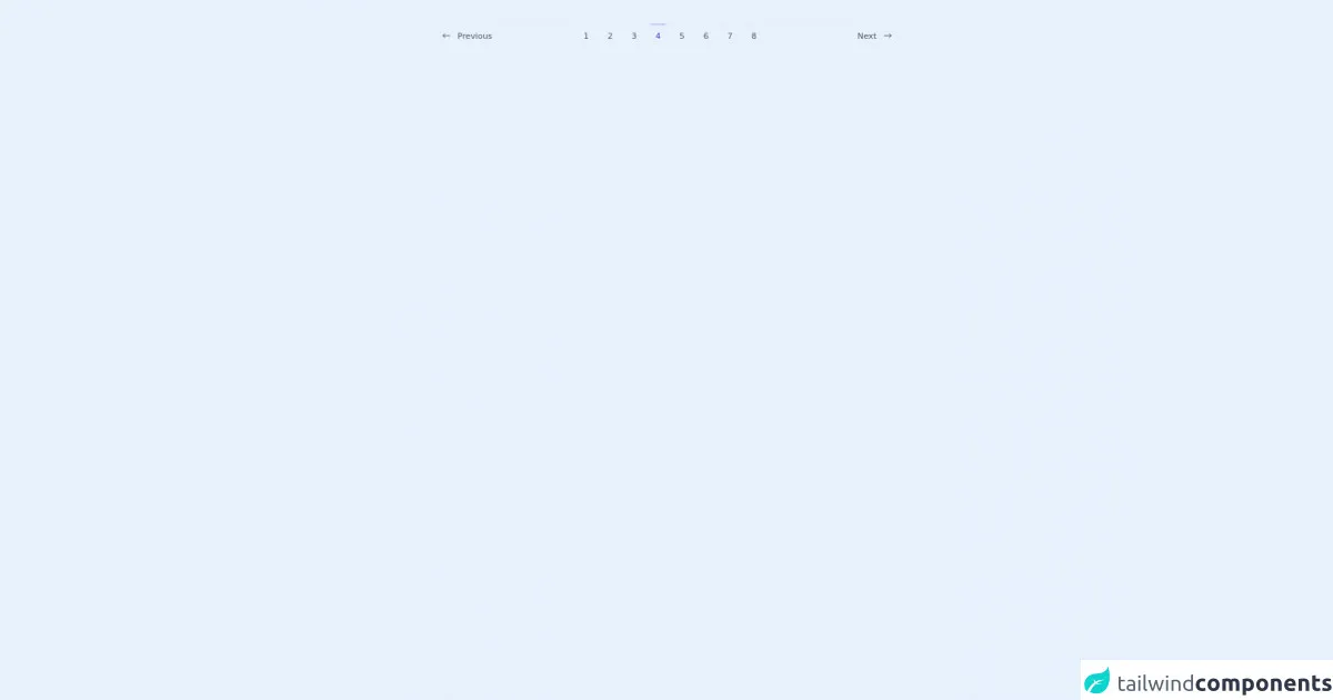
The preview of Free Tailwind CSS Pagination Component ui component
The Free Tailwind CSS Pagination Component is a highly customizable pagination component that can be easily integrated into any web application. It includes a set of numbered links that allow users to navigate through pages of data.
Free download of the Free Tailwind CSS Pagination Component's source code
The source code of Free Tailwind CSS Pagination Component ui component
The source code for the Free Tailwind CSS Pagination Component is available on GitHub. It includes HTML and CSS code that can be easily integrated into any web application.
<div class="flex items-center justify-center py-10 lg:px-0 sm:px-6 px-4">
<!--- more free and premium Tailwind CSS components at https://tailwinduikit.com/ --->

        <div class="lg:w-3/5 w-full  flex items-center justify-between border-t border-gray-200">
            <div class="flex items-center pt-3 text-gray-600 hover:text-indigo-700 cursor-pointer">
                <svg width="14" height="8" viewBox="0 0 14 8" fill="none" xmlns="http://www.w3.org/2000/svg">
                    <path d="M1.1665 4H12.8332" stroke="currentColor" stroke-width="1.25" stroke-linecap="round" stroke-linejoin="round"/>
                    <path d="M1.1665 4L4.49984 7.33333" stroke="currentColor" stroke-width="1.25" stroke-linecap="round" stroke-linejoin="round"/>
                    <path d="M1.1665 4.00002L4.49984 0.666687" stroke="currentColor" stroke-width="1.25" stroke-linecap="round" stroke-linejoin="round"/>
                    </svg>
                    <p class="text-sm ml-3 font-medium leading-none ">Previous</p>
            </div>
            <div class="sm:flex hidden">
                <p class="text-sm font-medium leading-none cursor-pointer text-gray-600 hover:text-indigo-700 border-t border-transparent hover:border-indigo-400 pt-3 mr-4 px-2">1</p>
                <p class="text-sm font-medium leading-none cursor-pointer text-gray-600 hover:text-indigo-700 border-t border-transparent hover:border-indigo-400 pt-3 mr-4 px-2">2</p>
                <p class="text-sm font-medium leading-none cursor-pointer text-gray-600 hover:text-indigo-700 border-t border-transparent hover:border-indigo-400 pt-3 mr-4 px-2">3</p>
                <p class="text-sm font-medium leading-none cursor-pointer text-indigo-700 border-t border-indigo-400 pt-3 mr-4 px-2">4</p>
                <p class="text-sm font-medium leading-none cursor-pointer text-gray-600 hover:text-indigo-700 border-t border-transparent hover:border-indigo-400 pt-3 mr-4 px-2">5</p>
                <p class="text-sm font-medium leading-none cursor-pointer text-gray-600 hover:text-indigo-700 border-t border-transparent hover:border-indigo-400 pt-3 mr-4 px-2">6</p>
                <p class="text-sm font-medium leading-none cursor-pointer text-gray-600 hover:text-indigo-700 border-t border-transparent hover:border-indigo-400 pt-3 mr-4 px-2">7</p>
                <p class="text-sm font-medium leading-none cursor-pointer text-gray-600 hover:text-indigo-700 border-t border-transparent hover:border-indigo-400 pt-3 mr-4 px-2">8</p>
            </div>
            <div class="flex items-center pt-3 text-gray-600 hover:text-indigo-700 cursor-pointer">
                <p class="text-sm font-medium leading-none mr-3">Next</p>
                <svg width="14" height="8" viewBox="0 0 14 8" fill="none" xmlns="http://www.w3.org/2000/svg">
                    <path d="M1.1665 4H12.8332" stroke="currentColor" stroke-width="1.25" stroke-linecap="round" stroke-linejoin="round"/>
                    <path d="M9.5 7.33333L12.8333 4" stroke="currentColor" stroke-width="1.25" stroke-linecap="round" stroke-linejoin="round"/>
                    <path d="M9.5 0.666687L12.8333 4.00002" stroke="currentColor" stroke-width="1.25" stroke-linecap="round" stroke-linejoin="round"/>
                    </svg>

            </div>
        </div>
    </div>
How to create a Free Tailwind CSS Pagination Component with Tailwind CSS?
Creating a Free Tailwind CSS Pagination Component with Tailwind CSS is a relatively simple process. The following steps outline the basic process:
Start by creating a new HTML file and adding the necessary HTML code for the pagination component. This should include a container element for the pagination links and a set of numbered links that allow users to navigate through pages of data.
Next, add the necessary Tailwind CSS classes to the HTML code to style the pagination component. This may include classes for the container element, the numbered links, and any other elements that make up the component.
Finally, test the pagination component in a web browser to ensure that it functions as expected. This may involve testing the navigation links to ensure that they move users forward and backward through pages of data.
Conclusion
The Free Tailwind CSS Pagination Component is a highly customizable pagination component that can be easily integrated into any web application. Using Tailwind CSS to create the component allows developers to focus on the functionality of the component rather than the design, saving time and effort. With the source code available on GitHub, developers can easily customize the component to meet their specific needs.