- Published on
3 Things You Must Know To Create A Free Tailwind CSS Newsletters Component With Tailwind CSS
- What is Tailwind CSS?
- The description of Free Tailwind CSS Newsletters Component ui component
- Why use Tailwind CSS to create a Free Tailwind CSS Newsletters Component ui component?
- The preview of Free Tailwind CSS Newsletters Component ui component
- The source code of Free Tailwind CSS Newsletters Component ui component
- How to create a Free Tailwind CSS Newsletters Component with Tailwind CSS?
- Step 1: Create the HTML code
- Step 2: Add Tailwind CSS classes
- Step 3: Customize the design
- Conclusion
As a FrontEnd technology blogger, you must have heard about Tailwind CSS. Tailwind CSS is a utility-first CSS framework that helps you create beautiful and responsive designs quickly. In this article, we will discuss how to create a Free Tailwind CSS Newsletters Component using Tailwind CSS.
What is Tailwind CSS?
Tailwind CSS is a utility-first CSS framework that allows you to create beautiful and responsive designs quickly. It provides a set of pre-defined classes that you can use to style your HTML elements. With Tailwind CSS, you don't have to write custom CSS code for every element on your website. Instead, you can use pre-defined classes to style your elements.
The description of Free Tailwind CSS Newsletters Component ui component
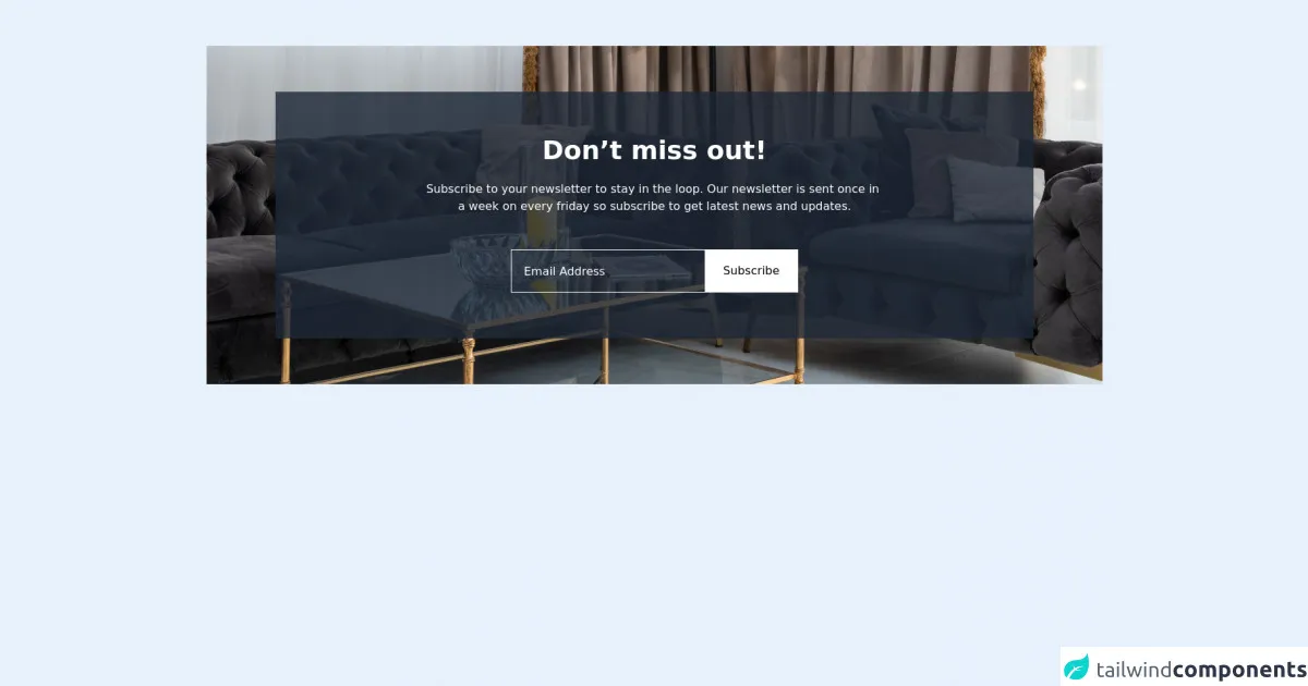
A newsletter is a great way to keep your audience engaged with your content. A Free Tailwind CSS Newsletters Component is a UI component that allows you to create a newsletter subscription form on your website. This component includes a form that collects the user's email address and a button to submit the form.
Why use Tailwind CSS to create a Free Tailwind CSS Newsletters Component ui component?
Tailwind CSS provides a set of pre-defined classes that you can use to style your HTML elements. This makes it easy to create a beautiful and responsive design for your Free Tailwind CSS Newsletters Component. Additionally, Tailwind CSS is easy to learn and use, even if you don't have a lot of experience with CSS.
The preview of Free Tailwind CSS Newsletters Component ui component
To create a Free Tailwind CSS Newsletters Component, you will need to use the following HTML and CSS code:
Free download of the Free Tailwind CSS Newsletters Component's source code
The source code of Free Tailwind CSS Newsletters Component ui component
To create a Free Tailwind CSS Newsletters Component, you will need to use the following HTML and CSS code:
<div class="2xl:mx-auto 2xl:container mx-4 py-16">
  <!--- more free and premium Tailwind CSS components at https://tailwinduikit.com/ --->
  <div class="w-full relative flex items-center justify-center">
    <img src="https://i.ibb.co/4sYZ8gC/img-2.png" alt="dining" class="w-full h-full absolute z-0 hidden xl:block" />
    <img src="https://i.ibb.co/bbS3J9C/pexels-max-vakhtbovych-6301182-1.png" alt="dining" class="w-full h-full absolute z-0 hidden sm:block xl:hidden" />
    <img src="https://i.ibb.co/JKkzGDs/pexels-max-vakhtbovych-6301182-1.png" alt="dining" class="w-full h-full absolute z-0 sm:hidden" />
    <div class="bg-gray-800 bg-opacity-80 md:my-16 lg:py-16 py-10 w-full md:mx-24 md:px-12 px-4 flex flex-col items-center justify-center relative z-40">
      <h1 class="text-4xl font-semibold leading-9 text-white text-center">Don’t miss out!</h1>
      <p class="text-base leading-normal text-center text-white mt-6">
        Subscribe to your newsletter to stay in the loop. Our newsletter is sent once in <br />
        a week on every friday so subscribe to get latest news and updates.
      </p>
      <div class="sm:border border-white flex-col sm:flex-row flex items-center lg:w-5/12 w-full mt-12 space-y-4 sm:space-y-0">
        <input class="border border-white sm:border-transparent text-base w-full font-medium leading-none text-white p-4 focus:outline-none bg-transparent placeholder-white" placeholder="Email Address" />
        <button class="focus:outline-none focus:ring-offset-2 focus:ring border border-white sm:border-transparent w-full sm:w-auto bg-white py-4 px-6 hover:bg-opacity-75">Subscribe</button>
      </div>
    </div>
  </div>
</div>
How to create a Free Tailwind CSS Newsletters Component with Tailwind CSS?
To create a Free Tailwind CSS Newsletters Component with Tailwind CSS, you will need to follow these steps:
Step 1: Create the HTML code
The first step is to create the HTML code for your Free Tailwind CSS Newsletters Component. This code should include a form that collects the user's email address and a button to submit the form. Here is an example of the HTML code:
<form class="bg-white p-6 rounded-lg shadow-md">
  <div class="mb-4">
    <label class="block text-gray-700 font-bold mb-2" for="email">
      Email Address
    </label>
    <input
      class="shadow appearance-none border rounded w-full py-2 px-3 text-gray-700 leading-tight focus:outline-none focus:shadow-outline"
      id="email"
      type="email"
      placeholder="Enter your email address"
    />
  </div>
  <button
    class="bg-blue-500 hover:bg-blue-700 text-white font-bold py-2 px-4 rounded focus:outline-none focus:shadow-outline"
    type="button"
  >
    Subscribe
  </button>
</form>
Step 2: Add Tailwind CSS classes
The next step is to add Tailwind CSS classes to your HTML code. These classes will style your HTML elements and make them look beautiful and responsive. Here is an example of the HTML code with Tailwind CSS classes:
<form class="bg-white p-6 rounded-lg shadow-md">
  <div class="mb-4">
    <label class="block text-gray-700 font-bold mb-2" for="email">
      Email Address
    </label>
    <input
      class="shadow appearance-none border rounded w-full py-2 px-3 text-gray-700 leading-tight focus:outline-none focus:shadow-outline"
      id="email"
      type="email"
      placeholder="Enter your email address"
    />
  </div>
  <button
    class="bg-blue-500 hover:bg-blue-700 text-white font-bold py-2 px-4 rounded focus:outline-none focus:shadow-outline"
    type="button"
  >
    Subscribe
  </button>
</form>
Step 3: Customize the design
The final step is to customize the design of your Free Tailwind CSS Newsletters Component. You can do this by modifying the Tailwind CSS classes that you added in step 2. For example, you can change the background color of the form by modifying the bg-white class. Here is an example of the HTML code with customized Tailwind CSS classes:
<form class="bg-gray-100 p-6 rounded-lg shadow-md">
  <div class="mb-4">
    <label class="block text-gray-700 font-bold mb-2" for="email">
      Email Address
    </label>
    <input
      class="shadow appearance-none border rounded w-full py-2 px-3 text-gray-700 leading-tight focus:outline-none focus:shadow-outline"
      id="email"
      type="email"
      placeholder="Enter your email address"
    />
  </div>
  <button
    class="bg-blue-500 hover:bg-blue-700 text-white font-bold py-2 px-4 rounded focus:outline-none focus:shadow-outline"
    type="button"
  >
    Subscribe
  </button>
</form>
Conclusion
In conclusion, creating a Free Tailwind CSS Newsletters Component is easy with Tailwind CSS. By following the steps outlined in this article, you can create a beautiful and responsive newsletter subscription form for your website. Tailwind CSS provides a set of pre-defined classes that you can use to style your HTML elements, making it easy to create a professional-looking design. So, what are you waiting for? Start creating your Free Tailwind CSS Newsletters Component today!