- Published on
The 5 Really Obvious Ways To Build A Free Tailwind CSS Modal Component With Tailwind CSS Better That You Ever Did
- What is Tailwind CSS?
- The description of Free Tailwind CSS Modal Component ui component
- Why use Tailwind CSS to create a Free Tailwind CSS Modal Component ui component?
- The preview of Free Tailwind CSS Modal Component ui component.
- The source code of Free Tailwind CSS Modal Component ui component.
- How to create a Free Tailwind CSS Modal Component with Tailwind CSS?
- Step 1: Install Tailwind CSS
- Step 2: Create the HTML markup
- Step 3: Add Tailwind CSS classes
- Step 4: Add JavaScript to show and hide the modal
- Step 5: Customize the modal
- Conclusion
As a FrontEnd technology blogger, you may have heard of Tailwind CSS. It is a popular utility-first CSS framework that allows you to quickly build custom designs without writing any CSS. In this article, we will explore how to build a Free Tailwind CSS Modal Component with Tailwind CSS.
What is Tailwind CSS?
Tailwind CSS is a utility-first CSS framework that provides a set of pre-defined CSS classes that you can use to style your HTML elements. It is designed to be highly customizable and flexible, allowing you to create unique designs without writing any CSS.
The description of Free Tailwind CSS Modal Component ui component
A modal is a dialog box or popup window that is displayed on top of the current page. It is used to display additional information or to ask the user for input. The Free Tailwind CSS Modal Component is a pre-built UI component that you can use to quickly add a modal to your website or application.
Why use Tailwind CSS to create a Free Tailwind CSS Modal Component ui component?
Tailwind CSS provides a set of pre-defined CSS classes that you can use to style your HTML elements. This makes it easy to create custom designs without writing any CSS. Additionally, Tailwind CSS is highly customizable, allowing you to create unique designs that match your brand or website.
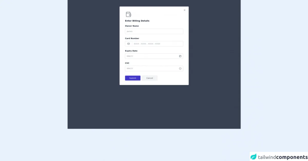
The preview of Free Tailwind CSS Modal Component ui component.
To give you an idea of what the Free Tailwind CSS Modal Component looks like, here is a preview:
Free download of the Free Tailwind CSS Modal Component's source code
The source code of Free Tailwind CSS Modal Component ui component.
If you are interested in seeing the source code for the Free Tailwind CSS Modal Component, you can find it here:
<!-- Code block starts -->
        <dh-component>
            <!--- more free and premium Tailwind CSS components at https://tailwinduikit.com/ --->
            <div class="py-12 bg-gray-700 transition duration-150 ease-in-out z-10 absolute top-0 right-0 bottom-0 left-0" id="modal">
                <div role="alert" class="container mx-auto w-11/12 md:w-2/3 max-w-lg">
                    <div class="relative py-8 px-5 md:px-10 bg-white shadow-md rounded border border-gray-400">
                        <div class="w-full flex justify-start text-gray-600 mb-3">
                            <svg  xmlns="http://www.w3.org/2000/svg" class="icon icon-tabler icon-tabler-wallet" width="52" height="52" viewBox="0 0 24 24" stroke-width="1" stroke="currentColor" fill="none" stroke-linecap="round" stroke-linejoin="round">
                                <path stroke="none" d="M0 0h24v24H0z" />
                                <path d="M17 8v-3a1 1 0 0 0 -1 -1h-10a2 2 0 0 0 0 4h12a1 1 0 0 1 1 1v3m0 4v3a1 1 0 0 1 -1 1h-12a2 2 0 0 1 -2 -2v-12" />
                                <path d="M20 12v4h-4a2 2 0 0 1 0 -4h4" />
                            </svg>
                        </div>
                        <h1 class="text-gray-800 font-lg font-bold tracking-normal leading-tight mb-4">Enter Billing Details</h1>
                        <label for="name" class="text-gray-800 text-sm font-bold leading-tight tracking-normal">Owner Name</label>
                        <input id="name" class="mb-5 mt-2 text-gray-600 focus:outline-none focus:border focus:border-indigo-700 font-normal w-full h-10 flex items-center pl-3 text-sm border-gray-300 rounded border" placeholder="James" />
                        <label for="email2" class="text-gray-800 text-sm font-bold leading-tight tracking-normal">Card Number</label>
                        <div class="relative mb-5 mt-2">
                            <div class="absolute text-gray-600 flex items-center px-4 border-r h-full">
                                <svg xmlns="http://www.w3.org/2000/svg" class="icon icon-tabler icon-tabler-credit-card" width="20" height="20" viewBox="0 0 24 24" stroke-width="1.5" stroke="currentColor" fill="none" stroke-linecap="round" stroke-linejoin="round">
                                    <path stroke="none" d="M0 0h24v24H0z" />
                                    <rect x="3" y="5" width="18" height="14" rx="3" />
                                    <line x1="3" y1="10" x2="21" y2="10" />
                                    <line x1="7" y1="15" x2="7.01" y2="15" />
                                    <line x1="11" y1="15" x2="13" y2="15" />
                                </svg>
                            </div>
                            <input id="email2" class="text-gray-600 focus:outline-none focus:border focus:border-indigo-700 font-normal w-full h-10 flex items-center pl-16 text-sm border-gray-300 rounded border" placeholder="XXXX - XXXX - XXXX - XXXX" />
                        </div>
                        <label for="expiry" class="text-gray-800 text-sm font-bold leading-tight tracking-normal">Expiry Date</label>
                        <div class="relative mb-5 mt-2">
                            <div class="absolute right-0 text-gray-600 flex items-center pr-3 h-full cursor-pointer">
                                <svg xmlns="http://www.w3.org/2000/svg" class="icon icon-tabler icon-tabler-calendar-event" width="20" height="20" viewBox="0 0 24 24" stroke-width="1.5" stroke="currentColor" fill="none" stroke-linecap="round" stroke-linejoin="round">
                                    <path stroke="none" d="M0 0h24v24H0z" />
                                    <rect x="4" y="5" width="16" height="16" rx="2" />
                                    <line x1="16" y1="3" x2="16" y2="7" />
                                    <line x1="8" y1="3" x2="8" y2="7" />
                                    <line x1="4" y1="11" x2="20" y2="11" />
                                    <rect x="8" y="15" width="2" height="2" />
                                </svg>
                            </div>
                            <input id="expiry" class="text-gray-600 focus:outline-none focus:border focus:border-indigo-700 font-normal w-full h-10 flex items-center pl-3 text-sm border-gray-300 rounded border" placeholder="MM/YY" />
                        </div>
                        <label for="cvc" class="text-gray-800 text-sm font-bold leading-tight tracking-normal">CVC</label>
                        <div class="relative mb-5 mt-2">
                            <div class="absolute right-0 text-gray-600 flex items-center pr-3 h-full cursor-pointer">
                                <svg xmlns="http://www.w3.org/2000/svg" class="icon icon-tabler icon-tabler-info-circle" width="20" height="20" viewBox="0 0 24 24" stroke-width="1.5" stroke="currentColor" fill="none" stroke-linecap="round" stroke-linejoin="round">
                                    <path stroke="none" d="M0 0h24v24H0z"></path>
                                    <circle cx="12" cy="12" r="9"></circle>
                                    <line x1="12" y1="8" x2="12.01" y2="8"></line>
                                    <polyline points="11 12 12 12 12 16 13 16"></polyline>
                                </svg>
                            </div>
                            <input id="cvc" class="mb-8 text-gray-600 focus:outline-none focus:border focus:border-indigo-700 font-normal w-full h-10 flex items-center pl-3 text-sm border-gray-300 rounded border" placeholder="MM/YY" />
                        </div>
                        <div class="flex items-center justify-start w-full">
                            <button class="focus:outline-none focus:ring-2 focus:ring-offset-2 focus:ring-indigo-700 transition duration-150 ease-in-out hover:bg-indigo-600 bg-indigo-700 rounded text-white px-8 py-2 text-sm">Submit</button>
                            <button class="focus:outline-none focus:ring-2 focus:ring-offset-2  focus:ring-gray-400 ml-3 bg-gray-100 transition duration-150 text-gray-600 ease-in-out hover:border-gray-400 hover:bg-gray-300 border rounded px-8 py-2 text-sm" onclick="modalHandler()">Cancel</button>
                        </div>
                        <button class="cursor-pointer absolute top-0 right-0 mt-4 mr-5 text-gray-400 hover:text-gray-600 transition duration-150 ease-in-out rounded focus:ring-2 focus:outline-none focus:ring-gray-600" onclick="modalHandler()" aria-label="close modal" role="button">
                            <svg  xmlns="http://www.w3.org/2000/svg"  class="icon icon-tabler icon-tabler-x" width="20" height="20" viewBox="0 0 24 24" stroke-width="2.5" stroke="currentColor" fill="none" stroke-linecap="round" stroke-linejoin="round">
                                <path stroke="none" d="M0 0h24v24H0z" />
                                <line x1="18" y1="6" x2="6" y2="18" />
                                <line x1="6" y1="6" x2="18" y2="18" />
                            </svg>
                        </button>
                    </div>
                </div>
            </div>
            <div class="w-full flex justify-center py-12" id="button">
                <button class="focus:outline-none focus:ring-2 focus:ring-offset-2 focus:ring-indigo-700 mx-auto transition duration-150 ease-in-out hover:bg-indigo-600 bg-indigo-700 rounded text-white px-4 sm:px-8 py-2 text-xs sm:text-sm" onclick="modalHandler(true)">Open Modal</button>
            </div>
            <script>
                let modal = document.getElementById("modal");
                function modalHandler(val) {
                    if (val) {
                        fadeIn(modal);
                    } else {
                        fadeOut(modal);
                    }
                }
                function fadeOut(el) {
                    el.style.opacity = 1;
                    (function fade() {
                        if ((el.style.opacity -= 0.1) < 0) {
                            el.style.display = "none";
                        } else {
                            requestAnimationFrame(fade);
                        }
                    })();
                }
                function fadeIn(el, display) {
                    el.style.opacity = 0;
                    el.style.display = display || "flex";
                    (function fade() {
                        let val = parseFloat(el.style.opacity);
                        if (!((val += 0.2) > 1)) {
                            el.style.opacity = val;
                            requestAnimationFrame(fade);
                        }
                    })();
                }
            </script>

        </dh-component>
        <!-- Code block ends -->
How to create a Free Tailwind CSS Modal Component with Tailwind CSS?
Now that we have covered the basics of Tailwind CSS and the Free Tailwind CSS Modal Component, let's dive into how to create a modal component with Tailwind CSS.
Step 1: Install Tailwind CSS
The first step is to install Tailwind CSS. You can do this by adding the following code to your HTML file:
<link rel="stylesheet" href="https://unpkg.com/tailwindcss@latest/dist/tailwind.min.css">
Alternatively, you can install Tailwind CSS using npm:
npm install tailwindcss
Step 2: Create the HTML markup
Next, you need to create the HTML markup for the modal. Here is an example:
<div class="modal fixed w-full h-full top-0 left-0 flex items-center justify-center">
  <div class="modal-overlay absolute w-full h-full bg-gray-900 opacity-50"></div>

  <div class="modal-container bg-white w-11/12 md:max-w-md mx-auto rounded shadow-lg z-50 overflow-y-auto">

    <div class="modal-content py-4 text-left px-6">
      <div class="flex justify-between items-center pb-3">
        <p class="text-2xl font-bold">Modal Header</p>
        <div class="modal-close cursor-pointer z-50">
          <svg class="fill-current text-black" xmlns="http://www.w3.org/2000/svg" width="18" height="18" viewBox="0 0 18 18">
            <path d="M1.5 1.5l15 15M16.5 1.5l-15 15"></path>
          </svg>
        </div>
      </div>
      <p>Modal content goes here.</p>
    </div>
  </div>
</div>
Step 3: Add Tailwind CSS classes
Once you have created the HTML markup, you can start adding Tailwind CSS classes to style the modal. Here is an example:
<div class="modal fixed w-full h-full top-0 left-0 flex items-center justify-center">
  <div class="modal-overlay absolute w-full h-full bg-gray-900 opacity-50"></div>

  <div class="modal-container bg-white w-11/12 md:max-w-md mx-auto rounded shadow-lg z-50 overflow-y-auto">

    <div class="modal-content py-4 text-left px-6">
      <div class="flex justify-between items-center pb-3">
        <p class="text-2xl font-bold">Modal Header</p>
        <div class="modal-close cursor-pointer z-50">
          <svg class="fill-current text-black" xmlns="http://www.w3.org/2000/svg" width="18" height="18" viewBox="0 0 18 18">
            <path d="M1.5 1.5l15 15M16.5 1.5l-15 15"></path>
          </svg>
        </div>
      </div>
      <p>Modal content goes here.</p>
    </div>
  </div>
</div>
Step 4: Add JavaScript to show and hide the modal
Finally, you need to add some JavaScript to show and hide the modal. Here is an example:
const openModalButtons = document.querySelectorAll('[data-modal-target]')
const closeModalButtons = document.querySelectorAll('[data-close-button]')
const overlay = document.getElementById('overlay')

openModalButtons.forEach(button => {
  button.addEventListener('click', () => {
    const modal = document.querySelector(button.dataset.modalTarget)
    openModal(modal)
  })
})

overlay.addEventListener('click', () => {
  const modals = document.querySelectorAll('.modal.active')
  modals.forEach(modal => {
    closeModal(modal)
  })
})

closeModalButtons.forEach(button => {
  button.addEventListener('click', () => {
    const modal = button.closest('.modal')
    closeModal(modal)
  })
})

function openModal(modal) {
  if (modal == null) return
  modal.classList.add('active')
  overlay.classList.add('active')
}

function closeModal(modal) {
  if (modal == null) return
  modal.classList.remove('active')
  overlay.classList.remove('active')
}
Step 5: Customize the modal
Once you have created the modal, you can customize it to match your brand or website. You can change the colors, fonts, and layout using Tailwind CSS classes.
Conclusion
In conclusion, building a Free Tailwind CSS Modal Component with Tailwind CSS is a great way to add a modal to your website or application. With Tailwind CSS, you can quickly create custom designs without writing any CSS. Additionally, the Free Tailwind CSS Modal Component provides a pre-built UI component that you can use to save time and effort.