- Published on
The Ninja Guide To How To Build A Free Tailwind CSS Highlights Component With Tailwind CSS Better
- What is Tailwind CSS?
- The description of Free Tailwind CSS Highlights Component ui component
- Why use Tailwind CSS to create a Free Tailwind CSS Highlights Component ui component?
- The preview of Free Tailwind CSS Highlights Component ui component
- The source code of Free Tailwind CSS Highlights Component ui component
- How to create a Free Tailwind CSS Highlights Component with Tailwind CSS?
- Conclusion
What is Tailwind CSS?
Tailwind CSS is a utility-first CSS framework that allows developers to quickly and easily create custom user interfaces. It provides a set of pre-defined classes that can be used to style HTML elements, making it easy to create responsive designs that work across different screen sizes.
The description of Free Tailwind CSS Highlights Component ui component
The Free Tailwind CSS Highlights Component is a UI component that can be used to highlight important information on a web page. It consists of a colored background with a border and text that is centered within the background. The component can be customized to match the color scheme of your website, making it a great addition to any project.
Why use Tailwind CSS to create a Free Tailwind CSS Highlights Component ui component?
Tailwind CSS provides a set of pre-defined classes that can be used to quickly and easily create custom UI components. This makes it easy to create a consistent look and feel across your entire website. Additionally, Tailwind CSS is highly customizable, allowing you to create unique designs that stand out from the crowd.
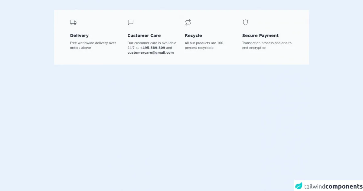
The preview of Free Tailwind CSS Highlights Component ui component
The Free Tailwind CSS Highlights Component is a simple and effective way to draw attention to important information on your website. It can be customized to match the color scheme of your website, making it a great addition to any project.
Free download of the Free Tailwind CSS Highlights Component's source code
The source code of Free Tailwind CSS Highlights Component ui component
If you want to create your own Free Tailwind CSS Highlights Component, you can use the following code as a starting point.
<div class="2xl:container 2xl:mx-auto md:py-12 py-9">
  <!--- more free and premium Tailwind CSS components at https://tailwinduikit.com/ --->
  <div class="bg-gray-50 dark:bg-gray-800 grid lg:grid-cols-4 md:grid-cols-2 grid-cols-1 lg:gap-8 md:gap-12 gap-14 lg:px-20 lg:py-12 py-10 md:px-12 px-4">
    <!-- Delivery grid Card -->
    <div class="">
      <svg class="text-gray-600 dark:text-white" width="32" height="32" viewBox="0 0 32 32" fill="none" xmlns="http://www.w3.org/2000/svg">
        <path d="M21.3334 4H1.33337V21.3333H21.3334V4Z" stroke="currentColor" stroke-width="1.5" stroke-linecap="round" stroke-linejoin="round" />
        <path d="M21.3334 10.6665H26.6667L30.6667 14.6665V21.3332H21.3334V10.6665Z" stroke="currentColor" stroke-width="1.5" stroke-linecap="round" stroke-linejoin="round" />
        <path d="M7.33333 28.0002C9.17428 28.0002 10.6667 26.5078 10.6667 24.6668C10.6667 22.8259 9.17428 21.3335 7.33333 21.3335C5.49238 21.3335 4 22.8259 4 24.6668C4 26.5078 5.49238 28.0002 7.33333 28.0002Z" stroke="currentColor" stroke-width="1.5" stroke-linecap="round" stroke-linejoin="round" />
        <path d="M24.6667 28.0002C26.5077 28.0002 28 26.5078 28 24.6668C28 22.8259 26.5077 21.3335 24.6667 21.3335C22.8258 21.3335 21.3334 22.8259 21.3334 24.6668C21.3334 26.5078 22.8258 28.0002 24.6667 28.0002Z" stroke="currentColor" stroke-width="1.5" stroke-linecap="round" stroke-linejoin="round" />
      </svg>
      <h3 class="text-xl leading-5 dark:text-white font-semibold text-gray-800 lg:mt-10 mt-8">Delivery</h3>
      <p class="text-base leading-6 font-normal dark:text-gray-300 text-gray-600 mt-4 lg:w-full md:w-9/12 w-full">Free worldwide delivery over orders above </p>
    </div>

    <!-- customer Grid Card -->

    <div class="">
      <svg class="text-gray-600 dark:text-white" width="32" height="32" viewBox="0 0 32 32" fill="none" xmlns="http://www.w3.org/2000/svg">
        <path d="M28 20C28 20.7072 27.719 21.3855 27.219 21.8856C26.7189 22.3857 26.0406 22.6667 25.3333 22.6667H9.33333L4 28V6.66667C4 5.95942 4.28095 5.28115 4.78105 4.78105C5.28115 4.28095 5.95942 4 6.66667 4H25.3333C26.0406 4 26.7189 4.28095 27.219 4.78105C27.719 5.28115 28 5.95942 28 6.66667V20Z" stroke="currentColor" stroke-width="1.5" stroke-linecap="round" stroke-linejoin="round" />
      </svg>
      <h3 class="text-xl leading-5 dark:text-white font-semibold text-gray-800 lg:mt-10 mt-8">Customer Care</h3>
      <p class="text-base leading-6 font-normal dark:text-gray-300 text-gray-600 mt-4 lg:w-full md:w-9/12 w-full">Our customer care is available 24/7 at <span class="font-semibold cursor-pointer">+495-589-509</span> and <span class="font-semibold cursor-pointer">[email protected]</span></p>
    </div>

    <!-- Recycle Grid Card -->

    <div class="">
      <svg class="text-gray-600 dark:text-white" width="32" height="32" viewBox="0 0 32 32" fill="none" xmlns="http://www.w3.org/2000/svg">
        <path d="M22.6667 1.3335L28.0001 6.66683L22.6667 12.0002" stroke="currentColor" stroke-width="1.5" stroke-linecap="round" stroke-linejoin="round" />
        <path d="M4 14.6665V11.9998C4 10.5853 4.5619 9.22879 5.5621 8.2286C6.56229 7.22841 7.91885 6.6665 9.33333 6.6665H28" stroke="currentColor" stroke-width="1.5" stroke-linecap="round" stroke-linejoin="round" />
        <path d="M9.33333 30.6667L4 25.3333L9.33333 20" stroke="currentColor" stroke-width="1.5" stroke-linecap="round" stroke-linejoin="round" />
        <path d="M28 17.3335V20.0002C28 21.4147 27.4381 22.7712 26.4379 23.7714C25.4377 24.7716 24.0812 25.3335 22.6667 25.3335H4" stroke="currentColor" stroke-width="1.5" stroke-linecap="round" stroke-linejoin="round" />
      </svg>
      <h3 class="text-xl leading-5 dark:text-white font-semibold text-gray-800 lg:mt-10 mt-8">Recycle</h3>
      <p class="text-base leading-6 font-normal dark:text-gray-300 text-gray-600 mt-4 lg:w-full md:w-9/12 w-full">All out products are 100 percent recycable</p>
    </div>

    <!-- Secure Payment Card -->

    <div class="">
      <svg class="text-gray-600 dark:text-white" width="32" height="32" viewBox="0 0 32 32" fill="none" xmlns="http://www.w3.org/2000/svg">
        <path d="M15.9999 29.3332C15.9999 29.3332 26.6666 23.9998 26.6666 15.9998V6.6665L15.9999 2.6665L5.33325 6.6665V15.9998C5.33325 23.9998 15.9999 29.3332 15.9999 29.3332Z" stroke="currentColor" stroke-width="1.5" stroke-linecap="round" stroke-linejoin="round" />
      </svg>
      <h3 class="text-xl leading-5 dark:text-white font-semibold text-gray-800 lg:mt-10 mt-8">Secure Payment</h3>
      <p class="text-base leading-6 font-normal dark:text-gray-300 text-gray-600 mt-4 lg:w-full md:w-9/12 w-full">Transaction process has end to end encryption</p>
    </div>
  </div>
</div>
How to create a Free Tailwind CSS Highlights Component with Tailwind CSS?
To create a Free Tailwind CSS Highlights Component with Tailwind CSS, follow these steps:
- Start by creating a new HTML file and adding the following code:
<div class="bg-blue-500 border border-blue-700 text-white text-center p-4">
  This is a highlighted section
</div>
- This code creates a simple highlighted section with a blue background and white text. To customize the component, you can modify the classes used in the
divelement. For example, to change the background color to red, you can use thebg-red-500class:
<div class="bg-red-500 border border-red-700 text-white text-center p-4">
  This is a highlighted section
</div>
- You can also modify the size of the component by adjusting the padding. For example, to create a larger component, you can use the
p-8class:
<div class="bg-blue-500 border border-blue-700 text-white text-center p-8">
  This is a larger highlighted section
</div>
- Finally, you can add additional styles to the component by using custom CSS. For example, to add a drop shadow to the component, you can add the following CSS:
.box-shadow {
  box-shadow: 0px 0px 10px rgba(0, 0, 0, 0.5);
}
And then add the box-shadow class to the div element:
<div class="bg-blue-500 border border-blue-700 text-white text-center p-4 box-shadow">
  This is a highlighted section with a drop shadow
</div>
Conclusion
The Free Tailwind CSS Highlights Component is a simple and effective way to draw attention to important information on your website. By using Tailwind CSS, you can easily customize the component to match the color scheme of your website and create a consistent look and feel across your entire project. With the steps outlined in this guide, you can quickly and easily create your own Free Tailwind CSS Highlights Component and take your web design to the next level.