- Published on
Learn How To Create A Free Tailwind CSS Grid Card Component With Tailwind CSS Like an Expert
- What is Tailwind CSS?
- The description of Free Tailwind CSS Grid Card Component ui component
- Why use Tailwind CSS to create a Free Tailwind CSS Grid Card Component ui component?
- The preview of Free Tailwind CSS Grid Card Component ui component
- The source code of Free Tailwind CSS Grid Card Component ui component
- How to create a Free Tailwind CSS Grid Card Component with Tailwind CSS?
- Conclusion
What is Tailwind CSS?
Tailwind CSS is a utility-first CSS framework that provides pre-defined classes to quickly style your HTML elements. It allows you to create custom designs without writing any CSS code. Tailwind CSS is easy to learn and use, and it is highly customizable.
The description of Free Tailwind CSS Grid Card Component ui component
The Free Tailwind CSS Grid Card Component is a UI component that allows you to display information in a grid format. It is a responsive component that works well on different screen sizes. The component consists of a card that contains an image, a title, a description, and a button. The component is easy to use and customize, and it is suitable for different types of websites.
Why use Tailwind CSS to create a Free Tailwind CSS Grid Card Component ui component?
Tailwind CSS provides pre-defined classes that make it easy to create a responsive and customizable UI component. With Tailwind CSS, you can create a Free Tailwind CSS Grid Card Component in just a few minutes. Tailwind CSS also allows you to customize the component to match your website's design.
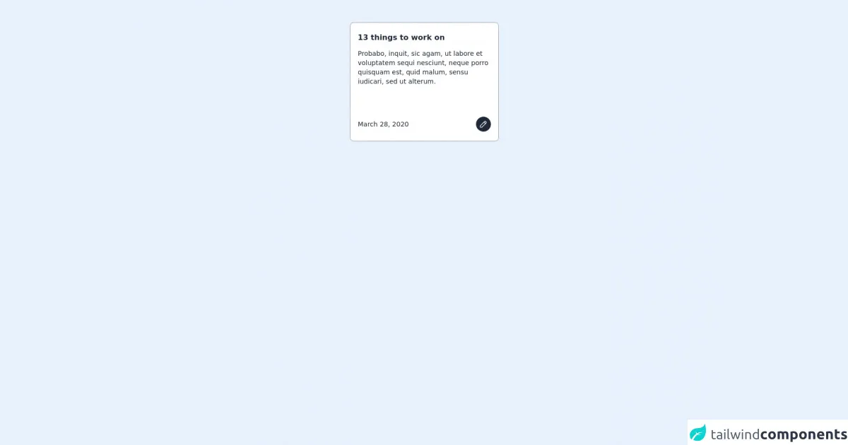
The preview of Free Tailwind CSS Grid Card Component ui component
The Free Tailwind CSS Grid Card Component is a responsive UI component that displays information in a grid format. It consists of a card that contains an image, a title, a description, and a button. The component is easy to use and customize, and it is suitable for different types of websites.
Free download of the Free Tailwind CSS Grid Card Component's source code
The source code of Free Tailwind CSS Grid Card Component ui component
The source code of the Free Tailwind CSS Grid Card Component is easy to understand and customize. It consists of HTML and CSS code that defines the structure and style of the component.
<div class="flex w-full items-center flex justify-center items-center py-12 px-6">
            <div>
                <!--- more free and premium Tailwind CSS components at https://tailwinduikit.com/ --->
                <div class="max-w-xs h-64 flex flex-col justify-between bg-white dark:bg-gray-800 rounded-lg border border-gray-400 mb-6 py-5 px-4">
                    <div>
                        <h4 tabindex="0" class="focus:outline-none text-gray-800 dark:text-gray-100 font-bold mb-3">13 things to work on</h4>
                        <p tabindex="0" class="focus:outline-none text-gray-800 dark:text-gray-100 text-sm">Probabo, inquit, sic agam, ut labore et voluptatem sequi nesciunt, neque porro quisquam est, quid malum, sensu iudicari, sed ut alterum.</p>
                    </div>
                    <div>
                        <div class="flex items-center justify-between text-gray-800">
                            <p tabindex="0" class="focus:outline-none text-sm dark:text-gray-100">March 28, 2020</p>
                            <div class="w-8 h-8 rounded-full bg-gray-800 text-white flex items-center justify-center">
                                <svg xmlns="http://www.w3.org/2000/svg" aria-label="edit icon" role="button" tabindex="0" class="focus:outline-none icon icon-tabler icon-tabler-pencil" width="20" height="20" viewBox="0 0 24 24" stroke-width="1.5" stroke="currentColor" fill="none" stroke-linecap="round" stroke-linejoin="round">
                                    <path stroke="none" d="M0 0h24v24H0z" />
                                    <path d="M4 20h4l10.5 -10.5a1.5 1.5 0 0 0 -4 -4l-10.5 10.5v4" />
                                    <line x1="13.5" y1="6.5" x2="17.5" y2="10.5" />
                                </svg>
                            </div>
                        </div>
                    </div>
                </div>
            </div>
        </div>
How to create a Free Tailwind CSS Grid Card Component with Tailwind CSS?
To create a Free Tailwind CSS Grid Card Component with Tailwind CSS, follow these steps:
- Create a new HTML file and add the following code:
<div class="grid grid-cols-1 sm:grid-cols-2 md:grid-cols-3 lg:grid-cols-4 gap-4">
  <div class="bg-white rounded-lg overflow-hidden shadow-lg">
    <img class="w-full h-48 object-cover" src="https://source.unsplash.com/random" alt="Card image">
    <div class="p-4">
      <h2 class="font-bold text-xl mb-2">Card title</h2>
      <p class="text-gray-700 text-base">Card description</p>
    </div>
    <div class="p-4">
      <a href="#" class="bg-blue-500 hover:bg-blue-700 text-white font-bold py-2 px-4 rounded">Button</a>
    </div>
  </div>
</div>
- Add the Tailwind CSS CDN to your HTML file:
<head>
  <link rel="stylesheet" href="https://cdn.jsdelivr.net/npm/tailwindcss@latest/dist/tailwind.min.css">
</head>
Customize the component by changing the content and styles of the HTML code.
Save the file and open it in a web browser to see the Free Tailwind CSS Grid Card Component in action.
Conclusion
In this article, we learned how to create a Free Tailwind CSS Grid Card Component with Tailwind CSS. We also learned about the benefits of using Tailwind CSS to create UI components. The Free Tailwind CSS Grid Card Component is a responsive and customizable component that is suitable for different types of websites. With Tailwind CSS, you can create custom designs without writing any CSS code, which makes it easy to create UI components quickly and efficiently.