- Published on
How to Make A Free Tailwind CSS Graph Component With Tailwind CSS?
- What is Tailwind CSS?
- The description of Free Tailwind CSS Graph Component ui component
- Why use Tailwind CSS to create a Free Tailwind CSS Graph Component ui component?
- The preview of Free Tailwind CSS Graph Component ui component.
- The source code of Free Tailwind CSS Graph Component ui component.
- How to create a Free Tailwind CSS Graph Component with Tailwind CSS?
- Step 1: Set up a new project
- Step 2: Create the HTML structure
- Step 3: Style the graph component
- Step 4: Add data to the graph component
- Conclusion
What is Tailwind CSS?
Tailwind CSS is a utility-first CSS framework that allows you to rapidly build custom user interfaces. It provides a set of pre-defined classes that can be used to style your HTML elements without writing any custom CSS. Tailwind CSS is gaining popularity among developers due to its flexibility and ease of use.
The description of Free Tailwind CSS Graph Component ui component
A graph is a visual representation of data that is used to display information in a clear and concise manner. A graph component is a reusable UI element that can be used to display different types of graphs. In this article, we will create a free Tailwind CSS graph component that can be used in any web application.
Why use Tailwind CSS to create a Free Tailwind CSS Graph Component ui component?
Tailwind CSS provides a set of pre-defined classes that can be used to style HTML elements without writing any custom CSS. This makes it easy to create a graph component with Tailwind CSS, as we can use the pre-defined classes to style the different elements of the graph. Additionally, Tailwind CSS is highly customizable, which means that we can easily modify the styles of the graph component to match the design of our web application.
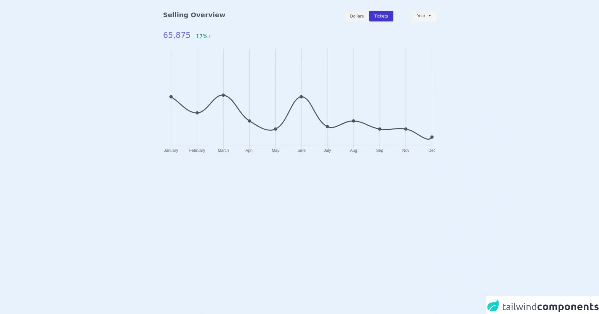
The preview of Free Tailwind CSS Graph Component ui component.
To give you an idea of what the free Tailwind CSS graph component will look like, here is a preview:
Free download of the Free Tailwind CSS Graph Component's source code
The source code of Free Tailwind CSS Graph Component ui component.
Here is the source code for the free Tailwind CSS graph component:
<div class="flex items-center justify-center py-8 px-4">
<!--- more free and premium Tailwind CSS components at https://tailwinduikit.com/ --->

            <div class="w-11/12 lg:w-2/3">
                <div class="flex flex-col justify-between h-full">
                    <div>
                        <div class="lg:flex w-full justify-between">
                            <h3 class="text-gray-600 dark:text-gray-400 leading-5 text-base md:text-xl font-bold">Selling Overview</h3>
                            <div class="flex items-center justify-between lg:justify-start mt-2 md:mt-4 lg:mt-0">
                                <div class="flex items-center">
                                    <button class="py-2 px-4 bg-gray-100 dark:bg-gray-700 rounded ease-in duration-150 text-xs text-gray-600 dark:text-gray-400 hover:bg-gray-200">Dollars</button>
                                    <button class="py-2 px-4 bg-indigo-700 focus:outline-none focus:ring-2 focus:ring-offset-2 focus:ring-indigo-700 rounded text-white ease-in duration-150 text-xs hover:bg-indigo-600">Tickets</button>
                                </div>
                                <div class="lg:ml-14">
                                    <div class="bg-gray-100 dark:bg-gray-700 ease-in duration-150 hover:bg-gray-200 pb-2 pt-1 px-3 rounded-sm">
                                        <select aria-label="select year"  class="text-xs text-gray-600 dark:text-gray-400 bg-transparent focus:outline-none focus:ring-2 focus:ring-offset-2 focus:ring-gray-800 rounded">
                                            <option class="leading-1">Year</option>
                                            <option class="leading-1">2020</option>
                                            <option class="leading-1">2019</option>
                                        </select>
                                    </div>
                                </div>
                            </div>
                        </div>
                        <div class="flex items-end mt-6">
                            <h3 class="text-indigo-500 leading-5 text-lg md:text-2xl">65,875</h3>
                            <div class="flex items-center md:ml-4 ml-1 text-green-700">
                                <p class="text-green-700 text-xs md:text-base">17%</p>
                                <svg role="img" class="text-green-700" aria-label="increase. upward arrow icon" xmlns="http://www.w3.org/2000/svg" width="12" height="12" viewBox="0 0 12 12" fill="none">
                                    <path d="M6 2.5V9.5" stroke="currentColor" stroke-width="0.75" stroke-linecap="round" stroke-linejoin="round"></path>
                                    <path d="M8 4.5L6 2.5" stroke="currentColor" stroke-width="0.75" stroke-linecap="round" stroke-linejoin="round"></path>
                                    <path d="M4 4.5L6 2.5" stroke="currentColor" stroke-width="0.75" stroke-linecap="round" stroke-linejoin="round"></path>
                                </svg>
                            </div>
                        </div>
                    </div>
                    <div class="mt-6">
                        <canvas id="myChart" width="1025" height="400" role="img" aria-label="line graph to show selling overview in terms of months and numbers" ></canvas>
                    </div>
                </div>
            </div>
        </div>
        <script src="https://cdn.jsdelivr.net/npm/[email protected]"></script>
        <script>const chart = new Chart(document.getElementById("myChart"), {
  type: "line",
  data: {
    labels: [
      "January",
      "February",
      "March",
      "April",
      "May",
      "June",
      "July",
      "Aug",
      "Sep",
      "Nov",
      "Dec"
    ],
    datasets: [
      {
        label: "16 Mar 2018",
        borderColor: "#4A5568",
        data: [600, 400, 620, 300, 200, 600, 230, 300, 200, 200, 100, 1200],
        fill: false,
        pointBackgroundColor: "#4A5568",
        borderWidth: "3",
        pointBorderWidth: "4",
        pointHoverRadius: "6",
        pointHoverBorderWidth: "8",
        pointHoverBorderColor: "rgb(74,85,104,0.2)"
      }
    ]
  },
  options: {
    legend: {
      position: false
    },
    scales: {
      yAxes: [
        {
          gridLines: {
            display: false
          },
          display: false
        }
      ]
    }
  }
});
</script>
How to create a Free Tailwind CSS Graph Component with Tailwind CSS?
To create a free Tailwind CSS graph component, we will follow these steps:
Step 1: Set up a new project
First, we need to set up a new project. We can do this by creating a new HTML file and linking to the Tailwind CSS CDN.
<!DOCTYPE html>
<html lang="en">
  <head>
    <meta charset="UTF-8" />
    <meta name="viewport" content="width=device-width, initial-scale=1.0" />
    <title>Free Tailwind CSS Graph Component</title>
    <link
      rel="stylesheet"
      href="https://cdn.jsdelivr.net/npm/[email protected]/dist/tailwind.min.css"
    />
  </head>
  <body>
    <!-- Our graph component will go here -->
  </body>
</html>
Step 2: Create the HTML structure
Next, we need to create the HTML structure for our graph component. We will use a div element to wrap the entire graph component, and then we will use svg elements to create the different parts of the graph.
<div class="graph-container">
  <svg class="graph-axis-x"></svg>
  <svg class="graph-axis-y"></svg>
  <svg class="graph-bars"></svg>
</div>
Step 3: Style the graph component
Now that we have created the HTML structure for our graph component, we can start styling it using Tailwind CSS classes. Here is the CSS code for the graph component:
.graph-container {
  width: 100%;
  height: 300px;
  position: relative;
}

.graph-axis-x,
.graph-axis-y,
.graph-bars {
  position: absolute;
  top: 0;
  left: 0;
  width: 100%;
  height: 100%;
}

.graph-axis-x line,
.graph-axis-y line {
  stroke: #e5e7eb;
  stroke-width: 1;
}

.graph-bars rect {
  fill: #60a5fa;
}
Step 4: Add data to the graph component
Finally, we need to add data to the graph component. We can do this by using JavaScript to dynamically create the rect elements for the bars of the graph. Here is the JavaScript code for adding data to the graph component:
const data = [10, 20, 30, 40, 50];

const graphBars = document.querySelector(".graph-bars");

data.forEach((value, index) => {
  const rect = document.createElementNS(
    "http://www.w3.org/2000/svg",
    "rect"
  );
  rect.setAttribute("x", `${index * 50}`);
  rect.setAttribute("y", `${300 - value}`);
  rect.setAttribute("width", "40");
  rect.setAttribute("height", `${value}`);
  graphBars.appendChild(rect);
});
Conclusion
In this article, we have learned how to create a free Tailwind CSS graph component that can be used in any web application. We have seen how Tailwind CSS can be used to rapidly build custom user interfaces, and how it can be used to style the different elements of the graph component. By following the steps outlined in this article, you can easily create your own graph component using Tailwind CSS.