- Published on
6 Tips To Build A Free Tailwind CSS Full Width With Right Grey Card Component With Tailwind CSS
- What is Tailwind CSS?
- The description of Free Tailwind CSS Full Width With Right Grey Card Component ui component
- Why use Tailwind CSS to create a Free Tailwind CSS Full Width With Right Grey Card Component ui component?
- The preview of Free Tailwind CSS Full Width With Right Grey Card Component ui component
- The source code of Free Tailwind CSS Full Width With Right Grey Card Component ui component
- How to create a Free Tailwind CSS Full Width With Right Grey Card Component with Tailwind CSS?
- 1. Set up your HTML structure
- 2. Add Tailwind CSS classes to your HTML elements
- 3. Customize your Tailwind CSS classes
- 4. Add responsive classes for different screen sizes
- 5. Use Tailwind CSS plugins for additional functionality
- 6. Test and refine your UI component
- Conclusion
What is Tailwind CSS?
Tailwind CSS is a utility-first CSS framework that provides a set of pre-defined CSS classes to help you quickly build custom user interfaces. It is a popular choice for developers who want to create responsive and scalable UI components without writing custom CSS from scratch.
The description of Free Tailwind CSS Full Width With Right Grey Card Component ui component
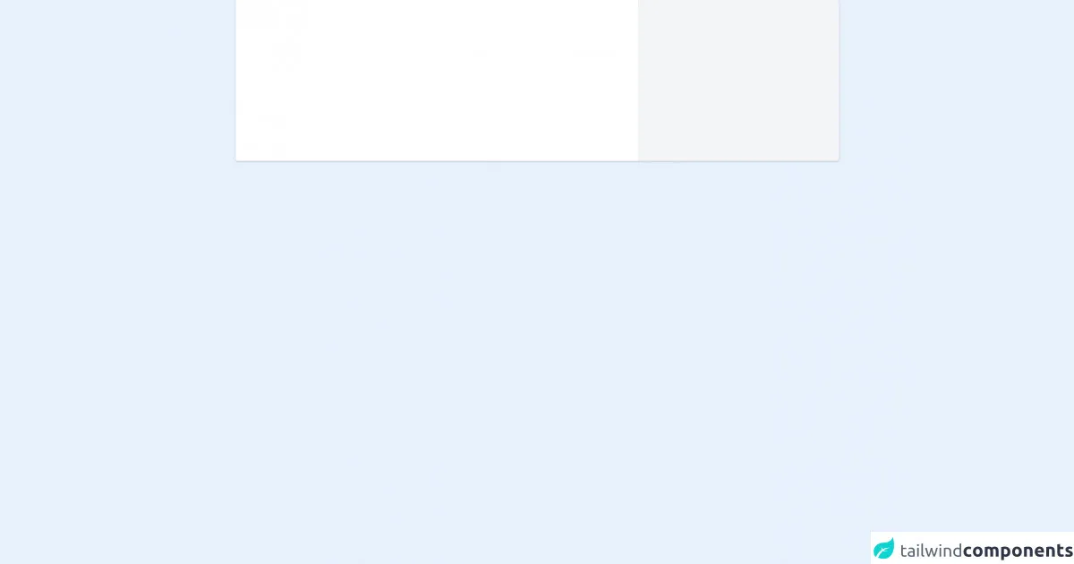
The Free Tailwind CSS Full Width With Right Grey Card Component UI component is a simple and elegant design that can be used for a variety of purposes. It features a full-width layout with a right-aligned grey card that can be used to display information, images, or other content. The design is clean and modern, making it a great choice for websites, blogs, or other digital projects.
Why use Tailwind CSS to create a Free Tailwind CSS Full Width With Right Grey Card Component ui component?
Tailwind CSS provides a number of benefits for developers who want to create custom UI components. Some of the key advantages of using Tailwind CSS include:
- Rapid development: Tailwind CSS provides a set of pre-defined CSS classes that can be used to quickly build custom UI components. This can save time and effort compared to writing custom CSS from scratch.
- Consistency: By using pre-defined CSS classes, developers can ensure that their UI components are consistent across different pages and projects. This can help to improve the user experience and make it easier to maintain code over time.
- Scalability: Tailwind CSS is designed to be scalable, which means that it can be used to create UI components of any size or complexity. This makes it a great choice for projects of all sizes, from small websites to large enterprise applications.
The preview of Free Tailwind CSS Full Width With Right Grey Card Component ui component
Free download of the Free Tailwind CSS Full Width With Right Grey Card Component's source code
The source code of Free Tailwind CSS Full Width With Right Grey Card Component ui component
<div class="container w-11/12 lg:w-9/12 mx-auto">
             <!-- Code block starts -->
            <!--- more free and premium Tailwind CSS components at https://tailwinduikit.com/ --->
             <dh-component>
                 <div class="flex items-center justify-between w-full">
                     <div class="flex flex-col lg:flex-row w-full items-start lg:items-center rounded bg-white shadow">
                         <div class="w-full lg:w-2/3 h-64 dark:bg-gray-800"></div>
                         <div class="w-full lg:w-1/3 h-24 dark:border-gray-700 lg:h-64 border-t lg:border-t-0 lg:border-r lg:border-l lg:rounded-r dark:bg-gray-700 bg-gray-100"></div>
                     </div>
                 </div>
             </dh-component>
             <!-- Code block ends -->
         </div>
How to create a Free Tailwind CSS Full Width With Right Grey Card Component with Tailwind CSS?
Here are six tips to help you create a Free Tailwind CSS Full Width With Right Grey Card Component with Tailwind CSS:
1. Set up your HTML structure
To get started, you'll need to set up the basic HTML structure for your Free Tailwind CSS Full Width With Right Grey Card Component. This should include a container element for the full-width layout, as well as a card element for the grey card.
<div class="container mx-auto">
  <div class="flex flex-wrap">
    <div class="w-full md:w-2/3 px-4">
      <!-- Full-width content goes here -->
    </div>
    <div class="w-full md:w-1/3 px-4">
      <!-- Grey card content goes here -->
    </div>
  </div>
</div>
2. Add Tailwind CSS classes to your HTML elements
Once you have your HTML structure in place, you can start adding Tailwind CSS classes to your HTML elements. This will help to define the layout and styling of your Free Tailwind CSS Full Width With Right Grey Card Component.
<div class="container mx-auto">
  <div class="flex flex-wrap">
    <div class="w-full md:w-2/3 px-4">
      <!-- Full-width content goes here -->
      <h1 class="text-4xl font-bold mb-4">Welcome to my website</h1>
      <p class="text-lg mb-4">Lorem ipsum dolor sit amet, consectetur adipiscing elit. Sed euismod, libero vel euismod ullamcorper, nunc nunc malesuada lorem, vel aliquet velit nisl sed risus.</p>
      <a href="#" class="bg-blue-500 hover:bg-blue-700 text-white font-bold py-2 px-4 rounded">Learn more</a>
    </div>
    <div class="w-full md:w-1/3 px-4">
      <!-- Grey card content goes here -->
      <div class="bg-gray-200 p-4 rounded">
        <h2 class="text-xl font-bold mb-4">About me</h2>
        <p class="text-base mb-4">Lorem ipsum dolor sit amet, consectetur adipiscing elit. Sed euismod, libero vel euismod ullamcorper, nunc nunc malesuada lorem, vel aliquet velit nisl sed risus.</p>
        <a href="#" class="bg-blue-500 hover:bg-blue-700 text-white font-bold py-2 px-4 rounded">Contact me</a>
      </div>
    </div>
  </div>
</div>
3. Customize your Tailwind CSS classes
Tailwind CSS provides a wide range of pre-defined CSS classes, but you can also customize these classes to suit your specific needs. For example, you might want to adjust the font size or color of your text, or change the background color of your grey card.
<div class="container mx-auto">
  <div class="flex flex-wrap">
    <div class="w-full md:w-2/3 px-4">
      <!-- Full-width content goes here -->
      <h1 class="text-4xl font-bold mb-4 text-blue-500">Welcome to my website</h1>
      <p class="text-lg mb-4 text-gray-500">Lorem ipsum dolor sit amet, consectetur adipiscing elit. Sed euismod, libero vel euismod ullamcorper, nunc nunc malesuada lorem, vel aliquet velit nisl sed risus.</p>
      <a href="#" class="bg-blue-500 hover:bg-blue-700 text-white font-bold py-2 px-4 rounded">Learn more</a>
    </div>
    <div class="w-full md:w-1/3 px-4">
      <!-- Grey card content goes here -->
      <div class="bg-gray-300 p-4 rounded">
        <h2 class="text-xl font-bold mb-4 text-blue-500">About me</h2>
        <p class="text-base mb-4 text-gray-500">Lorem ipsum dolor sit amet, consectetur adipiscing elit. Sed euismod, libero vel euismod ullamcorper, nunc nunc malesuada lorem, vel aliquet velit nisl sed risus.</p>
        <a href="#" class="bg-blue-500 hover:bg-blue-700 text-white font-bold py-2 px-4 rounded">Contact me</a>
      </div>
    </div>
  </div>
</div>
4. Add responsive classes for different screen sizes
Tailwind CSS provides a range of responsive classes that allow you to adjust the layout and styling of your UI components for different screen sizes. For example, you might want to display your grey card above your full-width content on smaller screens.
<div class="container mx-auto">
  <div class="flex flex-wrap">
    <div class="w-full md:w-2/3 px-4 order-last md:order-first">
      <!-- Full-width content goes here -->
      <h1 class="text-4xl font-bold mb-4 text-blue-500">Welcome to my website</h1>
      <p class="text-lg mb-4 text-gray-500">Lorem ipsum dolor sit amet, consectetur adipiscing elit. Sed euismod, libero vel euismod ullamcorper, nunc nunc malesuada lorem, vel aliquet velit nisl sed risus.</p>
      <a href="#" class="bg-blue-500 hover:bg-blue-700 text-white font-bold py-2 px-4 rounded">Learn more</a>
    </div>
    <div class="w-full md:w-1/3 px-4 order-first md:order-last">
      <!-- Grey card content goes here -->
      <div class="bg-gray-300 p-4 rounded">
        <h2 class="text-xl font-bold mb-4 text-blue-500">About me</h2>
        <p class="text-base mb-4 text-gray-500">Lorem ipsum dolor sit amet, consectetur adipiscing elit. Sed euismod, libero vel euismod ullamcorper, nunc nunc malesuada lorem, vel aliquet velit nisl sed risus.</p>
        <a href="#" class="bg-blue-500 hover:bg-blue-700 text-white font-bold py-2 px-4 rounded">Contact me</a>
      </div>
    </div>
  </div>
</div>
5. Use Tailwind CSS plugins for additional functionality
Tailwind CSS provides a range of plugins that can be used to add additional functionality to your UI components. For example, you might want to use the Tailwind CSS Forms plugin to create a contact form within your grey card.
<div class="container mx-auto">
  <div class="flex flex-wrap">
    <div class="w-full md:w-2/3 px-4 order-last md:order-first">
      <!-- Full-width content goes here -->
      <h1 class="text-4xl font-bold mb-4 text-blue-500">Welcome to my website</h1>
      <p class="text-lg mb-4 text-gray-500">Lorem ipsum dolor sit amet, consectetur adipiscing elit. Sed euismod, libero vel euismod ullamcorper, nunc nunc malesuada lorem, vel aliquet velit nisl sed risus.</p>
      <a href="#" class="bg-blue-500 hover:bg-blue-700 text-white font-bold py-2 px-4 rounded">Learn more</a>
    </div>
    <div class="w-full md:w-1/3 px-4 order-first md:order-last">
      <!-- Grey card content goes here -->
      <div class="bg-gray-300 p-4 rounded">
        <h2 class="text-xl font-bold mb-4 text-blue-500">Contact me</h2>
        <form>
          <div class="mb-4">
            <label class="block text-gray-700 font-bold mb-2" for="name">
              Name
            </label>
            <input class="shadow appearance-none border rounded w-full py-2 px-3 text-gray-700 leading-tight focus:outline-none focus:shadow-outline" id="name" type="text" placeholder="Enter your name">
          </div>
          <div class="mb-4">
            <label class="block text-gray-700 font-bold mb-2" for="email">
              Email
            </label>
            <input class="shadow appearance-none border rounded w-full py-2 px-3 text-gray-700 leading-tight focus:outline-none focus:shadow-outline" id="email" type="email" placeholder="Enter your email">
          </div>
          <div class="mb-4">
            <label class="block text-gray-700 font-bold mb-2" for="message">
              Message
            </label>
            <textarea class="shadow appearance-none border rounded w-full py-2 px-3 text-gray-700 leading-tight focus:outline-none focus:shadow-outline" id="message" placeholder="Enter your message"></textarea>
          </div>
          <div class="flex items-center justify-between">
            <button class="bg-blue-500 hover:bg-blue-700 text-white font-bold py-2 px-4 rounded focus:outline-none focus:shadow-outline" type="submit">
              Send
            </button>
          </div>
        </form>
      </div>
    </div>
  </div>
</div>
6. Test and refine your UI component
Once you have created your Free Tailwind CSS Full Width With Right Grey Card Component, it's important to test it thoroughly to ensure that it works as expected. You may also want to refine the design or functionality based on user feedback or other factors.
Conclusion
The Free Tailwind CSS Full Width With Right Grey Card Component is a great choice for developers who want to create a simple and elegant UI component for their website or digital project. By following these six tips, you can quickly and easily create a custom UI component using Tailwind CSS that is responsive, scalable, and easy to maintain.