- Published on
The Ultimate Guide To Help You Make A Free Tailwind CSS Featured Component With Tailwind CSS
- What is Tailwind CSS?
- The description of Free Tailwind CSS Featured Component ui component
- Why use Tailwind CSS to create a Free Tailwind CSS Featured Component ui component?
- The preview of Free Tailwind CSS Featured Component ui component.
- The source code of Free Tailwind CSS Featured Component ui component.
- How to create a Free Tailwind CSS Featured Component with Tailwind CSS?
- Step 1: Set up your project
- Step 2: Create the HTML structure
- Step 3: Style the component with Tailwind CSS
- Step 4: Customize the component
- Conclusion
What is Tailwind CSS?
Tailwind CSS is a utility-first CSS framework that allows you to create custom designs quickly. It provides a set of pre-defined CSS classes that you can use to style your HTML elements. With Tailwind CSS, you can create responsive designs, customize your color palette, and more.
The description of Free Tailwind CSS Featured Component ui component
A Free Tailwind CSS Featured Component is a UI component that can be used to display a featured item on your website or application. It typically includes an image, a title, a description, and a call-to-action button. This component is useful for highlighting important content and driving user engagement.
Why use Tailwind CSS to create a Free Tailwind CSS Featured Component ui component?
Tailwind CSS is an excellent choice for creating a Free Tailwind CSS Featured Component because it provides a set of pre-defined CSS classes that you can use to style your component quickly. With Tailwind CSS, you can create a responsive design that looks great on any device. Additionally, Tailwind CSS allows you to customize your color palette, typography, and more, so you can create a unique design that matches your brand.
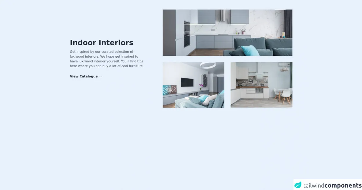
The preview of Free Tailwind CSS Featured Component ui component.
Free download of the Free Tailwind CSS Featured Component's source code
The source code of Free Tailwind CSS Featured Component ui component.
<div class="lg:px-20 md:px-6 px-4 md:py-12 py-8">
  <!--- more free and premium Tailwind CSS components at https://tailwinduikit.com/ --->
  <div class="lg:flex items-center justify-between">
    <div class="lg:w-1/3">
      <h1 class="text-4xl font-semibold leading-9 text-gray-800 dark:text-white">Indoor Interiors</h1>
      <p class="text-base leading-6 mt-4 text-gray-600 dark:text-gray-100">Get inspired by our curated selection of luxiwood interiors. We hope get inspired to have luxiwood interior yourself. You’ll find tips here where you can buy a lot of cool furniture.</p>
      <button role="button" aria-label="view catalogue" class="focus:ring-2 focus:ring-offset-2 focus:ring-gray-700 focus:outline-none mt-6 md:mt-8 text-base font-semibold leading-none text-gray-800 dark:text-white flex items-center hover:underline">
        View Catalogue
        <svg class="ml-2 mt-1 dark:text-white" width="12" height="8" viewBox="0 0 12 8" fill="none" xmlns="http://www.w3.org/2000/svg">
          <path d="M1.33325 4H10.6666" stroke="currentColor" stroke-linecap="round" stroke-linejoin="round" />
          <path d="M8 6.66667L10.6667 4" stroke="currentColor" stroke-linecap="round" stroke-linejoin="round" />
          <path d="M8 1.33398L10.6667 4.00065" stroke="currentColor" stroke-linecap="round" stroke-linejoin="round" />
        </svg>
      </button>
    </div>
    <div class="lg:w-7/12 lg:mt-0 mt-8">
      <div class="w-full h-full bg-red-200">
        <img src="https://i.ibb.co/cbyDY74/pexels-max-vakhtbovych-6782351-1-1.png" alt="apartment design" class="w-full sm:block hidden" />
        <img src="https://i.ibb.co/ZVPGjGJ/pexels-max-vakhtbovych-6782351-1.png" alt="apartment design" class="sm:hidden block w-full" />
      </div>
      <div class="grid sm:grid-cols-2 md:grid-cols-2 lg:grid-cols-2 xl:grid-cols-2 lg:gap-8 gap-6 lg:mt-8 md:mt-6 mt-4">
        <img src="https://i.ibb.co/4Jrp5TB/pexels-max-vakhtbovych-6782370-1.png" class="w-full" alt="kitchen" />
        <img src="https://i.ibb.co/0Jv3FSy/pexels-max-vakhtbovych-6436799-1-1.png" class="w-full" alt="sitting room" />
      </div>
    </div>
  </div>
</div>
How to create a Free Tailwind CSS Featured Component with Tailwind CSS?
To create a Free Tailwind CSS Featured Component, follow these steps:
Step 1: Set up your project
To get started, create a new HTML file and include the Tailwind CSS stylesheet. You can do this by adding the following code to the head section of your HTML file:
<head>
  <link rel="stylesheet" href="https://unpkg.com/tailwindcss@latest/dist/tailwind.min.css">
</head>
Step 2: Create the HTML structure
Next, create the HTML structure for your Free Tailwind CSS Featured Component. Here's an example:
<div class="max-w-md mx-auto bg-white rounded-xl shadow-md overflow-hidden md:max-w-2xl">
  <div class="md:flex">
    <div class="md:flex-shrink-0">
      <img class="h-48 w-full object-cover md:w-48" src="https://via.placeholder.com/300x200.png" alt="Featured Item">
    </div>
    <div class="p-8">
      <div class="uppercase tracking-wide text-sm text-indigo-500 font-semibold">Featured</div>
      <a href="#" class="block mt-1 text-lg leading-tight font-medium text-black hover:underline">Title of featured item</a>
      <p class="mt-2 text-gray-500">Lorem ipsum dolor sit amet, consectetur adipiscing elit. Phasellus nec iaculis mauris.</p>
      <a href="#" class="mt-3 text-indigo-500 hover:text-indigo-600 underline">Learn more</a>
    </div>
  </div>
</div>
Step 3: Style the component with Tailwind CSS
Now that you have your HTML structure, you can style your Free Tailwind CSS Featured Component using Tailwind CSS classes. Here's an example:
<div class="max-w-md mx-auto bg-white rounded-xl shadow-md overflow-hidden md:max-w-2xl">
  <div class="md:flex">
    <div class="md:flex-shrink-0">
      <img class="h-48 w-full object-cover md:w-48" src="https://via.placeholder.com/300x200.png" alt="Featured Item">
    </div>
    <div class="p-8">
      <div class="uppercase tracking-wide text-sm text-indigo-500 font-semibold">Featured</div>
      <a href="#" class="block mt-1 text-lg leading-tight font-medium text-black hover:underline">Title of featured item</a>
      <p class="mt-2 text-gray-500">Lorem ipsum dolor sit amet, consectetur adipiscing elit. Phasellus nec iaculis mauris.</p>
      <a href="#" class="mt-3 text-indigo-500 hover:text-indigo-600 underline">Learn more</a>
    </div>
  </div>
</div>
Step 4: Customize the component
Finally, you can customize your Free Tailwind CSS Featured Component by changing the colors, typography, and other styles. Here's an example:
<div class="max-w-md mx-auto bg-purple-100 rounded-xl shadow-md overflow-hidden md:max-w-2xl">
  <div class="md:flex">
    <div class="md:flex-shrink-0">
      <img class="h-48 w-full object-cover md:w-48" src="https://via.placeholder.com/300x200.png" alt="Featured Item">
    </div>
    <div class="p-8">
      <div class="uppercase tracking-wide text-sm text-purple-500 font-semibold">Featured</div>
      <a href="#" class="block mt-1 text-lg leading-tight font-medium text-black hover:underline">Title of featured item</a>
      <p class="mt-2 text-gray-500">Lorem ipsum dolor sit amet, consectetur adipiscing elit. Phasellus nec iaculis mauris.</p>
      <a href="#" class="mt-3 text-purple-500 hover:text-purple-600 underline">Learn more</a>
    </div>
  </div>
</div>
Conclusion
In conclusion, creating a Free Tailwind CSS Featured Component is a simple process that can be done quickly with Tailwind CSS. By following the steps outlined in this article, you can create a responsive, customizable component that can be used to highlight important content on your website or application. So, give it a try and see how Tailwind CSS can help you create beautiful designs with ease.