- Published on
6 Steps To Build A Free Tailwind CSS Feature Component With Tailwind CSS Like A Pro In Under An Hour
- What is Tailwind CSS?
- The description of Free Tailwind CSS Feature Component ui component
- Why use Tailwind CSS to create a Free Tailwind CSS Feature Component ui component?
- The preview of Free Tailwind CSS Feature Component ui component.
- The source code of Free Tailwind CSS Feature Component ui component.
- How to create a Free Tailwind CSS Feature Component with Tailwind CSS?
- Step 1: Set up your development environment
- Step 2: Create a new project
- Step 3: Install Tailwind CSS
- Step 4: Create a Tailwind CSS configuration file
- Step 5: Create the HTML markup
- Step 6: Style the UI component with Tailwind CSS
- Conclusion
As a FrontEnd technology blogger, I know how important it is to create stunning UI components that are both visually appealing and functional. Tailwind CSS is a popular utility-first CSS framework that can help you achieve this goal. In this article, we will walk through the steps to create a Free Tailwind CSS Feature Component UI component using Tailwind CSS.
What is Tailwind CSS?
Tailwind CSS is a utility-first CSS framework that provides you with a set of pre-defined CSS classes that you can use to style your UI components. It allows you to create custom designs by combining these classes without writing any CSS code.
The description of Free Tailwind CSS Feature Component ui component
The Free Tailwind CSS Feature Component is a UI component that is designed to showcase a product feature. It consists of an image, a title, a description, and a call-to-action button. This UI component is perfect for product landing pages, marketing websites, and e-commerce websites.
Why use Tailwind CSS to create a Free Tailwind CSS Feature Component ui component?
Tailwind CSS provides a set of pre-defined CSS classes that you can use to style your UI components. This makes it easy to create custom designs without writing any CSS code. Additionally, Tailwind CSS is highly customizable, which means that you can easily modify the default styles to match your brand's colors and typography.
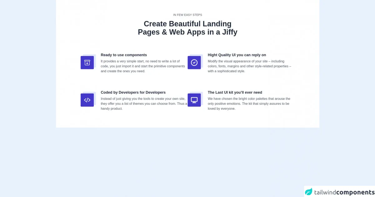
The preview of Free Tailwind CSS Feature Component ui component.
To get a better understanding of what the Free Tailwind CSS Feature Component looks like, take a look at the preview below.
Free download of the Free Tailwind CSS Feature Component's source code
The source code of Free Tailwind CSS Feature Component ui component.
If you want to create a Free Tailwind CSS Feature Component UI component, you can use the following source code as a starting point.
<div class="pb-16" style="font-family: 'Lato', sans-serif">
            <!-- Code block starts -->
            <dh-component>
                <section class="max-w-8xl mx-auto container bg-white pt-16">
                    <div>
                        <div role="contentinfo" class="flex items-center flex-col px-4">
                            <p tabindex="0" class="focus:outline-none uppercase text-sm text-center text-gray-600 leading-4">in few easy steps</p>
                            <hh1 tabindex="0" class="focus:outline-none text-4xl lg:text-4xl font-extrabold text-center leading-10 text-gray-800 lg:w-5/12 md:w-9/12 pt-4">Create Beautiful Landing Pages & Web Apps in a Jiffy</hh1>
                        </div>
                        <div tabindex="0" aria-label="group of cards" class="focus:outline-none mt-20 flex flex-wrap justify-center gap-10 px-4">
                            <div tabindex="0" aria-label="card 1" class="focus:outline-none flex sm:w-full md:w-5/12 pb-20">
                                <div class="w-20 h-20 relative mr-5">
                                    <div class="absolute top-0 right-0 bg-indigo-100 rounded w-16 h-16 mt-2 mr-1"></div>
                                    <div class="absolute text-white bottom-0 left-0 bg-indigo-700 rounded w-16 h-16 flex items-center justify-center mt-2 mr-3">
                                        <img src="https://tuk-cdn.s3.amazonaws.com/can-uploader/icon_and_text-SVG1.svg" alt="drawer">
                                    </div>
                                </div>
                                <div class="w-10/12">
                                    <h2 tabindex="0" class="focus:outline-none text-lg font-bold leading-tight text-gray-800">Ready to use components</h2>
                                    <p tabindex="0" class="focus:outline-none text-base text-gray-600 leading-normal pt-2">It provides a very simple start, no need to write a lot of code, you just import it and start the primitive components and create the ones you need.</p>
                                </div>
                            </div>
                            <div tabindex="0" aria-label="card 2" class="focus:outline-none flex sm:w-full md:w-5/12 pb-20">
                                <div class="w-20 h-20 relative mr-5">
                                    <div class="absolute top-0 right-0 bg-indigo-100 rounded w-16 h-16 mt-2 mr-1"></div>
                                    <div class="absolute text-white bottom-0 left-0 bg-indigo-700 rounded w-16 h-16 flex items-center justify-center mt-2 mr-3">
                                        <img src="https://tuk-cdn.s3.amazonaws.com/can-uploader/icon_and_text-SVG2.svg" alt="check">
                                    </div>
                                </div>
                                <div class="w-10/12">
                                    <h2 tabindex="0" class="focus:outline-none text-lg font-semibold leading-tight text-gray-800">Hight Quality UI you can reply on</h2>
                                    <p tabindex="0" class="focus:outline-none text-base text-gray-600 leading-normal pt-2">Modify the visual appearance of your site – including colors, fonts, margins and other style-related properties – with a sophisticated style.</p>
                                </div>
                            </div>
                            <div tabindex="0" aria-label="card 3" class="focus:outline-none flex sm:w-full md:w-5/12 pb-20">
                                <div class="w-20 h-20 relative mr-5">
                                    <div class="absolute top-0 right-0 bg-indigo-100 rounded w-16 h-16 mt-2 mr-1"></div>
                                    <div class="absolute text-white bottom-0 left-0 bg-indigo-700 rounded w-16 h-16 flex items-center justify-center mt-2 mr-3">
                                        <img src="https://tuk-cdn.s3.amazonaws.com/can-uploader/icon_and_text-SVG3.svg" alt="html tag">
                                    </div>
                                </div>
                                <div class="w-10/12">
                                    <h2 tabindex="0" class="focus:outline-none text-lg font-semibold leading-tight text-gray-800">Coded by Developers for Developers</h2>
                                    <p tabindex="0" class="focus:outline-none text-base text-gray-600 leading-normal pt-2">Instead of just giving you the tools to create your own site, they offer you a list of themes you can choose from. Thus a handy product.</p>
                                </div>
                            </div>
                            <div tabindex="0" aria-label="card 4" class="focus:outline-none flex sm:w-full md:w-5/12 pb-20">
                                <div class="w-20 h-20 relative mr-5">
                                    <div class="absolute top-0 right-0 bg-indigo-100 rounded w-16 h-16 mt-2 mr-1"></div>
                                    <div class="absolute text-white bottom-0 left-0 bg-indigo-700 rounded w-16 h-16 flex items-center justify-center mt-2 mr-3">
                                        <img src="https://tuk-cdn.s3.amazonaws.com/can-uploader/icon_and_text-SVG4.svg" alt="monitor">
                                    </div>
                                </div>
                                <div class="w-10/12">
                                    <h2 tabindex="0" class="focus:outline-none text-lg font-semibold leading-tight text-gray-800">The Last UI kit you’ll ever need</h2>
                                    <p tabindex="0" class="focus:outline-none text-base text-gray-600 leading-normal pt-2">We have chosen the bright color palettes that arouse the only positive emotions. The kit that simply assures to be loved by everyone.</p>
                                </div>
                            </div>
                        </div>
                    </div>
                </section>
            </dh-component>
            <!-- Code block ends -->
  <!--- more free and premium Tailwind CSS components at https://tailwinduikit.com/ --->
        </div>
How to create a Free Tailwind CSS Feature Component with Tailwind CSS?
Now that you have a better understanding of what the Free Tailwind CSS Feature Component looks like and why you should use Tailwind CSS to create it, let's walk through the steps to create this UI component.
Step 1: Set up your development environment
To get started, you will need to set up your development environment. This will involve installing Node.js and npm (Node Package Manager) on your computer. You can download Node.js from the official website and npm will be installed automatically.
Step 2: Create a new project
Once you have set up your development environment, you can create a new project by running the following command in your terminal.
npm init
This will create a new package.json file in your project directory.
Step 3: Install Tailwind CSS
Next, you will need to install Tailwind CSS by running the following command in your terminal.
npm install tailwindcss
Step 4: Create a Tailwind CSS configuration file
After installing Tailwind CSS, you will need to create a configuration file by running the following command in your terminal.
npx tailwindcss init
This will create a new tailwind.config.js file in your project directory.
Step 5: Create the HTML markup
Now that you have set up your development environment and installed Tailwind CSS, you can create the HTML markup for the Free Tailwind CSS Feature Component. You can use the following code as a starting point.
<div class="max-w-sm rounded overflow-hidden shadow-lg">
  <img class="w-full" src="https://via.placeholder.com/350x150" alt="Sunset in the mountains">
  <div class="px-6 py-4">
    <div class="font-bold text-xl mb-2">Feature Title</div>
    <p class="text-gray-700 text-base">
      Lorem ipsum dolor sit amet, consectetur adipiscing elit. Sed do eiusmod tempor incididunt ut labore et dolore magna aliqua.
    </p>
  </div>
  <div class="px-6 pt-4 pb-2">
    <button class="bg-blue-500 hover:bg-blue-700 text-white font-bold py-2 px-4 rounded">
      Call to Action
    </button>
  </div>
</div>
Step 6: Style the UI component with Tailwind CSS
Finally, you can style the Free Tailwind CSS Feature Component using Tailwind CSS classes. You can use the following code as a starting point.
<style>
  .max-w-sm {
    max-width: 18rem;
  }

  .rounded {
    border-radius: 0.25rem;
  }

  .overflow-hidden {
    overflow: hidden;
  }

  .shadow-lg {
    box-shadow: 0 10px 20px rgba(0, 0, 0, 0.19), 0 6px 6px rgba(0, 0, 0, 0.23);
  }

  .w-full {
    width: 100%;
  }

  .px-6 {
    padding-left: 1.5rem;
    padding-right: 1.5rem;
  }

  .py-4 {
    padding-top: 1rem;
    padding-bottom: 1rem;
  }

  .font-bold {
    font-weight: 700;
  }

  .text-xl {
    font-size: 1.25rem;
  }

  .mb-2 {
    margin-bottom: 0.5rem;
  }

  .text-gray-700 {
    color: #4a5568;
  }

  .text-base {
    font-size: 1rem;
  }

  .px-6 {
    padding-left: 1.5rem;
    padding-right: 1.5rem;
  }

  .pt-4 {
    padding-top: 1rem;
  }

  .pb-2 {
    padding-bottom: 0.5rem;
  }

  .bg-blue-500 {
    background-color: #4299e1;
  }

  .hover\:bg-blue-700:hover {
    background-color: #1a202c;
  }

  .text-white {
    color: #fff;
  }

  .font-bold {
    font-weight: 700;
  }

  .py-2 {
    padding-top: 0.5rem;
    padding-bottom: 0.5rem;
  }

  .px-4 {
    padding-left: 1rem;
    padding-right: 1rem;
  }

  .rounded {
    border-radius: 0.25rem;
  }
</style>
Conclusion
In this article, we walked through the steps to create a Free Tailwind CSS Feature Component UI component using Tailwind CSS. We covered what Tailwind CSS is, why you should use it to create UI components, and how to create this specific UI component. By following these steps, you can create stunning UI components that are both visually appealing and functional.