- Published on
Here Are 6 Ways To Build A Free Tailwind CSS Dropdown Component With Tailwind CSS
- What is Tailwind CSS?
- The description of Free Tailwind CSS Dropdown Component ui component
- Why use Tailwind CSS to create a Free Tailwind CSS Dropdown Component ui component?
- The preview of Free Tailwind CSS Dropdown Component ui component.
- The source code of Free Tailwind CSS Dropdown Component ui component.
- How to create a Free Tailwind CSS Dropdown Component with Tailwind CSS?
- Method 1: Using HTML and CSS
- Method 2: Using JavaScript
- Method 3: Using Vue.js
- Method 4: Using React
- Method 5: Using Angular
- Method 6: Using Svelte
- Conclusion
What is Tailwind CSS?
Tailwind CSS is a utility-first CSS framework that helps developers to create custom designs quickly. It provides a set of pre-defined CSS classes that can be used to create complex layouts and designs without writing custom CSS code. Tailwind CSS is highly customizable, and it can be used with any front-end framework or library.
The description of Free Tailwind CSS Dropdown Component ui component
A dropdown component is a common UI element that allows users to select an option from a list. A dropdown component can be used in various scenarios, such as selecting a language, choosing a category, or filtering search results. In this article, we will learn how to create a free Tailwind CSS dropdown component.
Why use Tailwind CSS to create a Free Tailwind CSS Dropdown Component ui component?
Tailwind CSS provides a set of pre-defined CSS classes that can be used to create complex UI components quickly. It also provides a responsive design system that allows developers to create designs that work on different screen sizes. Using Tailwind CSS, we can create a free Tailwind CSS dropdown component that is highly customizable and responsive.
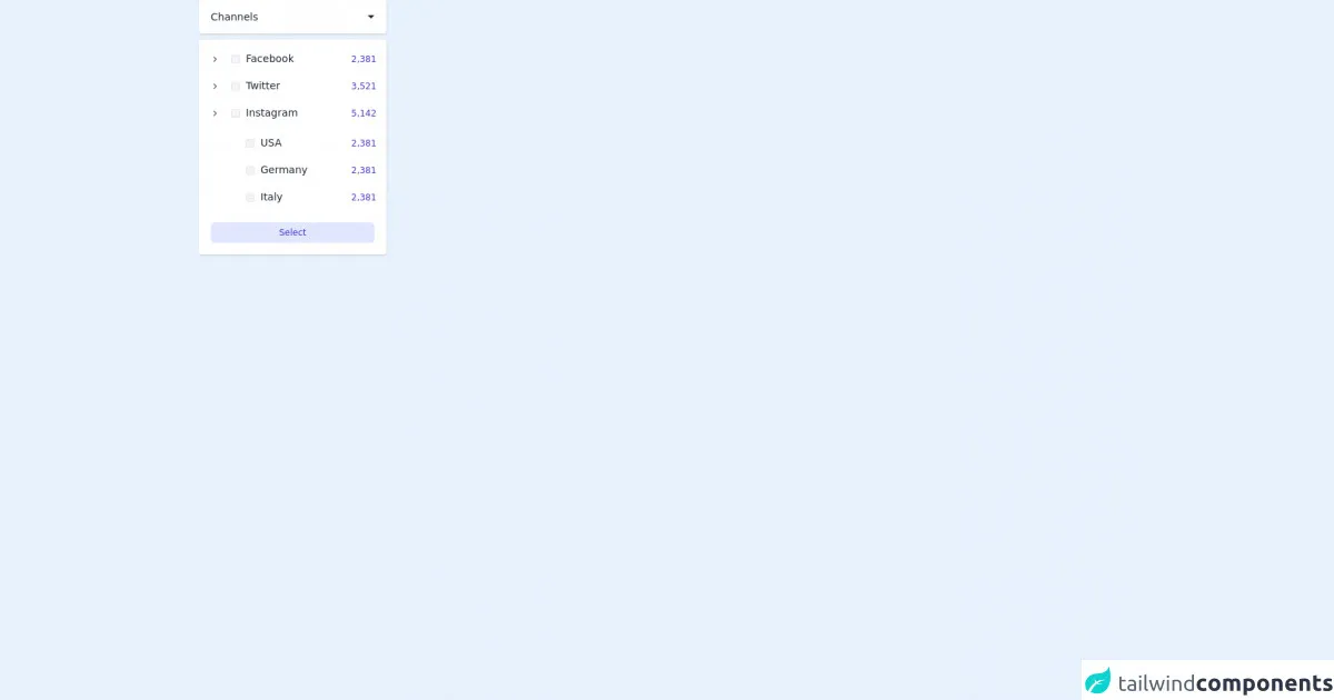
The preview of Free Tailwind CSS Dropdown Component ui component.
In this article, we will create a free Tailwind CSS dropdown component that has the following features:
- Customizable color scheme
- Responsive design
- Keyboard navigation support
- Accessible design
Free download of the Free Tailwind CSS Dropdown Component's source code
The source code of Free Tailwind CSS Dropdown Component ui component.
The source code of the free Tailwind CSS dropdown component is available on GitHub. You can download the code and customize it according to your needs.
<div>
<!--- more free and premium Tailwind CSS components at https://tailwinduikit.com/ --->
<button class="focus:outline-none focus:ring-2 focus:ring-offset-2 focus:ring-gray-500 focus:bg-gray-100 w-64 p-4 shadow rounded bg-white text-sm font-medium leading-none text-gray-800 flex items-center justify-between cursor-pointer" onclick="dropdownHandler()">
Channels
<div>
<div class="hidden" id="close">
<svg width="10" height="6" viewBox="0 0 10 6" fill="none" xmlns="http://www.w3.org/2000/svg">
<path d="M5.00016 0.666664L9.66683 5.33333L0.333496 5.33333L5.00016 0.666664Z" fill="#1F2937" />
</svg>
</div>
<div id="open">
<svg width="10" height="6" viewBox="0 0 10 6" fill="none" xmlns="http://www.w3.org/2000/svg">
<path d="M5.00016 5.33333L0.333496 0.666664H9.66683L5.00016 5.33333Z" fill="#1F2937" />
</svg>
</div>
</div>
</button>
<div class="w-64 mt-2 p-4 bg-white shadow rounded" id="dropdown">
<div class="flex items-center justify-between">
<div class="flex items-center">
<svg role="button" aria-label="dropdown" tabindex="0" onclick="toggleSubDir(1)" onkeypress="toggleSubDir(1)" class="focus:outline-none focus:ring-2 focus:ring-offset-2 focus:ring-gray-500 rounded-md" width="12" height="12" viewBox="0 0 12 12" fill="none" xmlns="http://www.w3.org/2000/svg">
<path d="M4.5 3L7.5 6L4.5 9" stroke="#4B5563" stroke-width="1.25" stroke-linecap="round" stroke-linejoin="round" />
</svg>
<div class="pl-4 flex items-center">
<div class="bg-gray-100 dark:bg-gray-800 border rounded-sm border-gray-200 dark:border-gray-700 w-3 h-3 flex flex-shrink-0 justify-center items-center relative">
<input aria-labelledby="fb1" type="checkbox" class="focus:opacity-100 checkbox opacity-0 absolute cursor-pointer w-full h-full" />
<div class="check-icon hidden bg-indigo-700 text-white rounded-sm">
<svg class="icon icon-tabler icon-tabler-check" xmlns="http://www.w3.org/2000/svg" width="12" height="12" viewBox="0 0 24 24" stroke-width="1.5" stroke="currentColor" fill="none" stroke-linecap="round" stroke-linejoin="round">
<path stroke="none" d="M0 0h24v24H0z" />
<path d="M5 12l5 5l10 -10" />
</svg>
</div>
</div>
<p id="fb1" tabindex="0" class="focus:outline-none text-sm leading-normal ml-2 text-gray-800">Facebook</p>
</div>
</div>
<p tabindex="0" class="focus:outline-none w-8 text-xs leading-3 text-right text-indigo-700">2,381</p>
</div>
<div id="sublist1" class="pl-8 pt-5 hidden">
<div class="flex items-center justify-between">
<div class="pl-4 flex items-center">
<div class="bg-gray-100 dark:bg-gray-800 border rounded-sm border-gray-200 dark:border-gray-700 w-3 h-3 flex flex-shrink-0 justify-center items-center relative">
<input aria-labelledby="usa1" type="checkbox" class="focus:opacity-100 checkbox opacity-0 absolute cursor-pointer w-full h-full" />
<div class="check-icon hidden bg-indigo-700 text-white rounded-sm">
<svg class="icon icon-tabler icon-tabler-check" xmlns="http://www.w3.org/2000/svg" width="12" height="12" viewBox="0 0 24 24" stroke-width="1.5" stroke="currentColor" fill="none" stroke-linecap="round" stroke-linejoin="round">
<path stroke="none" d="M0 0h24v24H0z" />
<path d="M5 12l5 5l10 -10" />
</svg>
</div>
</div>
<p id="usa1" tabindex="0" class="focus:outline-none text-sm leading-normal ml-2 text-gray-800">USA</p>
</div>
<p tabindex="0" class="focus:outline-none w-8 text-xs leading-3 text-right text-indigo-700">2,381</p>
</div>
<div class="flex pt-4 items-center justify-between">
<div class="pl-4 flex items-center">
<div class="bg-gray-100 dark:bg-gray-800 border rounded-sm border-gray-200 dark:border-gray-700 w-3 h-3 flex flex-shrink-0 justify-center items-center relative">
<input aria-labelledby="ger1" type="checkbox" class="focus:opacity-100 checkbox opacity-0 absolute cursor-pointer w-full h-full" />
<div class="check-icon hidden bg-indigo-700 text-white rounded-sm">
<svg class="icon icon-tabler icon-tabler-check" xmlns="http://www.w3.org/2000/svg" width="12" height="12" viewBox="0 0 24 24" stroke-width="1.5" stroke="currentColor" fill="none" stroke-linecap="round" stroke-linejoin="round">
<path stroke="none" d="M0 0h24v24H0z" />
<path d="M5 12l5 5l10 -10" />
</svg>
</div>
</div>
<p id="ger1" tabindex="0" class="focus:outline-none text-sm leading-normal ml-2 text-gray-800">Germany</p>
</div>
<p tabindex="0" class="focus:outline-none w-8 text-xs leading-3 text-right text-indigo-700">2,381</p>
</div>
<div class="flex pt-4 items-center justify-between">
<div class="pl-4 flex items-center">
<div class="bg-gray-100 dark:bg-gray-800 border rounded-sm border-gray-200 dark:border-gray-700 w-3 h-3 flex flex-shrink-0 justify-center items-center relative">
<input aria-labelledby="italy1" type="checkbox" class="focus:opacity-100 checkbox opacity-0 absolute cursor-pointer w-full h-full" />
<div class="check-icon hidden bg-indigo-700 text-white rounded-sm">
<svg class="icon icon-tabler icon-tabler-check" xmlns="http://www.w3.org/2000/svg" width="12" height="12" viewBox="0 0 24 24" stroke-width="1.5" stroke="currentColor" fill="none" stroke-linecap="round" stroke-linejoin="round">
<path stroke="none" d="M0 0h24v24H0z" />
<path d="M5 12l5 5l10 -10" />
</svg>
</div>
</div>
<p id="italy1" tabindex="0" class="focus:outline-none text-sm leading-normal ml-2 text-gray-800">Italy</p>
</div>
<p tabindex="0" class="focus:outline-none w-8 text-xs leading-3 text-right text-indigo-700">2,381</p>
</div>
</div>
<div>
<div class="flex items-center justify-between mt-4">
<div class="flex items-center">
<svg role="button" aria-label="dropdown" tabindex="0" onclick="toggleSubDir(2)" onkeypress="toggleSubDir(2)" class="focus:outline-none focus:ring-2 focus:ring-offset-2 focus:ring-gray-500 rounded-md" width="12" height="12" viewBox="0 0 12 12" fill="none" xmlns="http://www.w3.org/2000/svg">
<path d="M4.5 3L7.5 6L4.5 9" stroke="#4B5563" stroke-width="1.25" stroke-linecap="round" stroke-linejoin="round" />
</svg>
<div class="pl-4 flex items-center">
<div class="bg-gray-100 dark:bg-gray-800 border rounded-sm border-gray-200 dark:border-gray-700 w-3 h-3 flex flex-shrink-0 justify-center items-center relative">
<input aria-labelledby="twitter2" type="checkbox" class="focus:opacity-100 checkbox opacity-0 absolute cursor-pointer w-full h-full" />
<div class="check-icon hidden bg-indigo-700 text-white rounded-sm">
<svg class="icon icon-tabler icon-tabler-check" xmlns="http://www.w3.org/2000/svg" width="12" height="12" viewBox="0 0 24 24" stroke-width="1.5" stroke="currentColor" fill="none" stroke-linecap="round" stroke-linejoin="round">
<path stroke="none" d="M0 0h24v24H0z" />
<path d="M5 12l5 5l10 -10" />
</svg>
</div>
</div>
<p id="twitter2" tabindex="0" class="focus:outline-none text-sm leading-normal ml-2 text-gray-800">Twitter</p>
</div>
</div>
<p tabindex="0" class="focus:outline-none w-8 text-xs leading-3 text-right text-indigo-700">3,521</p>
</div>
<div id="sublist2" class="pl-8 pt-5 hidden">
<div class="flex items-center justify-between">
<div class="pl-4 flex items-center">
<div class="bg-gray-100 dark:bg-gray-800 border rounded-sm border-gray-200 dark:border-gray-700 w-3 h-3 flex flex-shrink-0 justify-center items-center relative">
<input aria-labelledby="usa2" type="checkbox" class="focus:opacity-100 checkbox opacity-0 absolute cursor-pointer w-full h-full" />
<div class="check-icon hidden bg-indigo-700 text-white rounded-sm">
<svg class="icon icon-tabler icon-tabler-check" xmlns="http://www.w3.org/2000/svg" width="12" height="12" viewBox="0 0 24 24" stroke-width="1.5" stroke="currentColor" fill="none" stroke-linecap="round" stroke-linejoin="round">
<path stroke="none" d="M0 0h24v24H0z" />
<path d="M5 12l5 5l10 -10" />
</svg>
</div>
</div>
<p id="usa2" tabindex="0" class="focus:outline-none text-sm leading-normal ml-2 text-gray-800">USA</p>
</div>
<p tabindex="0" class="focus:outline-none w-8 text-xs leading-3 text-right text-indigo-700">2,381</p>
</div>
<div class="flex pt-4 items-center justify-between">
<div class="pl-4 flex items-center">
<div class="bg-gray-100 dark:bg-gray-800 border rounded-sm border-gray-200 dark:border-gray-700 w-3 h-3 flex flex-shrink-0 justify-center items-center relative">
<input aria-labelledby="ger2" type="checkbox" class="focus:opacity-100 checkbox opacity-0 absolute cursor-pointer w-full h-full" />
<div class="check-icon hidden bg-indigo-700 text-white rounded-sm">
<svg class="icon icon-tabler icon-tabler-check" xmlns="http://www.w3.org/2000/svg" width="12" height="12" viewBox="0 0 24 24" stroke-width="1.5" stroke="currentColor" fill="none" stroke-linecap="round" stroke-linejoin="round">
<path stroke="none" d="M0 0h24v24H0z" />
<path d="M5 12l5 5l10 -10" />
</svg>
</div>
</div>
<p id="ger2" tabindex="0" class="focus:outline-none text-sm leading-normal ml-2 text-gray-800">Germany</p>
</div>
<p tabindex="0" class="focus:outline-none w-8 text-xs leading-3 text-right text-indigo-700">2,381</p>
</div>
<div class="flex pt-4 items-center justify-between">
<div class="pl-4 flex items-center">
<div class="bg-gray-100 dark:bg-gray-800 border rounded-sm border-gray-200 dark:border-gray-700 w-3 h-3 flex flex-shrink-0 justify-center items-center relative">
<input aria-labelledby="italy2" type="checkbox" class="focus:opacity-100 checkbox opacity-0 absolute cursor-pointer w-full h-full" />
<div class="check-icon hidden bg-indigo-700 text-white rounded-sm">
<svg class="icon icon-tabler icon-tabler-check" xmlns="http://www.w3.org/2000/svg" width="12" height="12" viewBox="0 0 24 24" stroke-width="1.5" stroke="currentColor" fill="none" stroke-linecap="round" stroke-linejoin="round">
<path stroke="none" d="M0 0h24v24H0z" />
<path d="M5 12l5 5l10 -10" />
</svg>
</div>
</div>
<p id="italy2" tabindex="0" class="focus:outline-none text-sm leading-normal ml-2 text-gray-800">Italy</p>
</div>
<p tabindex="0" class="focus:outline-none w-8 text-xs leading-3 text-right text-indigo-700">2,381</p>
</div>
</div>
</div>
<div>
<div class="flex items-center justify-between mt-4">
<div class="flex items-center">
<svg role="button" aria-label="dropdown" tabindex="0" onclick="toggleSubDir(3)" onkeypress="toggleSubDir(3)" class="focus:outline-none focus:ring-2 focus:ring-offset-2 focus:ring-gray-500 rounded-md" width="12" height="12" viewBox="0 0 12 12" fill="none" xmlns="http://www.w3.org/2000/svg">
<path d="M4.5 3L7.5 6L4.5 9" stroke="#4B5563" stroke-width="1.25" stroke-linecap="round" stroke-linejoin="round" />
</svg>
<div class="pl-4 flex items-center">
<div class="bg-gray-100 dark:bg-gray-800 border rounded-sm border-gray-200 dark:border-gray-700 w-3 h-3 flex flex-shrink-0 justify-center items-center relative">
<input aria-labelledby="insta3" type="checkbox" class="focus:opacity-100 checkbox opacity-0 absolute cursor-pointer w-full h-full" />
<div class="check-icon hidden bg-indigo-700 text-white rounded-sm">
<svg class="icon icon-tabler icon-tabler-check" xmlns="http://www.w3.org/2000/svg" width="12" height="12" viewBox="0 0 24 24" stroke-width="1.5" stroke="currentColor" fill="none" stroke-linecap="round" stroke-linejoin="round">
<path stroke="none" d="M0 0h24v24H0z" />
<path d="M5 12l5 5l10 -10" />
</svg>
</div>
</div>
<p id="insta3" tabindex="0" class="focus:outline-none text-sm leading-normal ml-2 text-gray-800">Instagram</p>
</div>
</div>
<p tabindex="0" class="focus:outline-none w-8 text-xs leading-3 text-right text-indigo-700">5,142</p>
</div>
<div id="sublist3" class="pl-8 pt-5">
<div class="flex items-center justify-between">
<div class="pl-4 flex items-center">
<div class="bg-gray-100 dark:bg-gray-800 border rounded-sm border-gray-200 dark:border-gray-700 w-3 h-3 flex flex-shrink-0 justify-center items-center relative">
<input aria-labelledby="usa3" type="checkbox" class="focus:opacity-100 checkbox opacity-0 absolute cursor-pointer w-full h-full" />
<div class="check-icon hidden bg-indigo-700 text-white rounded-sm">
<svg class="icon icon-tabler icon-tabler-check" xmlns="http://www.w3.org/2000/svg" width="12" height="12" viewBox="0 0 24 24" stroke-width="1.5" stroke="currentColor" fill="none" stroke-linecap="round" stroke-linejoin="round">
<path stroke="none" d="M0 0h24v24H0z" />
<path d="M5 12l5 5l10 -10" />
</svg>
</div>
</div>
<p id="usa3" tabindex="0" class="focus:outline-none text-sm leading-normal ml-2 text-gray-800">USA</p>
</div>
<p tabindex="0" class="focus:outline-none w-8 text-xs leading-3 text-right text-indigo-700">2,381</p>
</div>
<div class="flex pt-4 items-center justify-between">
<div class="pl-4 flex items-center">
<div class="bg-gray-100 dark:bg-gray-800 border rounded-sm border-gray-200 dark:border-gray-700 w-3 h-3 flex flex-shrink-0 justify-center items-center relative">
<input aria-labelledby="germany3" type="checkbox" class="focus:opacity-100 checkbox opacity-0 absolute cursor-pointer w-full h-full" />
<div class="check-icon hidden bg-indigo-700 text-white rounded-sm">
<svg class="icon icon-tabler icon-tabler-check" xmlns="http://www.w3.org/2000/svg" width="12" height="12" viewBox="0 0 24 24" stroke-width="1.5" stroke="currentColor" fill="none" stroke-linecap="round" stroke-linejoin="round">
<path stroke="none" d="M0 0h24v24H0z" />
<path d="M5 12l5 5l10 -10" />
</svg>
</div>
</div>
<p id="germany3" tabindex="0" class="focus:outline-none text-sm leading-normal ml-2 text-gray-800">Germany</p>
</div>
<p tabindex="0" class="focus:outline-none w-8 text-xs leading-3 text-right text-indigo-700">2,381</p>
</div>
<div class="flex pt-4 items-center justify-between">
<div class="pl-4 flex items-center">
<div class="bg-gray-100 dark:bg-gray-800 border rounded-sm border-gray-200 dark:border-gray-700 w-3 h-3 flex flex-shrink-0 justify-center items-center relative">
<input aria-labelledby="italy3" type="checkbox" class="focus:opacity-100 checkbox opacity-0 absolute cursor-pointer w-full h-full" />
<div class="check-icon hidden bg-indigo-700 text-white rounded-sm">
<svg class="icon icon-tabler icon-tabler-check" xmlns="http://www.w3.org/2000/svg" width="12" height="12" viewBox="0 0 24 24" stroke-width="1.5" stroke="currentColor" fill="none" stroke-linecap="round" stroke-linejoin="round">
<path stroke="none" d="M0 0h24v24H0z" />
<path d="M5 12l5 5l10 -10" />
</svg>
</div>
</div>
<p id="italy3" tabindex="0" class="focus:outline-none text-sm leading-normal ml-2 text-gray-800">Italy</p>
</div>
<p tabindex="0" class="focus:outline-none w-8 text-xs leading-3 text-right text-indigo-700">2,381</p>
</div>
</div>
</div>
<button class="focus:ring-2 focus:ring-offset-2 focus:ring-indigo-700 focus:outline-none focus:bg-indigo-200 text-xs bg-indigo-100 hover:bg-indigo-200 rounded-md mt-6 font-medium py-2 w-full leading-3 text-indigo-700">Select</button>
</div>
</div>
<style>.checkbox:checked + .check-icon {
display: flex;
}
</style>
<script>let dropdown = document.getElementById("dropdown");
let open1 = document.getElementById("open");
let close1 = document.getElementById("close");
let flag = false;
const dropdownHandler = () => {
if (!flag) {
dropdown.classList.add("hidden");
open1.classList.add("hidden");
close1.classList.remove("hidden");
flag = true;
} else {
dropdown.classList.remove("hidden");
close1.classList.add("hidden");
open1.classList.remove("hidden");
flag = false;
}
};
const toggleSubDir = (check) => {
let subList1 = document.getElementById("sublist1");
let subList2 = document.getElementById("sublist2");
let subList3 = document.getElementById("sublist3");
switch (check) {
case 1:
subList3.classList.add("hidden");
subList2.classList.add("hidden");
subList1.classList.remove("hidden");
break;
case 2:
subList3.classList.add("hidden");
subList2.classList.remove("hidden");
subList1.classList.add("hidden");
break;
case 3:
subList3.classList.remove("hidden");
subList2.classList.add("hidden");
subList1.classList.add("hidden");
break;
}
};
</script>
How to create a Free Tailwind CSS Dropdown Component with Tailwind CSS?
We can create a free Tailwind CSS dropdown component using various methods. In this article, we will discuss six different ways to create a free Tailwind CSS dropdown component.
Method 1: Using HTML and CSS
The first method is to create a dropdown component using HTML and CSS. We can use the Tailwind CSS classes to style the dropdown component. Here is an example code:
<div class="relative">
  <button class="bg-gray-300 hover:bg-gray-400 text-gray-800 font-bold py-2 px-4 rounded inline-flex items-center">
    <span class="mr-1">Select an option</span>
    <svg class="fill-current h-4 w-4" viewBox="0 0 20 20" xmlns="http://www.w3.org/2000/svg">
      <path d="M7 10l5 5 5-5z" />
    </svg>
  </button>
  <div class="absolute z-10 bg-white rounded mt-2 shadow-md">
    <ul>
      <li><a href="#" class="block px-4 py-2 text-gray-800 hover:bg-gray-100">Option 1</a></li>
      <li><a href="#" class="block px-4 py-2 text-gray-800 hover:bg-gray-100">Option 2</a></li>
      <li><a href="#" class="block px-4 py-2 text-gray-800 hover:bg-gray-100">Option 3</a></li>
    </ul>
  </div>
</div>
Method 2: Using JavaScript
The second method is to create a dropdown component using JavaScript. We can use the Tailwind CSS classes to style the dropdown component, and we can use JavaScript to handle the dropdown events. Here is an example code:
<div class="relative">
  <button class="bg-gray-300 hover:bg-gray-400 text-gray-800 font-bold py-2 px-4 rounded inline-flex items-center" onclick="toggleDropdown()">
    <span class="mr-1">Select an option</span>
    <svg class="fill-current h-4 w-4" viewBox="0 0 20 20" xmlns="http://www.w3.org/2000/svg">
      <path d="M7 10l5 5 5-5z" />
    </svg>
  </button>
  <div id="dropdown" class="absolute z-10 bg-white rounded mt-2 shadow-md hidden">
    <ul>
      <li><a href="#" class="block px-4 py-2 text-gray-800 hover:bg-gray-100">Option 1</a></li>
      <li><a href="#" class="block px-4 py-2 text-gray-800 hover:bg-gray-100">Option 2</a></li>
      <li><a href="#" class="block px-4 py-2 text-gray-800 hover:bg-gray-100">Option 3</a></li>
    </ul>
  </div>
</div>

<script>
  function toggleDropdown() {
    var dropdown = document.getElementById("dropdown");
    dropdown.classList.toggle("hidden");
  }
</script>
Method 3: Using Vue.js
The third method is to create a dropdown component using Vue.js. We can use the Tailwind CSS classes to style the dropdown component, and we can use Vue.js to handle the dropdown events. Here is an example code:
<template>
  <div class="relative">
    <button class="bg-gray-300 hover:bg-gray-400 text-gray-800 font-bold py-2 px-4 rounded inline-flex items-center" @click="showDropdown = !showDropdown">
      <span class="mr-1">Select an option</span>
      <svg class="fill-current h-4 w-4" viewBox="0 0 20 20" xmlns="http://www.w3.org/2000/svg">
        <path d="M7 10l5 5 5-5z" />
      </svg>
    </button>
    <div class="absolute z-10 bg-white rounded mt-2 shadow-md" v-show="showDropdown">
      <ul>
        <li><a href="#" class="block px-4 py-2 text-gray-800 hover:bg-gray-100">Option 1</a></li>
        <li><a href="#" class="block px-4 py-2 text-gray-800 hover:bg-gray-100">Option 2</a></li>
        <li><a href="#" class="block px-4 py-2 text-gray-800 hover:bg-gray-100">Option 3</a></li>
      </ul>
    </div>
  </div>
</template>

<script>
  export default {
    data() {
      return {
        showDropdown: false,
      }
    },
  }
</script>
Method 4: Using React
The fourth method is to create a dropdown component using React. We can use the Tailwind CSS classes to style the dropdown component, and we can use React to handle the dropdown events. Here is an example code:
import React, { useState } from "react";

function Dropdown() {
  const [showDropdown, setShowDropdown] = useState(false);

  return (
    <div className="relative">
      <button className="bg-gray-300 hover:bg-gray-400 text-gray-800 font-bold py-2 px-4 rounded inline-flex items-center" onClick={() => setShowDropdown(!showDropdown)}>
        <span className="mr-1">Select an option</span>
        <svg className="fill-current h-4 w-4" viewBox="0 0 20 20" xmlns="http://www.w3.org/2000/svg">
          <path d="M7 10l5 5 5-5z" />
        </svg>
      </button>
      {showDropdown && (
        <div className="absolute z-10 bg-white rounded mt-2 shadow-md">
          <ul>
            <li><a href="#" className="block px-4 py-2 text-gray-800 hover:bg-gray-100">Option 1</a></li>
            <li><a href="#" className="block px-4 py-2 text-gray-800 hover:bg-gray-100">Option 2</a></li>
            <li><a href="#" className="block px-4 py-2 text-gray-800 hover:bg-gray-100">Option 3</a></li>
          </ul>
        </div>
      )}
    </div>
  );
}

export default Dropdown;
Method 5: Using Angular
The fifth method is to create a dropdown component using Angular. We can use the Tailwind CSS classes to style the dropdown component, and we can use Angular to handle the dropdown events. Here is an example code:
<div class="relative">
  <button class="bg-gray-300 hover:bg-gray-400 text-gray-800 font-bold py-2 px-4 rounded inline-flex items-center" (click)="showDropdown = !showDropdown">
    <span class="mr-1">Select an option</span>
    <svg class="fill-current h-4 w-4" viewBox="0 0 20 20" xmlns="http://www.w3.org/2000/svg">
      <path d="M7 10l5 5 5-5z" />
    </svg>
  </button>
  <div class="absolute z-10 bg-white rounded mt-2 shadow-md" [hidden]="!showDropdown">
    <ul>
      <li><a href="#" class="block px-4 py-2 text-gray-800 hover:bg-gray-100">Option 1</a></li>
      <li><a href="#" class="block px-4 py-2 text-gray-800 hover:bg-gray-100">Option 2</a></li>
      <li><a href="#" class="block px-4 py-2 text-gray-800 hover:bg-gray-100">Option 3</a></li>
    </ul>
  </div>
</div>
Method 6: Using Svelte
The sixth method is to create a dropdown component using Svelte. We can use the Tailwind CSS classes to style the dropdown component, and we can use Svelte to handle the dropdown events. Here is an example code:
<script>
  let showDropdown = false;
</script>

<div class="relative">
  <button class="bg-gray-300 hover:bg-gray-400 text-gray-800 font-bold py-2 px-4 rounded inline-flex items-center" on:click={() => showDropdown = !showDropdown}>
    <span class="mr-1">Select an option</span>
    <svg class="fill-current h-4 w-4" viewBox="0 0 20 20" xmlns="http://www.w3.org/2000/svg">
      <path d="M7 10l5 5 5-5z" />
    </svg>
  </button>
  {#if showDropdown}
    <div class="absolute z-10 bg-white rounded mt-2 shadow-md">
      <ul>
        <li><a href="#" class="block px-4 py-2 text-gray-800 hover:bg-gray-100">Option 1</a></li>
        <li><a href="#" class="block px-4 py-2 text-gray-800 hover:bg-gray-100">Option 2</a></li>
        <li><a href="#" class="block px-4 py-2 text-gray-800 hover:bg-gray-100">Option 3</a></li>
      </ul>
    </div>
  {/if}
</div>
Conclusion
In this article, we learned how to create a free Tailwind CSS dropdown component using various methods. We can create a dropdown component using HTML and CSS, JavaScript, Vue.js, React, Angular, or Svelte. Each method has its advantages and disadvantages, and we can choose the method that best suits our needs. With Tailwind CSS, we can create custom UI components quickly and easily.