- Published on
Most Effective Ways To Create A Free Tailwind CSS Content Component With Tailwind CSS
- What is Tailwind CSS?
- The description of Free Tailwind CSS Content Component UI component
- Why use Tailwind CSS to create a Free Tailwind CSS Content Component UI component?
- The preview of Free Tailwind CSS Content Component UI component
- The source code of Free Tailwind CSS Content Component UI component
- How to create a Free Tailwind CSS Content Component with Tailwind CSS?
- Step 1: Set up your development environment
- Step 2: Create a new HTML file
- Step 3: Create the content component
- Step 4: Customize the component
- Step 5: Add the component to your web page
- Conclusion
Tailwind CSS has become one of the most popular CSS frameworks in recent years. It is known for its utility-first approach, which allows developers to write code faster and more efficiently. In this article, we will be discussing the most effective ways to create a free Tailwind CSS content component with Tailwind CSS.
What is Tailwind CSS?
Tailwind CSS is a utility-first CSS framework that provides a set of pre-defined CSS classes that can be used to create responsive and customizable UI components. It is designed to be highly customizable and easy to use, making it a popular choice for developers who want to build modern web applications.
The description of Free Tailwind CSS Content Component UI component
A free Tailwind CSS content component is a UI component that can be used to display content on a web page. It can be used to display text, images, videos, and other types of content in a visually appealing way. The component is designed to be responsive and customizable, allowing developers to easily integrate it into their web applications.
Why use Tailwind CSS to create a Free Tailwind CSS Content Component UI component?
Tailwind CSS provides a set of pre-defined CSS classes that can be used to create responsive and customizable UI components. This makes it easy for developers to create a free Tailwind CSS content component without having to write a lot of custom CSS code. Additionally, Tailwind CSS is highly customizable, which means that developers can easily modify the component to fit their specific needs.
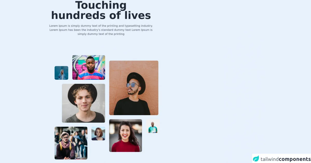
The preview of Free Tailwind CSS Content Component UI component
Free download of the Free Tailwind CSS Content Component's source code
The source code of Free Tailwind CSS Content Component UI component
<div class="xl:w-1/2 w-11/12">
                    <h1 role="heading" tabindex="0" class="text-6xl font-bold 2xl:leading-10 leading-0 text-center text-gray-800">Touching hundreds of lives</h1>
                    <h2 role="contentinfo" tabindex="0" class="text-base leading-normal text-center text-gray-600 mt-5">Lorem Ipsum is simply dummy text of the printing and typesetting industry. Lorem Ipsum has been the industry's standard dummy text Lorem Ipsum is simply dummy text of the printing</h2>
                </div>
                <div class="2xl:px-20 lg:px-12 px-4 flex flex-wrap items-start mt-4">
                    <div class="mt-24">
                        <div class="flex items-end">
                            <img tabindex="0" src="https://i.ibb.co/kBgtHK6/Rectangle-5.png" alt="girl with blue background" class="w-20 h-20 rounded-lg mr-6" />
                            <img tabindex="0" src="https://i.ibb.co/9nLBtjx/Rectangle-3.png" alt="guy winking" class="w-48 h-36 rounded-lg" />
                        </div>
                        <div class="flex items-center justify-end my-6">
                            <img tabindex="0" src="https://i.ibb.co/jRbF1KF/Rectangle-4.png" alt="guy smiling" />
                        </div>
                        <div class="flex items-start">
                            <img tabindex="0" src="https://i.ibb.co/Sf4Q94L/Rectangle-6.png" alt="girl with bluw background" class="w-48 h-48 rounded-lg" />
                            <img tabindex="0" src="https://i.ibb.co/fnNqJrx/Rectangle-7.png" alt="guy with glasses" class="w-20 h-20 rounded-lg ml-6 flex-shrink-0 object-cover object-fit" />
                        </div>
                    </div>
                    <div class="ml-6 mt-32">
                        <img tabindex="0" src="https://i.ibb.co/LSxy7fy/Rectangle-9.png" class="w-72 h-80 rounded-lg" alt="guy with sunglasses" />
                        <div class="flex items-start mt-6">
                            <img tabindex="0" src="https://i.ibb.co/X8PKD3q/Rectangle-8.png" alt="girl  laughing" class="w-48 h-48 rounded-lg" />
                            <img tabindex="0" src="https://i.ibb.co/2Yj51CY/Rectangle-13.png" alt="guy with glasses" class="w-20 h-20 rounded-lg ml-6 object-cover object-fit" />
                        </div>
                    </div>
                    <div class="mt-14 ml-6">
                        <div class="lg:flex">
                            <div>
                                <img tabindex="0" src="https://i.ibb.co/bWGVSkP/Rectangle-10.png" alt="group of friends" class="w-96 h-72 rounded-lg object-center object-fit" />
                            </div>
                            <div>
                                <div class="flex ml-6">
                                    <img tabindex="0" src="https://i.ibb.co/80jvpSv/Rectangle-16.png" class="w-20 h-20 rounded-lg mt-14" alt="man" />
                                    <img tabindex="0" src="https://i.ibb.co/6PR2Y74/Rectangle-15.png" class="w-20 h-24 rounded-lg ml-6" alt="woman" />
                                </div>
                                <img tabindex="0" src="https://i.ibb.co/M5rvjhk/Rectangle-14.png" alt="boy with blonde hair" class="ml-6 mt-6 w-48 h-32 rounded-lg" />
                            </div>
                        </div>
                        <div class="mt-6 flex">
                            <img tabindex="0" class="w-48 h-48 rounded-lg" src="https://i.ibb.co/GPpMsbr/Rectangle-12.png" alt="young girl with red hair" />
                            <img tabindex="0" class="w-72 h-56 rounded-lg ml-6" src="https://i.ibb.co/VBcgkVL/Rectangle-11.png" alt="young girl with red hair" />
                        </div>

                      <!--- more free and premium Tailwind CSS components at https://tailwinduikit.com/ --->
                    </div>
                </div>
How to create a Free Tailwind CSS Content Component with Tailwind CSS?
To create a free Tailwind CSS content component with Tailwind CSS, follow these steps:
Step 1: Set up your development environment
Before you can start building your free Tailwind CSS content component, you need to set up your development environment. This includes installing Node.js and the Tailwind CSS framework.
Step 2: Create a new HTML file
Create a new HTML file and add the following code:
<!DOCTYPE html>
<html lang="en">
  <head>
    <meta charset="UTF-8" />
    <meta name="viewport" content="width=device-width, initial-scale=1.0" />
    <title>Free Tailwind CSS Content Component</title>
    <link rel="stylesheet" href="https://cdn.jsdelivr.net/npm/[email protected]/dist/tailwind.min.css" />
  </head>
  <body>
    <div class="container mx-auto">
      <!-- Your content component goes here -->
    </div>
  </body>
</html>
This code sets up the basic structure of your HTML file and includes the Tailwind CSS framework.
Step 3: Create the content component
To create the content component, you can use a combination of pre-defined Tailwind CSS classes and custom CSS classes. Here is an example of a simple content component:
<div class="bg-white shadow-md rounded-md p-4">
  <h2 class="text-lg font-medium">Lorem ipsum dolor sit amet</h2>
  <p class="text-gray-500 mt-2">
    Lorem ipsum dolor sit amet, consectetur adipiscing elit. Sed euismod, nisi at bibendum malesuada, turpis sapien
    ultricies nunc, vel vestibulum sapien massa ut nisi. Sed at lorem at velit viverra fringilla.
  </p>
  <button class="bg-blue-500 text-white px-4 py-2 rounded-md mt-4 hover:bg-blue-600">Read More</button>
</div>
This code creates a content component with a white background, a shadow, and rounded corners. It includes a title, some text, and a button.
Step 4: Customize the component
You can customize the component by modifying the pre-defined Tailwind CSS classes or by adding your own custom CSS classes. For example, you can change the background color of the component by adding the bg-red-500 class:
<div class="bg-red-500 shadow-md rounded-md p-4">
  <h2 class="text-lg font-medium">Lorem ipsum dolor sit amet</h2>
  <p class="text-gray-500 mt-2">
    Lorem ipsum dolor sit amet, consectetur adipiscing elit. Sed euismod, nisi at bibendum malesuada, turpis sapien
    ultricies nunc, vel vestibulum sapien massa ut nisi. Sed at lorem at velit viverra fringilla.
  </p>
  <button class="bg-blue-500 text-white px-4 py-2 rounded-md mt-4 hover:bg-blue-600">Read More</button>
</div>
This code changes the background color of the component to red.
Step 5: Add the component to your web page
Once you have created and customized your content component, you can add it to your web page by including the HTML code in your HTML file:
<div class="container mx-auto">
  <div class="bg-white shadow-md rounded-md p-4">
    <h2 class="text-lg font-medium">Lorem ipsum dolor sit amet</h2>
    <p class="text-gray-500 mt-2">
      Lorem ipsum dolor sit amet, consectetur adipiscing elit. Sed euismod, nisi at bibendum malesuada, turpis sapien
      ultricies nunc, vel vestibulum sapien massa ut nisi. Sed at lorem at velit viverra fringilla.
    </p>
    <button class="bg-blue-500 text-white px-4 py-2 rounded-md mt-4 hover:bg-blue-600">Read More</button>
  </div>
</div>
This code adds the content component to your web page.
Conclusion
In conclusion, creating a free Tailwind CSS content component is easy and straightforward. By using pre-defined Tailwind CSS classes and custom CSS classes, you can create a responsive and customizable component that can be used to display content on your web page. With Tailwind CSS, you can save time and write code more efficiently, making it a popular choice for developers who want to build modern web applications.