- Published on
Learn How To Make A Free Tailwind CSS Carousels Component With Tailwind CSS from the Pros
- What is Tailwind CSS?
- The description of Free Tailwind CSS Carousels Component ui component
- Why use Tailwind CSS to create a Free Tailwind CSS Carousels Component ui component?
- The preview of Free Tailwind CSS Carousels Component ui component
- The source code of Free Tailwind CSS Carousels Component ui component
- How to create a Free Tailwind CSS Carousels Component with Tailwind CSS?
- Step 1: Download the Free Tailwind CSS Carousels Component from GitHub
- Step 2: Include the necessary CSS and JavaScript files in your HTML file
- Step 3: Add the HTML markup for the carousel component
- Step 4: Customize the carousel component using Tailwind CSS classes
- Conclusion
Are you looking for an easy way to create a beautiful and functional carousel component for your website? Look no further than Tailwind CSS! In this article, we'll show you how to make a free Tailwind CSS carousels component with the help of the pros.
What is Tailwind CSS?
Tailwind CSS is a utility-first CSS framework that makes it easy to create responsive and customizable user interfaces. It provides a set of pre-defined classes that you can use to style your HTML elements without having to write any CSS code. With Tailwind CSS, you can create beautiful and functional UI components in no time.
The description of Free Tailwind CSS Carousels Component ui component
A carousel is a UI component that allows you to display a set of images or other content in a rotating fashion. It's a great way to showcase your products, services, or other content in an engaging and interactive way. The Free Tailwind CSS Carousels Component is a pre-built carousel component that you can use in your projects. It's designed to be easy to use and customize, and it's completely free to use.
Why use Tailwind CSS to create a Free Tailwind CSS Carousels Component ui component?
Tailwind CSS makes it easy to create custom UI components without having to write any CSS code. With its pre-defined classes, you can quickly style your HTML elements and create a consistent look and feel across your entire website. The Free Tailwind CSS Carousels Component is built using Tailwind CSS, so you can be sure that it's well-designed and easy to use.
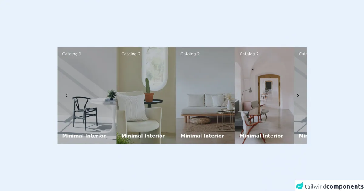
The preview of Free Tailwind CSS Carousels Component ui component
The Free Tailwind CSS Carousels Component is a beautiful and functional carousel component that you can use in your projects. It's designed to be easy to use and customize, and it's completely free to use.
Free download of the Free Tailwind CSS Carousels Component's source code
The source code of Free Tailwind CSS Carousels Component ui component
If you want to customize the Free Tailwind CSS Carousels Component, you can easily do so by modifying the source code. The source code is available for free on GitHub, and it's well-documented and easy to understand.
<div class="flex items-center justify-center w-full h-full py-24 sm:py-8 px-4">
  <!--- more free and premium Tailwind CSS components at https://tailwinduikit.com/ --->
  <div class="w-full relative flex items-center justify-center">
    <button aria-label="slide backward" class="absolute z-30 left-0 ml-10 focus:outline-none focus:bg-gray-400 focus:ring-2 focus:ring-offset-2 focus:ring-gray-400 cursor-pointer" id="prev">
      <svg class="dark:text-gray-900" width="8" height="14" viewBox="0 0 8 14" fill="none" xmlns="http://www.w3.org/2000/svg">
        <path d="M7 1L1 7L7 13" stroke="currentColor" stroke-width="2" stroke-linecap="round" stroke-linejoin="round" />
      </svg>
    </button>
    <div class="w-full h-full mx-auto overflow-x-hidden overflow-y-hidden">
      <div id="slider" class="h-full flex lg:gap-8 md:gap-6 gap-14 items-center justify-start transition ease-out duration-700">
        <div class="flex flex-shrink-0 relative w-full sm:w-auto">
          <img src="https://i.ibb.co/fDngH9G/carosel-1.png" alt="black chair and white table" class="object-cover object-center w-full" />
          <div class="bg-gray-800 bg-opacity-30 absolute w-full h-full p-6">
            <h2 class="lg:text-xl leading-4 text-base lg:leading-5 text-white dark:text-gray-900">Catalog 1</h2>
            <div class="flex h-full items-end pb-6">
              <h3 class="text-xl lg:text-2xl font-semibold leading-5 lg:leading-6 text-white dark:text-gray-900">Minimal Interior</h3>
            </div>
          </div>
        </div>
        <div class="flex flex-shrink-0 relative w-full sm:w-auto">
          <img src="https://i.ibb.co/DWrGxX6/carosel-2.png" alt="sitting area" class="object-cover object-center w-full" />
          <div class="bg-gray-800 bg-opacity-30 absolute w-full h-full p-6">
            <h2 class="lg:text-xl leading-4 text-base lg:leading-5 text-white dark:text-gray-900">Catalog 2</h2>
            <div class="flex h-full items-end pb-6">
              <h3 class="text-xl lg:text-2xl font-semibold leading-5 lg:leading-6 text-white dark:text-gray-900">Minimal Interior</h3>
            </div>
          </div>
        </div>
        <div class="flex flex-shrink-0 relative w-full sm:w-auto">
          <img src="https://i.ibb.co/tCfVky2/carosel-3.png" alt="sitting area" class="object-cover object-center w-full" />
          <div class="bg-gray-800 bg-opacity-30 absolute w-full h-full p-6">
            <h2 class="lg:text-xl leading-4 text-base lg:leading-5 text-white dark:text-gray-900">Catalog 2</h2>
            <div class="flex h-full items-end pb-6">
              <h3 class="text-xl lg:text-2xl font-semibold leading-5 lg:leading-6 text-white dark:text-gray-900">Minimal Interior</h3>
            </div>
          </div>
        </div>
        <div class="flex flex-shrink-0 relative w-full sm:w-auto">
          <img src="https://i.ibb.co/rFsGfr5/carosel-4.png" alt="sitting area" class="object-cover object-center w-full" />
          <div class="bg-gray-800 bg-opacity-30 absolute w-full h-full p-6">
            <h2 class="lg:text-xl leading-4 text-base lg:leading-5 text-white dark:text-gray-900">Catalog 2</h2>
            <div class="flex h-full items-end pb-6">
              <h3 class="text-xl lg:text-2xl font-semibold leading-5 lg:leading-6 text-white dark:text-gray-900">Minimal Interior</h3>
            </div>
          </div>
        </div>
        <div class="flex flex-shrink-0 relative w-full sm:w-auto">
          <img src="https://i.ibb.co/fDngH9G/carosel-1.png" alt="black chair and white table" class="object-cover object-center w-full" />
          <div class="bg-gray-800 bg-opacity-30 absolute w-full h-full p-6">
            <h2 class="lg:text-xl leading-4 text-base lg:leading-5 text-white dark:text-gray-900">Catalog 2</h2>
            <div class="flex h-full items-end pb-6">
              <h3 class="text-xl lg:text-2xl font-semibold leading-5 lg:leading-6 text-white dark:text-gray-900">Minimal Interior</h3>
            </div>
          </div>
        </div>
        <div class="flex flex-shrink-0 relative w-full sm:w-auto">
          <img src="https://i.ibb.co/DWrGxX6/carosel-2.png" alt="sitting area" class="object-cover object-center w-full" />
          <div class="bg-gray-800 bg-opacity-30 absolute w-full h-full p-6">
            <h2 class="lg:text-xl leading-4 text-base lg:leading-5 text-white dark:text-gray-900">Catalog 2</h2>
            <div class="flex h-full items-end pb-6">
              <h3 class="text-xl lg:text-2xl font-semibold leading-5 lg:leading-6 text-white dark:text-gray-900">Minimal Interior</h3>
            </div>
          </div>
        </div>
        <div class="flex flex-shrink-0 relative w-full sm:w-auto">
          <img src="https://i.ibb.co/tCfVky2/carosel-3.png" alt="sitting area" class="object-cover object-center w-full" />
          <div class="bg-gray-800 bg-opacity-30 absolute w-full h-full p-6">
            <h2 class="lg:text-xl leading-4 text-base lg:leading-5 text-white dark:text-gray-900">Catalog 2</h2>
            <div class="flex h-full items-end pb-6">
              <h3 class="text-xl lg:text-2xl font-semibold leading-5 lg:leading-6 text-white dark:text-gray-900">Minimal Interior</h3>
            </div>
          </div>
        </div>
        <div class="flex flex-shrink-0 relative w-full sm:w-auto">
          <img src="https://i.ibb.co/rFsGfr5/carosel-4.png" alt="sitting area" class="object-cover object-center w-full" />
          <div class="bg-gray-800 bg-opacity-30 absolute w-full h-full p-6">
            <h2 class="lg:text-xl leading-4 text-base lg:leading-5 text-white dark:text-gray-900">Catalog 2</h2>
            <div class="flex h-full items-end pb-6">
              <h3 class="text-xl lg:text-2xl font-semibold leading-5 lg:leading-6 text-white dark:text-gray-900">Minimal Interior</h3>
            </div>
          </div>
        </div>
      </div>
    </div>
    <button aria-label="slide forward" class="absolute z-30 right-0 mr-10 focus:outline-none focus:bg-gray-400 focus:ring-2 focus:ring-offset-2 focus:ring-gray-400" id="next">
      <svg class="dark:text-gray-900" width="8" height="14" viewBox="0 0 8 14" fill="none" xmlns="http://www.w3.org/2000/svg">
        <path d="M1 1L7 7L1 13" stroke="currentColor" stroke-width="2" stroke-linecap="round" stroke-linejoin="round" />
      </svg>
    </button>
  </div>
</div>
<script>
    let defaultTransform = 0;
function goNext() {
  defaultTransform = defaultTransform - 398;
  var slider = document.getElementById("slider");
  if (Math.abs(defaultTransform) >= slider.scrollWidth / 1.7)
    defaultTransform = 0;
  slider.style.transform = "translateX(" + defaultTransform + "px)";
}
next.addEventListener("click", goNext);
function goPrev() {
  var slider = document.getElementById("slider");
  if (Math.abs(defaultTransform) === 0) defaultTransform = 0;
  else defaultTransform = defaultTransform + 398;
  slider.style.transform = "translateX(" + defaultTransform + "px)";
}
prev.addEventListener("click", goPrev);
</script>
How to create a Free Tailwind CSS Carousels Component with Tailwind CSS?
To create a Free Tailwind CSS Carousels Component, you'll need to follow these steps:
- Download the Free Tailwind CSS Carousels Component from GitHub.
- Extract the files to your project directory.
- Include the necessary CSS and JavaScript files in your HTML file.
- Add the HTML markup for the carousel component.
- Customize the carousel component using Tailwind CSS classes.
Let's take a closer look at each of these steps.
Step 1: Download the Free Tailwind CSS Carousels Component from GitHub
You can download the Free Tailwind CSS Carousels Component from GitHub by clicking the "Download" button on the repository page. Once you've downloaded the files, extract them to your project directory.
Step 2: Include the necessary CSS and JavaScript files in your HTML file
To use the Free Tailwind CSS Carousels Component, you'll need to include the necessary CSS and JavaScript files in your HTML file. You can do this by adding the following code to your HTML file:
<link rel="stylesheet" href="path/to/tailwind.css">
<link rel="stylesheet" href="path/to/carousel.css">
<script src="path/to/carousel.js"></script>
Make sure to replace "path/to" with the actual path to the files on your server.
Step 3: Add the HTML markup for the carousel component
Next, you'll need to add the HTML markup for the carousel component. You can do this by adding the following code to your HTML file:
<div class="carousel">
<div class="carousel-inner">
<div class="carousel-item">
<img src="path/to/image1.jpg" alt="Image 1">
</div>
<div class="carousel-item">
<img src="path/to/image2.jpg" alt="Image 2">
</div>
<div class="carousel-item">
<img src="path/to/image3.jpg" alt="Image 3">
</div>
</div>
<a class="carousel-prev" href="#"><</a>
<a class="carousel-next" href="#">></a>
</div>
This code will create a basic carousel component with three images. You can add more images by adding more "carousel-item" elements.
Step 4: Customize the carousel component using Tailwind CSS classes
Finally, you can customize the carousel component using Tailwind CSS classes. For example, you can change the background color of the carousel by adding the "bg-gray-500" class to the "carousel" element:
<div class="carousel bg-gray-500">
  <!-- ... -->
</div>
You can also change the size of the carousel by adding the "w-64 h-64" classes to the "carousel" element:
<div class="carousel w-64 h-64">
  <!-- ... -->
</div>
There are many other Tailwind CSS classes that you can use to customize the carousel component. You can find a full list of classes in the Tailwind CSS documentation.
Conclusion
In this article, we've shown you how to create a free Tailwind CSS carousels component with the help of the pros. With Tailwind CSS, you can quickly and easily create beautiful and functional UI components for your website. The Free Tailwind CSS Carousels Component is a great example of what you can do with Tailwind CSS, and it's completely free to use. So why not give it a try and see what you can create?