- Published on
Practical Guide: Make A Free Tailwind CSS Card Heading Component With Tailwind CSS
- What is Tailwind CSS?
- The description of Free Tailwind CSS Card Heading Component ui component
- Why use Tailwind CSS to create a Free Tailwind CSS Card Heading Component ui component?
- The preview of Free Tailwind CSS Card Heading Component ui component
- The source code of Free Tailwind CSS Card Heading Component ui component
- How to create a Free Tailwind CSS Card Heading Component with Tailwind CSS?
- Step 1: Create a new HTML file and add the necessary HTML markup for the card heading component.
- Step 2: Add the necessary Tailwind CSS classes to style the card heading component.
- Step 3: Customize the styles to fit your specific needs.
- Conclusion
As a FrontEnd technology blogger, you must have heard of Tailwind CSS. It is a utility-first CSS framework that provides a set of pre-defined classes to help you quickly build custom designs. In this article, we will show you how to create a Free Tailwind CSS Card Heading Component with Tailwind CSS.
What is Tailwind CSS?
Tailwind CSS is a utility-first CSS framework that provides a set of pre-defined classes to help you quickly build custom designs. It is different from other CSS frameworks like Bootstrap or Foundation because it does not come with pre-designed components. Instead, it provides a set of low-level utility classes that you can use to build your own custom designs.
The description of Free Tailwind CSS Card Heading Component ui component
A card heading is an important part of any card design. It is the first thing that users see when they look at a card. A good card heading should be visually appealing, easy to read, and provide a clear indication of what the card is about. The Free Tailwind CSS Card Heading Component is a UI component that you can use to create beautiful and functional card headings for your website or application.
Why use Tailwind CSS to create a Free Tailwind CSS Card Heading Component ui component?
Tailwind CSS is a great choice for creating UI components like the Free Tailwind CSS Card Heading Component. It provides a set of low-level utility classes that you can use to create custom designs quickly and easily. With Tailwind CSS, you can create complex layouts and designs without writing a lot of custom CSS code.
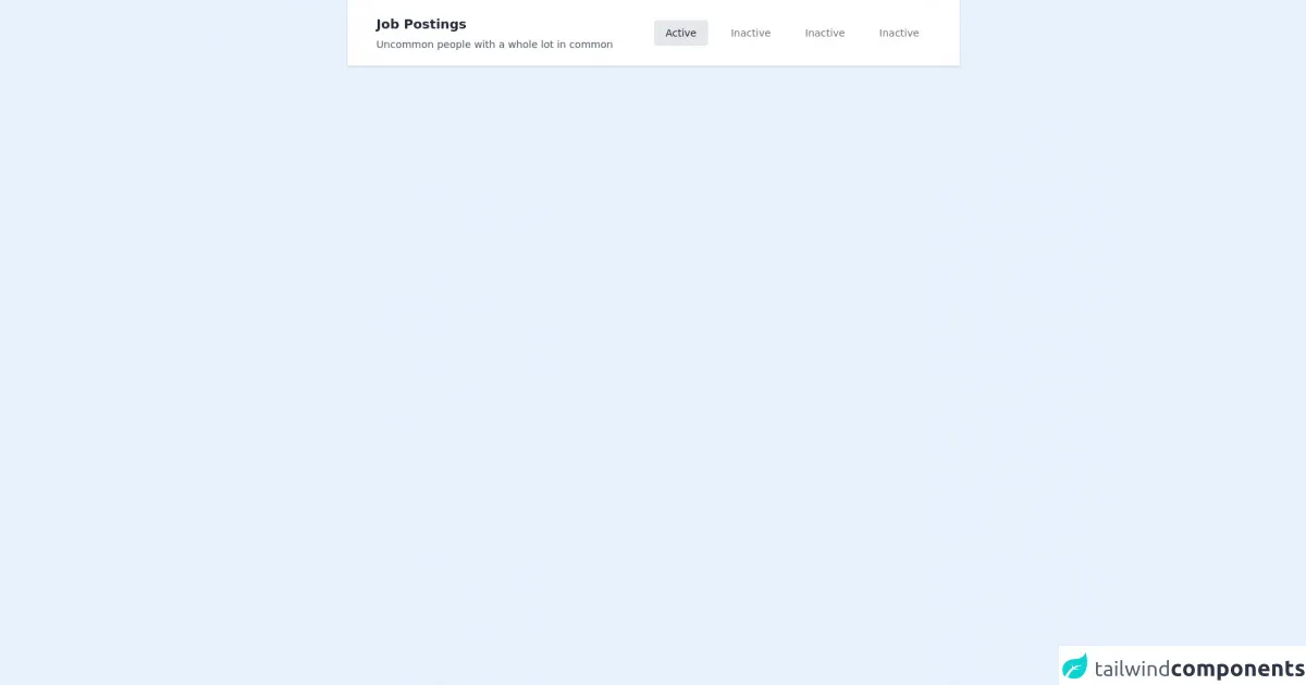
The preview of Free Tailwind CSS Card Heading Component ui component
The Free Tailwind CSS Card Heading Component is a beautiful and functional UI component that you can use to create card headings for your website or application. It is easy to use and customize, and it comes with a set of pre-defined styles that you can use to get started quickly.
Free download of the Free Tailwind CSS Card Heading Component's source code
The source code of Free Tailwind CSS Card Heading Component ui component
The source code for the Free Tailwind CSS Card Heading Component is simple and easy to understand. It is written using HTML and Tailwind CSS classes, and it can be easily customized to fit your specific needs.
<div class="container mx-auto w-5/6 sm:w-2/3 h-full">
<!--- more free and premium Tailwind CSS components at https://tailwinduikit.com/ --->
            <!-- Code block starts -->
            <dh-component>
                <div role="navigation" aria-label="Main" class="w-full bg-white dark:bg-gray-800 py-5 flex flex-col xl:flex-row items-start xl:items-center justify-between px-5 xl:px-10 shadow rounded-t">
                    <div class="mb-4 sm:mb-0 md:mb-0 lg:mb-0 xl:mb-0 lg:w-1/2">
                        <a tabindex="0" class="focus:outline-none  text-gray-800 dark:text-gray-100 text-lg font-bold">Job Postings</a>
                        <p tabindex="0" class="focus:outline-none font-normal text-sm text-gray-600 dark:text-gray-100 mt-1">Uncommon people with a whole lot in common</p>
                    </div>
                    <div class="lg:hidden w-full relative mt-2 md:mt-4">
                        <div class="absolute inset-0 m-auto mr-4 z-0 w-6 h-6">
                            <svg xmlns="http://www.w3.org/2000/svg" class="icon icon-tabler icon-tabler-selector" width="24" height="24" viewBox="0 0 24 24" stroke-width="1.5" stroke="#a0aec0" fill="none" stroke-linecap="round" stroke-linejoin="round">
                                <path stroke="none" d="M0 0h24v24H0z" />
                                <polyline points="8 9 12 5 16 9" />
                                <polyline points="16 15 12 19 8 15" />
                            </svg>
                        </div>
                        <select aria-label="Selected tab" class="form-select block w-full p-3 border border-gray-300 rounded text-gray-600 dark:text-gray-100 appearance-none bg-transparent relative z-10">
                            <option class="text-sm text-gray-600 dark:text-gray-100">Inactive</option>
                            <option class="text-sm text-gray-600 dark:text-gray-100">Inactive</option>
                            <option selected="" class="text-sm text-gray-600 dark:text-gray-100">Active</option>
                            <option class="text-sm text-gray-600 dark:text-gray-100">Inactive</option>
                            <option class="text-sm text-gray-600 dark:text-gray-100">Inactive</option>
                        </select>
                    </div>
                    <div role="list" class="hidden lg:flex items-center lg:mt-6 xl:mt-0">
                        <button role="listitem" tabindex="0" class=" focus:ring-2 focus:ring-offset-2 focus:ring-gray-400 focus:outline-none font-normal flex justify-center items-center py-2 px-4 rounded mr-4 xl:mr-0 xl:ml-0 bg-gray-200 dark:bg-gray-700 text-gray-800 dark:text-gray-100 text-sm">Active</button>
                        <button role="listitem" tabindex="0" class=" focus:ring-2 focus:ring-offset-2 focus:ring-gray-400 focus:outline-none cursor-pointer font-normal flex justify-center items-center py-2 px-4 rounded mr-4 sm:mr-0 md:mr-0 lg:mr-0 xl:mr-0 sm:ml-4 md:ml-4 lg:ml-4 xl:ml-4 hover:bg-gray-200 dark:hover:bg-gray-700 text-gray-500 dark:text-gray-400 text-sm">Inactive</button>
                        <button role="listitem" tabindex="0" class="focus:ring-2 focus:ring-offset-2 focus:ring-gray-400 focus:outline-none cursor-pointer font-normal flex justify-center items-center py-2 px-4 rounded mr-4 sm:mr-0 md:mr-0 lg:mr-0 xl:mr-0 sm:ml-4 md:ml-4 lg:ml-4 xl:ml-4 hover:bg-gray-200 dark:hover:bg-gray-700 text-gray-500 dark:text-gray-400 text-sm">Inactive</button>
                        <button role="listitem" tabindex="0" class=" focus:ring-2 focus:ring-offset-2 focus:ring-gray-400 focus:outline-none cursor-pointer font-normal flex justify-center items-center py-2 px-4 rounded mr-4 sm:mr-0 md:mr-0 lg:mr-0 xl:mr-0 sm:ml-4 md:ml-4 lg:ml-4 xl:ml-4 hover:bg-gray-200 dark:hover:bg-gray-700 text-gray-500 dark:text-gray-400 text-sm">Inactive</button>
                    </ul>
                </div>
            </dh-component>
            <!-- Code block ends -->
        </div>
How to create a Free Tailwind CSS Card Heading Component with Tailwind CSS?
To create a Free Tailwind CSS Card Heading Component with Tailwind CSS, you will need to follow these steps:
- Create a new HTML file and add the necessary HTML markup for the card heading component.
- Add the necessary Tailwind CSS classes to style the card heading component.
- Customize the styles to fit your specific needs.
Let's take a closer look at each of these steps.
Step 1: Create a new HTML file and add the necessary HTML markup for the card heading component.
The first step in creating a Free Tailwind CSS Card Heading Component is to create a new HTML file and add the necessary HTML markup for the card heading component. Here is an example of what the HTML markup might look like:
<div class="card-heading">
  <h2 class="text-2xl font-bold text-gray-900">Card Heading</h2>
  <p class="text-gray-500">Lorem ipsum dolor sit amet, consectetur adipiscing elit.</p>
</div>
In this example, we have created a div element with a class of card-heading. Inside the div element, we have added a h2 element with a class of text-2xl font-bold text-gray-900 and a p element with a class of text-gray-500. This will create a basic card heading with a title and a description.
Step 2: Add the necessary Tailwind CSS classes to style the card heading component.
The next step is to add the necessary Tailwind CSS classes to style the card heading component. Here is an example of what the CSS might look like:
.card-heading {
  padding: 1rem;
  background-color: #fff;
  border-radius: 0.5rem;
  box-shadow: 0 2px 4px rgba(0, 0, 0, 0.1);
}

.card-heading h2 {
  margin-bottom: 0.5rem;
}

.card-heading p {
  margin-bottom: 0;
}
In this example, we have added some basic styles to the card-heading class. We have set the padding to 1rem, the background-color to #fff, the border-radius to 0.5rem, and the box-shadow to 0 2px 4px rgba(0, 0, 0, 0.1). We have also added some styles to the h2 and p elements to adjust the margins.
Step 3: Customize the styles to fit your specific needs.
The final step is to customize the styles to fit your specific needs. You can adjust the colors, fonts, and other styles to match your website or application. Here is an example of what the customized CSS might look like:
.card-heading {
  padding: 1.5rem;
  background-color: #f8fafc;
  border-radius: 0.75rem;
  box-shadow: 0 4px 8px rgba(0, 0, 0, 0.1);
}

.card-heading h2 {
  margin-bottom: 1rem;
  color: #1a202c;
  font-size: 2rem;
}

.card-heading p {
  margin-bottom: 0;
  color: #718096;
  font-size: 1.25rem;
}
In this example, we have adjusted the padding to 1.5rem, the background-color to #f8fafc, the border-radius to 0.75rem, and the box-shadow to 0 4px 8px rgba(0, 0, 0, 0.1). We have also adjusted the colors and font sizes to match our website or application.
Conclusion
In this article, we have shown you how to create a Free Tailwind CSS Card Heading Component with Tailwind CSS. We have explained what Tailwind CSS is, why it is a great choice for creating UI components, and how to create a basic card heading component. We have also provided some examples of how to customize the styles to fit your specific needs. With this practical guide, you can create beautiful and functional card headings for your website or application in no time.