- Published on
6 Easy Ways To Make A Free Tailwind CSS Button Component With Tailwind CSS
- What is Tailwind CSS?
- The description of Free Tailwind CSS Button Component ui component
- Why use Tailwind CSS to create a Free Tailwind CSS Button Component ui component?
- The preview of Free Tailwind CSS Button Component ui component
- The source code of Free Tailwind CSS Button Component ui component
- How to create a Free Tailwind CSS Button Component with Tailwind CSS?
- 1. Change the background color
- 2. Change the text color
- 3. Change the font size
- 4. Change the button size
- 5. Change the button shape
- 6. Add an icon to the button
- Conclusion
As a FrontEnd technology blogger, it's important to stay up-to-date with the latest tools and trends in the industry. One such tool that has gained a lot of popularity in recent years is Tailwind CSS. Tailwind CSS is a utility-first CSS framework that makes it easy to create beautiful, responsive websites quickly. In this article, we'll explore 6 easy ways to make a free Tailwind CSS button component with Tailwind CSS.
What is Tailwind CSS?
Tailwind CSS is a utility-first CSS framework that provides a set of pre-defined classes that you can use to style your HTML elements. Unlike traditional CSS frameworks, Tailwind CSS doesn't come with pre-designed components. Instead, it provides a set of building blocks that you can use to create your own custom components.
The description of Free Tailwind CSS Button Component ui component
A button component is an essential part of any website or application. It's used to trigger an action or navigate to another page. In this article, we'll create a free Tailwind CSS button component that you can use in your projects.
Why use Tailwind CSS to create a Free Tailwind CSS Button Component ui component?
Tailwind CSS provides a set of pre-defined classes that you can use to style your HTML elements. This makes it easy to create custom components without having to write a lot of CSS code. Additionally, Tailwind CSS is highly customizable, so you can easily tweak the styles to match your project's design.
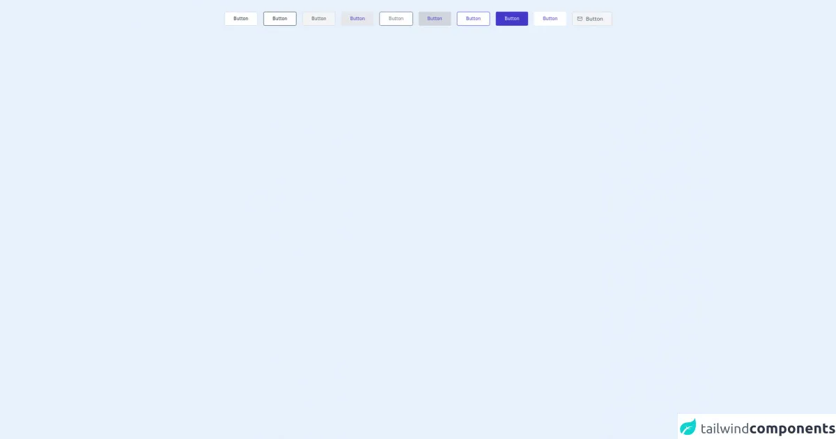
The preview of Free Tailwind CSS Button Component ui component
To create a free Tailwind CSS button component, we'll use the following classes:
<button class="bg-blue-500 hover:bg-blue-700 text-white font-bold py-2 px-4 rounded">
  Button
</button>
Free download of the Free Tailwind CSS Button Component's source code
The source code of Free Tailwind CSS Button Component ui component
To create a free Tailwind CSS button component, we'll use the following classes:
<button class="bg-blue-500 hover:bg-blue-700 text-white font-bold py-2 px-4 rounded">
  Button
</button>
<div class="py-6 flex justify-center">
            <dh-component>
<!--- more free and premium Tailwind CSS components at https://tailwinduikit.com/ --->

                <div class="px-6 flex flex-wrap">
                    <!-- Code block for white alternative button starts -->
                    <button class="mx-2 my-2 bg-white transition duration-150 ease-in-out rounded text-gray-800 border border-gray-300 px-6 py-2 text-xs hover:bg-gray-100 focus:outline-none focus:ring-2 focus:ring-offset-2  focus:ring-gray-800">Button</button>
                    <!-- Code block for white alternative button ends -->

                    <!-- Code block for button with black outline starts -->
                    <button class="mx-2 my-2 bg-white transition duration-150 ease-in-out hover:border-gray-900 hover:text-gray-900 rounded border border-gray-800 text-gray-800 px-6 py-2 text-xs hover:bg-gray-100 focus:outline-none focus:ring-2 focus:ring-offset-2  focus:ring-gray-800">Button</button>
                    <!-- Code block for button with black outline ends -->

                    <!-- Code block for gray button starts -->
                    <button class="mx-2 my-2 bg-gray-100 transition duration-150 ease-in-out hover:bg-gray-200 rounded border border-gray-300 text-gray-600 px-6 py-2 text-xs focus:outline-none focus:ring-2 focus:ring-offset-2  focus:ring-gray-600">Button</button>
                    <!-- Code block for gray button ends -->

                    <!-- Code block for gray alternative button starts -->
                    <button class="mx-2 my-2 bg-gray-200 transition duration-150 ease-in-out hover:bg-gray-300 rounded text-indigo-700 px-6 py-2 text-xs focus:outline-none focus:ring-2 focus:ring-offset-2  focus:ring-indigo-700">Button</button>
                    <!-- Code block for gray alternative button ends -->

                    <!-- Code block for button with gray outline starts -->
                    <button class="mx-2 my-2 bg-white transition duration-150 ease-in-out hover:bg-gray-100 hover:text-gray-600 rounded border border-gray-600 text-gray-500 px-6 py-2 text-xs focus:outline-none focus:ring-2 focus:ring-offset-2  focus:ring-gray-500">Button</button>
                    <!-- Code block for button with gray outline ends -->

                    <!-- Code block for indigo grey button starts -->
                    <button class="mx-2 my-2 bg-gray-300 transition duration-150 ease-in-out hover:bg-gray-400 rounded text-indigo-700 px-6 py-2 text-xs focus:outline-none focus:ring-2 focus:ring-offset-2  focus:ring-indigo-700">Button</button>
                    <!-- Code block for indigo grey button ends -->

                    <!-- Code block for button with indigo outline starts -->
                    <button class="mx-2 my-2 bg-white transition duration-150 ease-in-out hover:bg-gray-100 hover:text-indigo-600 rounded border border-indigo-700 text-indigo-700 px-6 py-2 text-xs focus:outline-none focus:ring-2 focus:ring-offset-2  focus:ring-indigo-700">Button</button>
                    <!-- Code block for button with indigo outline ends -->

                    <!-- Code block for primary button starts -->
                    <button class="mx-2 my-2 bg-indigo-700 transition duration-150 ease-in-out hover:bg-indigo-600 rounded text-white px-6 py-2 text-xs focus:outline-none focus:ring-2 focus:ring-offset-2  focus:ring-indigo-600">Button</button>
                    <!-- Code block for primary button ends -->

                    <!-- Code block for white button starts -->
                    <button class="mx-2 my-2 bg-white transition duration-150 ease-in-out focus:outline-none hover:bg-gray-200 rounded text-indigo-700 px-6 py-2 text-xs focus:outline-none focus:ring-2 focus:ring-offset-2  focus:ring-indigo-700">Button</button>
                    <!-- Code block for white button ends -->

                    <!-- Code block for button with icon starts -->
                    <a href="javascript: void(0)" class="mx-2 my-2 flex items-center bg-gray-100 transition duration-150 ease-in-out hover:bg-gray-200 rounded border border-gray-300 text-gray-600 pl-3 pr-6 py-2 text-sm hover:bg-gray-100 focus:outline-none focus:ring-2 focus:ring-offset-2  focus:ring-gray-600">
                        <span class="h-4 w-4 mr-2">
                            <svg xmlns="www.w3.org/2000/svg" viewBox="0 0 24 24" stroke-width="1.5" stroke="currentColor" fill="none" stroke-linecap="round" stroke-linejoin="round">
                                <path stroke="none" d="M0 0h24v24H0z" />
                                <rect x="3" y="5" width="18" height="14" rx="2" />
                                <polyline points="3 7 12 13 21 7" />
                            </svg>
                        </span>
                        Button
                    </a>
                    <!-- Code block for button with icon ends -->
                </div>
            </dh-component>
        </div>
How to create a Free Tailwind CSS Button Component with Tailwind CSS?
Now that we've seen a preview of the button component and its source code, let's explore 6 easy ways to customize it using Tailwind CSS.
1. Change the background color
To change the background color of the button, you can use the bg- prefix followed by a color name or a hexadecimal value. For example, to change the background color to red, you can use the bg-red-500 class:
<button class="bg-red-500 hover:bg-red-700 text-white font-bold py-2 px-4 rounded">
  Button
</button>
2. Change the text color
To change the text color of the button, you can use the text- prefix followed by a color name or a hexadecimal value. For example, to change the text color to green, you can use the text-green-500 class:
<button class="bg-blue-500 hover:bg-blue-700 text-green-500 font-bold py-2 px-4 rounded">
  Button
</button>
3. Change the font size
To change the font size of the button, you can use the text- prefix followed by a size value. For example, to change the font size to 24 pixels, you can use the text-2xl class:
<button class="bg-blue-500 hover:bg-blue-700 text-white font-bold text-2xl py-2 px-4 rounded">
  Button
</button>
4. Change the button size
To change the size of the button, you can use the py- and px- prefixes followed by a size value. For example, to make the button taller, you can use the py-3 class:
<button class="bg-blue-500 hover:bg-blue-700 text-white font-bold py-3 px-4 rounded">
  Button
</button>
5. Change the button shape
To change the shape of the button, you can use the rounded- prefix followed by a shape value. For example, to make the button square, you can use the rounded-none class:
<button class="bg-blue-500 hover:bg-blue-700 text-white font-bold py-2 px-4 rounded-none">
  Button
</button>
6. Add an icon to the button
To add an icon to the button, you can use the <i> tag and a class that defines the icon. For example, to add a search icon to the button, you can use the following code:
<button class="bg-blue-500 hover:bg-blue-700 text-white font-bold py-2 px-4 rounded">
  <i class="fas fa-search"></i> Search
</button>
Conclusion
In this article, we explored 6 easy ways to make a free Tailwind CSS button component with Tailwind CSS. We saw how Tailwind CSS provides a set of pre-defined classes that you can use to style your HTML elements, making it easy to create custom components. We also saw how Tailwind CSS is highly customizable, allowing you to tweak the styles to match your project's design. With these tips, you can create beautiful, responsive button components for your projects in no time!