- Published on
Most Effective Ways To Make A Free Tailwind CSS Banners Component With Tailwind CSS
- What is Tailwind CSS?
- The description of Free Tailwind CSS Banners Component ui component
- Why use Tailwind CSS to create a Free Tailwind CSS Banners Component ui component?
- The preview of Free Tailwind CSS Banners Component ui component.
- The source code of Free Tailwind CSS Banners Component ui component.
- How to create a Free Tailwind CSS Banners Component with Tailwind CSS?
- Step 1: Create a new HTML file and add the necessary HTML markup for your banner component.
- Step 2: Add the Tailwind CSS stylesheet to your HTML file.
- Step 3: Add the necessary classes to your HTML elements to style your banner component.
- Step 4: Customize the styles of your banner component to fit your needs.
- Conclusion
As a FrontEnd technology blogger, I am always on the lookout for the latest and greatest tools to make my life easier. One of the tools that I have recently discovered is Tailwind CSS. In this article, I will be discussing the most effective ways to make a free Tailwind CSS Banners Component with Tailwind CSS.
What is Tailwind CSS?
Tailwind CSS is a utility-first CSS framework that allows you to rapidly build custom user interfaces. It provides a set of pre-defined classes that you can use to style your HTML elements. With Tailwind CSS, you can create complex layouts and designs without having to write any custom CSS.
The description of Free Tailwind CSS Banners Component ui component
A banner is a great way to grab your user's attention and communicate important information. A banner component is a UI element that is used to display a message or call-to-action on a webpage. The Free Tailwind CSS Banners Component is a pre-designed banner that you can use in your projects. It is fully customizable and can be easily integrated into your website.
Why use Tailwind CSS to create a Free Tailwind CSS Banners Component ui component?
Tailwind CSS is a great tool for creating UI components because it provides a set of pre-defined classes that you can use to style your HTML elements. This means that you don't have to write any custom CSS, which saves you time and makes your code more maintainable. Additionally, Tailwind CSS is highly customizable, which means that you can easily modify the styles of your UI components to fit your needs.
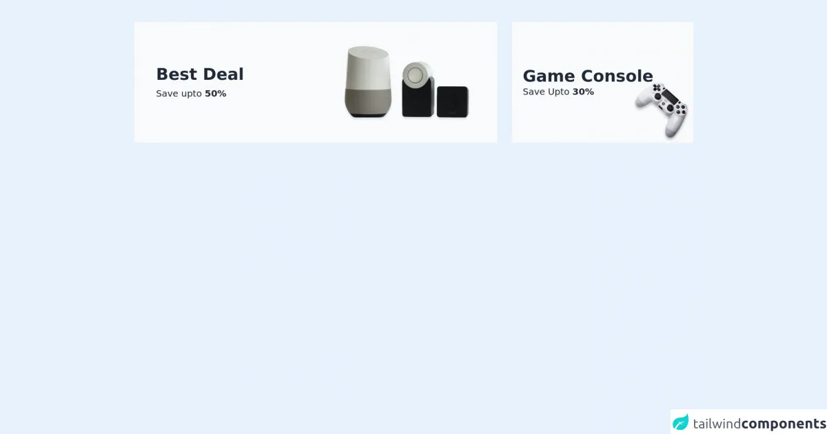
The preview of Free Tailwind CSS Banners Component ui component.
The Free Tailwind CSS Banners Component is a pre-designed banner that you can use in your projects. It is fully customizable and can be easily integrated into your website.
Free download of the Free Tailwind CSS Banners Component's source code
The source code of Free Tailwind CSS Banners Component ui component.
The source code for the Free Tailwind CSS Banners Component is available on GitHub. You can download the code and modify it to fit your needs.
<div class="container mx-auto py-9 md:py-12 px-4 md:px-6">
  <!--- more free and premium Tailwind CSS components at https://tailwinduikit.com/ --->
  <div class="flex items-strech justify-center flex-col md:flex-row space-y-4 md:space-y-0 md:space-x-6 lg:space-x-8">
    <div class="flex flex-col md:flex-row items-strech justify-between bg-gray-50 dark:bg-gray-800 py-6 px-6 md:py-12 lg:px-12 md:w-8/12 lg:w-7/12 xl:w-8/12 2xl:w-9/12">
      <div class="flex flex-col justify-center md:w-1/2">
        <h1 class="text-3xl lg:text-4xl font-semibold text-gray-800 dark:text-white">Best Deal</h1>
        <p class="text-base lg:text-xl text-gray-800 dark:text-white mt-2">Save upto <span class="font-bold">50%</span></p>
      </div>
      <div class="md:w-1/2 mt-8 md:mt-0 flex justify-center md:justify-end">
        <img src="https://i.ibb.co/J2BtZdg/Rectangle-56-1.png" alt="" class="" />
      </div>
    </div>
    <div class="md:w-4/12 lg:w-5/12 xl:w-4/12 2xl:w-3/12 bg-gray-50 dark:bg-gray-800 py-6 px-6 md:py-0 md:px-4 lg:px-6 flex flex-col justify-center relative">
      <div class="flex flex-col justify-center">
        <h1 class="text-3xl lg:text-4xl font-semibold text-gray-800 dark:text-white">Game Console</h1>
        <p class="text-base lg:text-xl text-gray-800 dark:text-white">Save Upto <span class="font-bold">30%</span></p>
      </div>
      <div class="flex justify-end md:absolute md:bottom-4 md:right-4 lg:bottom-0 lg:right-0">
        <img src="https://i.ibb.co/rGfP7mp/Rectangle-59-1.png" alt="" class="md:w-20 md:h-20 lg:w-full lg:h-full" />
      </div>
    </div>
  </div>
</div>
How to create a Free Tailwind CSS Banners Component with Tailwind CSS?
To create a Free Tailwind CSS Banners Component, you will need to follow these steps:
- Create a new HTML file and add the necessary HTML markup for your banner component.
- Add the Tailwind CSS stylesheet to your HTML file.
- Add the necessary classes to your HTML elements to style your banner component.
- Customize the styles of your banner component to fit your needs.
Let's take a closer look at each of these steps.
Step 1: Create a new HTML file and add the necessary HTML markup for your banner component.
The first step in creating a Free Tailwind CSS Banners Component is to create a new HTML file and add the necessary HTML markup for your banner component. Here's an example of what your HTML markup might look like:
<div class="bg-blue-500 p-4">
  <p class="text-white font-bold">This is a banner component</p>
  <p class="text-white">Lorem ipsum dolor sit amet, consectetur adipiscing elit.</p>
</div>
In this example, we have created a simple banner component with a blue background color, white text, and a bold font.
Step 2: Add the Tailwind CSS stylesheet to your HTML file.
The next step is to add the Tailwind CSS stylesheet to your HTML file. You can do this by adding the following code to the head section of your HTML file:
<link href="https://cdn.jsdelivr.net/npm/[email protected]/dist/tailwind.min.css" rel="stylesheet">
This code will load the Tailwind CSS stylesheet from a CDN.
Step 3: Add the necessary classes to your HTML elements to style your banner component.
The next step is to add the necessary classes to your HTML elements to style your banner component. Tailwind CSS provides a set of pre-defined classes that you can use to style your HTML elements. Here's an example of how you might use some of these classes to style your banner component:
<div class="bg-blue-500 p-4">
  <p class="text-white font-bold">This is a banner component</p>
  <p class="text-white">Lorem ipsum dolor sit amet, consectetur adipiscing elit.</p>
</div>
In this example, we have used the bg-blue-500 class to set the background color of our banner component to blue, the p-4 class to add padding to our banner component, the text-white class to set the text color of our banner component to white, and the font-bold class to make the text of our banner component bold.
Step 4: Customize the styles of your banner component to fit your needs.
The final step is to customize the styles of your banner component to fit your needs. Tailwind CSS provides a wide range of classes that you can use to customize the styles of your UI components. Here are a few examples of how you might customize the styles of your banner component:
<div class="bg-blue-500 p-4 rounded-md shadow-md">
  <p class="text-white font-bold text-lg">This is a banner component</p>
  <p class="text-white">Lorem ipsum dolor sit amet, consectetur adipiscing elit.</p>
  <a href="#" class="text-white underline">Learn more</a>
</div>
In this example, we have added the rounded-md class to make the corners of our banner component rounded, the shadow-md class to add a shadow to our banner component, the text-lg class to increase the font size of our banner component, and the underline class to add an underline to our "Learn more" link.
Conclusion
In conclusion, Tailwind CSS is a great tool for creating UI components. It provides a set of pre-defined classes that you can use to style your HTML elements, which saves you time and makes your code more maintainable. The Free Tailwind CSS Banners Component is a pre-designed banner that you can use in your projects. It is fully customizable and can be easily integrated into your website. By following the steps outlined in this article, you can create your own custom banner component using Tailwind CSS.