- Published on
How to Make A Free Tailwind CSS Alert Component With Tailwind CSS?
- What is Tailwind CSS?
- The description of Free Tailwind CSS Alert Component ui component
- Why use Tailwind CSS to create a Free Tailwind CSS Alert Component ui component?
- The preview of Free Tailwind CSS Alert Component ui component.
- The source code of Free Tailwind CSS Alert Component ui component.
- How to create a Free Tailwind CSS Alert Component with Tailwind CSS?
- Step 1: Create the HTML structure
- Step 2: Add Tailwind CSS classes
- Step 3: Add JavaScript code
- Conclusion
What is Tailwind CSS?
Tailwind CSS is a utility-first CSS framework that allows developers to quickly build custom user interfaces. It provides a set of pre-defined CSS classes that can be used to style HTML elements. Tailwind CSS is gaining popularity due to its flexibility, ease of use, and ability to speed up the development process.
The description of Free Tailwind CSS Alert Component ui component
Alerts are an essential part of any web application. They are used to inform users about important events or errors. A Free Tailwind CSS Alert Component is a user interface element that displays a message to the user. It is a simple and effective way to communicate with users.
Why use Tailwind CSS to create a Free Tailwind CSS Alert Component ui component?
Tailwind CSS provides a set of pre-defined CSS classes that can be used to style HTML elements. This makes it easy to create custom user interfaces without having to write custom CSS. Tailwind CSS also provides a responsive design system that allows developers to create user interfaces that work well on all devices.
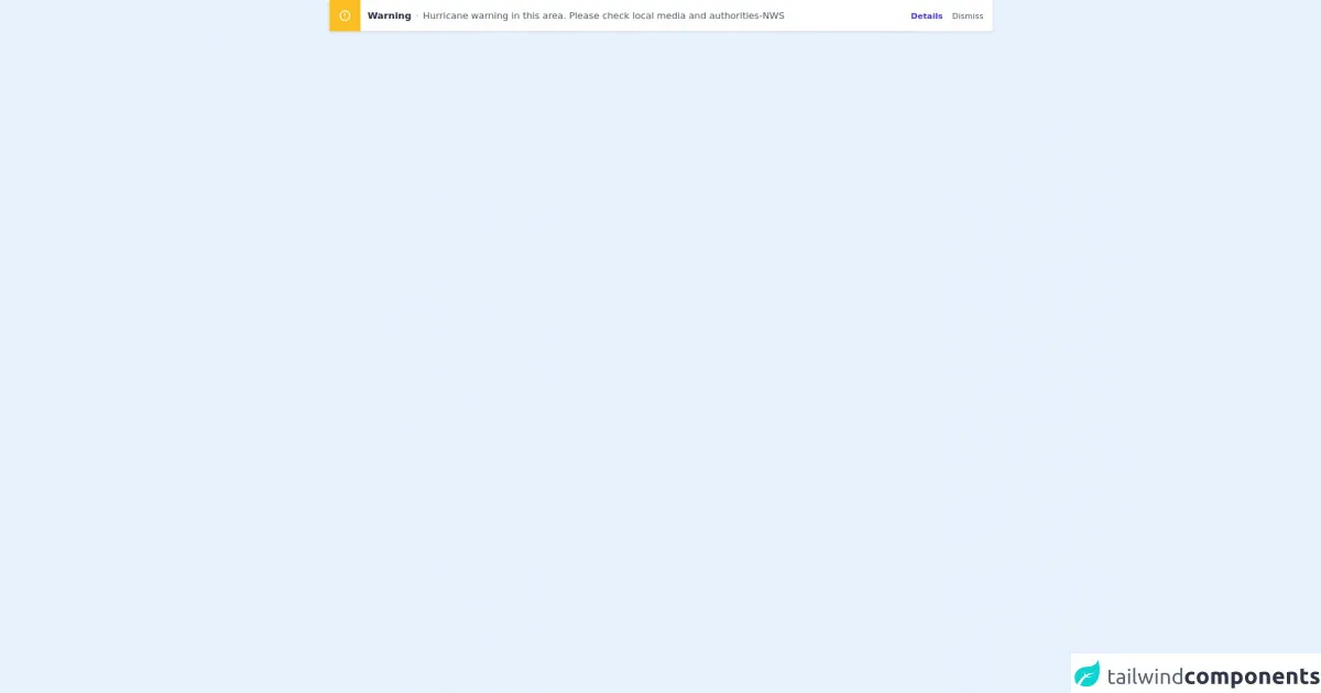
The preview of Free Tailwind CSS Alert Component ui component.
To create a Free Tailwind CSS Alert Component, we will be using Tailwind CSS classes to style the HTML elements. The alert component will have a close button, a heading, and a message.
Free download of the Free Tailwind CSS Alert Component's source code
The source code of Free Tailwind CSS Alert Component ui component.
To create a Free Tailwind CSS Alert Component, we will be using HTML and Tailwind CSS classes. The HTML code will define the structure of the alert component, and the Tailwind CSS classes will style the HTML elements.
<dh-component>
<!--- more free and premium Tailwind CSS components at https://tailwinduikit.com/ --->
            <!-- Code block starts -->
            <div class="flex items-center justify-center px-4">
                <div role="alert" id="alert" class="transition duration-150 ease-in-out w-full lg:w-11/12 mx-auto bg-white dark:bg-gray-800 shadow rounded flex flex-col py-4 md:py-0 items-center md:flex-row justify-between">
                    <div class="flex flex-col items-center md:flex-row">
                        <div class="mr-3 p-4 bg-yellow-400 rounded md:rounded-tr-none md:rounded-br-none text-white">
                            <svg tabindex="0" role="alert" aria-label="warning" class="focus:outline-none" xmlns="http://www.w3.org/2000/svg" viewBox="0 0 24 24" width="22" height="22" fill="currentColor">
                                <path class="heroicon-ui" d="M12 2a10 10 0 1 1 0 20 10 10 0 0 1 0-20zm0 2a8 8 0 1 0 0 16 8 8 0 0 0 0-16zm0 9a1 1 0 0 1-1-1V8a1 1 0 0 1 2 0v4a1 1 0 0 1-1 1zm0 4a1 1 0 1 1 0-2 1 1 0 0 1 0 2z" />
                            </svg>
                        </div>
                        <p class="mr-2 text-base font-bold text-gray-800 dark:text-gray-100 mt-2 md:my-0">Warning</p>
                        <div class="h-1 w-1 bg-gray-300 dark:bg-gray-700 rounded-full mr-2 hidden xl:block"></div>
                        <p class="text-sm lg:text-base dark:text-gray-400 text-gray-600 lg:pt-1 xl:pt-0 sm:mb-0 mb-2 text-center sm:text-left">Hurricane warning in this area. Please check local media and authorities-NWS</p>
                    </div>
                    <div class="flex xl:items-center lg:items-center sm:justify-end justify-center pr-4">
                        <button class="focus:outline-none focus:text-indigo-400 hover:text-indigo-400 text-sm mr-4 font-bold cursor-pointer text-indigo-700 dark:text-indigo-600">Details</button>
                        <button class="focus:outline-none focus:text-gray-400 hover:text-gray-400 text-sm cursor-pointer text-gray-600 dark:text-gray-400" onclick="closeAlert()">Dismiss</button>
                    </div>
                </div>
            </div>
            <!-- Code block ends -->
        </dh-component>
        <script>var Alert = document.getElementById("alert");
var close = document.getElementById("close-modal");
Alert.style.transform = "translateY(0%)";
function closeAlert() {
  Alert.style.transform = "translateY(-200%)";
  setTimeout(function () {
    Alert.style.transform = "translateY(0%)";
  }, 1000);
}
</script>
How to create a Free Tailwind CSS Alert Component with Tailwind CSS?
To create a Free Tailwind CSS Alert Component, follow these steps:
Step 1: Create the HTML structure
The first step is to create the HTML structure for the alert component. The HTML code should include a close button, a heading, and a message. Here is an example of the HTML code:
<div class="bg-blue-100 border-t-4 border-blue-500 rounded-b text-blue-900 px-4 py-3 shadow-md" role="alert">
  <div class="flex">
    <div class="py-1"><svg class="fill-current h-6 w-6 text-blue-500 mr-4" xmlns="http://www.w3.org/2000/svg" viewBox="0 0 20 20"><path d="M10 12a2 2 0 100-4 2 2 0 000 4z"/><path fill-rule="evenodd" d="M18.156 10.134a9 9 0 11-16.31 0 7 7 0 019.893 0 1 1 0 001.414 0 7 7 0 019.003 0 1 1 0 001.41 0zM10 14a1 1 0 100-2 1 1 0 000 2z" clip-rule="evenodd"/></svg></div>
    <div>
      <p class="font-bold">Note</p>
      <p class="text-sm">Lorem ipsum dolor sit amet, consectetur adipiscing elit. Duis nec nisi ut mi aliquam eleifend. Sed ac odio id velit dictum efficitur. </p>
    </div>
  </div>
  <div class="flex justify-end mt-2">
    <button class="bg-blue-500 hover:bg-blue-700 text-white font-bold py-2 px-4 rounded" type="button">
      Close
    </button>
  </div>
</div>
Step 2: Add Tailwind CSS classes
The next step is to add Tailwind CSS classes to style the HTML elements. Here is an example of the Tailwind CSS classes that can be used to style the alert component:
.bg-blue-100 {
  background-color: #ebf8ff;
}
.border-blue-500 {
  border-color: #3b82f6;
}
.text-blue-900 {
  color: #1a365d;
}
.shadow-md {
  box-shadow: 0 4px 6px -1px rgba(0, 0, 0, 0.1), 0 2px 4px -1px rgba(0, 0, 0, 0.06);
}
Step 3: Add JavaScript code
The final step is to add JavaScript code to handle the close button. Here is an example of the JavaScript code that can be used to handle the close button:
const alert = document.querySelector('.alert');
const close = document.querySelector('.close');

close.addEventListener('click', function() {
  alert.style.display = 'none';
});
Conclusion
In this article, we have learned how to create a Free Tailwind CSS Alert Component using Tailwind CSS. We have seen how Tailwind CSS can be used to style HTML elements and create custom user interfaces. We have also seen how JavaScript can be used to handle user interactions. With Tailwind CSS, creating custom user interfaces has never been easier.