- Published on
What You Need To Create A Free Tailwind CSS Action Panel Component With Tailwind CSS
- The description of Free Tailwind CSS Action Panel Component ui component
- Why use Tailwind CSS to create a Free Tailwind CSS Action Panel Component ui component?
- The preview of Free Tailwind CSS Action Panel Component ui component
- The source code of Free Tailwind CSS Action Panel Component ui component
- How to create a Free Tailwind CSS Action Panel Component with Tailwind CSS?
- Step 1: Create a new HTML file and add the necessary HTML elements to create the panel.
- Step 2: Add the necessary Tailwind CSS classes to style the panel.
- Step 3: Add the necessary JavaScript code to handle the button or link clicks.
- Conclusion
Tailwind CSS is a utility-first CSS framework that allows you to quickly create custom designs without having to write custom CSS. It provides a set of pre-defined CSS classes that can be used to style your HTML elements. Tailwind CSS has become increasingly popular among developers because it is easy to use and saves a lot of time in the development process.
The description of Free Tailwind CSS Action Panel Component ui component
The Free Tailwind CSS Action Panel Component is a UI component that allows users to perform actions on a website or application. It is a panel that contains buttons or links that trigger specific actions when clicked. This component can be used in a variety of applications, from e-commerce sites to social media platforms.
Why use Tailwind CSS to create a Free Tailwind CSS Action Panel Component ui component?
Tailwind CSS is an excellent choice for creating UI components because it provides a set of pre-defined CSS classes that can be used to style your HTML elements. This means that you can quickly create custom designs without having to write custom CSS. Additionally, Tailwind CSS is easy to learn and use, making it an excellent choice for developers of all skill levels.
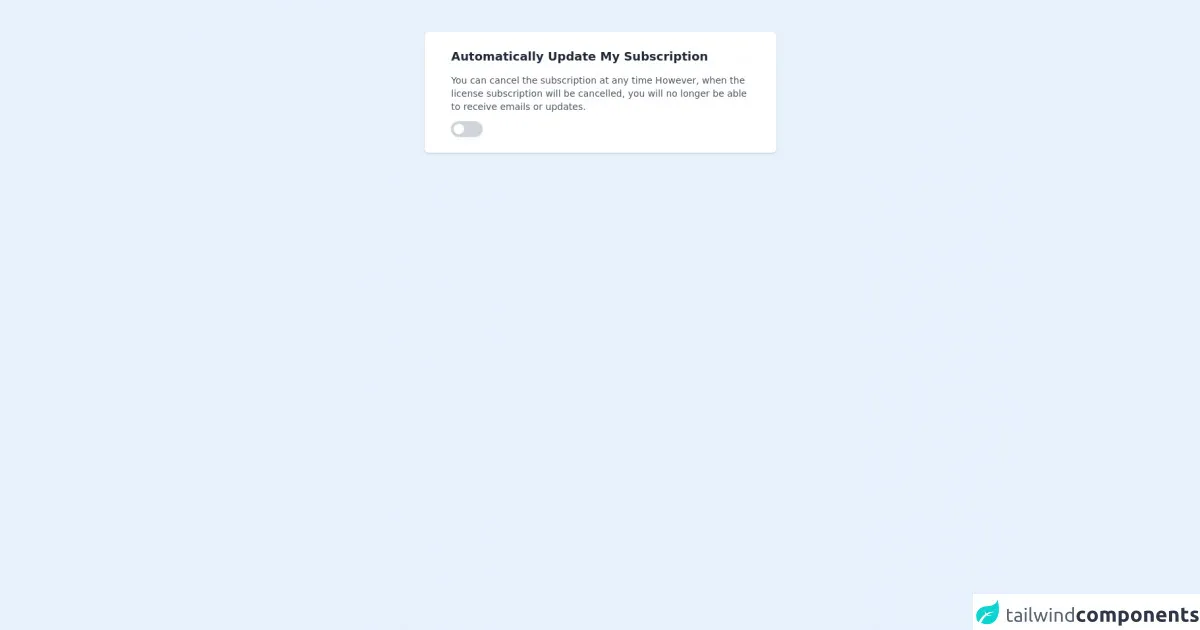
The preview of Free Tailwind CSS Action Panel Component ui component
The Free Tailwind CSS Action Panel Component is a simple and elegant UI component that can be used in a variety of applications. It is a panel that contains buttons or links that trigger specific actions when clicked. The component is fully customizable, allowing you to change the colors, fonts, and layout to match your application's design.
Free download of the Free Tailwind CSS Action Panel Component's source code
The source code of Free Tailwind CSS Action Panel Component ui component
Creating a Free Tailwind CSS Action Panel Component is relatively easy with Tailwind CSS. The component can be created using HTML and CSS, with Tailwind CSS classes used to style the component. Below is an example of the HTML and CSS code used to create the Free Tailwind CSS Action Panel Component.
<div class="py-6 w-full h-full">
            <div class="container mx-auto">
<!--- more free and premium Tailwind CSS components at https://tailwinduikit.com/ --->
                <!-- Card code block starts -->
                <dh-component>
                    <div aria-label="action panel"  tabindex="0" class="focus:outline-none w-11/12 mx-auto mb-4 my-6 md:w-5/12 shadow sm:px-10 sm:py-6 py-4 px-4 bg-white dark:bg-gray-800 rounded-md">
                        <p tabindex="0" class="focus:outline-none text-lg text-gray-800 dark:text-gray-100 font-semibold pb-3">Automatically Update My Subscription</p>
                        <p tabindex="0" class="focus:outline-none text-sm text-gray-600 dark:text-gray-400 pb-3 font-normal">You can cancel the subscription at any time However, when the license subscription will be cancelled, you will no longer be able to receive emails or updates.</p>
                        <div class="w-12 h-6 cursor-pointer rounded-full relative shadow-sm">
                            <input aria-label="subscribe" type="checkbox" name="toggle" id="toggle1" class="focus:ring-2 focus:ring-offset-2 focus:ring-indigo-700 focus:bg-indigo-600 focus:outline-none checkbox w-4 h-4 rounded-full bg-white absolute m-1 shadow-sm appearance-none cursor-pointer" />
                            <label for="toggle1" class="toggle-label bg-gray-200 block w-12 h-6 overflow-hidden rounded-full bg-gray-300 cursor-pointer"></label>
                        </div>
                        <style>
                            .checkbox:checked {
                                /* Apply class right-0*/
                                right: 0;
                            }
                            .checkbox:checked + .toggle-label {
                                /* Apply class bg-indigo-700 */
                                background-color: #4c51bf;
                            }
                        </style>
                    </div>
                </dh-component>
                <!-- Card code block ends -->
            </div>
        </div>
How to create a Free Tailwind CSS Action Panel Component with Tailwind CSS?
To create a Free Tailwind CSS Action Panel Component, you will need to follow these steps:
- Create a new HTML file and add the necessary HTML elements to create the panel.
- Add the necessary Tailwind CSS classes to style the panel.
- Add the necessary JavaScript code to handle the button or link clicks.
Let's go through each of these steps in more detail.
Step 1: Create a new HTML file and add the necessary HTML elements to create the panel.
The first step in creating a Free Tailwind CSS Action Panel Component is to create a new HTML file and add the necessary HTML elements to create the panel. Here is an example of the HTML code you can use:
<div class="fixed bottom-0 right-0 p-4">
  <div class="bg-white rounded-lg shadow-lg">
    <div class="flex flex-col p-4">
      <a href="#" class="mb-2 px-4 py-2 rounded-md text-white bg-blue-500 hover:bg-blue-600">Action 1</a>
      <a href="#" class="mb-2 px-4 py-2 rounded-md text-white bg-green-500 hover:bg-green-600">Action 2</a>
      <a href="#" class="mb-2 px-4 py-2 rounded-md text-white bg-yellow-500 hover:bg-yellow-600">Action 3</a>
      <a href="#" class="px-4 py-2 rounded-md text-white bg-red-500 hover:bg-red-600">Action 4</a>
    </div>
  </div>
</div>
In this example, we have created a panel using a div element with the fixed, bottom-0, and right-0 classes to position it at the bottom right corner of the screen. We have also added a bg-white, rounded-lg, and shadow-lg classes to give it a clean and modern look.
Inside the panel, we have added four buttons using a elements with the mb-2, px-4, py-2, rounded-md, and text-white classes to style them. We have also used different background colors for each button using the bg-blue-500, bg-green-500, bg-yellow-500, and bg-red-500 classes.
Step 2: Add the necessary Tailwind CSS classes to style the panel.
The next step is to add the necessary Tailwind CSS classes to style the panel. In the example above, we have already used several Tailwind CSS classes to style the panel and buttons. Here is a breakdown of the classes we have used:
fixed: Positions the panel at a fixed position on the screen.bottom-0: Positions the panel at the bottom of the screen.right-0: Positions the panel at the right of the screen.bg-white: Sets the background color of the panel to white.rounded-lg: Rounds the corners of the panel.shadow-lg: Adds a shadow to the panel to give it depth.flex: Sets the display property of the panel to flex.flex-col: Sets the flex-direction property of the panel to column.p-4: Adds padding to the panel.mb-2: Adds margin-bottom to the buttons.px-4: Adds horizontal padding to the buttons.py-2: Adds vertical padding to the buttons.rounded-md: Rounds the corners of the buttons.text-white: Sets the text color of the buttons to white.bg-blue-500: Sets the background color of the first button to blue.bg-green-500: Sets the background color of the second button to green.bg-yellow-500: Sets the background color of the third button to yellow.bg-red-500: Sets the background color of the fourth button to red.
Step 3: Add the necessary JavaScript code to handle the button or link clicks.
The final step is to add the necessary JavaScript code to handle the button or link clicks. In this example, we have not added any JavaScript code, but you can add your own code to handle the button or link clicks.
Conclusion
In conclusion, the Free Tailwind CSS Action Panel Component is a simple and elegant UI component that can be used in a variety of applications. It is easy to create with Tailwind CSS, and you can customize it to match your application's design. By using Tailwind CSS, you can save a lot of time in the development process and focus on creating great user experiences.