- Published on
Surprisingly Effective Ways To Create A Form Stepper With Tailwind CSS
- What is Tailwind CSS?
- The description of Form stepper UI component
- Why use Tailwind CSS to create a Form stepper UI component?
- The preview of Form stepper UI component
- The source code of Form stepper UI component
- How to create a Form stepper with Tailwind CSS?
- Step 1: Create the HTML structure for the Form stepper
- Step 2: Add Tailwind CSS classes to style the Form stepper
- Step 3: Add JavaScript to handle the navigation between steps
- Conclusion
As a FrontEnd technology blogger, it's important to stay up-to-date with the latest trends and tools in the industry. One such tool that has gained a lot of popularity in recent times is Tailwind CSS. It's a utility-first CSS framework that helps you quickly build custom designs without writing any CSS.
In this article, we'll explore how to create a Form stepper UI component using Tailwind CSS. We'll cover the basics of Tailwind CSS, the description of the Form stepper UI component, why use Tailwind CSS to create it, the preview and source code of the component, and finally, how to create it step-by-step.
What is Tailwind CSS?
Tailwind CSS is a utility-first CSS framework that provides a set of pre-defined classes to help you style your HTML elements. It's different from other CSS frameworks like Bootstrap and Foundation, which provide pre-built components. With Tailwind CSS, you can create your own custom designs without writing any CSS.
The description of Form stepper UI component
A Form stepper UI component is a type of form that allows users to fill out information in a step-by-step process. It's useful when you have a lot of information to collect from the user, and you want to break it down into smaller, more manageable chunks.
The Form stepper UI component typically consists of a series of steps, each with its own form fields. The user can move forward or backward through the steps, and each step is only displayed once the previous step has been completed.
Why use Tailwind CSS to create a Form stepper UI component?
Tailwind CSS is a great choice for creating a Form stepper UI component because it provides a lot of utility classes that can help you quickly style your HTML elements. With Tailwind CSS, you can create a custom design without writing any CSS, which can save you a lot of time.
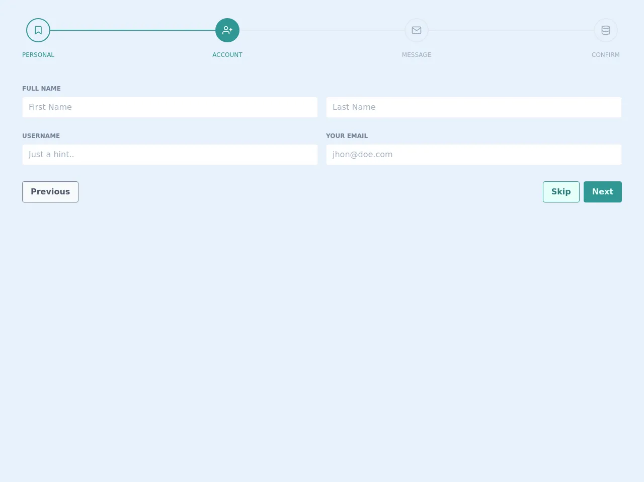
The preview of Form stepper UI component
To create a Form stepper UI component, we'll use Tailwind CSS to style our HTML elements. The component will consist of a series of steps, each with its own form fields. The user can move forward or backward through the steps, and each step is only displayed once the previous step has been completed.
Free download of the Form stepper's source code
The source code of Form stepper UI component
To create the Form stepper UI component, we'll use HTML and Tailwind CSS. We'll create a series of steps, each with its own form fields. The user can move forward or backward through the steps, and each step is only displayed once the previous step has been completed.
<div class="p-5">
    <div class="mx-4 p-4">
        <div class="flex items-center">
            <div class="flex items-center text-teal-600 relative">
                <div class="rounded-full transition duration-500 ease-in-out h-12 w-12 py-3 border-2 border-teal-600">
                    <svg xmlns="http://www.w3.org/2000/svg" width="100%" height="100%" fill="none" viewBox="0 0 24 24" stroke="currentColor" stroke-width="2" stroke-linecap="round" stroke-linejoin="round" class="feather feather-bookmark ">
                        <path d="M19 21l-7-5-7 5V5a2 2 0 0 1 2-2h10a2 2 0 0 1 2 2z"></path>
                    </svg>
                </div>
                <div class="absolute top-0 -ml-10 text-center mt-16 w-32 text-xs font-medium uppercase text-teal-600">Personal</div>
            </div>
            <div class="flex-auto border-t-2 transition duration-500 ease-in-out border-teal-600"></div>
            <div class="flex items-center text-white relative">
                <div class="rounded-full transition duration-500 ease-in-out h-12 w-12 py-3 border-2 bg-teal-600 border-teal-600">
                    <svg xmlns="http://www.w3.org/2000/svg" width="100%" height="100%" fill="none" viewBox="0 0 24 24" stroke="currentColor" stroke-width="2" stroke-linecap="round" stroke-linejoin="round" class="feather feather-user-plus ">
                        <path d="M16 21v-2a4 4 0 0 0-4-4H5a4 4 0 0 0-4 4v2"></path>
                        <circle cx="8.5" cy="7" r="4"></circle>
                        <line x1="20" y1="8" x2="20" y2="14"></line>
                        <line x1="23" y1="11" x2="17" y2="11"></line>
                    </svg>
                </div>
                <div class="absolute top-0 -ml-10 text-center mt-16 w-32 text-xs font-medium uppercase text-teal-600">Account</div>
            </div>
            <div class="flex-auto border-t-2 transition duration-500 ease-in-out border-gray-300"></div>
            <div class="flex items-center text-gray-500 relative">
                <div class="rounded-full transition duration-500 ease-in-out h-12 w-12 py-3 border-2 border-gray-300">
                    <svg xmlns="http://www.w3.org/2000/svg" width="100%" height="100%" fill="none" viewBox="0 0 24 24" stroke="currentColor" stroke-width="2" stroke-linecap="round" stroke-linejoin="round" class="feather feather-mail ">
                        <path d="M4 4h16c1.1 0 2 .9 2 2v12c0 1.1-.9 2-2 2H4c-1.1 0-2-.9-2-2V6c0-1.1.9-2 2-2z"></path>
                        <polyline points="22,6 12,13 2,6"></polyline>
                    </svg>
                </div>
                <div class="absolute top-0 -ml-10 text-center mt-16 w-32 text-xs font-medium uppercase text-gray-500">Message</div>
            </div>
            <div class="flex-auto border-t-2 transition duration-500 ease-in-out border-gray-300"></div>
            <div class="flex items-center text-gray-500 relative">
                <div class="rounded-full transition duration-500 ease-in-out h-12 w-12 py-3 border-2 border-gray-300">
                    <svg xmlns="http://www.w3.org/2000/svg" width="100%" height="100%" fill="none" viewBox="0 0 24 24" stroke="currentColor" stroke-width="2" stroke-linecap="round" stroke-linejoin="round" class="feather feather-database ">
                        <ellipse cx="12" cy="5" rx="9" ry="3"></ellipse>
                        <path d="M21 12c0 1.66-4 3-9 3s-9-1.34-9-3"></path>
                        <path d="M3 5v14c0 1.66 4 3 9 3s9-1.34 9-3V5"></path>
                    </svg>
                </div>
                <div class="absolute top-0 -ml-10 text-center mt-16 w-32 text-xs font-medium uppercase text-gray-500">Confirm</div>
            </div>
        </div>
    </div>
    <div class="mt-8 p-4">
        <div>
            <div class="font-bold text-gray-600 text-xs leading-8 uppercase h-6 mx-2 mt-3">Full Name</div>
            <div class="flex flex-col md:flex-row">
                <div class="w-full flex-1 mx-2 svelte-1l8159u">
                    <div class="bg-white my-2 p-1 flex border border-gray-200 rounded svelte-1l8159u">
                        <input placeholder="First Name" class="p-1 px-2 appearance-none outline-none w-full text-gray-800"> </div>
                </div>
                <div class="w-full flex-1 mx-2 svelte-1l8159u">
                    <div class="bg-white my-2 p-1 flex border border-gray-200 rounded svelte-1l8159u">
                        <input placeholder="Last Name" class="p-1 px-2 appearance-none outline-none w-full text-gray-800"> </div>
                </div>
            </div>
            <div class="flex flex-col md:flex-row">
                <div class="w-full mx-2 flex-1 svelte-1l8159u">
                    <div class="font-bold h-6 mt-3 text-gray-600 text-xs leading-8 uppercase"> Username</div>
                    <div class="bg-white my-2 p-1 flex border border-gray-200 rounded svelte-1l8159u">
                        <input placeholder="Just a hint.." class="p-1 px-2 appearance-none outline-none w-full text-gray-800"> </div>
                </div>
                <div class="w-full mx-2 flex-1 svelte-1l8159u">
                    <div class="font-bold h-6 mt-3 text-gray-600 text-xs leading-8 uppercase"> Your Email</div>
                    <div class="bg-white my-2 p-1 flex border border-gray-200 rounded svelte-1l8159u">
                        <input placeholder="[email protected]" class="p-1 px-2 appearance-none outline-none w-full text-gray-800"> </div>
                </div>
            </div>
        </div>
        <div class="flex p-2 mt-4">
            <button class="text-base hover:scale-110 focus:outline-none flex justify-center px-4 py-2 rounded font-bold cursor-pointer
        hover:bg-gray-200
        bg-gray-100
        text-gray-700
        border duration-200 ease-in-out
        border-gray-600 transition">Previous</button>
            <div class="flex-auto flex flex-row-reverse">
                <button class="text-base  ml-2  hover:scale-110 focus:outline-none flex justify-center px-4 py-2 rounded font-bold cursor-pointer
        hover:bg-teal-600
        bg-teal-600
        text-teal-100
        border duration-200 ease-in-out
        border-teal-600 transition">Next</button>
                <button class="text-base hover:scale-110 focus:outline-none flex justify-center px-4 py-2 rounded font-bold cursor-pointer
        hover:bg-teal-200
        bg-teal-100
        text-teal-700
        border duration-200 ease-in-out
        border-teal-600 transition">Skip</button>
            </div>
        </div>
    </div>
</div>
How to create a Form stepper with Tailwind CSS?
To create a Form stepper with Tailwind CSS, we'll follow these steps:
- Create the HTML structure for the Form stepper.
- Add Tailwind CSS classes to style the Form stepper.
- Add JavaScript to handle the navigation between steps.
Let's dive into each step in more detail.
Step 1: Create the HTML structure for the Form stepper
The first step is to create the HTML structure for the Form stepper. We'll create a series of steps, each with its own form fields. The user can move forward or backward through the steps, and each step is only displayed once the previous step has been completed.
<div class="w-full max-w-lg mx-auto">
  <div class="border-t-2 border-gray-200 pt-8">
    <div class="flex justify-center">
      <div class="flex">
        <div class="relative w-16 h-16">
          <div class="absolute top-0 w-full h-1/2 bg-gray-200"></div>
          <div class="absolute bottom-0 w-full h-1/2 bg-gray-200"></div>
          <div class="absolute top-1/2 w-full h-2 bg-indigo-600"></div>
          <div class="absolute inset-0 flex items-center justify-center">
            <span class="text-2xl font-semibold text-white">1</span>
          </div>
        </div>
        <div class="flex-1 border-t-2 border-gray-200 ml-4"></div>
      </div>
    </div>
    <div class="mt-8">
      <div>
        <label for="email" class="block text-gray-700 font-bold mb-2">Email Address</label>
        <input type="email" id="email" name="email" class="w-full border border-gray-400 p-2 rounded-md">
      </div>
      <div class="mt-4">
        <label for="password" class="block text-gray-700 font-bold mb-2">Password</label>
        <input type="password" id="password" name="password" class="w-full border border-gray-400 p-2 rounded-md">
      </div>
    </div>
  </div>
</div>
In this HTML structure, we've created the first step of the Form stepper. We've added two form fields for the user to enter their email address and password.
Step 2: Add Tailwind CSS classes to style the Form stepper
The next step is to add Tailwind CSS classes to style the Form stepper. We'll use a combination of Flexbox and Grid to create the layout for the Form stepper.
<div class="w-full max-w-lg mx-auto">
  <div class="border-t-2 border-gray-200 pt-8">
    <div class="flex justify-center">
      <div class="flex">
        <div class="relative w-16 h-16">
          <div class="absolute top-0 w-full h-1/2 bg-gray-200"></div>
          <div class="absolute bottom-0 w-full h-1/2 bg-gray-200"></div>
          <div class="absolute top-1/2 w-full h-2 bg-indigo-600"></div>
          <div class="absolute inset-0 flex items-center justify-center">
            <span class="text-2xl font-semibold text-white">1</span>
          </div>
        </div>
        <div class="flex-1 border-t-2 border-gray-200 ml-4"></div>
      </div>
    </div>
    <div class="mt-8">
      <div>
        <label for="email" class="block text-gray-700 font-bold mb-2">Email Address</label>
        <input type="email" id="email" name="email" class="w-full border border-gray-400 p-2 rounded-md">
      </div>
      <div class="mt-4">
        <label for="password" class="block text-gray-700 font-bold mb-2">Password</label>
        <input type="password" id="password" name="password" class="w-full border border-gray-400 p-2 rounded-md">
      </div>
    </div>
  </div>
</div>
In this code block, we've added Tailwind CSS classes to create the layout for the Form stepper. We've used Flexbox to center the stepper and Grid to create the layout for the form fields.
Step 3: Add JavaScript to handle the navigation between steps
The final step is to add JavaScript to handle the navigation between steps. We'll create a function that listens for clicks on the "Next" and "Back" buttons, and updates the visibility of the steps accordingly.
const steps = document.querySelectorAll('.step');
const nextBtn = document.querySelectorAll('.next-btn');
const prevBtn = document.querySelectorAll('.prev-btn');

let currentStep = 0;

function showStep(n) {
  steps[currentStep].classList.remove('active');
  steps[n].classList.add('active');
  currentStep = n;

  if (currentStep === 0) {
    prevBtn.disabled = true;
  } else {
    prevBtn.disabled = false;
  }

  if (currentStep === steps.length - 1) {
    nextBtn.disabled = true;
  } else {
    nextBtn.disabled = false;
  }
}

nextBtn.forEach(btn => {
  btn.addEventListener('click', () => {
    showStep(currentStep + 1);
  });
});

prevBtn.forEach(btn => {
  btn.addEventListener('click', () => {
    showStep(currentStep - 1);
  });
});
In this JavaScript code block, we've created a function that updates the visibility of the steps based on which step the user is currently on. We've also added event listeners to the "Next" and "Back" buttons to call this function when they are clicked.
Conclusion
In this article, we've explored how to create a Form stepper UI component using Tailwind CSS. We've covered the basics of Tailwind CSS, the description of the Form stepper UI component, why use Tailwind CSS to create it, the preview and source code of the component, and finally, how to create it step-by-step.
Tailwind CSS is a powerful tool that can help you quickly create custom designs without writing any CSS. By using Tailwind CSS to create a Form stepper UI component, you can save a lot of time and create a great user experience for your users.