- Published on
6 Ideas To Help You Make A Form Sign Up With Tailwind CSS Like A Pro
- What is Tailwind CSS?
- The description of Form Sign Up UI component
- Why use Tailwind CSS to create a Form Sign Up UI component?
- The preview of Form Sign Up UI component
- The source code of Form Sign Up UI component
- How to create a Form Sign Up with Tailwind CSS?
- Idea #1: Use the Form element
- Idea #2: Use the Input element
- Idea #3: Use the Label element
- Idea #4: Use the Button element
- Idea #5: Use Tailwind CSS classes
- Idea #6: Use custom CSS classes
- Conclusion
Are you looking to create a Form Sign Up UI component for your website or application? If so, you're in luck! In this article, we'll be discussing how to create a Form Sign Up UI component using Tailwind CSS. Tailwind CSS is a utility-first CSS framework that allows you to quickly and easily create custom UI components. With Tailwind CSS, you can create beautiful and responsive UI components without having to write a lot of custom CSS code.
What is Tailwind CSS?
Tailwind CSS is a utility-first CSS framework that provides you with a set of pre-defined CSS classes that you can use to style your HTML elements. With Tailwind CSS, you can create custom UI components without having to write a lot of custom CSS code. Tailwind CSS is designed to be highly customizable and flexible, allowing you to create unique and responsive UI components for your website or application.
The description of Form Sign Up UI component
A Form Sign Up UI component is a user interface element that allows users to sign up for a service or create an account. A typical Form Sign Up UI component includes fields for users to enter their name, email address, password, and other relevant information. The Form Sign Up UI component is an essential element for any website or application that requires user registration.
Why use Tailwind CSS to create a Form Sign Up UI component?
Tailwind CSS provides you with a set of pre-defined CSS classes that you can use to style your HTML elements. With Tailwind CSS, you can create custom UI components without having to write a lot of custom CSS code. Tailwind CSS is designed to be highly customizable and flexible, allowing you to create unique and responsive UI components for your website or application.
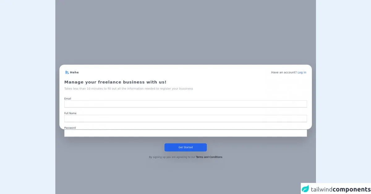
The preview of Form Sign Up UI component
To create a Form Sign Up UI component using Tailwind CSS, you can start by using the pre-defined CSS classes provided by Tailwind CSS. Here is a preview of what the Form Sign Up UI component will look like:
Free download of the Form Sign Up's source code
The source code of Form Sign Up UI component
To create a Form Sign Up UI component using Tailwind CSS, you can start by using the pre-defined CSS classes provided by Tailwind CSS. Here is the source code for the Form Sign Up UI component:
<!DOCTYPE html>
<html lang="en">

<head>
  <meta charset="UTF-8">
  <meta http-equiv="X-UA-Compatible" content="IE=edge">
  <meta name="viewport" content="width=device-width, initial-scale=1.0">
  <title>Document</title>
  <script src="https://cdn.tailwindcss.com"></script>
</head>

<body class="bg-white">
  <div class="
            font-sans
            bg-gray-500 bg-opacity-60
            w-full
            min-h-screen
            flex justify-center flex items-center
            h-full
            top-0
            backdrop-filter backdrop-blur-lg
        ">
    <link href="https://fonts.googleapis.com/css?family=Poppins" rel="stylesheet" />
    <div class="
                px-6
                p-2
                bg-white
                relative
                justify-center
                items-center
                w-1/2
                m-auto
                mx-auto
                h-1/3
                sm:h-1/3
                md:w-1/3
                md:h-1/3
                lg:w-full
                lg: mx-5
                lg:h-1/3
                rounded-3xl
                filter
                drop-shadow-2xl
            ">
      <div class="flex p-1 sm:mt-4 border-black items-center justify-between">
        <div class="flex">
          <svg xmlns="http://www.w3.org/2000/svg" class="h-5 w-5 text-blue-400" viewBox="0 0 20 20" fill="currentColor">
            <path fill-rule="evenodd"
              d="M4 2a2 2 0 00-2 2v11a3 3 0 106 0V4a2 2 0 00-2-2H4zm1 14a1 1 0 100-2 1 1 0 000 2zm5-1.757l4.9-4.9a2 2 0 000-2.828L13.485 5.1a2 2 0 00-2.828 0L10 5.757v8.486zM16 18H9.071l6-6H16a2 2 0 012 2v2a2 2 0 01-2 2z"
              clip-rule="evenodd" />
          </svg>
          <p class="text-gray-600 tracking-wider ml-1 text-sm sm:text-md font-bold">
            Hehe
          </p>
        </div>
        <div class="flex items-center">
          <p class="text-gray-600 hidden text-sm lg:block">Have an account?</p>
          <a class="text-blue-600 ml-1 hover:underline text-sm sm:text-md" href="#">Log in</a>
        </div>
      </div>
      <div class="mt-3  sm:mt-5">
        <h1 class="text-xl text-gray-600 tracking-wider text-sm sm:text-md font-black">
          Manage your freelance business with us!
        </h1>
        <p class="text-xs sm:text-sm text-gray-400 mt-2">
          Takes less than 10 minutes to fill out all the information needed to register
          your bussiness
        </p>
      </div>
      <div class="mt-1 sm:mt-8">
        <form action="" class="flex-col flex">
          <label for="judul" class="text-gray-700 text-xs sm:text-md">Email</label>
          <input name="judul" type="text" class="
                                w-full
                                h-4
                                sm:h-9
                                border-b-2 border-gray-300
                                focus:border-blue-300
                                outline-none
                            " />
          <label for="judul" class="text-gray-700 mt-1 sm:mt-5 text-xs sm:text-md">Full Name</label>
          <input name="judul" type="text" class="
                                w-full
                                h-4
                                sm:h-9
                                border-b-2 border-gray-300
                                focus:border-blue-300
                                outline-none
                            " />

          <label for="judul" class="text-gray-700 mt-1 sm:mt-5 text-xs sm:text-md">Password</label>
          <input name="judul" type="text" class="
                                                w-full
                                                h-4
                                                sm:h-9
                                                border-b-2 border-gray-300
                                                focus:border-blue-300
                                                outline-none
                                            " />
        </form>
      </div>
      <div class="justify-center flex-col items-center mt-2 sm:mt-8 flex">
        <button class="
                        bg-blue-600
                        text-gray-100
                        rounded-md
                        h-8
                        sm:h-auto
                        sm:rounded-lg
                        w-20
                        sm:w-52
                        p-1
                        text-xs
                        sm:text-md
                        sm:p-3
                    ">
          Get Started
        </button>
        <p class="text-gray-600 text-xs my-2 sm:my-5 sm:text-md">
          By signing up you are agreeing to our
          <a href="#" class="text-black text-xs sm:text-md">Terms and Conditions</a>
        </p>
      </div>
    </div>
  </div>
</body>

</html>
How to create a Form Sign Up with Tailwind CSS?
Now that you have an idea of what the Form Sign Up UI component looks like and the source code required to create it, let's dive into how to create a Form Sign Up UI component using Tailwind CSS.
Idea #1: Use the Form element
The first idea to help you create a Form Sign Up UI component with Tailwind CSS is to use the HTML <form> element. The <form> element is used to create a form that can be used to collect user input. To create a Form Sign Up UI component, you can start by creating a <form> element and adding the necessary input fields.
Idea #2: Use the Input element
The second idea to help you create a Form Sign Up UI component with Tailwind CSS is to use the HTML <input> element. The <input> element is used to create input fields that can be used to collect user input. To create a Form Sign Up UI component, you can start by creating <input> elements and adding the necessary attributes.
Idea #3: Use the Label element
The third idea to help you create a Form Sign Up UI component with Tailwind CSS is to use the HTML <label> element. The <label> element is used to associate a label with an input field. To create a Form Sign Up UI component, you can start by creating <label> elements and associating them with the corresponding <input> elements.
Idea #4: Use the Button element
The fourth idea to help you create a Form Sign Up UI component with Tailwind CSS is to use the HTML <button> element. The <button> element is used to create a button that can be used to submit the form. To create a Form Sign Up UI component, you can start by creating a <button> element and adding the necessary attributes.
Idea #5: Use Tailwind CSS classes
The fifth idea to help you create a Form Sign Up UI component with Tailwind CSS is to use the pre-defined CSS classes provided by Tailwind CSS. Tailwind CSS provides you with a set of pre-defined CSS classes that you can use to style your HTML elements. To create a Form Sign Up UI component, you can start by using the pre-defined CSS classes provided by Tailwind CSS.
Idea #6: Use custom CSS classes
The sixth idea to help you create a Form Sign Up UI component with Tailwind CSS is to use custom CSS classes. Tailwind CSS allows you to create custom CSS classes that can be used to style your HTML elements. To create a Form Sign Up UI component, you can start by creating custom CSS classes and applying them to the necessary HTML elements.
Conclusion
Creating a Form Sign Up UI component using Tailwind CSS is a great way to create a custom and responsive UI component for your website or application. With Tailwind CSS, you can quickly and easily create beautiful and responsive UI components without having to write a lot of custom CSS code. By following the ideas outlined in this article, you can create a Form Sign Up UI component like a pro.