- Published on
6 Incredibly Easy Ways To Make A Form Register Component With Tailwind CSS Better While Spending Less
- What is Tailwind CSS?
- The description of Form Register Component UI component
- Why use Tailwind CSS to create a Form Register Component UI component?
- The preview of Form Register Component UI component
- The source code of Form Register Component UI component
- How to create a Form Register Component with Tailwind CSS?
- Step 1: Set up your project
- Step 2: Create the HTML structure
- Step 3: Style the Form Register Component with Tailwind CSS
- Step 4: Customize the Form Register Component
- Conclusion
As a FrontEnd technology blogger, I'm always looking for ways to make my code more efficient and effective. One tool that has been a game-changer for me is Tailwind CSS. Tailwind CSS is a utility-first CSS framework that allows developers to create beautiful and responsive user interfaces with minimal effort. In this article, I will show you how to create a Form Register Component using Tailwind CSS and share some tips to make it better while spending less time.
What is Tailwind CSS?
Tailwind CSS is a utility-first CSS framework that provides a set of pre-defined CSS classes to create UI components. It is designed to help developers create beautiful and responsive user interfaces quickly and easily. Tailwind CSS allows developers to focus on the functionality of their application rather than the design, making it an excellent choice for developers who want to create functional applications without spending too much time on the design.
The description of Form Register Component UI component
A Form Register Component is a UI component that allows users to register for an application or service. It typically includes fields for the user's name, email address, password, and other relevant information. The Form Register Component is an essential component of any application that requires user registration.
Why use Tailwind CSS to create a Form Register Component UI component?
Tailwind CSS provides a set of pre-defined CSS classes that can be used to create UI components quickly and easily. By using Tailwind CSS, developers can create a Form Register Component without spending too much time on the design. Additionally, Tailwind CSS is highly customizable, allowing developers to create unique designs that match their application's branding.
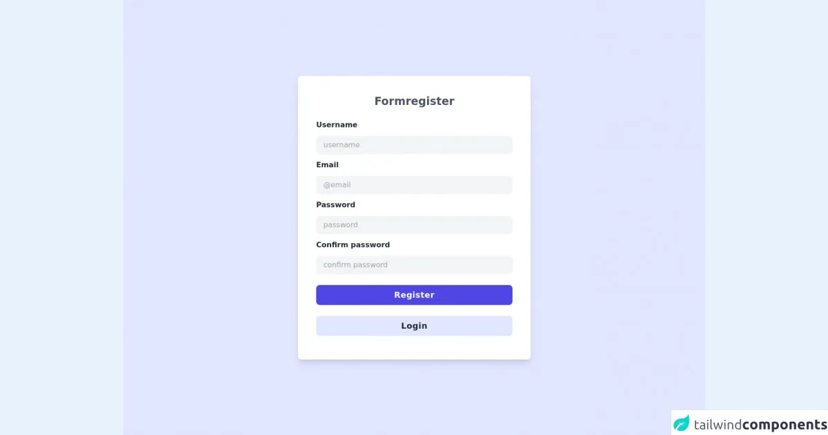
The preview of Form Register Component UI component
To give you an idea of what the Form Register Component will look like, here is a preview:
Free download of the Form Register Component's source code
The source code of Form Register Component UI component
Here is the source code for the Form Register Component:
<!-- Create by joker banny -->
<div class="h-screen bg-indigo-100 flex justify-center items-center">
	<div class="lg:w-2/5 md:w-1/2 w-2/3">
		<form class="bg-white p-10 rounded-lg shadow-lg min-w-full">
			<h1 class="text-center text-2xl mb-6 text-gray-600 font-bold font-sans">Formregister</h1>
			<div>
				<label class="text-gray-800 font-semibold block my-3 text-md" for="username">Username</label>
				<input class="w-full bg-gray-100 px-4 py-2 rounded-lg focus:outline-none" type="text" name="username" id="username" placeholder="username" />
      </div>
				<div>
					<label class="text-gray-800 font-semibold block my-3 text-md" for="email">Email</label>
					<input class="w-full bg-gray-100 px-4 py-2 rounded-lg focus:outline-none" type="text" name="email" id="email" placeholder="@email" />
      </div>
					<div>
						<label class="text-gray-800 font-semibold block my-3 text-md" for="password">Password</label>
						<input class="w-full bg-gray-100 px-4 py-2 rounded-lg focus:outline-none" type="text" name="password" id="password" placeholder="password" />
      </div>
						<div>
							<label class="text-gray-800 font-semibold block my-3 text-md" for="confirm">Confirm password</label>
							<input class="w-full bg-gray-100 px-4 py-2 rounded-lg focus:outline-none" type="text" name="confirm" id="confirm" placeholder="confirm password" />
      </div>
							<button type="submit" class="w-full mt-6 bg-indigo-600 rounded-lg px-4 py-2 text-lg text-white tracking-wide font-semibold font-sans">Register</button>
							<button type="submit" class="w-full mt-6 mb-3 bg-indigo-100 rounded-lg px-4 py-2 text-lg text-gray-800 tracking-wide font-semibold font-sans">Login</button>
		</form>
	</div>
</div>
How to create a Form Register Component with Tailwind CSS?
Now that we have an understanding of what Tailwind CSS is and why it's useful, let's dive into how to create a Form Register Component using Tailwind CSS.
Step 1: Set up your project
To get started, you'll need to set up your project. You can either use a starter template or create a new project from scratch. If you're using a starter template, make sure it includes Tailwind CSS.
Step 2: Create the HTML structure
The first step in creating a Form Register Component is to create the HTML structure. Here is an example of what the HTML structure could look like:
<form class="bg-white shadow-md rounded px-8 pt-6 pb-8 mb-4">
  <div class="mb-4">
    <label class="block text-gray-700 font-bold mb-2" for="username">
      Username
    </label>
    <input
      class="shadow appearance-none border rounded w-full py-2 px-3 text-gray-700 leading-tight focus:outline-none focus:shadow-outline"
      id="username"
      type="text"
      placeholder="Username"
    />
  </div>
  <div class="mb-4">
    <label class="block text-gray-700 font-bold mb-2" for="email">
      Email
    </label>
    <input
      class="shadow appearance-none border rounded w-full py-2 px-3 text-gray-700 leading-tight focus:outline-none focus:shadow-outline"
      id="email"
      type="email"
      placeholder="Email"
    />
  </div>
  <div class="mb-4">
    <label class="block text-gray-700 font-bold mb-2" for="password">
      Password
    </label>
    <input
      class="shadow appearance-none border rounded w-full py-2 px-3 text-gray-700 leading-tight focus:outline-none focus:shadow-outline"
      id="password"
      type="password"
      placeholder="Password"
    />
  </div>
  <div class="mb-6">
    <label class="block text-gray-700 font-bold mb-2" for="password_confirmation">
      Confirm Password
    </label>
    <input
      class="shadow appearance-none border rounded w-full py-2 px-3 text-gray-700 leading-tight focus:outline-none focus:shadow-outline"
      id="password_confirmation"
      type="password"
      placeholder="Confirm Password"
    />
  </div>
  <div class="flex items-center justify-between">
    <button
      class="bg-blue-500 hover:bg-blue-700 text-white font-bold py-2 px-4 rounded focus:outline-none focus:shadow-outline"
      type="button"
    >
      Register
    </button>
  </div>
</form>
Step 3: Style the Form Register Component with Tailwind CSS
Once you have the HTML structure in place, you can start styling the Form Register Component with Tailwind CSS. Here is an example of what the CSS could look like:
/* Form Register Component */
.form-register {
  max-width: 500px;
  margin: 0 auto;
}

.form-register label {
  display: block;
  font-weight: 700;
  margin-bottom: 0.5rem;
}

.form-register input {
  display: block;
  width: 100%;
  padding: 0.5rem;
  border-radius: 0.25rem;
  border: 1px solid #d2d6dc;
  transition: border-color 0.2s ease-in-out, box-shadow 0.2s ease-in-out;
}

.form-register input:focus {
  outline: none;
  border-color: #4299e1;
  box-shadow: 0 0 0 3px rgba(66, 153, 225, 0.5);
}

.form-register button {
  display: inline-block;
  background-color: #4299e1;
  color: #fff;
  font-weight: 700;
  padding: 0.5rem 1rem;
  border-radius: 0.25rem;
  transition: background-color 0.2s ease-in-out;
}

.form-register button:hover {
  background-color: #2b6cb0;
}
Step 4: Customize the Form Register Component
Tailwind CSS provides a set of pre-defined CSS classes that can be used to customize the Form Register Component. Here are some examples of how you can customize the Form Register Component:
- Change the background color of the form:
bg-gray-100 - Change the font size of the labels:
text-lg - Add a border to the form:
border-2 border-gray-200 - Change the font family of the form:
font-sans - Change the color of the submit button:
bg-green-500 hover:bg-green-700
Conclusion
In conclusion, Tailwind CSS is an excellent tool for creating UI components quickly and easily. By using Tailwind CSS, developers can create a Form Register Component without spending too much time on the design. Additionally, Tailwind CSS is highly customizable, allowing developers to create unique designs that match their application's branding. By following the steps outlined in this article, you can create a Form Register Component with Tailwind CSS that is both functional and beautiful.