- Published on
Imagine You Create A Form Register Component With Tailwind CSS Like An Expert. Follow These 6 Steps To Get There
- What is Tailwind CSS?
- The description of Form Register Component ui component
- Why use Tailwind CSS to create a Form Register Component ui component?
- The preview of Form Register Component ui component.
- The source code of Form Register Component ui component.
- How to create a Form Register Component with Tailwind CSS?
- Step 1: Install Tailwind CSS
- Step 2: Create a new HTML file
- Step 3: Add the Form Register Component code
- Step 4: Customize the styles
- Step 5: Add your own form fields
- Step 6: Add form validation and submission
- Conclusion
What is Tailwind CSS?
Tailwind CSS is a utility-first CSS framework that helps you quickly build custom designs without having to write any CSS from scratch. It provides a set of pre-defined CSS classes that you can use to style your HTML elements. With Tailwind CSS, you can easily create responsive and mobile-first designs.
The description of Form Register Component ui component
A Form Register Component is a UI component that allows users to register for a service or product. It typically includes form fields for the user's name, email address, password, and other relevant information. The component should be easy to use and visually appealing to encourage users to complete the registration process.
Why use Tailwind CSS to create a Form Register Component ui component?
Tailwind CSS is an excellent choice for creating a Form Register Component because it provides a wide range of pre-defined CSS classes that you can use to style your form fields and buttons. This saves you time and effort in writing custom CSS from scratch. Additionally, Tailwind CSS is highly customizable, so you can easily tweak the styles to match your brand's visual identity.
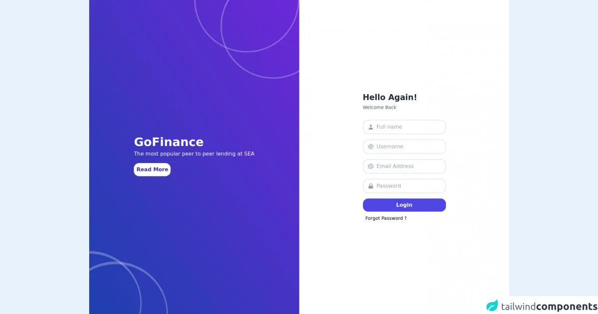
The preview of Form Register Component ui component.
To create a Form Register Component with Tailwind CSS, you can use the following template:
<div class="bg-white shadow-md rounded px-8 pt-6 pb-8 mb-4 flex flex-col my-2">
  <div class="-mx-3 md:flex mb-6">
    <div class="md:w-1/2 px-3 mb-6 md:mb-0">
      <label class="block uppercase tracking-wide text-gray-700 text-xs font-bold mb-2" for="grid-first-name">
        First Name
      </label>
      <input class="appearance-none block w-full bg-gray-200 text-gray-700 border border-gray-200 rounded py-3 px-4 mb-3 leading-tight focus:outline-none focus:bg-white" id="grid-first-name" type="text" placeholder="Jane">
    </div>
    <div class="md:w-1/2 px-3">
      <label class="block uppercase tracking-wide text-gray-700 text-xs font-bold mb-2" for="grid-last-name">
        Last Name
      </label>
      <input class="appearance-none block w-full bg-gray-200 text-gray-700 border border-gray-200 rounded py-3 px-4 leading-tight focus:outline-none focus:bg-white focus:border-gray-500" id="grid-last-name" type="text" placeholder="Doe">
    </div>
  </div>
  <div class="-mx-3 md:flex mb-6">
    <div class="md:w-full px-3">
      <label class="block uppercase tracking-wide text-gray-700 text-xs font-bold mb-2" for="grid-email">
        Email
      </label>
      <input class="appearance-none block w-full bg-gray-200 text-gray-700 border border-gray-200 rounded py-3 px-4 mb-3 leading-tight focus:outline-none focus:bg-white focus:border-gray-500" id="grid-email" type="email" placeholder="[email protected]">
    </div>
  </div>
  <div class="-mx-3 md:flex mb-6">
    <div class="md:w-1/2 px-3 mb-6 md:mb-0">
      <label class="block uppercase tracking-wide text-gray-700 text-xs font-bold mb-2" for="grid-password">
        Password
      </label>
      <input class="appearance-none block w-full bg-gray-200 text-gray-700 border border-gray-200 rounded py-3 px-4 mb-3 leading-tight focus:outline-none focus:bg-white focus:border-gray-500" id="grid-password" type="password" placeholder="********">
    </div>
    <div class="md:w-1/2 px-3">
      <label class="block uppercase tracking-wide text-gray-700 text-xs font-bold mb-2" for="grid-password-confirm">
        Confirm Password
      </label>
      <input class="appearance-none block w-full bg-gray-200 text-gray-700 border border-gray-200 rounded py-3 px-4 mb-3 leading-tight focus:outline-none focus:bg-white focus:border-gray-500" id="grid-password-confirm" type="password" placeholder="********">
    </div>
  </div>
  <div class="flex items-center justify-between">
    <button class="bg-blue-500 hover:bg-blue-700 text-white font-bold py-2 px-4 rounded focus:outline-none focus:shadow-outline" type="button">
      Register
    </button>
  </div>
</div>
Free download of the Form Register Component's source code
The source code of Form Register Component ui component.
To create the Form Register Component, you can use the following HTML and CSS code:
<div class="bg-white shadow-md rounded px-8 pt-6 pb-8 mb-4 flex flex-col my-2">
  <div class="-mx-3 md:flex mb-6">
    <div class="md:w-1/2 px-3 mb-6 md:mb-0">
      <label class="block uppercase tracking-wide text-gray-700 text-xs font-bold mb-2" for="grid-first-name">
        First Name
      </label>
      <input class="appearance-none block w-full bg-gray-200 text-gray-700 border border-gray-200 rounded py-3 px-4 mb-3 leading-tight focus:outline-none focus:bg-white" id="grid-first-name" type="text" placeholder="Jane">
    </div>
    <div class="md:w-1/2 px-3">
      <label class="block uppercase tracking-wide text-gray-700 text-xs font-bold mb-2" for="grid-last-name">
        Last Name
      </label>
      <input class="appearance-none block w-full bg-gray-200 text-gray-700 border border-gray-200 rounded py-3 px-4 leading-tight focus:outline-none focus:bg-white focus:border-gray-500" id="grid-last-name" type="text" placeholder="Doe">
    </div>
  </div>
  <div class="-mx-3 md:flex mb-6">
    <div class="md:w-full px-3">
      <label class="block uppercase tracking-wide text-gray-700 text-xs font-bold mb-2" for="grid-email">
        Email
      </label>
      <input class="appearance-none block w-full bg-gray-200 text-gray-700 border border-gray-200 rounded py-3 px-4 mb-3 leading-tight focus:outline-none focus:bg-white focus:border-gray-500" id="grid-email" type="email" placeholder="[email protected]">
    </div>
  </div>
  <div class="-mx-3 md:flex mb-6">
    <div class="md:w-1/2 px-3 mb-6 md:mb-0">
      <label class="block uppercase tracking-wide text-gray-700 text-xs font-bold mb-2" for="grid-password">
        Password
      </label>
      <input class="appearance-none block w-full bg-gray-200 text-gray-700 border border-gray-200 rounded py-3 px-4 mb-3 leading-tight focus:outline-none focus:bg-white focus:border-gray-500" id="grid-password" type="password" placeholder="********">
    </div>
    <div class="md:w-1/2 px-3">
      <label class="block uppercase tracking-wide text-gray-700 text-xs font-bold mb-2" for="grid-password-confirm">
        Confirm Password
      </label>
      <input class="appearance-none block w-full bg-gray-200 text-gray-700 border border-gray-200 rounded py-3 px-4 mb-3 leading-tight focus:outline-none focus:bg-white focus:border-gray-500" id="grid-password-confirm" type="password" placeholder="********">
    </div>
  </div>
  <div class="flex items-center justify-between">
    <button class="bg-blue-500 hover:bg-blue-700 text-white font-bold py-2 px-4 rounded focus:outline-none focus:shadow-outline" type="button">
      Register
    </button>
  </div>
</div>
<div class="h-screen md:flex">
	<div
		class="relative overflow-hidden md:flex w-1/2 bg-gradient-to-tr from-blue-800 to-purple-700 i justify-around items-center hidden">
		<div>
			<h1 class="text-white font-bold text-4xl font-sans">GoFinance</h1>
			<p class="text-white mt-1">The most popular peer to peer lending at SEA</p>
			<button type="submit" class="block w-28 bg-white text-indigo-800 mt-4 py-2 rounded-2xl font-bold mb-2">Read More</button>
		</div>
		<div class="absolute -bottom-32 -left-40 w-80 h-80 border-4 rounded-full border-opacity-30 border-t-8"></div>
		<div class="absolute -bottom-40 -left-20 w-80 h-80 border-4 rounded-full border-opacity-30 border-t-8"></div>
		<div class="absolute -top-40 -right-0 w-80 h-80 border-4 rounded-full border-opacity-30 border-t-8"></div>
		<div class="absolute -top-20 -right-20 w-80 h-80 border-4 rounded-full border-opacity-30 border-t-8"></div>
	</div>
	<div class="flex md:w-1/2 justify-center py-10 items-center bg-white">
		<form class="bg-white">
			<h1 class="text-gray-800 font-bold text-2xl mb-1">Hello Again!</h1>
			<p class="text-sm font-normal text-gray-600 mb-7">Welcome Back</p>
			<div class="flex items-center border-2 py-2 px-3 rounded-2xl mb-4">
				<svg xmlns="http://www.w3.org/2000/svg" class="h-5 w-5 text-gray-400" viewBox="0 0 20 20"
					fill="currentColor">
					<path fill-rule="evenodd" d="M10 9a3 3 0 100-6 3 3 0 000 6zm-7 9a7 7 0 1114 0H3z"
						clip-rule="evenodd" />
				</svg>
				<input class="pl-2 outline-none border-none" type="text" name="" id="" placeholder="Full name" />
      </div>
				<div class="flex items-center border-2 py-2 px-3 rounded-2xl mb-4">
					<svg xmlns="http://www.w3.org/2000/svg" class="h-5 w-5 text-gray-400" fill="none"
						viewBox="0 0 24 24" stroke="currentColor">
						<path stroke-linecap="round" stroke-linejoin="round" stroke-width="2"
							d="M12 11c0 3.517-1.009 6.799-2.753 9.571m-3.44-2.04l.054-.09A13.916 13.916 0 008 11a4 4 0 118 0c0 1.017-.07 2.019-.203 3m-2.118 6.844A21.88 21.88 0 0015.171 17m3.839 1.132c.645-2.266.99-4.659.99-7.132A8 8 0 008 4.07M3 15.364c.64-1.319 1-2.8 1-4.364 0-1.457.39-2.823 1.07-4" />
					</svg>
					<input class="pl-2 outline-none border-none" type="text" name="" id="" placeholder="Username" />
      </div>
					<div class="flex items-center border-2 py-2 px-3 rounded-2xl mb-4">
						<svg xmlns="http://www.w3.org/2000/svg" class="h-5 w-5 text-gray-400" fill="none"
							viewBox="0 0 24 24" stroke="currentColor">
							<path stroke-linecap="round" stroke-linejoin="round" stroke-width="2"
								d="M16 12a4 4 0 10-8 0 4 4 0 008 0zm0 0v1.5a2.5 2.5 0 005 0V12a9 9 0 10-9 9m4.5-1.206a8.959 8.959 0 01-4.5 1.207" />
						</svg>
						<input class="pl-2 outline-none border-none" type="text" name="" id="" placeholder="Email Address" />
      </div>
						<div class="flex items-center border-2 py-2 px-3 rounded-2xl">
							<svg xmlns="http://www.w3.org/2000/svg" class="h-5 w-5 text-gray-400" viewBox="0 0 20 20"
								fill="currentColor">
								<path fill-rule="evenodd"
									d="M5 9V7a5 5 0 0110 0v2a2 2 0 012 2v5a2 2 0 01-2 2H5a2 2 0 01-2-2v-5a2 2 0 012-2zm8-2v2H7V7a3 3 0 016 0z"
									clip-rule="evenodd" />
							</svg>
							<input class="pl-2 outline-none border-none" type="text" name="" id="" placeholder="Password" />
      </div>
							<button type="submit" class="block w-full bg-indigo-600 mt-4 py-2 rounded-2xl text-white font-semibold mb-2">Login</button>
							<span class="text-sm ml-2 hover:text-blue-500 cursor-pointer">Forgot Password ?</span>
		</form>
	</div>
</div>
How to create a Form Register Component with Tailwind CSS?
To create a Form Register Component with Tailwind CSS, follow these six steps:
Step 1: Install Tailwind CSS
First, you need to install Tailwind CSS in your project. You can do this by running the following command in your terminal:
npm install tailwindcss
Step 2: Create a new HTML file
Create a new HTML file and add the following code:
<!DOCTYPE html>
<html lang="en">
<head>
  <meta charset="UTF-8">
  <title>Form Register Component</title>
  <link rel="stylesheet" href="https://cdn.jsdelivr.net/npm/tailwindcss/dist/tailwind.min.css">
</head>
<body>
  <div class="container mx-auto">
    <!-- Form Register Component goes here -->
  </div>
</body>
</html>
Step 3: Add the Form Register Component code
Copy the Form Register Component code from the previous section and paste it inside the container div in your HTML file.
Step 4: Customize the styles
You can customize the styles of the Form Register Component by modifying the Tailwind CSS classes. For example, you can change the background color of the form by changing the bg-white class to bg-gray-100.
Step 5: Add your own form fields
You can add your own form fields to the Form Register Component by copying and pasting the existing form fields and modifying the labels and placeholders as needed.
Step 6: Add form validation and submission
Finally, you can add form validation and submission functionality to the Form Register Component using JavaScript or a server-side language like PHP.
Conclusion
Creating a Form Register Component with Tailwind CSS is a simple and efficient way to create a visually appealing and user-friendly registration form. By following the six steps outlined in this article, you can create a custom Form Register Component that matches your brand's visual identity and meets your specific requirements.