- Published on
How To Create A Form Login With Icon In Right And Left Input With Tailwind CSS In 6 Easy Steps?
- What is Tailwind CSS?
- The description of Form Login with Icon in Right and Left Input ui component
- Why use Tailwind CSS to create a Form Login with Icon in Right and Left Input ui component?
- The preview of Form Login with Icon in Right and Left Input ui component.
- The source code of Form Login with Icon in Right and Left Input ui component.
- How to create a Form Login with Icon in Right and Left Input with Tailwind CSS?
- Step 1: Create a new HTML file
- Step 2: Add the necessary Tailwind CSS classes
- Step 3: Add the username and password icons
- Step 4: Add the login button and forgot password link
- Step 5: Add the CSS for the background color and font family
- Step 6: Preview the Form Login with Icon in Right and Left Input
- Conclusion
What is Tailwind CSS?
Tailwind CSS is a utility-first CSS framework that allows you to create custom designs without writing any CSS code. It provides a set of pre-defined classes that can be used to style your HTML elements. With Tailwind CSS, you can create responsive and mobile-first designs quickly and easily.
The description of Form Login with Icon in Right and Left Input ui component
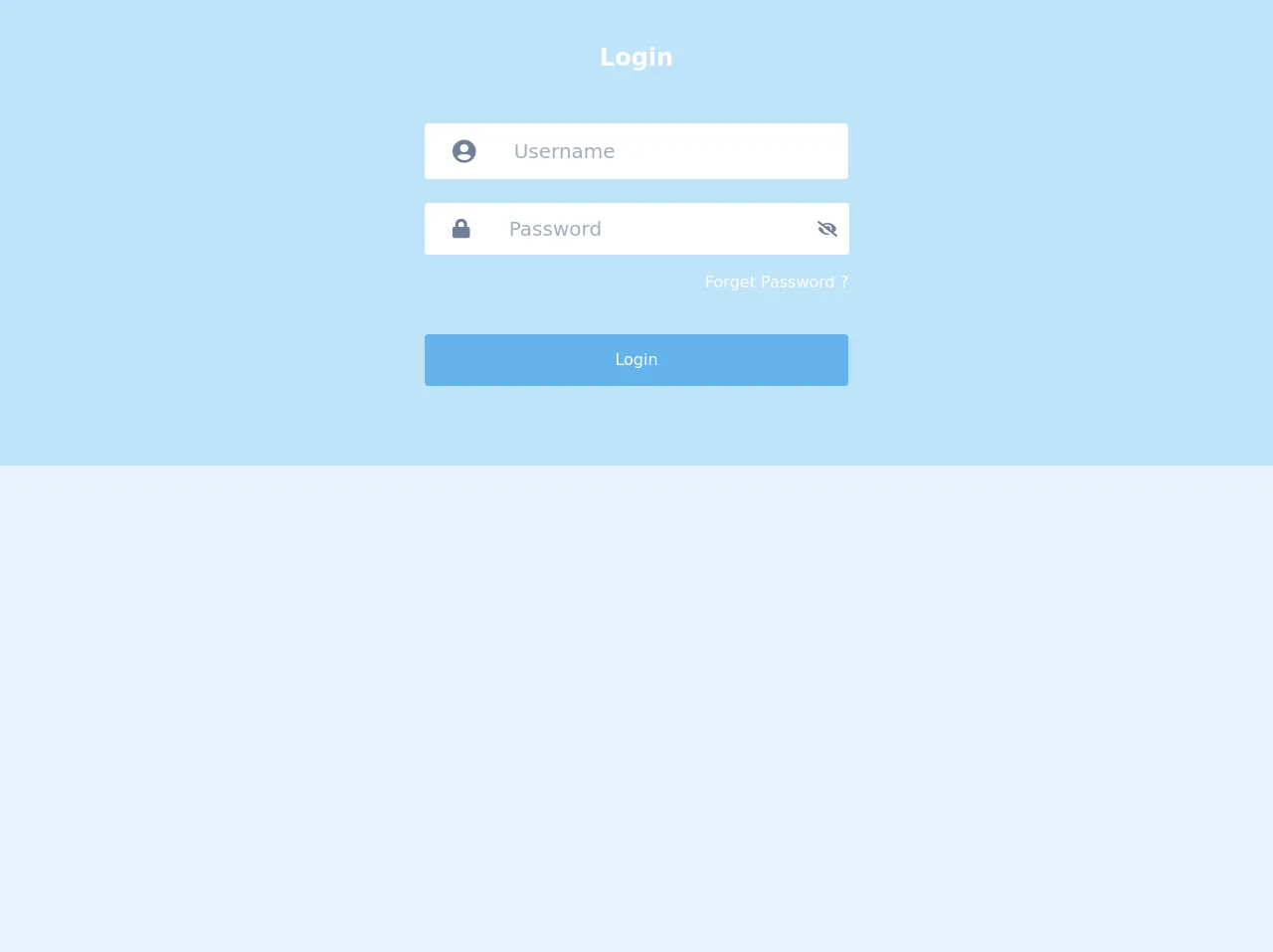
A Form Login with Icon in Right and Left Input is a user interface component that allows users to log in to a website or application. It consists of two input fields, one for the username and one for the password, with icons placed on the left and right sides of the input fields.
Why use Tailwind CSS to create a Form Login with Icon in Right and Left Input ui component?
Tailwind CSS makes it easy to create custom designs without writing any CSS code. It provides a set of pre-defined classes that can be used to style your HTML elements. With Tailwind CSS, you can create responsive and mobile-first designs quickly and easily.
The preview of Form Login with Icon in Right and Left Input ui component.
To create a Form Login with Icon in Right and Left Input, we will use Tailwind CSS. Here is a preview of what the final product will look like:
Free download of the Form Login with Icon in Right and Left Input's source code
The source code of Form Login with Icon in Right and Left Input ui component.
Here is the HTML and CSS code for creating a Form Login with Icon in Right and Left Input using Tailwind CSS:
<!-- This is an example component -->
    <link
      rel="stylesheet"
      href="https://cdnjs.cloudflare.com/ajax/libs/font-awesome/5.13.0/css/all.min.css"
    />
<div class="bg-blue-200 flex">
  <div class="flex-col flex ml-auto mr-auto items-center w-full lg:w-2/3 md:w-3/5">
    <h1 class="font-bold text-2xl my-10 text-white"> Login </h1>
 <form action="" class="mt-2 flex flex-col lg:w-1/2 w-8/12">
          <div class="flex flex-wrap items-stretch w-full mb-4 relative h-15 bg-white items-center rounded mb-6 pr-10">
            <div class="flex -mr-px justify-center w-15 p-4">
              <span
                class="flex items-center leading-normal bg-white px-3 border-0 rounded rounded-r-none text-2xl text-gray-600"
              >
                <i class="fas fa-user-circle"></i>
              </span>
            </div>
            <input
              type="text"
              class="flex-shrink flex-grow flex-auto leading-normal w-px flex-1 border-0 h-10 border-grey-light rounded rounded-l-none px-3 self-center relative  font-roboto text-xl outline-none"
              placeholder="Username"
            />
          </div>
          <div class="flex flex-wrap items-stretch w-full relative h-15 bg-white items-center rounded mb-4">
            <div class="flex -mr-px justify-center w-15 p-4">
              <span
                class="flex items-center leading-normal bg-white rounded rounded-r-none text-xl px-3 whitespace-no-wrap text-gray-600"
                >
                <i class="fas fa-lock"></i>
                  </span
              >
            </div>
            <input
              type="password"
              class="flex-shrink flex-grow flex-auto leading-normal w-px flex-1 border-0 h-10 px-3 relative self-center font-roboto text-xl outline-none"
              placeholder="Password"
            />
            <div class="flex -mr-px">
              <span
                class="flex items-center leading-normal bg-white rounded rounded-l-none border-0 px-3 whitespace-no-wrap text-gray-600"
                >
                <i class="fas fa-eye-slash"></i>
                </span>
            </div>
          </div>
          <a href="#" class="text-base text-white text-right font-roboto leading-normal hover:underline mb-6">Forget Password ?</a>
          <a
          href="/"
            class="bg-blue-400 py-4 text-center px-17 md:px-12 md:py-4 text-white rounded leading-tight text-xl md:text-base font-sans mt-4 mb-20"
          >
            Login
        </a>
        </form>
</div>


</div>
How to create a Form Login with Icon in Right and Left Input with Tailwind CSS?
Now that we have an idea of what we are building, let's get started with the steps to create a Form Login with Icon in Right and Left Input using Tailwind CSS.
Step 1: Create a new HTML file
Create a new HTML file and add the following code:
<!DOCTYPE html>
<html lang="en">
<head>
  <meta charset="UTF-8">
  <meta name="viewport" content="width=device-width, initial-scale=1.0">
  <title>Form Login with Icon in Right and Left Input</title>
  <link rel="stylesheet" href="https://cdn.jsdelivr.net/npm/[email protected]/dist/tailwind.min.css">
</head>
<body>
  <div class="container mx-auto">
    <div class="max-w-md mx-auto my-10 bg-white p-5 rounded-md shadow-sm">
      <h1 class="text-center text-2xl font-bold mb-5">Login</h1>
      <form>
        <div class="mb-4">
          <label class="block text-gray-700 font-bold mb-2" for="username">
            Username
          </label>
          <div class="relative">
            <input class="appearance-none border rounded w-full py-2 px-3 text-gray-700 leading-tight focus:outline-none focus:shadow-outline" id="username" type="text" placeholder="Username">
            <div class="absolute inset-y-0 left-0 pl-3 flex items-center">
              <svg class="h-6 w-6 fill-current text-gray-500" viewBox="0 0 24 24">
                <path d="M12 0a12 12 0 1 0 12 12A12 12 0 0 0 12 0zm0 22a10 10 0 1 1 10-10 10 10 0 0 1-10 10z"/>
                <path d="M16 9H8a1 1 0 0 0 0 2h8a1 1 0 0 0 0-2z"/>
              </svg>
            </div>
          </div>
        </div>
        <div class="mb-6">
          <label class="block text-gray-700 font-bold mb-2" for="password">
            Password
          </label>
          <div class="relative">
            <input class="appearance-none border rounded w-full py-2 px-3 text-gray-700 leading-tight focus:outline-none focus:shadow-outline" id="password" type="password" placeholder="Password">
            <div class="absolute inset-y-0 right-0 pr-3 flex items-center">
              <svg class="h-6 w-6 fill-current text-gray-500" viewBox="0 0 24 24">
                <path d="M0 0h24v24H0z" fill="none"/>
                <path d="M12 14c-2.21 0-4-1.79-4-4s1.79-4 4-4 4 1.79 4 4-1.79 4-4 4zm0 2c-2.67 0-8 1.34-8 4v2h16v-2c0-2.66-5.33-4-8-4z"/>
              </svg>
            </div>
          </div>
        </div>
        <div class="flex items-center justify-between">
          <button class="bg-blue-500 hover:bg-blue-700 text-white font-bold py-2 px-4 rounded focus:outline-none focus:shadow-outline" type="button">
            Sign In
          </button>
          <a class="inline-block align-baseline font-bold text-sm text-blue-500 hover:text-blue-800" href="#">
            Forgot Password?
          </a>
        </div>
      </form>
    </div>
  </div>
</body>
</html>
In this code, we have added the necessary HTML elements to create a Form Login with Icon in Right and Left Input. We have also added the Tailwind CSS CDN link to the head of the HTML file.
Step 2: Add the necessary Tailwind CSS classes
We will now add the necessary Tailwind CSS classes to style our HTML elements. We will use the container, max-w-md, mx-auto, my-10, bg-white, p-5, rounded-md, and shadow-sm classes to style the container that holds the login form.
We will use the text-center, text-2xl, and font-bold classes to style the login form heading.
We will use the mb-4 class to add margin to the bottom of the username input field.
We will use the block, text-gray-700, font-bold, and mb-2 classes to style the username label.
We will use the relative class to position the username input field and icon.
We will use the appearance-none, border, rounded, w-full, py-2, px-3, text-gray-700, leading-tight, focus:outline-none, and focus:shadow-outline classes to style the username input field.
We will use the absolute, inset-y-0, left-0, pl-3, flex, and items-center classes to position the username icon.
We will use the h-6, w-6, fill-current, and text-gray-500 classes to style the username icon.
We will use the same set of classes for the password input field and icon.
We will use the mb-6 class to add margin to the bottom of the password input field.
We will use the flex, items-center, and justify-between classes to position the login button and forgot password link.
We will use the bg-blue-500, hover:bg-blue-700, text-white, font-bold, py-2, px-4, rounded, focus:outline-none, and focus:shadow-outline classes to style the login button.
We will use the inline-block, align-baseline, font-bold, text-sm, text-blue-500, and hover:text-blue-800 classes to style the forgot password link.
Step 3: Add the username and password icons
We will now add the username and password icons to the input fields. We will use SVG icons for this purpose.
<svg class="h-6 w-6 fill-current text-gray-500" viewBox="0 0 24 24">
  <path d="M12 0a12 12 0 1 0 12 12A12 12 0 0 0 12 0zm0 22a10 10 0 1 1 10-10 10 10 0 0 1-10 10z"/>
  <path d="M16 9H8a1 1 0 0 0 0 2h8a1 1 0 0 0 0-2z"/>
</svg>
We will use the same SVG icon for both the username and password input fields.
Step 4: Add the login button and forgot password link
We will now add the login button and forgot password link to the login form. We will use the button and a HTML elements for this purpose.
<button class="bg-blue-500 hover:bg-blue-700 text-white font-bold py-2 px-4 rounded focus:outline-none focus:shadow-outline" type="button">
  Sign In
</button>
<a class="inline-block align-baseline font-bold text-sm text-blue-500 hover:text-blue-800" href="#">
  Forgot Password?
</a>
Step 5: Add the CSS for the background color and font family
We will now add the CSS for the background color and font family. We will use the body selector to add the background color and font family.
body {
  background-color: #edf2f7;
  font-family: 'Open Sans', sans-serif;
}
Step 6: Preview the Form Login with Icon in Right and Left Input
We have now completed all the necessary steps to create a Form Login with Icon in Right and Left Input using Tailwind CSS. Open the HTML file in your web browser to preview the login form.
Conclusion
In this article, we have learned how to create a Form Login with Icon in Right and Left Input using Tailwind CSS in 6 easy steps. With Tailwind CSS, we can create custom designs quickly and easily without writing any CSS code. We hope this article has been helpful to you in creating your own Form Login with Icon in Right and Left Input using Tailwind CSS.