- Published on
6 Tips To Build A Form Login With Tailwind CSS
- What is Tailwind CSS?
- The description of Form Login ui component
- Why use Tailwind CSS to create a Form Login ui component?
- The preview of Form Login ui component
- The source code of Form Login ui component
- How to create a Form Login with Tailwind CSS?
- Step 1: Set up your HTML structure
- Step 2: Style your Form Login with Tailwind CSS
- Step 3: Customize your Form Login
- Conclusion
As a FrontEnd technology blogger, it's important to stay up-to-date with the latest trends and tools in the industry. One such tool that has gained a lot of popularity in recent times is Tailwind CSS. It's a utility-first CSS framework that allows you to quickly build custom designs without having to write any CSS code. In this article, we'll discuss how to build a Form Login with Tailwind CSS.
What is Tailwind CSS?
Tailwind CSS is a utility-first CSS framework that provides you with a set of pre-defined CSS classes that you can use to quickly build custom designs. It's different from other CSS frameworks like Bootstrap or Foundation, which provide you with pre-built components that you can use in your designs. With Tailwind CSS, you have complete control over the design of your website.
The description of Form Login ui component
A Form Login is a user interface component that allows users to log into a website or application. It typically consists of two input fields for the user's email or username and password, along with a submit button. The design of a Form Login can vary depending on the website or application, but it's important to make it easy to use and visually appealing.
Why use Tailwind CSS to create a Form Login ui component?
Tailwind CSS provides you with a set of pre-defined CSS classes that you can use to quickly build custom designs. This makes it easy to create a Form Login that looks great and is easy to use. Additionally, Tailwind CSS is highly customizable, so you can easily tweak the design of your Form Login to match your website or application's branding.
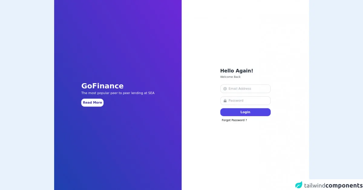
The preview of Form Login ui component
To create a Form Login with Tailwind CSS, we'll use a combination of pre-defined CSS classes and custom styles. The final result will be a visually appealing and easy-to-use Form Login that looks great on any device.
Free download of the Form Login's source code
The source code of Form Login ui component
To create a Form Login with Tailwind CSS, we'll use HTML and CSS. We'll start by creating a basic HTML structure for our Form Login, and then we'll add the necessary CSS classes and styles to make it look great.
<div class="h-screen flex">
  <div class="flex w-1/2 bg-gradient-to-tr from-blue-800 to-purple-700 i justify-around items-center">
    <div>
      <h1 class="text-white font-bold text-4xl font-sans">GoFinance</h1>
      <p class="text-white mt-1">The most popular peer to peer lending at SEA</p>
      <button type="submit" class="block w-28 bg-white text-indigo-800 mt-4 py-2 rounded-2xl font-bold mb-2">Read More</button>
    </div>
  </div>
  <div class="flex w-1/2 justify-center items-center bg-white">
    <form class="bg-white">
      <h1 class="text-gray-800 font-bold text-2xl mb-1">Hello Again!</h1>
      <p class="text-sm font-normal text-gray-600 mb-7">Welcome Back</p>
      <div class="flex items-center border-2 py-2 px-3 rounded-2xl mb-4">
        <svg xmlns="http://www.w3.org/2000/svg" class="h-5 w-5 text-gray-400" fill="none" viewBox="0 0 24 24" stroke="currentColor">
          <path stroke-linecap="round" stroke-linejoin="round" stroke-width="2" d="M16 12a4 4 0 10-8 0 4 4 0 008 0zm0 0v1.5a2.5 2.5 0 005 0V12a9 9 0 10-9 9m4.5-1.206a8.959 8.959 0 01-4.5 1.207" />
        </svg>
        <input class="pl-2 outline-none border-none" type="text" name="" id="" placeholder="Email Address" />
      </div>
      <div class="flex items-center border-2 py-2 px-3 rounded-2xl">
        <svg xmlns="http://www.w3.org/2000/svg" class="h-5 w-5 text-gray-400" viewBox="0 0 20 20" fill="currentColor">
          <path fill-rule="evenodd" d="M5 9V7a5 5 0 0110 0v2a2 2 0 012 2v5a2 2 0 01-2 2H5a2 2 0 01-2-2v-5a2 2 0 012-2zm8-2v2H7V7a3 3 0 016 0z" clip-rule="evenodd" />
        </svg>
        <input class="pl-2 outline-none border-none" type="text" name="" id="" placeholder="Password" />
      </div>
      <button type="submit" class="block w-full bg-indigo-600 mt-4 py-2 rounded-2xl text-white font-semibold mb-2">Login</button>
      <span class="text-sm ml-2 hover:text-blue-500 cursor-pointer">Forgot Password ?</span>
    </form>
  </div>
</div>
How to create a Form Login with Tailwind CSS?
Now that we know why we should use Tailwind CSS to create a Form Login, let's dive into the steps to create one.
Step 1: Set up your HTML structure
The first step is to set up the HTML structure for your Form Login. Here's a basic structure that you can use:
<form class="bg-white p-6 rounded-lg shadow-md">
  <div class="mb-4">
    <label class="block text-gray-700 font-bold mb-2" for="email">
      Email
    </label>
    <input
      class="shadow appearance-none border rounded w-full py-2 px-3 text-gray-700 leading-tight focus:outline-none focus:shadow-outline"
      id="email" type="email" placeholder="Email">
  </div>
  <div class="mb-6">
    <label class="block text-gray-700 font-bold mb-2" for="password">
      Password
    </label>
    <input
      class="shadow appearance-none border rounded w-full py-2 px-3 text-gray-700 mb-3 leading-tight focus:outline-none focus:shadow-outline"
      id="password" type="password" placeholder="Password">
  </div>
  <div class="flex items-center justify-between">
    <button
      class="bg-blue-500 hover:bg-blue-700 text-white font-bold py-2 px-4 rounded focus:outline-none focus:shadow-outline"
      type="button">
      Sign In
    </button>
    <a class="inline-block align-baseline font-bold text-sm text-blue-500 hover:text-blue-800"
      href="#">
      Forgot Password?
    </a>
  </div>
</form>
In this HTML structure, we've used a combination of pre-defined CSS classes and custom styles to create a basic Form Login.
Step 2: Style your Form Login with Tailwind CSS
Now that we have our HTML structure set up, it's time to add some styles to make it look great. Here are some Tailwind CSS classes that you can use to style your Form Login:
bg-white: sets the background color of the Form Login to whitep-6: adds padding of 6 units to the Form Loginrounded-lg: rounds the corners of the Form Loginshadow-md: adds a shadow to the Form Loginmb-4: adds a margin-bottom of 4 units to the input fieldstext-gray-700: sets the text color to grayfont-bold: sets the font weight to boldleading-tight: sets the line height to be tightfocus:outline-none: removes the outline when the input field is focusedfocus:shadow-outline: adds a shadow outline when the input field is focusedbg-blue-500: sets the background color of the Sign In button to bluehover:bg-blue-700: sets the background color of the Sign In button to a darker blue when hovered overtext-white: sets the text color of the Sign In button to whitepy-2: adds padding of 2 units to the top and bottom of the Sign In buttonpx-4: adds padding of 4 units to the left and right of the Sign In buttonrounded: rounds the corners of the Sign In buttoninline-block: sets the display property to inline-blockalign-baseline: aligns the text to the baselinetext-sm: sets the font size to smalltext-blue-500: sets the text color to bluehover:text-blue-800: sets the text color to a darker blue when hovered over
By using these classes, we can create a visually appealing Form Login that looks great on any device.
Step 3: Customize your Form Login
Tailwind CSS is highly customizable, so you can easily tweak the design of your Form Login to match your website or application's branding. Here are some custom styles that you can use to customize your Form Login:
border: adds a border to the input fieldsborder-gray-400: sets the border color to grayfocus:border-blue-500: sets the border color to blue when the input field is focusedplaceholder-gray-400: sets the placeholder text color to grayw-full: sets the width of the input fields to 100%mb-3: adds a margin-bottom of 3 units to the password input fieldtext-center: centers the text in the Sign In button
By using these custom styles, you can create a Form Login that matches your website or application's branding.
Conclusion
In this article, we've discussed how to build a Form Login with Tailwind CSS. We've covered the benefits of using Tailwind CSS, the HTML structure and CSS classes needed to create a Form Login, and some custom styles that you can use to customize your Form Login. By following these tips, you can create a visually appealing and easy-to-use Form Login that looks great on any device.