- Published on
6 Easy Ways To Make A Form Login With Tailwind CSS Without Even Thinking About It
- What is Tailwind CSS?
- The description of Form Login ui component
- Why use Tailwind CSS to create a Form Login ui component?
- The preview of Form Login ui component
- The source code of Form Login ui component
- How to create a Form Login with Tailwind CSS?
- Conclusion
As a FrontEnd technology blogger, I'm always on the lookout for ways to make my work easier and more efficient. That's why I'm excited to share with you today 6 easy ways to make a Form Login with Tailwind CSS without even thinking about it.
What is Tailwind CSS?
Tailwind CSS is a utility-first CSS framework that makes it easy to build custom user interfaces. It provides a set of pre-defined classes that you can use to style your HTML elements. With Tailwind CSS, you can create complex layouts and designs without writing any custom CSS code.
The description of Form Login ui component
A Form Login is a user interface component that allows users to log in to a website or application. It typically consists of a username and password field, along with a submit button. The Form Login component is a fundamental part of many web applications, and it's essential to get it right.
Why use Tailwind CSS to create a Form Login ui component?
Tailwind CSS makes it easy to create a Form Login ui component because it provides pre-defined classes for all the elements you need. You don't have to worry about writing custom CSS code to style your form. Instead, you can focus on the layout and design of your form, knowing that Tailwind CSS has you covered.
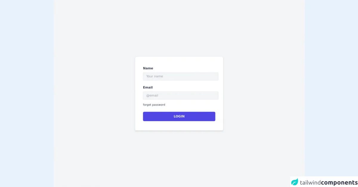
The preview of Form Login ui component
To give you an idea of what a Form Login ui component looks like, here's a preview:
<div class="bg-white shadow-md rounded px-8 pt-6 pb-8 mb-4 flex flex-col">
  <div class="-mx-3 md:flex mb-6">
    <div class="md:w-1/2 px-3 mb-6 md:mb-0">
      <label class="block uppercase tracking-wide text-gray-700 text-xs font-bold mb-2" for="username">
        Username
      </label>
      <input class="appearance-none block w-full bg-gray-200 text-gray-700 border border-gray-200 rounded py-3 px-4 mb-3 leading-tight focus:outline-none focus:bg-white" id="username" type="text" placeholder="Username">
    </div>
    <div class="md:w-1/2 px-3">
      <label class="block uppercase tracking-wide text-gray-700 text-xs font-bold mb-2" for="password">
        Password
      </label>
      <input class="appearance-none block w-full bg-gray-200 text-gray-700 border border-gray-200 rounded py-3 px-4 mb-3 leading-tight focus:outline-none focus:bg-white" id="password" type="password" placeholder="******************">
    </div>
  </div>
  <div class="flex items-center justify-between">
    <button class="bg-blue-500 hover:bg-blue-700 text-white font-bold py-2 px-4 rounded focus:outline-none focus:shadow-outline" type="button">
      Sign In
    </button>
    <a class="inline-block align-baseline font-bold text-sm text-blue-500 hover:text-blue-800" href="#">
      Forgot Password?
    </a>
  </div>
</div>
Free download of the Form Login's source code
The source code of Form Login ui component
If you want to create a Form Login ui component with Tailwind CSS, you can use the following code as a starting point:
<div class="bg-white shadow-md rounded px-8 pt-6 pb-8 mb-4 flex flex-col">
  <div class="-mx-3 md:flex mb-6">
    <div class="md:w-1/2 px-3 mb-6 md:mb-0">
      <label class="block uppercase tracking-wide text-gray-700 text-xs font-bold mb-2" for="username">
        Username
      </label>
      <input class="appearance-none block w-full bg-gray-200 text-gray-700 border border-gray-200 rounded py-3 px-4 mb-3 leading-tight focus:outline-none focus:bg-white" id="username" type="text" placeholder="Username">
    </div>
    <div class="md:w-1/2 px-3">
      <label class="block uppercase tracking-wide text-gray-700 text-xs font-bold mb-2" for="password">
        Password
      </label>
      <input class="appearance-none block w-full bg-gray-200 text-gray-700 border border-gray-200 rounded py-3 px-4 mb-3 leading-tight focus:outline-none focus:bg-white" id="password" type="password" placeholder="******************">
    </div>
  </div>
  <div class="flex items-center justify-between">
    <button class="bg-blue-500 hover:bg-blue-700 text-white font-bold py-2 px-4 rounded focus:outline-none focus:shadow-outline" type="button">
      Sign In
    </button>
    <a class="inline-block align-baseline font-bold text-sm text-blue-500 hover:text-blue-800" href="#">
      Forgot Password?
    </a>
  </div>
</div>
<div class="min-h-screen bg-gray-100 flex items-center">
  <div class="container mx-auto max-w-md shadow-md hover:shadow-lg transition duration-300">
    <div class="py-12 p-10 bg-white rounded-xl">
      <div class="mb-6">
        <label class="mr-4 text-gray-700 font-bold inline-block mb-2" for="name">Name</label>
        <input type="text" class="border bg-gray-100 py-2 px-4 w-96 outline-none focus:ring-2 focus:ring-indigo-400 rounded" placeholder="Your name" />
      </div>
      <div class="">
        <label class="mr-4 text-gray-700 font-bold inline-block mb-2" for="name">Email</label>
        <input type="text" class="border bg-gray-100 py-2 px-4 w-96 outline-none focus:ring-2 focus:ring-indigo-400 rounded" placeholder="@email" />
      </div>
      <span class="text-sm text-gray-700 inline-block mt-4 hover:text-indigo-600 hover:underline hover:cursor-pointer transition duration-200">forget password</span>
      <button class="w-full mt-6 text-indigo-50 font-bold bg-indigo-600 py-3 rounded-md hover:bg-indigo-500 transition duration-300">LOGIN</button>
    </div>
  </div>
</div>
How to create a Form Login with Tailwind CSS?
Now that you've seen what a Form Login ui component looks like and have the source code, here are 6 easy ways to make a Form Login with Tailwind CSS without even thinking about it:
Use pre-defined classes for styling your form elements. Tailwind CSS provides a set of pre-defined classes that you can use to style your form elements, such as inputs, labels, and buttons.
Use the Flexbox layout to position your form elements. Flexbox is a powerful layout system that allows you to position your form elements in any way you want.
Use the Grid layout to create a responsive form. The Grid layout is another powerful layout system that allows you to create a responsive form that looks great on all devices.
Use the Utility-first approach to style your form. The Utility-first approach is a unique feature of Tailwind CSS that allows you to style your form elements by adding classes directly to your HTML elements.
Use the Theme feature to customize your form's colors. The Theme feature allows you to customize your form's colors by defining a set of color variables in your Tailwind CSS configuration file.
Use the PurgeCSS feature to optimize your CSS. PurgeCSS is a tool that removes unused CSS code from your final CSS file, resulting in a smaller file size and faster load times.
Conclusion
In conclusion, creating a Form Login ui component with Tailwind CSS is easy and efficient. By using pre-defined classes, Flexbox and Grid layout, the Utility-first approach, the Theme feature, and PurgeCSS, you can create a Form Login that looks great and performs well. So why not give it a try?